Layout of adaptive emails: a detailed guide (part 2)
- Transfer
In the previous article, we talked about why we need to adapt mailing letters for mobile devices, examined some points that should be considered when creating letter templates, and “played around” with the layout code.
Today we will focus on the use of media queries for various devices, optimizing images for mobile and increasing the effectiveness of subscription forms.
Media queries for different devices
You may have noticed that earlier in this tutorial, we have used a standard version of the query media:
@media only screen and (max-device-width: 480px) { ... }. With it, you can work well with old iPhone and other mobile devices of the same form factor. But if the recipients of the letter can view it on new iPhone, tablets and Android devices with a large screen of various exotic resolutions, then it is necessary to use both unique media query and unique styles.
As you must know, media queries are not supported by all mobile email clients, without exception - for example, Gmail will not show an adaptive version of the message on any platform.
Debugging media queries
Now back to the already mentioned media query and the max-device-width: 480px rule. It seems to tell the mobile mail application (and browser) that the maximum value for displaying the template is 480 pixels. If the screen is larger, then you should use CSS.
At the same time, with the help of media queries, you can also fine-tune the display of letters on different screens. For example, to aim at displays that are 320px wide and not wider than 480px wide, you could write this:
@media only screen and (min-device-width: 320px) and (max-device-width: 480px) { ... }Many don't know, but media queries can be very focused- with their help, it is possible to create letters not only for display ranges, but also for different screen orientations (landscape, portrait), as well as pixel ratios (the ratio of the pixel in the image to the width of the screen on which it is displayed).
As a result, it is possible to work with jewelry accuracy - you need to create a template "for iPad" - there are no problems, you need to adapt to devices with Retina - please. Adding new styles can take time, but media queries can achieve acceptable display of letters on many devices with a couple of lines of code.
Here is a good guide to working with different screens for beginners.
At the same time, some designers and typesetters oppose the creation of templates oriented to a fixed screen size (for example, 480px) - these values are also called “breakpoints”.
If you use adaptive design techniques (which is definitely worth doing!), This means that the use of "default" media queries with breakpoints by screen size is simply useless.
- Mark Drummond , “ Responsive design with breakpoints is dead ”
Building liquid templates using media queries
Using a media query, which instead of using a fixed width, applies the percentage width to the elements of the letter. This results in compression and stretching of the content targeted at large screens when displaying it on small displays. Using this method, you can achieve an adequate display of content even on older Nokias:
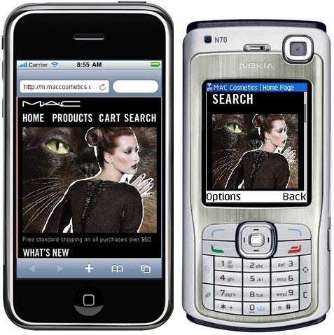
Starbucks designers used the described technique at one time - try to open this letter in a browser and “play around” with the window size.
Optimization of images for display on mobile devices
The lack of screen space on mobile devices requires the thoughtful use of images in mailing lists. At the same time, good CSS support in some mobile clients (such as Mail for iPhone) provides designers with some scope for creativity.
Next, we’ll look at several CSS techniques and techniques for optimizing images for display on mobile devices.
Background Images and Headers
In general, the use of background images is such a thing that should be avoided per kilometer, but in the case of "default" email applications on iPhone and Android, good CSS support gives some flexibility. One of the possible advantages is the ability to replace the default images with those optimized for the "mobile" in the event that the letter is viewed on a mobile device.
As a rule, designers are advised to optimize images for the selected array of screen sizes. But when resizing images, a problem may arise - sometimes some content (for example, text) becomes too small, and it is impossible to make out with the eye.
In this case, it is better to create a unique image for each individual target device. This is done by placing the image in a table cell or div tag and using a media query, which hides the original image and displays another background image in the header instead:
CSS:
@media only screen and (max-device-width: 480px) {
    td[class="headercell"] {
        background-image: url(images/header-325.png);
        width: 325px !important;
        height: 115px !important;
    }
    td[class="headercell"] img {
        display: none;
    }
}
HTML:

Here's what the letter looks like in the mobile client before and after this procedure: The
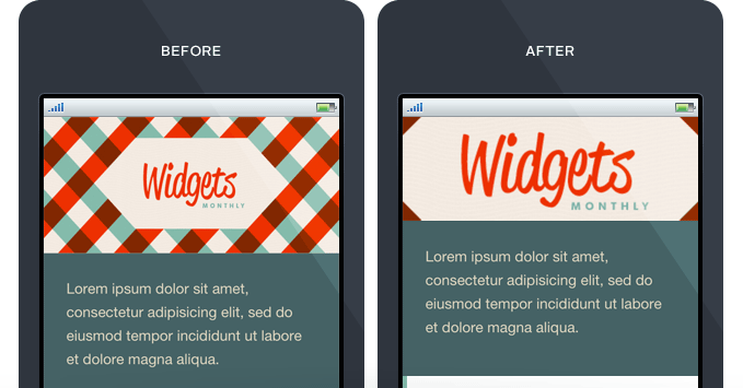
advantage of this technique is that it allows you to reduce the length of the letter by using shorter pictures. As you know, in the "mobile" the shorter the better .
Image resizing for liquid templates
The problem with the method described above is that it is only effective when it comes to templates with a fixed width. Nowadays, there are a huge number of devices with a variety of screen settings, so the use of "liquid" letter templates that are adequately displayed on each of them is a more logical solution.
The obvious solution seems to be to use the option in our above media query option
background-size: 100%. But there is a better option - background-size: cover :@media only screen and (max-device-width: 480px) {
td[class="headercell"] {
background-image: url(images/header-480.png) !important;
background-size: cover;
}
td[class="headercell"] img {
display: none;
}
}
Webkit browsers are fully supported
background-size, so everything will work fine in default email clients on iPhone and Android. In other cases, you can use the traditional approach with the use of a tag and further image resizing:@media only screen and (max-device-width: 480px) {
td[class=headercell] img {
height:auto !important;
width:100% !important;
}
}
Display high-res images for Retina displays
Here the whole trick is to create images that are twice as large as those that you plan to actually use - this allows you to achieve crystal clarity on the displays of the iPhone and iPad. For example, you can create a 650px X 230px image, and then crop it in half for mobile devices. You can do this using the following media query code:
@media only screen and (max-device-width: 480px) {
    td[class="headercell"] {
        background-image: url(images/header-650@2x.png) !important;
        background-size: 325px 115px;
        width: 325px !important;
        height: 115px !important;
        }
    td[class="headercell"] img {
        display: none;
        }
    }
}
In order to work with Retina displays using a specific stylesheet, you can declare CSS this way:
@media all and (min-device-pixel-ratio : 1.5) { ... }Not everything is perfect with this method either. All email clients that support media query will be forced to upload large hi-res pictures - which means that the letter will also open longer in the inbox. Therefore, the described approach should be used with caution and only when the advantages of displaying high-definition pictures outweigh the associated disadvantages.
Optimize your subscription forms
Optimization of mailing lists for mobile devices is not limited to only work on increasing the readability of messages on small screens. Among other things, what's the point of spending so much effort on this optimization if mobile device users cannot easily subscribe to the newsletter?
IOS and Android smartphones allow users to interact fairly easily with forms, but there are several ways designers and developers can use to make this process even easier. Optimization of forms is necessary in order to make it easier to fill out from a mobile device. For businesses, “easy filling” translates into increased conversions and new subscribers.
Here are some tips for working with forms and consider a small example that is useful for beginners:
- Top alignment . In the case of mobile devices, a situation often arises in which the user selects a form field and does not see its name. For example, at the initial zoom level, the inscription “Enter your email” left-aligned may be visible, but after the user taps on the input field, it will “zoom” into it, as a result of which the inscription disappears from the field of view. There can be two ways out: use alignment on the top edge or add a description of the form as its text value. In the latter case, less space is required on the screen, but it can sometimes annoy users - no one likes when the field that you just started filling in is suddenly hidden behind the left telephone keypad.
- Use
input type=”email”. When using the parameterinput type=”email”in the forms for entering the mailing address, a special keyboard will appear on iOS phones, including characters like @. - Better to make the shapes narrower . Using media queries and CSS can greatly improve the usability of forms. However, nothing annoys users as much as situations in which a significant part of the input fields on the screen are blocked by other elements or simply do not fit into it after you start typing. If you make the length of the input field, say, no more than 80% of the screen width, this can significantly improve the usability of forms.
- Forms with several answer options should be made more concise . All content on a mobile device is better placed in one column - especially for checkboxes. Often, drop-down lists will be more convenient than radio buttons and will eliminate the need for scrolling to work with the form.
- Practical advice on scaling . The above is more about design in general, and not just about forms. Now one practical piece of advice that applies exclusively to forms. Using the viewport meta tag will help prevent unintended zoom of the form - and, as a result, the loss of most of its contents from view. Here's how such a meta tag might look in the title of an HTML page:
/>Detailed information on this topic is provided, for example, in the Apple documentation.
In order to better understand the optimization of forms, you can use this example CSS template that contains the form. You can download the example here .
How to create text email for mobile
In many cases, it is possible to effectively use text rather than HTML emails. When it comes to formatting such messages, specialists are often divided into two camps - some include line breaks after 60-65 characters, and those who do not. Both camps have their pros and cons.
According to CampaignMonitor, a limit of 60-65 characters works well for desktop and web-based email clients. On the desktop there are no special boundaries for the width of paragraphs of text, so limiting them at the stage of developing a letter template allows you to make it more readable - scrolling a very long line is not very convenient.
In a mobile environment, things are not so simple. Sometimes in the same iPhone Mail, a string of 65 characters looks worse than if it were much longer.
Case Study: Twitter Newsletter
Having considered a lot of theory, it is time to move on to practice. And consider not just some kind of newsletter there, but such a newsletter, the letters of which are received by millions of people.
A few years ago, Twitter email notifications were "not very" when viewed from mobile devices. The problem was in the small text and wide template - the need for constant zoom and scrolling killed all the desire to read such a message on a small screen. Not much effort was required to improve the situation.
We deal with small text
First of all, you should deal with the display of text. The reason for its so small size was to use a template with a width of 710px - in order to show it in its entirety, the mail client “pulls out” when viewing it. The use of a special media query helped:
@media only screen and (max-width: 480px) { ... }Similar ads are placed between tags
— таблицы стилей внутри них могут быть интерпретированы только HTML-почтовыми клиентами, которые соответствуют критерию @media only screen and (max-width: 480px). Вот как выглядят две таблицы, содержащие тело письма:
Привести их к нормальному размеру можно с помощью введения классов wrappertable, wrappercell и structure:
Затем эти классы описываются в media query:
@media only screen and (max-device-width: 480px) {
body {
width: 320px !important;
}
table[class="wrappertable"] {
width: 320px !important;
}
table[class="structure"] {
width: 300px !important;
}
Использованные ширины довольно значительны, поскольку на старых iPhone (материал впервые опубликован в 2012 году — прим. перев.) ширина экрана в портретной ориентации составляет 320px. Использование именно этой величины для описания ширины шаблона письма позволит добиться его отображения в режиме 100% зума по умолчанию — это значит, что будет виден не только весь дизайн, но и то, что текст и изображения получатся читабельными.
Решаем проблему изображения в заголовке
Для того, чтобы справиться с «ужасно широким» заглавным изображением в письме Twitter, его пришлось разбить на три отдельные картинки. Секции, которые отображать не обязательно, на мобильных устройствах можно просто опустить.
Так выглядел изначальный код:

Разбиение на три части:


Нетрудно заметить, что класс logo разбит на три изображения logo-left.png, logo.png и logo-right.png. Скрыть ненужные куски можно довольно простым способом:
img[class="logo"] { display: none !important; }
В результате письмо стало выглядеть куда лучше:

Скачать код примера можно по этой ссылке.
На сегодня все, спасибо за внимание!
Ниже представлен список других статей о вёрстке email-писем в блоге «Печкина»:
- How-to: Правила вёрстки email-писем
- Тренды и статистика: Как интернет-компании создать эффективную рассылку
- 5 правил верстки email-писем от Печкина
- Добавление видео из Youtube в email-рассылку
