 April 30, 2015 at 14:00
How Aviasales switched to Material Design
In June 2014, at the Google I / O conference, along with the new version of the Android 5 operating system, a whole design philosophy from Google was introduced - Material Design.
Developing previous Android versions of Aviasales, we did not “listen” to Google in everything. Now, with the release of Android 5, it was decided to try out new guidelines, and I’ll talk about our impressions below.
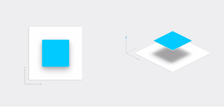
No matter how it sounds, Material Design is not just a collection of Do's and Don'ts, it is its own system, its own philosophy. Material Design has its own physics, and when designing a design, you need to consider how each screen will look in 3D, at what height each element is located, and how the shadow will look, given the light incident on the element.
At the very beginning, Google’s guidelines contradicted the applications that left it. This introduced a discord into the workflow, and we ourselves decided what to do.
We started from the main screens, and on the most fashionable Floating Action Button, as bequeathed to Google, we entrusted the main function of the application - ticket search. Here is just one problem: there is a button, but there are no views in the Android SDK for it, they wrote it themselves.

Although we try to make the application more convenient, we cannot change the process of buying tickets, it occurs through WebView on the side of counterparties who do not always make sure that their site is convenient to use on mobile platforms. The only thing that sweetened this pill in the new Android was that WebView was finally untied from the system. It will be updated independently. This means that there are fewer problems when buying tickets on the websites of our partners.
One of the key features of Material Design was the adaptation to different versions of the operating system, for which Google, among other things, provided a whole group of Support Library. A vivid example is the V7 Cardview Library, which, however, did not greatly facilitate adaptation to older versions of Android, because in L and up to L Cardview will have different indents from the edges of the screen. We solved this problem with setUseCompatPadding, but faced another: in older versions of Android, Cardview does not round the corners of the content inside it, but instead adds padding to fit the image into a radius. One of the superficial solutions to this problem is to round the corners of the picture itself, which we enter in Cardview, but be careful: this solution will not be suitable for all cases.
Despite a good attempt by Google to enable developers to adapt their applications to different versions of the OS, a lot of funny pieces in the “material”, such as the Ripple Effect, are not supported in the earlier versions, while our application has a lot of users with API versions below . In the Look & Feel bunch, the four users, by and large, will receive only Look - this is the main message of the compatibility libraries from Google.
For all our enthusiasm for new guidelines, we did not forget about the new features of the application. In the new version, we completely revised the concept of the price calendar. Now it more clearly shows the cost of tickets for the coming dates and allows you to see the difference between direct flights and flights with transfers.
For the convenience of users, we selected the best (fastest and cheapest) tickets and placed them in a separate tab in the issue, which was made possible thanks to the adoption of Tapbar from the Google I / O application: |
Another innovation was the appearance in the Android version of additional flight information, which is a summary of statistics:

 We completely animated the appearance of the search form on the main screen and the Floating Action Button at the time of creating the subscription for the direction of interest to the user:

Unfortunately, we did not manage to work out all the animations in detail, so to some extent we are forced to use the Google approach, which demonstrates new animations with every fresh release of the application.
Mark, Aviasales Designer
 Immediately after the announcement of Google, I asked the leadership for two days to read severely and delve into the basic principles of the new ecosystem. I came to the office early in the morning and sat for two days from 8 to 23 and sorted out every little thing. I must say that I really mastered the material well and started to work. It was a revelation for me that the platform, which was always lagging behind (subjectively by the standards of design and objectively by in-app), made a serious request for its visual presentation.
The biggest joy was Meaningful Transitions, which I was not allowed to implement due to the release dates. Now the platform itself has given us the green light for cool interface solutions and animations.
That was my first mistake. The desire to make the animation as soon as possible led to the fact that at first we realized not so important things, and only then we started working on the details of the interface. Immediately we were faced with the problem of the absence of any support from the Good Corporation, and our developers, suffering, implemented animations manually. It's cool, like pumping in a personal plan, but we make the product and the agreed release dates must be respected.
The second wrong step, I subjectively consider strict adherence to Google recommendations. We passionately followed the guidelines and did everything according to them, but the result seemed a bit bland to us. The point is not that we wanted fun, just in fact it is not as pretty as in the pictures from Google.

In parallel with everything, we looked at examples of applications from Google and often sounded something like: “Why so? After all, you yourself teach another. ” There have been many discussions and memes on the Internet about this. In principle, you can understand the situation: completely new guides, it is difficult to immediately take into account all the points and do everything right. But on the other hand, we, as developers, have suffered with a constant lack of material and the declared capabilities of the platform.
What happened as a result: a new look at how you can work with interfaces. Google gave a decent answer to Apple, and personally I know a lot of people who switched from iPhone to, say, Nexus 5. It's cool that it was possible to implement interesting animations without losing color. But there is one big problem: old devices. People with top models simply do not realize that the world is full of users with very old phones. We, as developers, see the real picture: there are many such devices, and we must support them. It is painful and sad, often I want to cry in the corner, but so far nothing can be done. Naturally, not everyone is after technology.
In general, the release took place, and we received a positive response from users, but there is still a lot of work :)
 Igor, Aviasales Android developer:
I liked the fact that Google clearly defined all the indents, font sizes, colors, etc. etc. that need to be used in the application.
- Of the minuses: there are a certain number of new interface elements (bottom sheet, snackbar, floating button) that are actively recommended in the guidelines, but are not available in the SDK. The pain is slightly mitigated by the fact that on the Internet you can find libraries with these elements.
- At first they wrote as if blindly, since Android L came out much later than the guidelines for it, and it was not completely clear what opportunities Google would provide and what they would have to write themselves. There was only a preview version of Android L, which was little understood.

 Andrey, Aviasales Android Developer
- In the end, not everything is so bad - supporting 4/5 has become much easier than 2/4. For developers trying to support 2/4/5, I highly recommend joining minSdkVersion14.
Impressions of the new design philosophy of Google, if not to touch on some nuances, are positive, because Google realized that design is as much an integral part of the application as the technical component. By issuing detailed guidelines, they simplified the interaction between the team by building a kind of bridge between the designer and the developers.
We believe that Material Design is a huge leap towards quality content on Google Play.
Our previous posts:
" And we have an SDK, and you?
A
First impressions
No matter how it sounds, Material Design is not just a collection of Do's and Don'ts, it is its own system, its own philosophy. Material Design has its own physics, and when designing a design, you need to consider how each screen will look in 3D, at what height each element is located, and how the shadow will look, given the light incident on the element.
At the very beginning, Google’s guidelines contradicted the applications that left it. This introduced a discord into the workflow, and we ourselves decided what to do.
We started from the main screens, and on the most fashionable Floating Action Button, as bequeathed to Google, we entrusted the main function of the application - ticket search. Here is just one problem: there is a button, but there are no views in the Android SDK for it, they wrote it themselves.
Although we try to make the application more convenient, we cannot change the process of buying tickets, it occurs through WebView on the side of counterparties who do not always make sure that their site is convenient to use on mobile platforms. The only thing that sweetened this pill in the new Android was that WebView was finally untied from the system. It will be updated independently. This means that there are fewer problems when buying tickets on the websites of our partners.
One of the key features of Material Design was the adaptation to different versions of the operating system, for which Google, among other things, provided a whole group of Support Library. A vivid example is the V7 Cardview Library, which, however, did not greatly facilitate adaptation to older versions of Android, because in L and up to L Cardview will have different indents from the edges of the screen. We solved this problem with setUseCompatPadding, but faced another: in older versions of Android, Cardview does not round the corners of the content inside it, but instead adds padding to fit the image into a radius. One of the superficial solutions to this problem is to round the corners of the picture itself, which we enter in Cardview, but be careful: this solution will not be suitable for all cases.
Despite a good attempt by Google to enable developers to adapt their applications to different versions of the OS, a lot of funny pieces in the “material”, such as the Ripple Effect, are not supported in the earlier versions, while our application has a lot of users with API versions below . In the Look & Feel bunch, the four users, by and large, will receive only Look - this is the main message of the compatibility libraries from Google.
New Services
For all our enthusiasm for new guidelines, we did not forget about the new features of the application. In the new version, we completely revised the concept of the price calendar. Now it more clearly shows the cost of tickets for the coming dates and allows you to see the difference between direct flights and flights with transfers.
For the convenience of users, we selected the best (fastest and cheapest) tickets and placed them in a separate tab in the issue, which was made possible thanks to the adoption of Tapbar from the Google I / O application: |
Another innovation was the appearance in the Android version of additional flight information, which is a summary of statistics:
- which planes carry out this flight;
- average delay in poisoning;
- percentage of flights arriving on time;
- punctuality rating of the route.
Animations
We completely animated the appearance of the search form on the main screen and the Floating Action Button at the time of creating the subscription for the direction of interest to the user: Unfortunately, we did not manage to work out all the animations in detail, so to some extent we are forced to use the Google approach, which demonstrates new animations with every fresh release of the application.
Impressions of designers and developers
Mark, Aviasales Designer
Immediately after the announcement of Google, I asked the leadership for two days to read severely and delve into the basic principles of the new ecosystem. I came to the office early in the morning and sat for two days from 8 to 23 and sorted out every little thing. I must say that I really mastered the material well and started to work. It was a revelation for me that the platform, which was always lagging behind (subjectively by the standards of design and objectively by in-app), made a serious request for its visual presentation. The biggest joy was Meaningful Transitions, which I was not allowed to implement due to the release dates. Now the platform itself has given us the green light for cool interface solutions and animations.
That was my first mistake. The desire to make the animation as soon as possible led to the fact that at first we realized not so important things, and only then we started working on the details of the interface. Immediately we were faced with the problem of the absence of any support from the Good Corporation, and our developers, suffering, implemented animations manually. It's cool, like pumping in a personal plan, but we make the product and the agreed release dates must be respected.
The second wrong step, I subjectively consider strict adherence to Google recommendations. We passionately followed the guidelines and did everything according to them, but the result seemed a bit bland to us. The point is not that we wanted fun, just in fact it is not as pretty as in the pictures from Google.
In parallel with everything, we looked at examples of applications from Google and often sounded something like: “Why so? After all, you yourself teach another. ” There have been many discussions and memes on the Internet about this. In principle, you can understand the situation: completely new guides, it is difficult to immediately take into account all the points and do everything right. But on the other hand, we, as developers, have suffered with a constant lack of material and the declared capabilities of the platform.
What happened as a result: a new look at how you can work with interfaces. Google gave a decent answer to Apple, and personally I know a lot of people who switched from iPhone to, say, Nexus 5. It's cool that it was possible to implement interesting animations without losing color. But there is one big problem: old devices. People with top models simply do not realize that the world is full of users with very old phones. We, as developers, see the real picture: there are many such devices, and we must support them. It is painful and sad, often I want to cry in the corner, but so far nothing can be done. Naturally, not everyone is after technology.
In general, the release took place, and we received a positive response from users, but there is still a lot of work :)
Igor, Aviasales Android developer: I liked the fact that Google clearly defined all the indents, font sizes, colors, etc. etc. that need to be used in the application.
- Of the minuses: there are a certain number of new interface elements (bottom sheet, snackbar, floating button) that are actively recommended in the guidelines, but are not available in the SDK. The pain is slightly mitigated by the fact that on the Internet you can find libraries with these elements.
- At first they wrote as if blindly, since Android L came out much later than the guidelines for it, and it was not completely clear what opportunities Google would provide and what they would have to write themselves. There was only a preview version of Android L, which was little understood.
Andrey, Aviasales Android Developer- In the end, not everything is so bad - supporting 4/5 has become much easier than 2/4. For developers trying to support 2/4/5, I highly recommend joining minSdkVersion14.
Instead of output
Impressions of the new design philosophy of Google, if not to touch on some nuances, are positive, because Google realized that design is as much an integral part of the application as the technical component. By issuing detailed guidelines, they simplified the interaction between the team by building a kind of bridge between the designer and the developers.
We believe that Material Design is a huge leap towards quality content on Google Play.
Our previous posts:
" And we have an SDK, and you?
A