Layout of adaptive emails: a detailed guide (part 1)
- Transfer
Anyone who periodically reads mail on the phone knows that this experience can be both quite pleasant and just awful. The fact that the email from the newsletter looks great on the desktop does not mean that everything will be fine in the mobile email client - on a small screen, there are often problems with fonts, the display of columns, and the layout of the templates just goes around.
Why you need to adapt letters for mobile devices
A significant part of the audience of various companies engaged in email marketing, view emails on mobile devices. During a Campaign Monitor study in 2011, it turned out that almost 20% of email openings took place on smartphones and tablets - in 2009, this figure was only 4%. Almost 90% of these discoveries were made on iOS devices. Now the numbers are even higher.
In this guide, we will look at several ways to improve the display of mailing lists.on mobile devices (from the use of media queries in the layout of adaptive templates to more advanced techniques). In addition, we will consider various design issues that arise even at the planning stage of the mailing list, and also talk about how to place subscription forms for receiving letters on smartphones and tablets.
Design techniques
Before diving into the world of typesetting letters, let's talk about the visual component of this case. An interesting point is that during the analysis of the material we will create two versions of the same letter - one template is designed to look good on desktop email clients, and the second should be nice to read on devices with small screens.
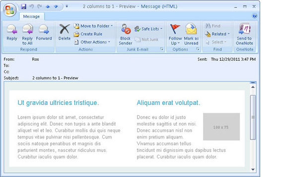
Here, for example, how such an email might look in Outlook:
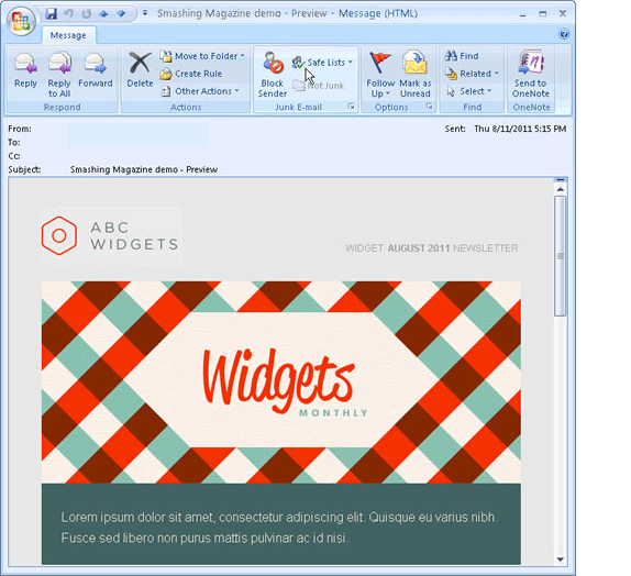
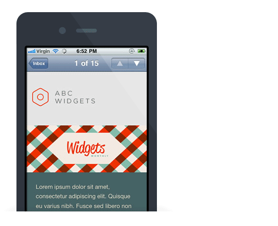
Below is the same email, but open in Mail for iPhone. The difference between the two patterns is clearly visible. The mobile version is already, it has fewer optional visual elements, but reading it is as convenient as the desktop version. The difference in the appearance of the two mobile options is the use of CSS.
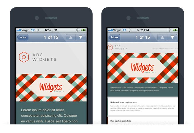
The right letter is no different from the left one, but CSS was not used for its layout. Some sections of the text turned out to be too small, and it is almost impossible for the user to make out what is written there - this is the problem of the millions of news letters that the owners of mobile devices receive every day.
What to consider when creating templates
Creating emails that look good on mobile devices is much more complicated than just using custom CSS. You should pay attention to other things:
- On mobile devices, single-column patterns no wider than 500-600 pixels work better. They are easier to read, and even if they have some kind of flaws, all the "shoals" in any case look better.
- According to Apple guidelines, the minimum target area for buttons and links should be 44 x 44 pixels. There is nothing more “non-usable” than a bunch of small links that are difficult to get to on a small screen of a mobile device.
- The minimum font displayed on iPhone is 13 pixels. It is necessary to take this fact into account when creating the text of the letter - if the text in the template is typed in a smaller font, then it will be automatically enlarged, which can break the entire layout.
- The letter should be concise, and all important information should be placed in its upper part. Scrolling on touchscreens with a finger is more difficult than scrolling on a desktop with a mouse.
- If possible, use the display property: none; to hide optional template elements. Sharing buttons on the social network are appropriate on the desktop, but they are not always convenient to use on a smartphone.
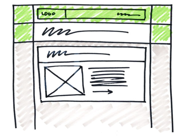
In the process of prototyping, it’s worth creating two sketches or wireframes - one for the template that will be displayed in desktop clients and web versions of mail services, and one for mobile devices. It is important to check how the call to action included in the letter looks like on different platforms - is it visible immediately after opening the letter or will the user have to scroll email for this:
Now, after we have examined some important issues of the design of mailing lists for mobile platforms, you can go directly to the various aspects of their layout.
Typesetting mobile letters
When it comes to mobile styles, most often it’s not a separate style file, but media queries. This is how they look:
<styletype="text/css">
    @media only screen and (max-device-width: 480px) {
        /* сюда пишутся стили для мобильных платформ */
    }
    /* сюда пишется CSS для десктопа */
</style>
Let's take a closer look at how the ad comes about
@media. First of all, to create “mobile” CSS, you need to implement some kind of criterion by which the email client will determine which styles to use. An operator
@media only screenis used for this - it shows that the mail client should be displayed on the screen (instead of, for example, being printed on a printer). After that, in the code example above, we set the maximum screen width of the device to 480 pixels. This is important because many (but not all) mobile devices have a display area of 480 pixels or less. Therefore often used
max-device-width: 480px (This is also the display width of previous iPhone models in landscape mode), but you can expand the description to cover other screen sizes:@media screen and (device-width: 480px) and (device-height: 360px), screen and (device-width: 360px) and (device-height: 480px), screen and (device-width: 320px) and (device-height: 240px) { ... }
Let's return to the mobile letter template discussed above. Here's what it looks like in Apple Mail:
In this example, the class is applied to HTML tables containing text and images
contenttable. Here is a sample code:<styletype="text/css">
@media only screen and (max-device-width: 480px) {
/* сюда пишутся мобильные CSS-стили */table[class=contenttable] {
width: 320px!important;
}
}
/* regular CSS styles go here */table.contenttable {
width: 640px;
}
</style>
This class plays an interesting role - when a letter is opened on a device with a screen of 480 pixels or wider, it does not affect anything. However, when the screen is 480 or smaller, it narrows the width of the tables to 320 pixels. In order to avoid an unusual glitch in Yahoo mail, attribute selectors were used . Otherwise, “regular” CSS is used. You can also include these ads:
@media only screen and (max-device-width: 480px) {
    /* mobile-specific CSS styles go here */table[class=contenttable] { width: 325px!important; }
    img[class="headerimage"] { width: 325px!important;  }
    p[class="date"] { display: none !important; }
}
Next, we will look at more complex techniques for adapting mobile emails to mobile devices.
Create responsive templates with two-to-one columns
Using single-column templates is a good way to optimize distribution for mobile devices. At the same time, there are ways to create adaptive two-column templates, without the need to use long CSS in media queries.
The two-column template allows you to put more content at the top of the message displayed in desktop or web-based email clients, but reading and navigating such messages on mobile devices is still a pleasure. You can fix this with the good old code.
The golden rule for the layout of letters is: "Wherever possible, use HTML instead of CSS." The degree to which CSS can be supported by different email clients can vary greatly, but they all work the same way with HTML. For example, attributes like
align=”left”andcellpadding=”10”- a much more reliable tool than their counterparts in CSS float: left;and padding: 10px;. These attributes will be used when creating letters in the format “from two to one column”. This is how a similar letter might look in Outlook 2007:
In the example above, we used a container table with a width of 640px, which contains two 320px tables that form the columns. For these columns
cellpadding=”20“, this is done so that the content does not cling to the borders. When making layouts for the web, they are usually used
float:left;to align columns. However, you can use it instead align=”left”. Since the width of the container table is equal to or greater than the combined width of the two nested tables, using HTML will work well. The following is a simplified code for such a two-column template:<tablewidth="640"border="0"cellpadding="0"cellspacing="0"><tr><td><tablewidth="320"border="0"cellspacing="0"cellpadding="20"align="left"><tr><td><p>Column Left Content</p></td></tr></table><tablewidth="320"border="0"cellspacing="0"cellpadding="20"align="right"><tr><td><p>Column Right Content</p></td></tr></table></td></tr></table>The result looks like this:

A container table with a width of 640 pixels, so the template will be two-columned. But in the event that the screen width is less than this, then the content of the right column will be “wrapped” under the left. If you make the width of the nested tables equal to 320 pixels, then when displayed on a mobile device, you will get a single-column letter, which does not need to be “zoomed” at all. You can achieve this effect by adding one line of media query to the HTML code:
<styletype="text/css">
    @media only screen and (max-device-width: 480px) {
        table[class=contenttable] {
            width:320px!important;
        }
    }
</style>
<tablewidth="640" border="0" cellpadding="0" cellspacing="0" class="contenttable">
The result is an adaptive template that will be two-column on the desktop and one-column on mobile devices (in the default Mail application for iPhone and the Android mail client).
Adding “progressive disclosure” (as in Wikipedia)
Many sites use to convert long web content into a short mobile technique called progressive disclosure . It consists in hiding the content behind an interactive element like a button or link, and then showing that content on a click (or tap). This technique is used by Wikipedia and many other projects - it can also be used to make emails for mobile devices (CSS is used to hide and show content).
For example, a situation is possible in which various articles are listed in the newsletter. In the web version for each article should display the title and text:
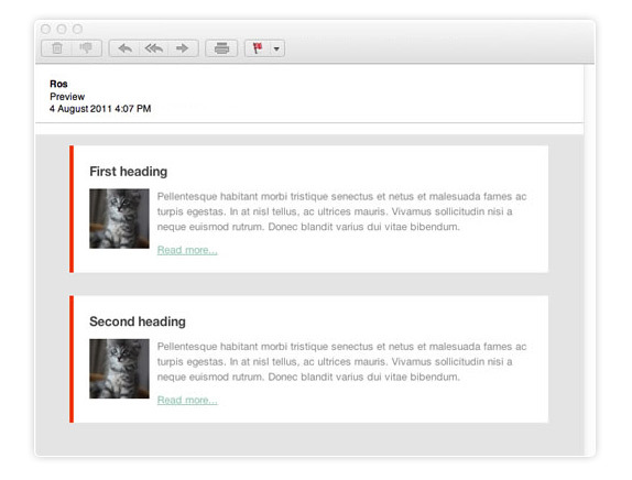
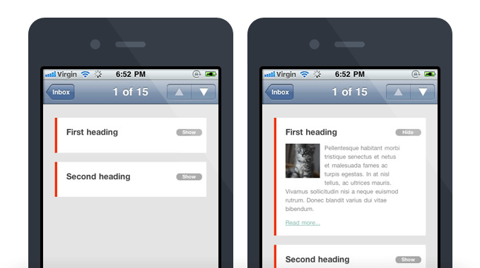
But for mobile devices, it’s much better to display only the title and button, with which you can expand (and collapse) the description. This turns the letter into an interactive table with content and allows you to make it much more concise:
In order to achieve this effect, you first need to create an “fish” article with its title and description using HTML. You should also add a couple of classes to display the expand / hide buttons only on mobile devices. The following is a simplified version of such code:
<td><h4><ahref="http://yourdomain.com"class="link">First heading</a></h4><ahref="#"class="mobilehide">Hide</a><ahref="#"class="mobileshow">Show</a><divclass="article"><pclass="bodytext"><imgsrc="kitten.jpg"style="float: left;" >Pellentesque habitant morbi...
      </p><ahref="http://yourdomain.com">Read more...</a></div></td>
The main actions will be carried out using classes
mobilehide, mobileshowand article. Using the display:none;button to expand / hide the content will be hidden on the desktop:a[class="mobileshow"], a[class="mobilehide"] {
display: none !important;
}
To make sure that this button is displayed only on mobile devices, you will have to resort to a media query. Below is the code for this (including previously used snippets
mobileshowand mobilehide, as well as some styles for webkit):@media only screen and (max-device-width: 480px) {
a[class="mobileshow"], a[class="mobilehide"] {
display: block !important;
color: #fff!important;
background-color: #aaa;
border-radius: 20px;
padding: 08px;
text-decoration: none;
font-weight: bold;
font-family: "Helvetica Neue", Helvetica, sans-serif;
font-size: 11px;
position: absolute;
top: 25px;
right: 10px;
text-align: center;
width: 40px;
}
div[class="article"] {
display: none;
}
a.mobileshow:hover {
visibility: hidden;
}
.mobileshow:hover + .article, .article:hover {
display: inline !important;
}
}
As a result, buttons for minimizing and maximizing content will be displayed on the iPhone. GitHub presents the entire code of the test case - it can be used for adaptation and use in your own email campaigns.
For today, everything in the next article will focus on the use of media query to target mobile devices and optimize images for display on smartphones and tablets.
Thank you for your attention, do not forget to subscribe to our blog !