 April 10, 2015 at 12:08
Ice cream candy, or how to bring a little Material to your application
The fifth version of Android was released almost half a year ago . Despite this, most applications in the market still persist in the Holo style. Either the new Material-style is not yet tough for the average developer, or Android L has not yet managed to firmly enter the ordinary.
Be that as it may, the new design paradigm is actively promoted by the “good corporation”, and it looks pretty good, despite some inconsistency. And more and more good wizards are appearing, helping us, simple developers, to remain “in the stream” of the changing world of mobile UI.
If you, like I recently, decided to wrap your application, which had not been updated for a long time, in a new skin, this review of tools and libraries can save you N hours of time.
For more than 3.5 years, I have been involved in the collective mind of Habr. A little more time has passed since I first downloaded and installed the Android Development Kit. I think the time has come to contribute.
Realizing that such reviews quickly lose relevance, I could not write it. There are several main reasons for this:
The list of design elements to be rebranded is quite long.
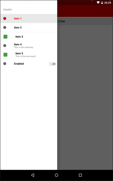
Since many elements (such as, for example, CheckBox and EditText) change styles automatically when using the AppCompat theme, here we will consider the following widgets not included in the compatibility library:
I don’t know how anyone, but I really like this element. In addition, he has already managed to become standard for Android, as well as a hamburger icon. True, here Google could not do without jambs:
I’ll make a reservation right away - in my applications I still leave the second option (returned from the third) - it seems to me much more logical.
Drawer itself is easy to integrate into the application, especially if the project is created from scratch. Just select the appropriate type of application in the wizard - and get a template with the activity, fragment and class of the Drawer itself. I think this moment can be omitted - the operation is standard. If you are trying to reorganize an old application, keep in mind that you will need the android-support-v4 compatibility library.
The appcompat-v7 library will help you bring ActionBarDrawerToggle to a new look (it, like the previous one, can be found in the extras directory of your SDK).
You can include these libraries in your module assembly in one line in the dependencies block of the build.gradle file:
22.0.0 - the number of the current version of the library (you can peek in the SDK manager, or you can put "+", and the development environment will use the latest available version, persistently inviting you to put down the current version number in order to avoid, so to speak .. .).
To stylize the new guidelines (with a menu full screen) you will have to sweat a little. Firstly, the standard ActionBar will need to be replaced with a ToolBar, and secondly, add additional elements to the application styles. A working solution is found on Stackoverflow .
If you do not want to set all indents and HEX codes of text color in the menu for a long time , you can find instructions on using the library in Habrdoing it for you. Comments on the article, as often happens, are very valuable, I recommend reading. In any case, you decide.

Another new UI element. It helps to highlight one (or several) the main action on the screen, and draw the user's attention to it.
Unfortunately, this element is not included in the support library (like many others), so in this case we will have to use third-party solutions.
I selected several of them, and for each I will write a couple of thoughts that arose when using them.
As you can see, there is plenty to choose from.
Every developer has ever used this widget. I personally really did not like the style of dialogs in 4 versions of Android, as well as the code itself, which had to be written for AlertDialogs.
Of course, with the help of Retrolambda and the call chain, this can be combed a bit and cut back. But the code still remains, with your permission, a little sloppy.
There are a lot of libraries implementing this widget in Material-style, and they are quite similar:

The progress bars in the new version of Android have become very beautiful.
It just so happened that in my application this element is used often - a lot of work with photos, a lot of heavy network requests. Therefore, I approached the choice of ProgressBar for a long time and hard. But I was looking for an ordinary Circular widget, no frills - after all, this is a stylization, and not a completely new paradigm. And it turned out that the usual circular indicators of progress are somehow not enough ...
For myself, I chose two libraries. The first one was eliminated due to not quite correct initialization from the code. I use the second now.

I have not very pleasant memories associated with this widget. The fact is that according to the old screen layout in my application, when using landscape orientation, I needed vertical SeekBars.
Do not ask.
So, if for Holo themes I found such widgets, then for Material and the usual ones a bit. But in the end, it prompted me to a little re-layout of the screen, so I'm even grateful to SeekBar for that.
Right now I am using DiscreteSeekBar for this item . Despite the fact that the library is still very young, and not even present in jcenter, it suits me completely: powerful customization, convenient implementation of the listener, use of Animatable Drawable, which allows you to work quite quickly and without brakes.
In addition, it is almost the only library for this widget. There is also a MaterialRangeBar , but it does not implement a simple SeekBar, so it does not suit me.
(I’ll tell you about another implementation below, as well as the reasons why it didn’t suit me.)
If you are interested in what I got as a result, clickable comparative screenshots of the old and new versions are under the spoiler.
Looking for libraries for SeekBar, I came across this repository . And I really thought that I didn’t need all of the above decorations - this library alone would be enough. Seriously, there is everything that I need (and the vast majority of developers, most likely).
But everything is not so rosy. The project is very young, and still in development (for example, onSeekChangeListener has not yet been implemented for SeekBar). Therefore, I would not recommend using it now. But what I would recommend is the feasible help to this library - bug reports, feature requests and code. I'm going to myself. This can greatly simplify the life of both novice programmers and those who are already so mature that they can break their bikes.
In general, connect!
Thanks to everyone who read to the end. Especially for such patient and corrosive here are some very useful links:
Less bicycles for programming!
Be that as it may, the new design paradigm is actively promoted by the “good corporation”, and it looks pretty good, despite some inconsistency. And more and more good wizards are appearing, helping us, simple developers, to remain “in the stream” of the changing world of mobile UI.
If you, like I recently, decided to wrap your application, which had not been updated for a long time, in a new skin, this review of tools and libraries can save you N hours of time.
For more than 3.5 years, I have been involved in the collective mind of Habr. A little more time has passed since I first downloaded and installed the Android Development Kit. I think the time has come to contribute.
Realizing that such reviews quickly lose relevance, I could not write it. There are several main reasons for this:
- working on a new design for my application, in two months I shoveled tons of Google pages, bit by bit collecting links to Github, which in the end turned out to be absolutely useless;
- summer is coming, it's time for vacations, and I can imagine exactly what the developers are doing on vacation (on sick leave, etc). So now, I think, is the time;
- currently on the Internet you can already find stylization, if not for everyone, then for most design elements.
Disclaimer
Of course, this review does not purport to be complete, absolute, or a call to action. Perhaps while I was writing this, Google released a common compatibility library for all interface elements.
It’s also possible that it’s more convenient for someone to write another bike, but yours, with “Munchkin” and the elves ...
In the same way, I can’t recommend using the tools presented: almost all of them are distributed with the mark AS IS, and you include them in your project You can only at your own peril and risk.
Well, the last. I nevertheless (not without a butchert) switched to Android Studio about six months ago. And fell in love with this development environment. Therefore, all the ways to include libraries in the project will relate to gradle. With Eclipse, everything is simpler and more complicated at the same time, and I will assume that the developer knows how to connect the library project in this IDE.
The list of design elements to be rebranded is quite long.
Since many elements (such as, for example, CheckBox and EditText) change styles automatically when using the AppCompat theme, here we will consider the following widgets not included in the compatibility library:
- NavigationDrawer
- FloatingActionButton
- Alertlerialog
- Progressbar
- Seekbar
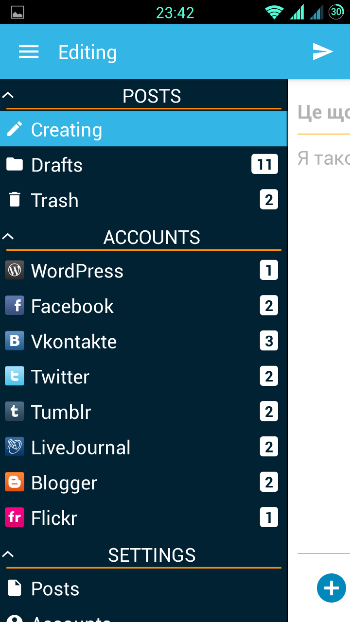
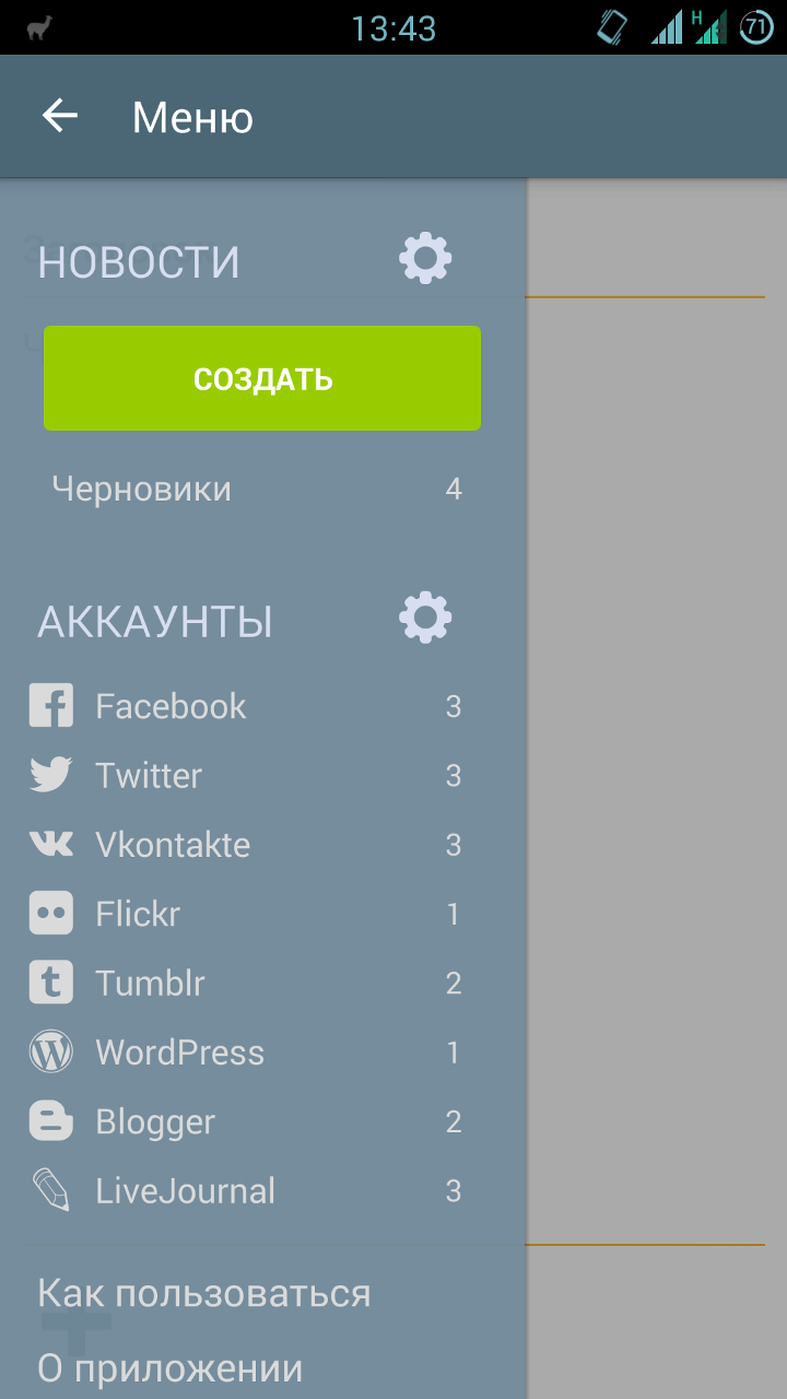
NavigationDrawer
I don’t know how anyone, but I really like this element. In addition, he has already managed to become standard for Android, as well as a hamburger icon. True, here Google could not do without jambs:
- Drawer appeared along with ActionBarDrawerToggle in the form of three stripes moving sideways;
- ActionBarDrawerToggle has changed (many people liked the “hamburger” turning into an arrow);
- the rules for Drawer have changed along with the concept of the Toolbar: now NavigationDrawer overlaps the title of the application. This led to two strange, in my opinion, consequences - the ActionBarDrawerToggle animation is now not visible (and it is not clear at all why it is), and we can close the menu only with a swipe or the back button.
I’ll make a reservation right away - in my applications I still leave the second option (returned from the third) - it seems to me much more logical.
Drawer itself is easy to integrate into the application, especially if the project is created from scratch. Just select the appropriate type of application in the wizard - and get a template with the activity, fragment and class of the Drawer itself. I think this moment can be omitted - the operation is standard. If you are trying to reorganize an old application, keep in mind that you will need the android-support-v4 compatibility library.
The appcompat-v7 library will help you bring ActionBarDrawerToggle to a new look (it, like the previous one, can be found in the extras directory of your SDK).
You can include these libraries in your module assembly in one line in the dependencies block of the build.gradle file:
dependencies {
    compile 'com.android.support:appcompat-v7:22.0.0'
}
22.0.0 - the number of the current version of the library (you can peek in the SDK manager, or you can put "+", and the development environment will use the latest available version, persistently inviting you to put down the current version number in order to avoid, so to speak .. .).
To stylize the new guidelines (with a menu full screen) you will have to sweat a little. Firstly, the standard ActionBar will need to be replaced with a ToolBar, and secondly, add additional elements to the application styles. A working solution is found on Stackoverflow .
If you do not want to set all indents and HEX codes of text color in the menu for a long time , you can find instructions on using the library in Habrdoing it for you. Comments on the article, as often happens, are very valuable, I recommend reading. In any case, you decide.
Another customization of NavigationDrawer
An interesting library met me when the customer wanted to blur the layer under the menu during opening, instead of darkening.
Of the difficulties noted - if you have a scrolling list in the content, the library is often unable to track its status, and when you open the menu it shows a blur of the “old” content, while the list is actually different. But attention is definitely worth it.
Of the difficulties noted - if you have a scrolling list in the content, the library is often unable to track its status, and when you open the menu it shows a blur of the “old” content, while the list is actually different. But attention is definitely worth it.
FloatingActionButton
Another new UI element. It helps to highlight one (or several) the main action on the screen, and draw the user's attention to it.
Unfortunately, this element is not included in the support library (like many others), so in this case we will have to use third-party solutions.
I selected several of them, and for each I will write a couple of thoughts that arose when using them.
- The decision from dear John Hogan described on Habré . I will single out two uncomfortable moments:
- you need to include code in your project, which will degrade readability;
- the developer left us the disappearance / appearance processing;
- This library. The "nested" buttons are implemented quite well, but it has a "fatal flaw": the work with the button itself is very limited, in practice - only clicks. Of course, there is no “listener” that allows you to automatically remove / show the button when, for example, scrolling ListView.
- Here is the solution. Very good, as for me, implementation. There are two sizes (let me remind you that the mini-button is used as an auxiliary action when viewing content), it is quite “docked” to scrollable elements for auto-hide, it has flexible settings through the markup file. The only problem I stumbled upon was the inability to make this button friends with another custom OnTouchListener. This was critical for me as I use swipe-to-dismiss in my ListView.
- Chosen by me for my project. Simple, customizable, does not conflict with OnTouch, integrates in two clicks.
- This library was found already in the process of preparing the article, therefore it was not tested by me. If someone can give information on it, please write in the comments, and I will add it to the article.
As you can see, there is plenty to choose from.
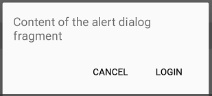
Alertlerialog
Every developer has ever used this widget. I personally really did not like the style of dialogs in 4 versions of Android, as well as the code itself, which had to be written for AlertDialogs.
AlertDialog.Builder alertDialogBuilder = new AlertDialog.Builder(this);
    alertDialogBuilder.setTitle("Alert title");
    alertDialogBuilder.setMessage("Alert message");
    alertDialogBuilder.setPositiveButton("Ok",
        new DialogInterface.OnClickListener() {
        @Override
        public void onClick(DialogInterface arg0, int arg1) {
        }
    });
    alertDialogBuilder.setNegativeButton("Cancel",
        new DialogInterface.OnClickListener() {
        @Override
        public void onClick(DialogInterface arg0, int arg1) {
        }
    });
    AlertDialog alertDialog = alertDialogBuilder.create();
    alertDialog.show();
Of course, with the help of Retrolambda and the call chain, this can be combed a bit and cut back. But the code still remains, with your permission, a little sloppy.
There are a lot of libraries implementing this widget in Material-style, and they are quite similar:
- github.com/drakeet/MaterialDialog
- github.com/lewisjdeane/L-Dialogs
- github.com/fengdai/AlertDialogPro
- github.com/avast/android-styled-dialogs
- even this
- The library of my choice. It seemed to me the most elegant, while quite easily customizable.Nothing extra
new MaterialDialog.Builder(this).
   .title("Title")
   .message("Message")
   .positiveText(R.string.ok)
   .negativeText(R.string.cancel)
   .callback(someCallback)
   .show();
Progressbar
The progress bars in the new version of Android have become very beautiful.
It just so happened that in my application this element is used often - a lot of work with photos, a lot of heavy network requests. Therefore, I approached the choice of ProgressBar for a long time and hard. But I was looking for an ordinary Circular widget, no frills - after all, this is a stylization, and not a completely new paradigm. And it turned out that the usual circular indicators of progress are somehow not enough ...
For myself, I chose two libraries. The first one was eliminated due to not quite correct initialization from the code. I use the second now.
Seekbar
I have not very pleasant memories associated with this widget. The fact is that according to the old screen layout in my application, when using landscape orientation, I needed vertical SeekBars.
So, if for Holo themes I found such widgets, then for Material and the usual ones a bit. But in the end, it prompted me to a little re-layout of the screen, so I'm even grateful to SeekBar for that.
Right now I am using DiscreteSeekBar for this item . Despite the fact that the library is still very young, and not even present in jcenter, it suits me completely: powerful customization, convenient implementation of the listener, use of Animatable Drawable, which allows you to work quite quickly and without brakes.
In addition, it is almost the only library for this widget. There is also a MaterialRangeBar , but it does not implement a simple SeekBar, so it does not suit me.
(I’ll tell you about another implementation below, as well as the reasons why it didn’t suit me.)
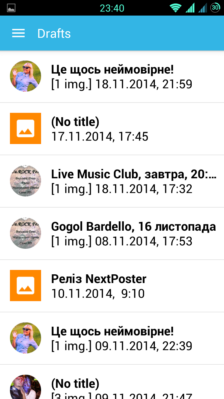
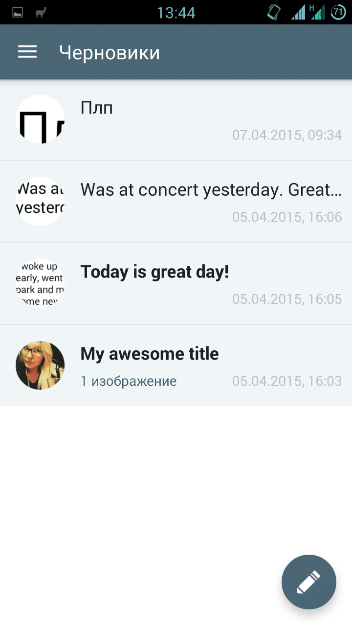
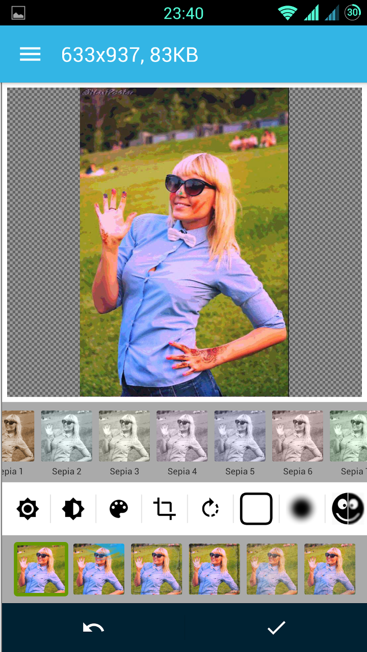
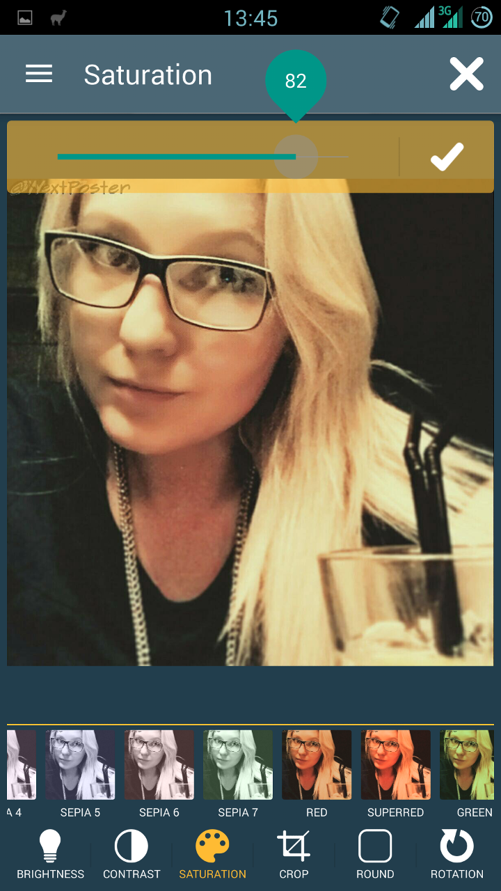
If you are interested in what I got as a result, clickable comparative screenshots of the old and new versions are under the spoiler.
Here they are, screenshots
 |  | |
 |  | |
 |  | |
 |  |  |
For sweet
Looking for libraries for SeekBar, I came across this repository . And I really thought that I didn’t need all of the above decorations - this library alone would be enough. Seriously, there is everything that I need (and the vast majority of developers, most likely).
But everything is not so rosy. The project is very young, and still in development (for example, onSeekChangeListener has not yet been implemented for SeekBar). Therefore, I would not recommend using it now. But what I would recommend is the feasible help to this library - bug reports, feature requests and code. I'm going to myself. This can greatly simplify the life of both novice programmers and those who are already so mature that they can break their bikes.
In general, connect!
Thanks to everyone who read to the end. Especially for such patient and corrosive here are some very useful links:
- Awesome Android is a huge collection of libraries. There is [almost] everything.
- Polymer project - a project of full customization of the interface. It looks very cool.
- Libraries for developers - an application on Google Play, created for developers, a kind of reference for libraries. Allows you to "touch" them live.
- (Updated) Another collection of all kinds of decorations and libraries - thanks afeozzz
- (Updated) Web application and PhoneGap framework - thanks antirek
Less bicycles for programming!