What 22 billion news letters can say about design for mobile platforms
- Transfer
How to understand which mobile platform to focus on when creating a newsletter for the company and its customers? CampaignMonitor specialists analyzed 22 billion letters in order to formulate recommendations on the design of email newsletters .
Specialists analyzed 6 million marketing campaigns, during which 22 billion letters were sent. Researchers were interested in statistics on opening emails on mobile platforms, desktop computers and web clients, a change in these numbers over several years, and CTR “click-on” patterns depending on a particular device. Data based on 1.8 billion letter openings made by 22 million recipients; in 9% of cases, it was not possible to determine the platform. As expected, the numbers showed the dominance of mobile devices in 2013 and 2014. Among other things, the growing popularity of mobile email clients helps designers to design email templates for all platforms.
After analyzing the statistics, the researchers divided the information received into three main areas and formed tips for creating the most effective mailings.
In recent years, mobile devices have gained considerable popularity, and designers had to adapt to the changes that affected the sending of letters. For example, desktop email clients dominated until early 2012, but now mobile devices have become the main tool for working with mail.
This means that the ability to work with single-column fixed-width templates is now not enough - the content should not just look good, it should be convenient to read and navigate through it on the small screen of a mobile device. Responsive email design has become not a luxury, but an urgent need.
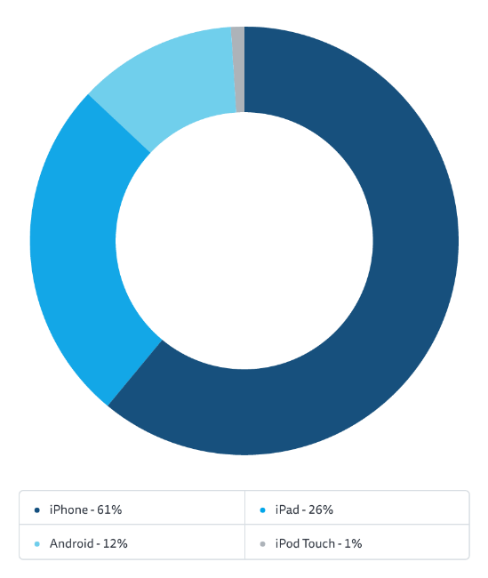
An important point: almost 90% of discoveries on mobile devices come from iOS devices. This is partly due to the fact that Apple displays images in letters by default (which is not the case with many email clients on Android), but the statistics are still very revealing:
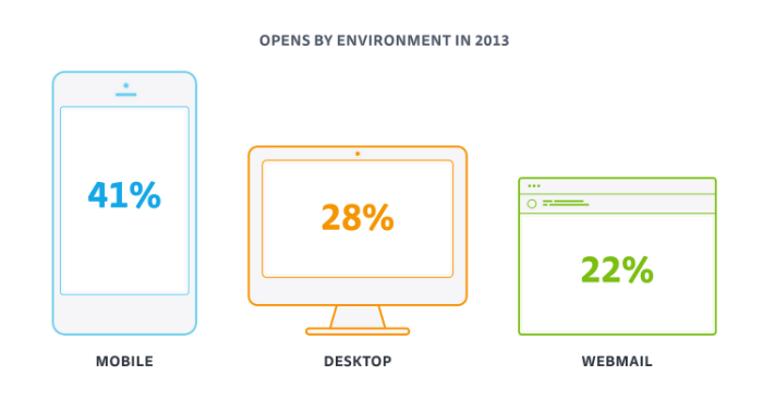
Data on 780,479,174 opening emails during 2,164,665 campaigns in 2013
iOS Domination has one good side effect - this fact allows designers (especially those whose letters are read by a large number of users of Apple devices) to create a mailing list in the style of a regular web. For example, startup Panic integrates SVG animation, web fonts into its letters and uses adaptive design:

The lesson here is that using CSS can lead to problems, as different clients will display such emails in different ways. What looks great in Mail can be horrible (and completely "non-usable") in Outlook.
Statistics show that letter templates “sharpened” for display on mobile devices work better. Crocs' DEG Digital redesign showed a 16% increase in engagement and an 8% increase in clicks, while SitePoint tests showed that the responsive version of the newsletter received 16% more clicks compared to the previous template.
Mobile devices have taken the lead in the email market, and now you need to worry about what is happening in desktop and web-based clients for reading mail? Definitely worth it. 87% of clicks occur when the user sees the letter for the first time, but users who open the letter for the second time from the desktop having already seen it in the mobile client are 65% more likely to make the click. This is a very important phenomenon.

Mobile device users who open a letter for the second time with a desktop are 65% more likely to click on it
Which customers do users click through? 56% of all desktop-open emails account for Outlook 2007+ and 16% of all openings in different environments. Unfortunately, such a large number of discoveries in different versions of Outlook does not facilitate the process of creating templates for letters.
Each version of Outlook has its own rendering subtleties that you have to tinker with (for example, working with background images). It is more difficult to work with new versions of Outlook for Windows than with old ones: versions 2000 and 2003 used Internet Explorer for rendering HTML, while new clients of versions 2007, 2010 and 2013 use MS Word.
The good news is that Apple's Mail application (which thanks to WebKit is awesomely CSS-enabled) holds 33% of all email clients and is much easier to work with.
The English-language web client market is constantly shrinking, but in 2014 the web accounted for 22% of all registered open emails. Of this group, a significant number (almost half) came from Outlook.com (formerly Hotmail). Gmail and Yahoo occupy about 25% each and share second place.
Not only Outlook has CSS problems, but also Gmail. Firstly, the Google email service cuts out CSS styles from the head tag of letters, which forces designers to use tools like CSS inliner ( version of Pechkin-mai l).
When composing emails from scratch, you should first study what subtleties of rendering various email clients have. (We also published material with tips on typesetting letters for Russian-language mail systems).
Very few companies create mailings that do not lead anywhere. This means that landing pages should be an important part of the entire marketing campaign. Sometimes people really have nothing against reading the letter on several platforms, but this does not work with landing pages (“landing pages”).
Email that looks bad on a mobile device can lead to a significant increase in bounce rates . If the company started a newsletter to increase sales, and 41% of subscribers cannot interact normally with the letter, this will only lead to a loss of money.
Optimizing the site’s pages for display on mobile devices will significantly improve the results of mailing lists (and indeed have a positive effect on business). For example, Studios 5th Finger developed a website redesign of one of its customers using the ResponsiveJS framework - the conversion to purchases increased by 54% on smartphones and 24% on tablets. And all this in less than 14 weeks.

There are a significant number of services for creating landing pages (for example, Unbounce ) and frameworks (for example, Zurb Foundation ), which can solve problems with displaying content on mobile devices.
Technologies are constantly evolving, and this leads to a change in user habits (including those associated with reading email). Understanding how people currently choose to consume content is critical to creating a successful newsletter.
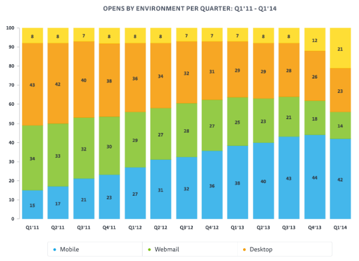
Use of mobile clients from 2011 to 2014. Yellow indicates “undetected” devices, the number of which increased significantly in the fourth quarter of 2014 due to Google’s decision to cache images in emails - this affected the efficiency of determining the clients used.
In total, several trends can be identified:
Most of the openings of letters occur on mobile devices, and in the near future the situation will not change. This means that designers should get away from working with fixed-width templates and made in a tabular version. You can create more effective mailings using CSS, responsive layout, web fonts.
Unfortunately, email clients for desktop and web, which have to deal with a lot, will also not leave the scene in the near future. Until now, a significant part of letters has been opened in Outlook and mail systems like Gmail (Mail.ru and Yandex in Russia). This means that to create letters that will be displayed well in each of these systems, you will have to use special tools (for example, Canvas).
Email campaigns do not start on their own - as a rule, there is a task with their help to bring users to the site. This means that a landing page should be developed on this site that is optimized for display on mobile devices - 41% of users view emails on mobile devices, you should not forget about this to get good results.
That's all for today, thanks for watching. Here you can read material on how Internet companies to create an effective newsletter with tips based on data on the Runet.
Figures
Specialists analyzed 6 million marketing campaigns, during which 22 billion letters were sent. Researchers were interested in statistics on opening emails on mobile platforms, desktop computers and web clients, a change in these numbers over several years, and CTR “click-on” patterns depending on a particular device. Data based on 1.8 billion letter openings made by 22 million recipients; in 9% of cases, it was not possible to determine the platform. As expected, the numbers showed the dominance of mobile devices in 2013 and 2014. Among other things, the growing popularity of mobile email clients helps designers to design email templates for all platforms.
What is this talking about
After analyzing the statistics, the researchers divided the information received into three main areas and formed tips for creating the most effective mailings.
Mobile first approach is very effective
In recent years, mobile devices have gained considerable popularity, and designers had to adapt to the changes that affected the sending of letters. For example, desktop email clients dominated until early 2012, but now mobile devices have become the main tool for working with mail.
This means that the ability to work with single-column fixed-width templates is now not enough - the content should not just look good, it should be convenient to read and navigate through it on the small screen of a mobile device. Responsive email design has become not a luxury, but an urgent need.
An important point: almost 90% of discoveries on mobile devices come from iOS devices. This is partly due to the fact that Apple displays images in letters by default (which is not the case with many email clients on Android), but the statistics are still very revealing:
Data on 780,479,174 opening emails during 2,164,665 campaigns in 2013
iOS Domination has one good side effect - this fact allows designers (especially those whose letters are read by a large number of users of Apple devices) to create a mailing list in the style of a regular web. For example, startup Panic integrates SVG animation, web fonts into its letters and uses adaptive design:
The lesson here is that using CSS can lead to problems, as different clients will display such emails in different ways. What looks great in Mail can be horrible (and completely "non-usable") in Outlook.
Statistics show that letter templates “sharpened” for display on mobile devices work better. Crocs' DEG Digital redesign showed a 16% increase in engagement and an 8% increase in clicks, while SitePoint tests showed that the responsive version of the newsletter received 16% more clicks compared to the previous template.
Despite everything, desktop and web clients will not die
Mobile devices have taken the lead in the email market, and now you need to worry about what is happening in desktop and web-based clients for reading mail? Definitely worth it. 87% of clicks occur when the user sees the letter for the first time, but users who open the letter for the second time from the desktop having already seen it in the mobile client are 65% more likely to make the click. This is a very important phenomenon.
Mobile device users who open a letter for the second time with a desktop are 65% more likely to click on it
Which customers do users click through? 56% of all desktop-open emails account for Outlook 2007+ and 16% of all openings in different environments. Unfortunately, such a large number of discoveries in different versions of Outlook does not facilitate the process of creating templates for letters.
Each version of Outlook has its own rendering subtleties that you have to tinker with (for example, working with background images). It is more difficult to work with new versions of Outlook for Windows than with old ones: versions 2000 and 2003 used Internet Explorer for rendering HTML, while new clients of versions 2007, 2010 and 2013 use MS Word.
The good news is that Apple's Mail application (which thanks to WebKit is awesomely CSS-enabled) holds 33% of all email clients and is much easier to work with.
The English-language web client market is constantly shrinking, but in 2014 the web accounted for 22% of all registered open emails. Of this group, a significant number (almost half) came from Outlook.com (formerly Hotmail). Gmail and Yahoo occupy about 25% each and share second place.
Not only Outlook has CSS problems, but also Gmail. Firstly, the Google email service cuts out CSS styles from the head tag of letters, which forces designers to use tools like CSS inliner ( version of Pechkin-mai l).
When composing emails from scratch, you should first study what subtleties of rendering various email clients have. (We also published material with tips on typesetting letters for Russian-language mail systems).
It doesn’t end with a click.
Very few companies create mailings that do not lead anywhere. This means that landing pages should be an important part of the entire marketing campaign. Sometimes people really have nothing against reading the letter on several platforms, but this does not work with landing pages (“landing pages”).
Email that looks bad on a mobile device can lead to a significant increase in bounce rates . If the company started a newsletter to increase sales, and 41% of subscribers cannot interact normally with the letter, this will only lead to a loss of money.
Optimizing the site’s pages for display on mobile devices will significantly improve the results of mailing lists (and indeed have a positive effect on business). For example, Studios 5th Finger developed a website redesign of one of its customers using the ResponsiveJS framework - the conversion to purchases increased by 54% on smartphones and 24% on tablets. And all this in less than 14 weeks.
There are a significant number of services for creating landing pages (for example, Unbounce ) and frameworks (for example, Zurb Foundation ), which can solve problems with displaying content on mobile devices.
What will happen next
Technologies are constantly evolving, and this leads to a change in user habits (including those associated with reading email). Understanding how people currently choose to consume content is critical to creating a successful newsletter.
Use of mobile clients from 2011 to 2014. Yellow indicates “undetected” devices, the number of which increased significantly in the fourth quarter of 2014 due to Google’s decision to cache images in emails - this affected the efficiency of determining the clients used.
In total, several trends can be identified:
It’s worth designing using the mobile-first approach
Most of the openings of letters occur on mobile devices, and in the near future the situation will not change. This means that designers should get away from working with fixed-width templates and made in a tabular version. You can create more effective mailings using CSS, responsive layout, web fonts.
Throwing away desktop and web clients is still impossible
Unfortunately, email clients for desktop and web, which have to deal with a lot, will also not leave the scene in the near future. Until now, a significant part of letters has been opened in Outlook and mail systems like Gmail (Mail.ru and Yandex in Russia). This means that to create letters that will be displayed well in each of these systems, you will have to use special tools (for example, Canvas).
You need to think about what happens after the click.
Email campaigns do not start on their own - as a rule, there is a task with their help to bring users to the site. This means that a landing page should be developed on this site that is optimized for display on mobile devices - 41% of users view emails on mobile devices, you should not forget about this to get good results.
That's all for today, thanks for watching. Here you can read material on how Internet companies to create an effective newsletter with tips based on data on the Runet.