https://sudonull.com/sankey-diagrams-flow-analysis-in-an-hour
Create an interactive Sankey on D3.js for financial data. From PDF to visualization: structure, tooltips, mobile version. Instructions for middle/senior dev.
https://sudonull.com/sankey-diagrams-flow-analysis-in-an-hour
Create an interactive Sankey on D3.js for financial data. From PDF to visualization: structure, tooltips, mobile version. Instructions for middle/senior dev.
https://sudonull.com/bubble-charts-overlap-color-dynamics
Learn how to eliminate bubble overlap, implement color coding and timeline in bubble chart. Practical techniques for business visualizations. Create effective dashboards.
https://sudonull.com/building-graphs-from-csv-in-python-matplotlib
Learn to build 2D graphs from CSV files with matplotlib: code, examples with illuminance threshold, installation. For middle/senior dev. Start visualizing data in 5 min.
https://sudonull.com/matrix-downsampling-filter-50m-points
Pixel-perfect rendering of scatter plots: matrix filter vs LTTB/M4. 100% coverage on 50 million points. Code, benchmarks, metrics for developers.
https://sudonull.com/date-filters-in-apache-superset-workarounds
How to solve the default time column issue in Superset 3.x–6.x. Working technical solutions for developers: virtual datasets, extra_json, SQL parameterization.
https://ymaho.com/targeted-therapy-for-usher-syndrome-1b-new-data-on-aavb-081
Interim data from phase 1/2 gene therapy AAVB-081 for Usher syndrome 1B: safety, efficacy, and prognosis. Learn about the dual AAV vector and treatment prospects.
https://ymaho.com/who-healthcare-crisis-data-and-inequality-2026
WHO 2026 Report Hides Funding Collapse. Rise in Malaria, Impoverishment of Patients, and Data Failure. Find out why progress has stalled and what comes next.
https://ymaho.com/maine-ai-data-center-ban-what-it-means-for-you
Maine may pause new AI data centers over energy and noise concerns. Learn why this first-in-nation move affects everyone.
https://lrivo.com/arsenal-s-april-struggles-what-the-data-shows
Explore the historical data on Arsenal's April performances and why it's a cause for concern. Learn about the upcoming challenges and how they compare to Manchester City.
https://ymaho.com/helium-tokenomics-explained-hnt-data-credits-halving
Learn how Helium’s HNT token, Data Credits, and halving schedule power a crowd-sourced wireless network. Simple breakdown of the mechanics.
https://ymaho.com/opinion-opn-tokenized-macro-data-explained-simply
Learn how Opinion turns economic reports into tradable assets—no finance degree needed. Understand the future of data markets.
https://ymaho.com/opn-token-explained-how-data-gets-rewarded-in-prediction-markets
Learn how OPN tokens turn real-world facts into fair market incentives—no jargon, just plain sense.
https://ymaho.com/spacex-orbital-data-centers-in-space-ahead-of-ipo-analysis
Analysis of SpaceX's IPO prospectus: orbital data centers, $45 billion contract with Anthropic, shareholder Musk's dictatorship, and Starlink realities. Read the details.
https://ymaho.com/paricalcitol-in-metastatic-cancer-2026-data
2026 clinical data confirmed the safety of the vitamin D analog paricalcitol in metastatic pancreatic cancer. Learn about the mechanism, results, and limitations.
https://ymaho.com/us-labor-market-data-fed-rate-assessment-and-impact-on-investors
Analysis of the impact of the US employment report on the Fed rate, stock markets, dollar, and cryptocurrencies. Forecasts, risks, and opportunities for traders. Read the details.
WoW Forever Talent Calculator (including new talents)
https://www.zockify.com/forever/talents/
Zockify’s WoW Forever talent calculator includes all talent trees and currently known talents for all 9 playable classes. We will keep …
WoW Forever Talent Calculator | Talents Forever
https://talentsforever.com/
Free WoW Forever talent calculator for all nine classes, read from the BlizzCon 2026 demo. Plan a build, share it by link, check …
WoW Forever Talent Calculator | All 9 Classes
https://wowforevertalents.com/
Plan and share World of Warcraft: Forever talent builds for all nine classes. 51-point trees marked as confirmed Forever footage or …
WoW Forever Talent Calculator | OXM.GG
https://oxm.gg/forever/talents
Plan a level 60 talent build for World of Warcraft: Forever, the Classic+ relaunch. All nine classes, 51 points, and a link for every build …
WoW Forever Talent Calculator | Forever Builds
https://foreverbuilds.gg/
Plan WoW Forever builds with talent calculators for all nine classes. Looking for Classic Plus? Explore demo trees, save your points, …
WoW Forever Talent Calculator | Mobile Build Planner
https://urgametips.com/wow-forever-talent-calculator/
23 hours ago · Plan a WoW Forever talent build for any of the nine classes below. Choose your level, open a tree and select a talent …
WoW Forever talent calculator — Classic WoW Forever
https://classicwowforever.com/talents/
1 day ago · Plan WoW Forever talent builds for all nine classes. Explore talent trees, spend up to 51 points, share builds and check …
WoW Forever: What We Know - wowtbc.gg
https://wowtbc.gg/warcraftforever/news/what-we-know/
1 day ago · This page will be constantly updated with new information about World of Warcraft Warcraft Forever. New Skills and …
WoW Forever Talent Calculator - Talent Trees for All Classes
https://wowclassicforever.info/
Free WoW Forever talent calculator for all 9 classes. Plan and share builds, replay your leveling order and see which talents are new …
Warcraft Forever Talent Calculator · wowtbc.gg
https://wowtbc.gg/warcraftforever/talent-calculator/
WOWTBC.GG is not affiliated with or endorsed by Activision Blizzard, Inc. WOWTBC.GG is a comprehensive collection of BiS Lists, …

Figure AI introduced the humanoid robot Figure 02 with physical AI and OpenAI language model. The robot passed tests at BMW factories. Learn how humanoid robots are changing manufacturing.

Learn how to set up CI/CD pipeline with GitHub Actions. Step-by-step guide with YAML examples for automated testing, Docker builds, and deployment.

Learn how to use React hooks effectively with practical examples. Master useState, useEffect, useContext, and custom hooks in this complete guide for modern React.

Master prompt engineering best practices with 15 proven techniques. Learn to craft effective prompts, reduce errors, and get better AI results. Start optimizing now.

Discover how to learn Python for beginners with this step-by-step roadmap. Master fundamentals, data structures, and build real projects. Start your coding journey today.

Compare REST API vs GraphQL side-by-side. Learn which architecture fits your project with data on performance, caching, cost, and scalability. Make the right choice.

Learn what is Kubernetes and how it works. Understand its architecture, self-healing, scaling benefits, and real-world impact. Start mastering container orchestration today.

Learn what is the difference between vpn and proxy, from encryption to scope. Discover which tool fits your privacy needs with our expert comparison.
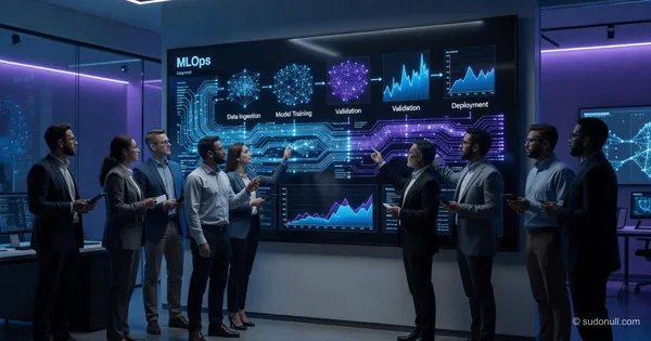
Learn what is MLOps and why it is important for AI success. Discover key concepts, benefits, and how it bridges data science and operations for scalable ML.

Compare fine tuning vs retrieval augmented generation for LLMs. Learn which approach suits your AI project based on accuracy, cost, and data freshness.