Sankey Diagrams for Financial Flow Analysis: From Data to Interactivity
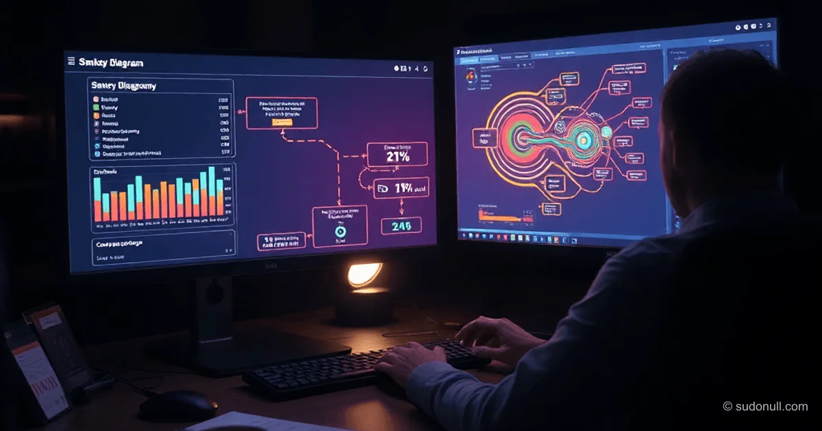
Sankey diagrams visualize resource flows, showing the movement of funds from sources through nodes to recipients. Unlike pie charts, which focus on shares, Sankey diagrams display the full chain: where funds come from, which intermediate nodes they pass through, and where they are distributed.
This allows you to identify hidden patterns. For example, small expenses individually seem insignificant, but collectively they make up 21% of the budget. The diagram has four layers: income, total budget, expense categories, subcategories.
Key insights:
- Flow direction is visible: salary → common pool → food/transport.
- Nodes (e.g., banks) show fund concentration.
- Nesting preserves connections: transfer to T-Bank → further detailing.
Comparison with Pie Charts
Pie charts lose readability with 5–7 categories: segments are hard to compare, there is no direction of movement or nesting. Sankey solves this by displaying the process as a sequence of flows with proportional line widths.
| Aspect | Pie Chart | Sankey |
|--------|-----------|--------|
| Readability | Drops with >5 categories | Scalable with zoom |
| Direction | None | Explicit: left to right |
| Nesting | No | Supported |
| Flows | Only shares | Full trajectory |
Sankey is suitable for tasks with a clear sequence of stages.
Steps to Create an Interactive Sankey
Stack: React + D3.js with custom Sankey layout. The process was accelerated by AI (Claude) to generate code based on descriptions.
- Data Preparation: From PDF statement to CSV via AI. Cleaning, grouping, normalizing categories. Amounts <1000 rubles grouped into "Miscellaneous" with details in the tooltip.
- Structure: Income (by source: salary, transfers) → total budget → expenses → subcategories.
- First Iteration: Basic render with tooltips.
- Refinements:
- Centering subcategories.
- Limiting flow width.
- Zoom for label readability.
- Mobile adaptation: bottom sheet instead of tooltips.
Example Task Formulation for AI:
"Sankey on D3.js with tooltips. Income → budget → expenses. Group <1000 rubles into 'Miscellaneous'."
Interactive Features and Refinements
Tooltips: on hover — brief info, hold — list of operations, click fixes position. Positioning accounts for screen boundaries.
AI Issues and Fixes:
- Tooltip offset: rules added.
- Payment categorization: manual correction of ambiguous ones (e.g., MAPP_SBERBANK → "Other Transfers").
- Savings not treated as expenses.
Mobile Version:
- Zoom with buttons + gestures.
- List mode for detailed view.
- Bottom sheet for tooltips.
Labels do not wrap separately from numbers (₽ attached).
Applications Beyond Personal Finance
- Movement of funds between accounts/units.
- Cost analysis with intermediate nodes.
- Customer flows, requests, stages in business.
Limitations:
- Not for precise analytics (no numbers on axes).
- Poor without flows or >3 nesting levels.
- Cluttered with large data volumes.
What Matters
- Development Speed: Static diagram in Illustrator — 2 days; interactive on D3 — 1 hour + refinements.
- Entry Barrier: Requires understanding of data and ability to formulate tasks for AI.
- Readability Compromise: Zoom and hiding overlapping labels; details in tooltips.
- AI as a Tool: Generates code, but iterations and domain logic are on the developer.
- Approach Shift: Experiments became cheaper, focus on interactivity.
— Editorial Team










No comments yet.