Presentation of scientific results: integration of LaTeX and Gnuplot
“If your only tool is a hammer, then every problem becomes like a nail.”
Abraham Maslow
Introduction
Scientific creativity in itself is not a trivial process, requiring some detachment from the outside world. And non-linear in terms of the distribution of intensity over time - sometimes you’ll waste for six months in vain, so that later, within a month and a half, you will solve most of the issues that concern you.
And so, you 100% used the opportunities of the “eureka” that visited you, finished the main work and it was time to publish your results in the journal, report them to the conference, and simply please your supervisor / consultant with a beautiful report. And you begin the painful phase of writing an article / report / report. And how painful this phase will be, depends on what tools you decide to use for this work.
I recall the times when a young and stupid graduate student, I wrote the first version of the candidate "brick", intended for thorough "reading" by me and my supervisor. Then I did not know about the EPS format, and therefore exported graphs built in Maple to a * .bmp raster and manually ... circled them in MS Visio for subsequent insertion into Word. There were other, equally clumsy stupidities. It is not surprising that then I cursed everything, and pledged to write the following dissertation in a completely different way.
By successive iterations, today I have come to this decision:
And it is time to give the accumulated experience to people. For those interested, welcome to cat.
1. Gnuplot: what is and what to eat
I think I won’t discover America, and the reader is familiar with this utility. In order not to talk about it for a long time, I will provide a number of links, first of all, to the official website of the project , lowering the threshold for entering the “Notes of the Dean” , as well as a very useful resource with numerous examples , and a very well-formed FAQ in Russian . This will help to quickly get into the course of business for those who have not tried this tool in their work.
In short - Gnuplot- A powerful utility for building graphs defined by analytical dependencies, tabular (experimental data and numerical simulation data), supporting command mode and scripting. Linux users only need to install the package from the repository of their distribution, users of Windows and OS X can also install this utility, guided by the instructions on the official website. I will state everything planned for presentation, using Linux as an example.
We type in the command line:
$ gnuplot
        G N U P L O T
        Version 4.6 patchlevel 6    last modified September 2014
        Build System: Linux x86_64
        Copyright (C) 1986-1993, 1998, 2004, 2007-2014
        Thomas Williams, Colin Kelley and many others
        gnuplot home:     http://www.gnuplot.info
        faq, bugs, etc:   type "help FAQ"
        immediate help:   type "help"  (plot window: hit 'h')
Terminal type set to 'qt'
gnuplot>
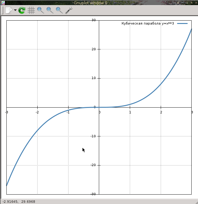
Receiving an invitation to enter commands. We introduce, for example:
plot x**3 title 'Кубическая парабола y = x^3'
And we get:

When I saw this for the first time, I also said "Fuuu ...!" This is the default result, and it somehow does not look solid. So no one bothers to finalize it. First of all, change the color and thickness of the graph line.
gnuplot> set style line 1 lt 1 lw 3 lc rgb '#4682b4' pt -1
plot x**3 title 'Кубическая парабола y = x^3' ls 1
Let's make “school” axes, with the intersection point at the origin, drawn by solid lines
gnuplot> set xzeroaxis lt -1
gnuplot> set yzeroaxis lt -1
gnuplot> replot
Add a grid - dashed lines of gray color:
gnuplot> set grid xtics lc rgb '#555555' lw 1 lt 0
gnuplot> set grid ytics lc rgb '#555555' lw 1 lt 0
Move the axis labels to the axes themselves closer:
gnuplot> set xtics axis
gnuplot> set ytics axis
Change the argument range:
gnuplot> set xrange [-3:3]
And in the end we get this:
What is much better than the original version. The possibilities of customizing the charts are simply gorgeous, more about this can be found on the above links. The entire text set forth above is intended for seed, and we will talk about
2. Gnuplottex: Integrating Charts into LaTeX Documents
Gnuplottex is a package that is included with TeXlive, allowing you to enter Gnuplot commands directly in a layout document. Without being distracted by theorizing, we proceed directly to practice. Create a new document
\documentclass[12pt]{article}
% Подключаем всяко-разное, задаем кодировку, язык и прочие параметры по вкусу
\usepackage[OT1,T2A]{fontenc}
\usepackage[utf8]{inputenc}
\usepackage[english,russian]{babel}
\usepackage{amsmath,amssymb,amsfonts,textcomp,latexsym,pb-diagram,amsopn}
\usepackage{cite,enumerate,float,indentfirst}
\usepackage{graphicx,xcolor}
% Порядку для задаем размер полей страницы, дальше это нам пригодится
\usepackage[left=2cm, right=2cm, top=2cm, bottom=2cm]{geometry}
% Включаем Gnuplottex
\usepackage{gnuplottex}
\begin{document}
\section{Построение графиков Gnuplot в документе \LaTeX}
\end{document}
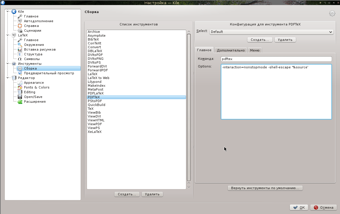
ATTENTION! The assembly of the document should be performed with the -shell-escape switch , including the ability to execute shell commands, or this way:
$ pdflatex -shell-escape gnuplottex_rus.tex
Or set this key in the IDE settings (I have it Kile):
Now, in the body of the document we will sculpt our graph:
\begin{figure}[h]
 \centering
 \begin{gnuplot}
  plot x**3 title 'Кубическая парабола $y = x^3$'
 \end{gnuplot}
\end{figure}
After assembly, getting:
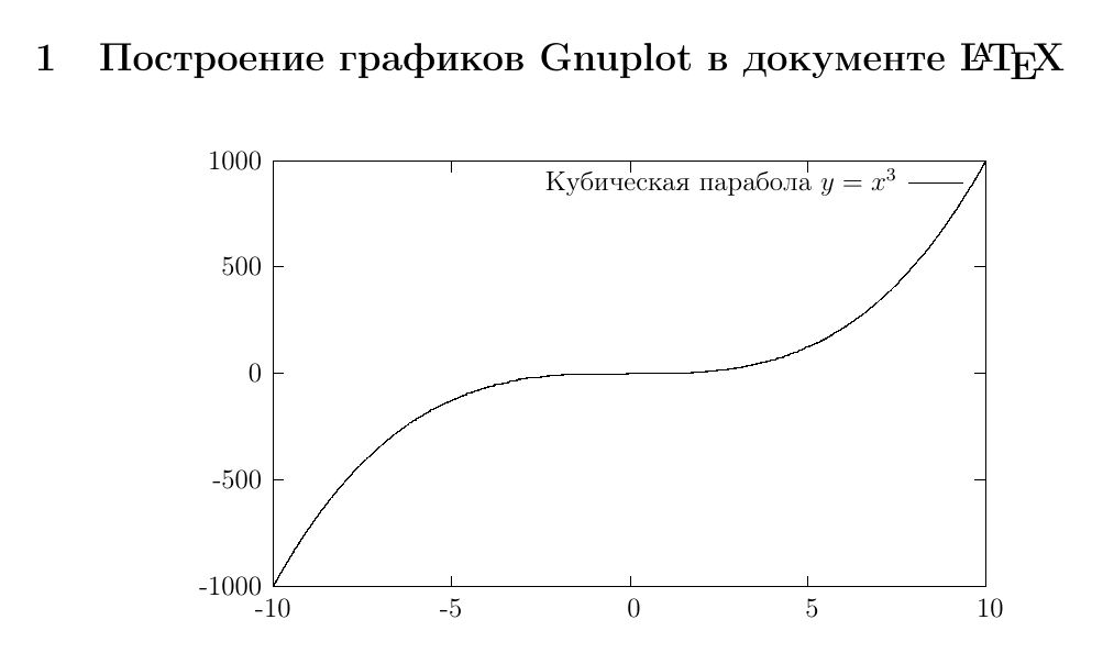
Noticed what is the most “tasty” here? The formula in the signature for the graph looks human - the full power of LaTeX is at your complete disposal. Now let's finish this file with a file:
\begin{figure}[h]
 \centering
 \begin{gnuplot}
  set terminal epslatex color size 12cm,15cm
  set xzeroaxis lt -1
  set yzeroaxis lt -1
  set style line 1 lt 1 lw 4 lc rgb '#4682b4' pt -1
  set grid ytics lc rgb '#555555' lw 1 lt 0
  set grid xtics lc rgb '#555555' lw 1 lt 0
  set xrange [-3:3]
  plot x**3 title '$y = x^3$' ls 1
 \end{gnuplot}
\end{figure}
We especially note the command:
set terminal epslatex color size 12cm,15cm
Defining terminal type: EPS LaTeX with color output support; and its size is 12 x 15 cm - your picture is this terminal. As a result, we get a graph. We

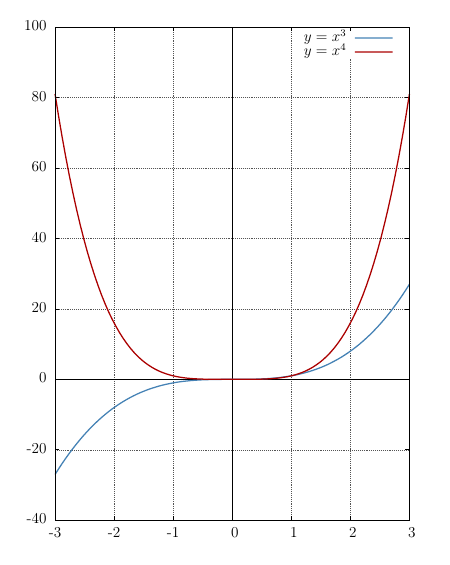
slightly change the code by adding another line style and a graph:
  set style line 2 lt 1 lw 4 lc rgb '#aa0000' pt -1
  .
  .
  .
  plot x**3 title '$y = x^3$' ls 1, \
       x**4 title '$y = x^4$' ls 2
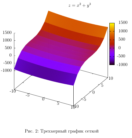
It can be seen that there is no fundamental difficulty in using the technology under consideration. You can add here the three-dimensional graph:
\begin{figure}[h]
 \centering
 \begin{gnuplot}
  set terminal epslatex color size 12cm,12cm
  splot x**2 + y**3 with lines title '$z = x^2 + y^3$'
 \end{gnuplot}
 \caption{Трехмерный график сеткой}
\end{figure}

Change the display scheme from the grid to colored polygons:
splot x**2 + y**3 with pm3d title '$z = x^2 + y^3$'
Customizing the appearance, choosing a palette - all this can be gleaned from the documentation for Gnuplot, and we move on to the next item in the program
3. Graphing from data files
This is the main power of this tool. Suppose you have a text file with data formed as follows:
#  x  y1 y2
0  0  0
1  1  1
2  4  8
3  9  27
4  16 64
The first column, for example an argument, the second and third are the values of some functions. This may be the result of a field experiment, or the result of numerical simulation. Building a two-dimensional graph will look like this:
plot '<имя файла с данными>' using <колонка аргумента>:<колонка функции> title '<легенда>'
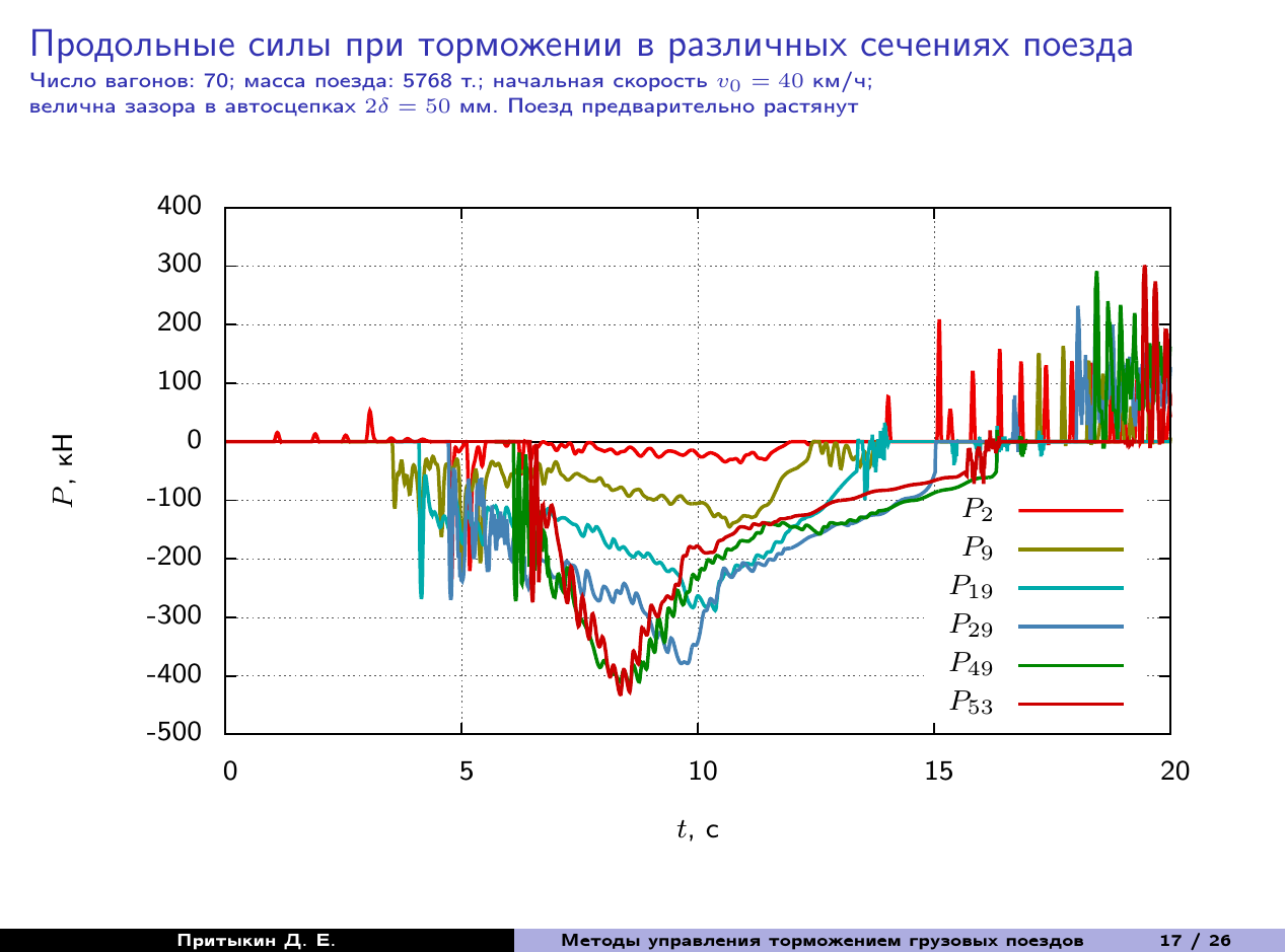
Columns are numbered starting from one. In order not to be bored, I will give an example from my documents. I will create the results / directory in the folder with this training project and put the file with the results of the numerical experiment 2319.log there (here there is my own specifics for naming logs ...). Then I will add the following code to our project:
\begin{figure}
  \centering
  \begin{gnuplot}
   set terminal epslatex color size 17cm,8cm
   set xzeroaxis lt -1
   set yzeroaxis lt -1
   set xrange [0:20]
   set style line 1 lt 1 lw 4 lc rgb '#4682b4' pt -1
   set style line 2 lt 1 lw 4 lc rgb '#ee0000' pt -1
   set style line 3 lt 1 lw 4 lc rgb '#008800' pt -1
   set style line 4 lt 1 lw 4 lc rgb '#888800' pt -1
   set style line 5 lt 1 lw 4 lc rgb '#00aaaa' pt -1
   set style line 6 lt 1 lw 4 lc rgb '#cc0000' pt -1
   set grid xtics lc rgb '#555555' lw 1 lt 0
   set grid ytics lc rgb '#555555' lw 1 lt 0
   set xlabel '$t$, c'
   set ylabel '$P$, кН'
   set key bottom right
   plot 'results/2319.log' using 1:3 with lines ls 2 ti '$P_2$', \
	'results/2319.log' using 1:9 with lines ls 4 ti '$P_9$', \
	'results/2319.log' using 1:19 with lines ls 5 ti '$P_{19}$',\
	'results/2319.log' using 1:29 with lines ls 1 ti '$P_{29}$',\
	'results/2319.log' using 1:49 with lines ls 3 ti '$P_{49}$', \
	'results/2319.log' using 1:54 with lines ls 6 ti '$P_{53}$'
  \end{gnuplot}
  \caption{Продольные силы в различных сечениях поезда}
\end{figure}
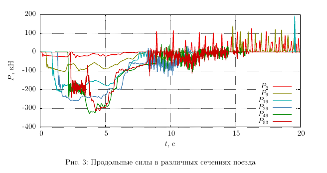
Command:
set key bottom right
Places the legend in the lower right corner of the graph field so that it does not interfere with the top and right. In addition, Gnuplot commands and their parameters can be reduced to a degree of unambiguous interpretation of the spelling, as in this example: ti => title.
Now imagine that you were doing your dissertation, but at the last moment you needed to substitute other results of the same measurements. No need to rearrange the graphs - change the result file and rebuild the project. All! Your layout will not go anywhere. Five minutes if the data change does not lead to far-reaching scientific conclusions.
And the last - if you place the chart on a Beamer slide, then the environment of the slide should contain the fragile option , otherwise a compilation error awaits you. Like this:
\begin{frame}[fragile]
%
% Содержимое слайда
%
\end{frame}
Conclusion
The study of the question took me all last night. The presentation had to be made up at night, but I managed to successfully report today (report on the first year of doctoral studies). The soul left a warm feeling of the possibility of open technologies that help in scientific work. Which way to go, everyone chooses for himself. The article is of an overview nature and covers only the issues necessary for a quick start. The rest can be easily learned from the documentation.
The document created in the example can be collected here.
Successes in scientific work, and thank you for your attention to mine.