 January 22, 2015 at 15:45
Getting started with Myth, the future preprocessor
Myth is a CSS preprocessor that allows you to use new and experimental CSS features in your projects right now.
With Myth, you can make full use of even those CSS properties that are still in the development phase of W3C and are not supported by the vast majority of browsers. But its main advantage over other preprocessors is that you do not have to learn a new markup language, as happens with SASS or LESS. Myth uses standard CSS markup. Therefore, you don’t have to rewrite anything when support for certain properties appears in browsers, but just recompile existing styles, which usually takes just a few seconds - Myth will do the rest for you.
Here are some of the CSS features currently available in Myth:
Here is a small CSS example using Myth, containing properties not yet supported by most browsers:
After compilation, Myth converts this example to such that most browsers correctly understand it:
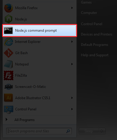
First you need to install node.js using the installation wizard . After that, run the Node.js command prompt:
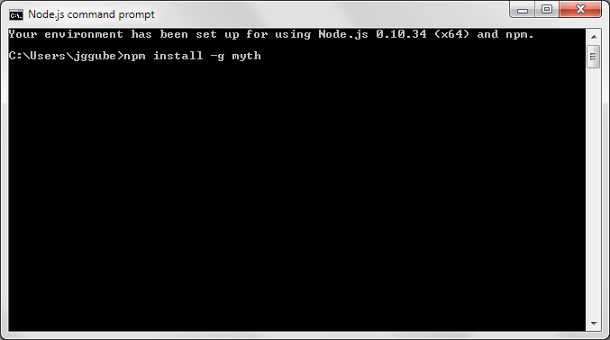
To install Myth, use npm (the standard Node.js package manager). Run the following command:
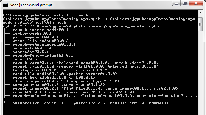
If the installation of Myth completed correctly, then we should see something like this:
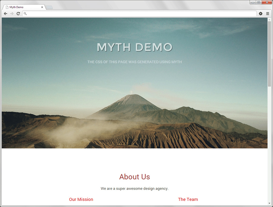
Let's create simple responsive markup using Myth:
Demo
Sources
This is what the folder structure of this demo looks like:
We will use the following Node.js command to go to the place where our styles are located:
Where / path / to / your / folder / css is the actual path to the style files on the local machine or server. The next step is to tell Myth that dev.css is the file we will work with, and styles.css is the final file into which Myth will automatically compile our styles every time it changes:
If you want to compile yourself, get rid of --watch:
Note that dev.css must already exist while styles.css is created automatically if it is not found. Naturally, you can use any names for your files, and not just those considered in this example.
In order to see the markup of our example, you can look at the source. Below is the contents of dev.css. As you can see, it uses experimental functions such as variables, custom media queries and the color () function:
When working with Myth, in case of errors, information about them will be displayed on the Node.js command line, so it can be considered as a debugging tool. For example, if a custom media query has not been announced, you will see the following picture:
Also, in case something goes wrong, the Myth debugger will pamper you with the following information
Something else you can do to improve performance before you host your site on a web server is to minify your stylesheet (write on one line). In Myth, this process is automated and implemented using the --compress function:
In our example, this reduced the file size by 20%.
Teams can also be written in abbreviated form. For example, you are free to write:
Instead:
You can read more about this in the list of teams on the official website.
Myth is a great preprocessor, perfect for developers who are eager to start using all the experimental CSS features. In addition, to work with Myth you do not need to learn additional markup languages, which, of course, is a big plus. And finally, I’ll duplicate links to demos and sources of the project, which was considered as an example in this article:
Demo
Sources
Source of translation: www.sitepoint.com/getting-started-myth-preprocessor-future/
Why myth?
With Myth, you can make full use of even those CSS properties that are still in the development phase of W3C and are not supported by the vast majority of browsers. But its main advantage over other preprocessors is that you do not have to learn a new markup language, as happens with SASS or LESS. Myth uses standard CSS markup. Therefore, you don’t have to rewrite anything when support for certain properties appears in browsers, but just recompile existing styles, which usually takes just a few seconds - Myth will do the rest for you.
Here are some of the CSS features currently available in Myth:
- CSS variables ;
- Custom Media queries ;
- Function color () ;
- calc () function without dynamic calculations at runtime;
- Automatically add vendor prefixes;
Example
Here is a small CSS example using Myth, containing properties not yet supported by most browsers:
:root {
  --bgcolor: #0072bc;
  --textcolor: color(var(--bgcolor) lightness(85%));
}
.button {
  display: block;
  width: 90%;
  max-width: 220px;
  padding: 10px;
  background: var(--bgcolor);
  color: var(--textcolor);
  border-radius: 6px;
  transition: background-color 0.4s ease-out,
              color 0.3s ease-out;
}
After compilation, Myth converts this example to such that most browsers correctly understand it:
.button {
  display: block;
  width: 90%;
  max-width: 220px;
  padding: 10px;
  background: #0072bc;
  color: rgb(179, 224, 255);
  border-radius: 6px;
  -webkit-transition: background-color 0.4s ease-out,
                      color 0.3s ease-out;
  transition: background-color 0.4s ease-out,
              color 0.3s ease-out;
}
Myth Installation
First you need to install node.js using the installation wizard . After that, run the Node.js command prompt:
To install Myth, use npm (the standard Node.js package manager). Run the following command:
npm install -g myth
If the installation of Myth completed correctly, then we should see something like this:
Create Responsive Design Using Myth
Let's create simple responsive markup using Myth:
Demo
Sources
Explanation
This is what the folder structure of this demo looks like:
/demo/
|-- /css/
  |-- dev.css
  |-- styles.css
  |-- styles.min.css
|-- /images/
|-- index.html
- The folder / css / contains files with the styles of our project
- dev.css - the input styles file we are working with
- styles.css - recompiled Myth, the output styles file that the site will palm off to the browser
- styles.min.css - minified version of styles.css
- / images / - graphics used in our project.
- index.html - and of course the page we are working on
Linking input and output files
We will use the following Node.js command to go to the place where our styles are located:
cd /path/to/your/folder/css
Where / path / to / your / folder / css is the actual path to the style files on the local machine or server. The next step is to tell Myth that dev.css is the file we will work with, and styles.css is the final file into which Myth will automatically compile our styles every time it changes:
myth --watch dev.css styles.css
If you want to compile yourself, get rid of --watch:
myth dev.css styles.css
Note that dev.css must already exist while styles.css is created automatically if it is not found. Naturally, you can use any names for your files, and not just those considered in this example.
Adding CSS Myth
In order to see the markup of our example, you can look at the source. Below is the contents of dev.css. As you can see, it uses experimental functions such as variables, custom media queries and the color () function:
:root {
  --max-width: 960px;
  --gutter: 2%;
  --base-size: 17px;
  --small-size: 14px;
  --base-lineheight: 1.4;
  --default-color: #464646;
  --default-bgcolor: #fff;
  --link-color: #0072bc;
  --dark-bgcolor: #759ea1;
  --dark-bgcolor-text-color: color(var(--dark-bgcolor) lightness(85%));
  --highlight-color: firebrick;
}
@custom-media --small-devices (max-width: 400px);
@custom-media --medium-devices (min-width: 401px) and (max-width: 750px);
* {
  margin: 0;
  padding: 0;
}
body {
  background: var(--default-bgcolor);
  color: var(--default-color);
  font: normal var(--base-size)/var(--base-lineheight) "Roboto", sans-serif;
  text-align: center;
}
img {
  width: 100%;
  height: auto;
}
/* Typography */
h1, h2, h3, p {
  margin: 5px auto 20px auto;
}
h1 {
  font-size: calc(var(--base-size) * 3);
  line-height: calc((var(--base-size) * 3) * var(--base-lineheight));
}
h2 {
  font-size: calc(var(--base-size) * 2);
  font-weight: 400;
  line-height: calc((var(--base-size) * 2) * var(--base-lineheight));
  color: color(var(--highlight-color) saturation(-20%));
}
h3 {
  font-size: calc(var(--base-size) * 1.2);
  font-weight: 400;
  line-height: calc((var(--base-size) * 1.2) * var(--base-lineheight));
  color: color(var(--highlight-color) saturation(+50%));
}
a {
  color: var(--link-color);
  text-decoration: none;
  transition: color 0.2s ease-in;
}
a:hover {
  color: color(var(--link-color) lightness(-10%));
  transition: color 0.4s ease-out;
}
/* Layout */
header {
  display: block;
  width: 100%;
  min-height: 500px;
  padding-top: 100px;
  background: var(--dark-bgcolor)
              url(header-bg.jpg) no-repeat center center;
  background-size: cover;
  background-attachment: fixed;
  color: var(--dark-bgcolor-text-color);
}
.container {
  position: relative;
  width: 96%;
  max-width: var(--max-width);
  margin: 0 auto;
}
.fullcol, .halfcol, .fourthcol {
  float: left;
  box-sizing: border-box;
  margin-left: var(--gutter);
}
.container .fullcol,
.container .halfcol:first-child,
.container .fourthcol:first-child  {
  margin-left: 0;
}
.fullcol {
  width: 100%;
  text-align: center;
}
.halfcol {
  width: calc((100% - var(--gutter)) / 2);
}
.fourthcol {
  width: calc(((100% - (var(--gutter) * 3)) / 4));
}
section {
  float: left;
  width: 100%;
  padding-top: 80px;
  padding-bottom: 80px;
}
/* Special */
.logo {
  margin-top: 0;
  font-family: "Montserrat", sans-serif;
  font-weight: 400;
  letter-spacing: 2px;
  text-transform: uppercase;
  text-shadow: rgba(0, 0, 0, 0.5) 2px 2px 2px;
}
.tagline {
  text-transform: uppercase;
}
.button {
  display: block;
  width: 90%;
  max-width: 220px;
  margin: 30px auto 50px auto;
  background: var(--link-color);
  color: var(--dark-bgcolor-text-color);
  border-radius: 6px;
  padding: 10px;
  transition: background-color 0.4s ease-out, color 0.3s ease-out;
}
.button:hover {
  background: color(var(--link-color) tint(50%));
  color: color(var(--dark-bgcolor-text-color) whiteness(100%));
  transition: background-color 0.3s ease-in, color 0.2s ease-in;
}
.credits {
  margin: 80px auto 20px auto;
  font-size: calc(var(--base-size) * 0.75);
  color: color(var(--dark-bgcolor-text-color) hue(+120%));
}
#work {
  background: color(var(--dark-bgcolor) lightness(+30%));
}
#contact {
  background: color(var(--highlight-color) saturation(-30%));
  color: var(--dark-bgcolor-text-color);
}
#contact h2 {
  color: color(var(--dark-bgcolor-text-color) saturation(+20%));
}
/* Media Queries */
@media (--small-devices) {
  .fullcol, .halfcol, .fourthcol {
    width: 100%;
    margin-left: 0;
    text-align: center;
  }
  .button, .tagline {
    font-size: var(--small-size);
  }
  .logo {
    margin-top: 0;
    font-size: calc(var(--base-size) * 1.8);
    line-height: calc((var(--base-size) * 1.8) * var(--base-lineheight));
  }
}
@media (--medium-devices) {
  .fourthcol {
    width: calc((100% - var(--gutter)) / 2);
    margin-left: var(--gutter);
    margin-bottom: 20px;
  }
  .container .fourthcol:nth-child(odd) {
    margin-left: 0;
    clear: left;
  }
}
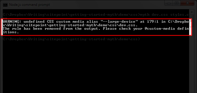
Debugging
When working with Myth, in case of errors, information about them will be displayed on the Node.js command line, so it can be considered as a debugging tool. For example, if a custom media query has not been announced, you will see the following picture:
Also, in case something goes wrong, the Myth debugger will pamper you with the following information
- what exactly happened;
- on which line did this happen;
- what Myth did in response to the mistake;
- proposed solutions to the problem;
CSS optimization for better performance
Something else you can do to improve performance before you host your site on a web server is to minify your stylesheet (write on one line). In Myth, this process is automated and implemented using the --compress function:
myth --compress dev.css styles.css
In our example, this reduced the file size by 20%.
Something More About Myth Commands
Teams can also be written in abbreviated form. For example, you are free to write:
myth -c -w dev.css styles.css
Instead:
myth --compress --watch dev.css styles.css
You can read more about this in the list of teams on the official website.
conclusions
Myth is a great preprocessor, perfect for developers who are eager to start using all the experimental CSS features. In addition, to work with Myth you do not need to learn additional markup languages, which, of course, is a big plus. And finally, I’ll duplicate links to demos and sources of the project, which was considered as an example in this article:
Demo
Sources
Source of translation: www.sitepoint.com/getting-started-myth-preprocessor-future/