How we did polar chart in DevExtreme

Recently, our company introduced to the public a new version of products, traditionally offering a large number of controls, features and buns. Our DevExtreme team was no exception, and one of the results of our fruitful work was the polar schedule. Why did we decide to do it, what problems did we encounter, and what did we end up with?
Why did we decide to make a polar schedule?
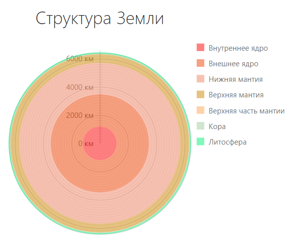
A polar graph is an extraordinary type of diagram that is not used as often as linear, pie, and bar graphs. This is a graphical way to display multidimensional data in the form of a two-dimensional diagram with three or more variables represented on axes starting from a single point. The polar graph is often called the radial diagram, lobe diagram, cobweb . If we talk about the polar graph, an example of use immediately pops up in memory - this is a familiar rose of the winds.

Display data in polar coordinate system
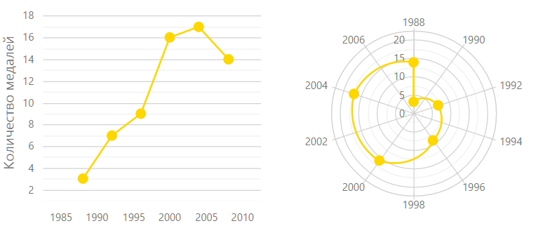
Graphs with a polar coordinate system are one way to display data, along with their display in a rectangular coordinate system. Essentially, almost any graph in a rectangular coordinate system can be displayed in polar, and vice versa.

The history of the polar graph
Where did such an intricate type of chart come from?
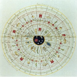
If you think about it, all the ancient calendars depicting time cyclically in a circle are a kind of example of the representation of data in the polar coordinate system. Signs of the zodiac and constellations also always depicted in a circle.

If we mention official documents, then in 1801 William Playfer released a work entitled “The Statistical Breviary”, in which he used a kind of diagram in polar coordinates. They are not like the modern presentation of polar graphs, rather more like pie charts, but they were the first step towards a polar graph.
In 1843, Leon Lalanne used a polar graph to display wind roses. Florence Nightingale used in 1858 a semblance of a polar graph to display information about the causes of death in the army.

Despite all this, primacy in the use of the polar graph is attributed to George von Mayer, who applied it in 1877.
And in 1997, Patrick Hoffman in his work on data processing introduced the term radial imaging . Since then, the polar graph has been used in many modern infographics.
Of course, this is not a complete history of the appearance and use of this graph, there are a large number of other examples. Such a schedule could not but fall into our field of vision, this is one of the reasons for the decision to implement it.
Disadvantages and advantages
Like all types of graphs, the polar graph has its drawbacks and advantages, which are described in great detail in this book . The disadvantages include:
- line charts and histograms are visually easier and faster to process
- almost any polar graph can be displayed in a rectangular coordinate system, which will speed up its perception
- the fluctuations in the values on the polar graph look more significant than they actually are, due to the incorrect estimation of the areas in the polar coordinate system by the human eye

But in addition to the disadvantages of the polar schedule, there are advantages:
- graphic primitives - circles, are used in polar graphics, and although such graphs are more difficult to perceive than linear ones, they are nevertheless easier to analyze than graphs with other complex forms
- polar graph allows you to quickly evaluate the symmetry of values
- polar graphics look interesting, fresh and attractive
- analysis and evaluation of temporary cyclic data is better done on the polar graph, rather than on a linear

- data that is intuitive in a circular form looks more spectacular on the polar graph
As you can see, the polar graph can be useful in data visualization, which also tipped the scales in favor of developing such a tool.
Extension widget line
From year to year, we are expanding the range of our visualization tools , trying to keep up with the times. We already have widgets like
- dxChart
- dxPieChart
- dxCircularGauge
- dxLinearGauge
- dxBarGauge
- dxRangeSelector
- dxSparkline
- dxBullet
- dxVectorMap
Therefore, the appearance of a polar graph widget in us was only a matter of time.
So, what are the reasons that prompted our team to make a polar schedule:
- Displaying data in a polar coordinate system is as important a visualization tool as displaying it in a rectangular coordinate system, because almost any graph can be transferred from one system to another.
- The polar graph has a rich history of its use.
- Despite all the drawbacks, in some cases, a polar graph can be useful in visualizing data.
- We strive to expand our line of visualization products.
What problems have we encountered on the way?
At the beginning of our work on the polar schedule, we thought, and what should it be? The first requirement that we put forward to him was his compliance with our entire line of widgets, namely, that he had a similar API, recognizable appearance and the same fast speed. The second thing we would like to do is spend the least amount of resources, people, time and money to create it.
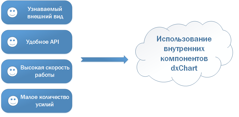
To achieve all these goals, the most optimal solution was to write a new widget based on the dxChart widget, reusing its components.
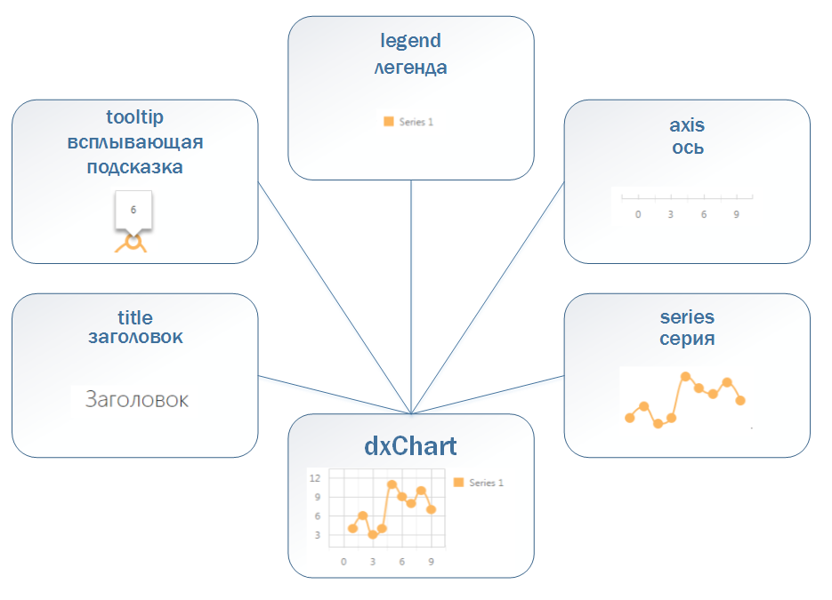
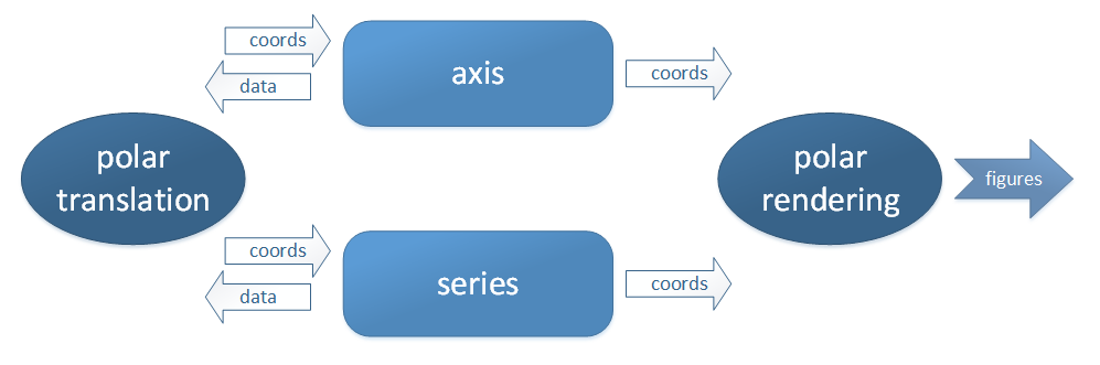
Components such as a tooltip, legend, and title look the same on any widget, so they could be reused without any changes. But the axis and series had to be modified, because now they had to be displayed in the polar coordinate system. These components perform two tasks - they work with data that is the same for any chart, and draw themselves. It is in the rendering that the main difference lies.
Along with “how to draw,” the aspect of “where to draw” should have changed. In the widget of a regular chart, we have a special module that, according to the received data, returns the coordinates on the screen. We call this module a translator. Obviously, we had to create a new, polar translator that could work in polar coordinates.
As a result, we identified our main problems:
- lack of polar translator
- axis and series cannot be drawn in polar coordinates
- the need to teach a legend, tooltip and title to work with a new widget
Solving these problems, we would get a widget with a well-designed component architecture, which would allow us to effectively solve problems and expand its functionality if necessary. Such a widget would allow you to create different complex graphics simply and quickly.
What did we get?
So, having solved all the problems that stood in our way, we implemented a polar graph by creating the dxPolarChart widget, which has a homogeneous structure with our other widgets and a flexible API that allows us to solve a wide range of problems, as well as having fast speed of both work and rendering.
Now our polar chart supports such types of series as:
- scatter
- line
- area
- bar
- stacked bar

A tool such as setting a period for the axis of the arguments allows you to display cyclic data, and the axis of the arguments itself can be drawn as a circle or a polygon, which is useful when creating a web graph.
Let's see how to use our widget to implement the main scenarios for applying the polar graph. All examples can be viewed and touched here .
Graph comparing two objects according to some criteria
On the polar graph, it is very convenient to evaluate the characteristics of objects among themselves. Let's compare two breeds of cats by the following criteria: weight, coat length, health, good-naturedness, playfulness and intelligence.
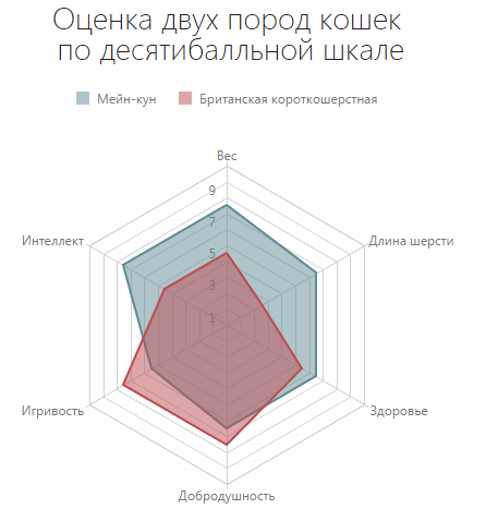
How to get such a schedule? Let's start in order, with data and series. We describe the data used:
dataSource: [{
    arg: "Вес",
    cat1: 8,
    cat2: 5
}, {
    arg: "Длина шерсти",
    cat1: 7,
    cat2: 3
}, {
    arg: "Здоровье",
    cat1: 7,
    cat2: 6
}, {
    arg: "Добродушность",
    cat1: 7,
    cat2: 8
}, {
    arg: "Игривость",
    cat1: 6,
    cat2: 8
}, {
    arg: "Интеллект",
    cat1: 8,
    cat2: 5
}]
series: [{
    name: "Мейн-кун",
    valueField: "cat1"
}, {
    name: "Британская короткошерстная",
    valueField: "cat2"
}]
commonSeriesSettings: {
    type: "area",
    border: {
        visible: true
    }
}
valueAxis: {
    categories: [1, 2, 3, 4, 5, 6, 7, 8, 9, 10]
}
tooltip: {
    enabled: true
}
title: "Оценка двух пород кошек\n по десятибалльной шкале"
 legend: {
    horizontalAlignment: "center",
    itemTextPosition: "right"
}
useSpiderWeb: trueAnd here are the ready-made options
options = {
 title: "Оценка двух пород кошек\n по десятибалльной шкале",
    useSpiderWeb: true,
    dataSource: [{
        arg: "Вес",
        cat1: 8,
        cat2: 5
    }, {
        arg: "Длина шерсти",
        cat1: 7,
        cat2: 3
    }, {
        arg: "Здоровье",
        cat1: 7,
        cat2: 6
    }, {
        arg: "Добродушность",
        cat1: 7,
        cat2: 8
    }, {
          arg: "Игривость",
        cat1: 6,
        cat2: 8
    }, {
        arg: "Интеллект",
        cat1: 8,
        cat2: 5
    }],
    commonSeriesSettings: {
        type: "area",
        border: {
            visible: true
        }
    },
    series: [{
        name: "Мейн-кун",
        valueField: "cat1"
    }, {
        name: "Британская короткошерстная",
        valueField: "cat2"
    }],
    valueAxis: {
        categories: [1,2,3,4,5,6,7,8,9,10]
    },
    legend: {
        horizontalAlignment: "center",
        itemTextPosition: "right"
    },
    tooltip: {
        enabled: true
    }
}
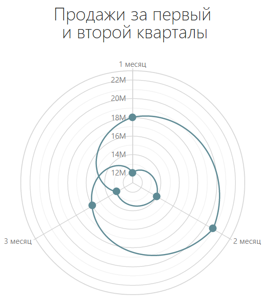
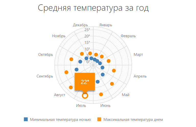
Time Cycle Chart
When you need to compare data for some recurring time periods, it is most productive to use a polar graph. Let's say we need to compare sales data for the first two quarters of the year.
We describe the data:
dataSource: [{
    arg: 1,
    val: 12000000
},{
    arg: 2,
    val: 14000000
},{
    arg: 3,
    val: 13000000
},{
    arg: 4,
    val: 18000000
},{
    arg: 5,
    val: 21000000
},{
    arg: 6,
    val: 16000000
}]
series: {
    type: "line"
}
title: "Продажи за первый\n и второй кварталы"
legend: {
    visible: false
}
valueAxis: {
    label: {
        format: "millions"
    }
}
argumentAxis: {
    period: 3,
    tickInterval: 1,
    label: {
        customizeText: function(label) {
            return label.valueText + " месяц";
        }
    }
}
And here are the ready-made options
options = {
    title: "Продажи за первый\n и второй кварталы",
    dataSource: [{
        arg: 1,
        val: 12000000
    },{
        arg: 2,
        val: 14000000
    },{
        arg: 3,
        val: 13000000
    },{
        arg: 4,
        val: 18000000
    },{
        arg: 5,
        val: 21000000
    },{
        arg: 6,
        val: 16000000
    }],
    series: {
        type: "line"
    },
    argumentAxis: {
        period: 3,
        tickInterval: 1,
        label: {
            customizeText: function(label) {
             return label.valueText + " месяц";
            }
        }
    },
    valueAxis: {
        label: {
            format: "millions"
        }
    },
    legend: {
        visible: false
    }
}
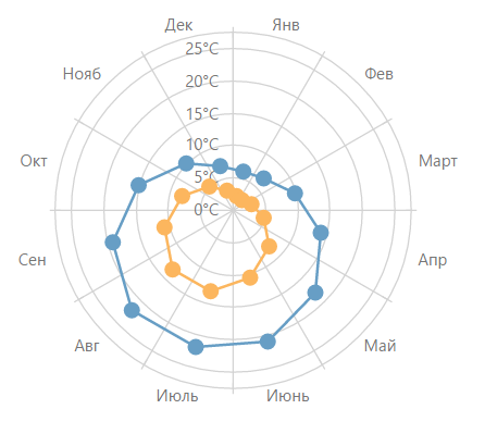
Wind rose chart
The display of the wind rose is a classic application for the polar graph.

Again, let's start with the data and the series. Here's what the data looks like:
dataSource: [{
    arg: "С",
    day: 8,
    night: 6
},{
    arg: "СВ",
    day: 3,
    night: 2
},{
    arg: "В",
    day: 1,
    night: 1
},{
    arg: "ЮВ",
    day: 0,
    night: 2
},{
    arg: "Ю",
    day: 4,
    night: 3
},{
    arg: "ЮЗ",
    day: 2,
    night: 1
},{
    arg: "З",
    day: 4,
    night: 4
},{
    arg: "СЗ",
    day: 6,
    night: 4
}]
series: [{
    name: "Количество дней",
    valueField: "day",
    color: "#FFD700"
}, {
    name: "Количество ночей",
    valueField: "night",
    color: "#009ACD"
}]
commonSeriesSettings: {
    type: "line",
    point: {
        size: 6
    }
}
title: "Роза ветров в Москве\n за октябрь 2014"
argumentAxis: {
    firstPointOnStartAngle: true
}
minorTickInterval: 1,
label: {
    customizeText: function(label) {
       return label.valueText + " дн";
    }
}
constantLines: [{
    value: 5,
    color: "#FFD700",
    dashStyle: "dash",
    label: {
        text: "Штиль",
        font: {
            color: "#FFD700"
        }
    }
}, {
    value: 7,
    color: "#009ACD",
    dashStyle: "dash",
    label: {
        text: "Штиль",
        font: {
            color: "#009ACD"
        }
    }
}]
And here are the ready-made options
options = {
      title: "Роза ветров в Москве\n за октябрь 2014",
    dataSource: [{
        arg: "С",
        day: 8,
        night: 6
    },{
        arg: "СВ",
        day: 3,
        night: 2
    },{
        arg: "В",
        day: 1,
        night: 1
    },{
        arg: "ЮВ",
        day: 0,
        night: 2
    },{
        arg: "Ю",
        day: 4,
        night: 3
    },{
        arg: "ЮЗ",
        day: 2,
        night: 1
    },{
        arg: "З",
        day: 4,
        night: 4
    },{
        arg: "СЗ",
        day: 6,
        night: 4
    }],
    commonSeriesSettings: {
        type: "line",
        point: {
            size: 6
        }
    },
    series: [{
        name: "Количество дней",
        valueField: "day",
        color: "#FFD700"
    }, {
        name: "Количество ночей",
        valueField: "night",
        color: "#009ACD"
    }],
    argumentAxis: {
      firstPointOnStartAngle: true
    },
    valueAxis: {
        minorTickInterval: 1,
        label: {
            customizeText: function(label) {
                return label.valueText + " дн";
            }
        },
        constantLines: [{
            value: 5,
            color: "#FFD700",
            dashStyle: "dash",
            label: {
                text: "Штиль",
                font: {
                    color: "#FFD700"
                }
            }
        }, {
            value: 7,
            color: "#009ACD",
            dashStyle: "dash",
            label: {
                text: "Штиль",
                font: {
                    color: "#009ACD"
                }
            }
        }]
   }
Quantitative Data Comparison Chart
Although comparing quantitative data is the prerogative of line graphs, a polar graph can also be used for this purpose. For example, we compare the number of people, men and women, in different countries.
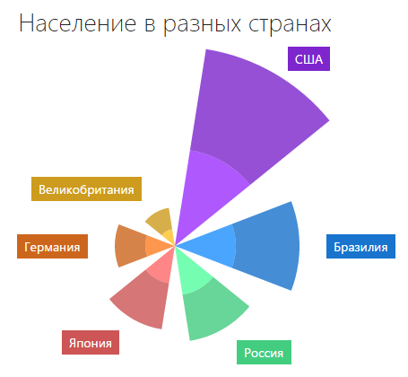
Traditionally, start with the data and the series. The data here looks like this:
dataSource:[{
    arg:"США",
    usa_male: 134782000,
    usa_female: 140786000
},{
    arg: "Бразилия",
    brazil_male: 85127000,
    brazil_female: 87730000
},{
    arg: "Россия",
    rus_male: 68278000,
    rus_female: 64750000
},{
    arg: "Япония",
    japan_male: 52387000,
    japan_female: 64586000
},{
    arg: "Германия",
    ger_male: 40450000,
    ger_female: 42344000
},{
    arg: "Великобритания",
    gb_male: 23486000,
    gb_female: 30206000
}]
series:[{
    name: "Кол-во мужчин в США",
    valueField: "usa_male",
    color: "#9B30FF",
    tag: "male"
},{
    name: "Кол-во женщин в США",
    valueField: "usa_female",
    color: "#7D26CD"
},{
    name: "Кол-во мужчин в Бразилии",
    valueField: "brazil_male",
    color: "#1E90FF",
    tag: "male"
},{
    name: "Кол-во женщин в Бразилии",
    valueField: "brazil_female",
    color: "#1874CD"
},{
    name: "Кол-во мужчин в России",
    valueField: "rus_male",
    color: "#54FF9F",
    tag: "male"
},{
    name: "Кол-во женщин в России",
    valueField: "rus_female",
    color: "#43CD80"
},{
    name: "Кол-во мужчин в Японии",
    valueField: "japan_male",
    color: "#FF6A6A",
    tag: "male"
},{
    name: "Кол-во женщин в Японии",
    valueField: "japan_female",
    color: "#CD5555"
},{
    name: "Кол-во мужчин в Германии",
    valueField: "ger_male",
    color: "#FF7F24",
    tag: "male"
},{
    name: "Кол-во женщин в Германии",
    valueField: "ger_female",
    color: "#CD661D"
},{
    name: "Кол-во мужчин в Великобритании",
    valueField: "gb_male",
    color: "#FFC125",
    tag: "male"
},{
    name: "Кол-во женщин в Великобритании",
    valueField: "gb_female",
    color: "#CD9B1D"
}]
commonSeriesSettings: {
    type: "stackedbar",
    label: {
        visible: true,
        font: {
            size: 14
        },
        customizeText: function(label){
            return label.argumentText;
	        }
    }
}
customizeLabel: function(label) {
    if (label.series.tag === "male") {
        return {
           visible: false
        }
    }
}
title: "Население в разных странах"
legend: {
    visible: false
}
argumentAxis: {
    visible: false,
    label: {
        visible: false
    },
    grid: {
        visible: false
    },
    tick: {
        visible: false
    }
}
valueAxis: {
    valueMarginsEnabled: false,
    visible: false,
    label: {
        visible: false
    },
    grid: {
        visible: false
    },
    minorGrid: {
        visible: false
    }
}
tooltip: {
    enabled: true,
    shared: true,
    font: {
        color: "#FFFFFF",
        size: 14
    },
    format: "millions",
    customizeTooltip: function(arg) {
        return {
            color: arg.point.getColor(),
            borderColor: arg.point.getColor()
        }
    }
}
And here are the ready-made options
options = {
     title: "Население в разных странах",
    dataSource:[{
        arg:"США",
        usa_male: 134782000,
        usa_female: 140786000
    },{
        arg: "Бразилия",
        brazil_male: 85127000,
        brazil_female: 87730000
    },{
        arg: "Россия",
        rus_male: 68278000,
        rus_female: 64750000
    },{
        arg: "Япония",
        japan_male: 52387000,
        japan_female: 64586000
    },{
        arg: "Германия",
        ger_male: 40450000,
        ger_female: 42344000
    },{
        arg: "Великобритания",
        gb_male: 23486000,
        gb_female: 30206000
    }],
    commonSeriesSettings: {
        type: "stackedbar",
        label: {
            visible: true,
            font: {
                size: 14
            },
            customizeText: function(label){
                return label.argumentText;
            }
        }
    },
    series:[{
        name: "Кол-во мужчин в США",
        valueField: "usa_male",
        color: "#9B30FF",
        tag: "male"
    },{
        name: "Кол-во женщин в США",
        valueField: "usa_female",
        color: "#7D26CD"
    },{
        name: "Кол-во мужчин в Бразилии",
        valueField: "brazil_male",
        color: "#1E90FF",
        tag: "male"
    },{
        name: "Кол-во женщин в Бразилии",
        valueField: "brazil_female",
        color: "#1874CD"
    },{
        name: "Кол-во мужчин в России",
        valueField: "rus_male",
        color: "#54FF9F",
        tag: "male"
    },{
        name: "Кол-во женщин в России",
        valueField: "rus_female",
        color: "#43CD80"
    },{
        name: "Кол-во мужчин в Японии",
        valueField: "japan_male",
        color: "#FF6A6A",
        tag: "male"
    },{
        name: "Кол-во женщин в Японии",
        valueField: "japan_female",
        color: "#CD5555"
    },{
        name: "Кол-во мужчин в Германии",
        valueField: "ger_male",
        color: "#FF7F24",
        tag: "male"
    },{
        name: "Кол-во женщин в Германии",
        valueField: "ger_female",
        color: "#CD661D"
    },{
        name: "Кол-во мужчин в Великобритании",
        valueField: "gb_male",
        color: "#FFC125",
        tag: "male"
    },{
        name: "Кол-во женщин в Великобритании",
        valueField: "gb_female",
        color: "#CD9B1D"
    }],
    legend: {
        visible: false
    },
    argumentAxis: {
        visible: false,
        label: {
            visible: false
        },
        grid: {
            visible: false
        },
        tick: {
            visible: false
        }
    },
    valueAxis: {
        valueMarginsEnabled: false,
        visible: false,
        label: {
            visible: false
        },
        grid: {
            visible: false
        },
        minorGrid: {
            visible: false
        }
    },
    customizeLabel: function(label) {
        if (label.series.tag === "male") {
            return {
                visible: false
            }
        }
    },
    tooltip: {
        enabled: true,
        shared: true,
        font: {
            color: "#FFFFFF",
            size: 14
        },
        format: "millions",
        customizeTooltip: function(arg) {
            return {
                color: arg.point.getColor(),
                borderColor: arg.point.getColor()
            }
        }
    }
}
More examples, demos and options can be found in our demo gallery .
conclusions
And now in the new release, having conceived, implemented and solved all the problems, we present our new kind of dxPolarChart chart. It allows you to solve both specific tasks specific to this type of chart, and everyday tasks, replacing the usual types of charts.
We tried to make this widget convenient to use, with an attractive recognizable design, with high speed and rendering.
Our team hopes that the polar graph will expand your ability to visualize data and allow you to make your products better and more interesting. How well it turned out to implement the polar schedule, you decide, and we are always open to your wishes and constructive criticism.