Monospaced fonts with programmer ligatures
Programmers love pseudo-graphics. In any language, full composite characters:
It would seem a matter of seams. But in April 2014, Ian Tuomi came up with an elegant solution: replace frequently occurring sequences with ligatures. At the same time, the monospace does not break (if you make the ligature width a multiple of the number of characters included in it), the code also does not spoil (ligatures are a purely visual feature). But you can instead
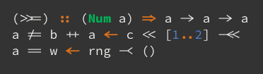
This is how the Hasklig font was born : it is the Adobe Source Code Pro, supplemented by ligatures for Haskell programs. It looks like this:
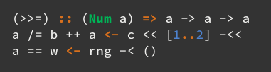
Compare with pure Source Code Pro without ligatures:
There are also nuances: far from all editors it works. Of the Macs, these are the Atom and LightTable web engines, BBEdit, the latest TextMate assemblies, for the rest, see the README for the repository . If I understand correctly, Linux editors are doing very well. Let's hope that if the idea gains popularity, the rest will catch up.
Hasklig, however, has three fundamental flaws: it contains only the ligatures present in Haskell, and it is based on Source Code Pro, and it does not have Cyrillic. Fira Code is
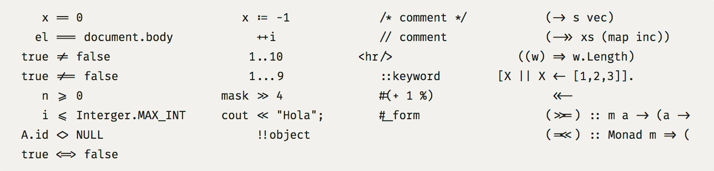
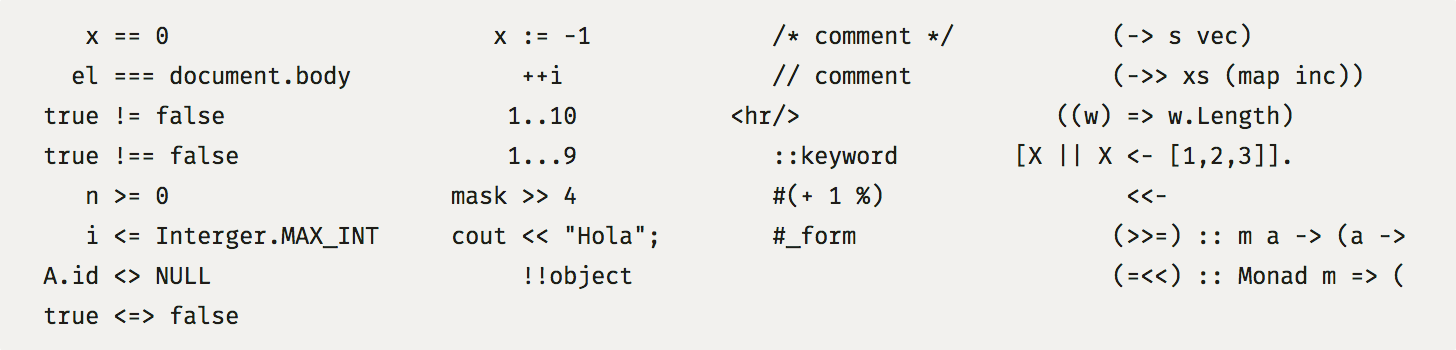
designed to solve these problems : a font based on Mozilla 's open- source Fira Mono font, supplemented by ligatures for most programming languages. Images: For comparison: I really like this line of thought, and I hope that it will gain popularity: editors will snap up support for ligatures, and for monospaced fonts it will become the norm to produce a font with a set of standard programmer ligatures, as it is now the norm to include fi, ffi and fl in proportional fonts.
->, <=, ++, :=. In meaning, this is one character, but made up of several simpler ones. The brain needs extra effort to read and integrate such structures on the fly. Someday, perhaps, Unicode will save everyone, where there will be enough characters for a hundred languages ahead - if they come up with a convenient way to enter and all legacy withers. But for now, we have to read and write code in ASCII. It would seem a matter of seams. But in April 2014, Ian Tuomi came up with an elegant solution: replace frequently occurring sequences with ligatures. At the same time, the monospace does not break (if you make the ligature width a multiple of the number of characters included in it), the code also does not spoil (ligatures are a purely visual feature). But you can instead
->draw a real arrow. This greatly facilitates the brain scanning and tokenization of the code: where, in the meaning of one symbol, now one symbol is drawn. Most importantly, it works with any, even already written code. This is how the Hasklig font was born : it is the Adobe Source Code Pro, supplemented by ligatures for Haskell programs. It looks like this:
Compare with pure Source Code Pro without ligatures:
There are also nuances: far from all editors it works. Of the Macs, these are the Atom and LightTable web engines, BBEdit, the latest TextMate assemblies, for the rest, see the README for the repository . If I understand correctly, Linux editors are doing very well. Let's hope that if the idea gains popularity, the rest will catch up.
Hasklig, however, has three fundamental flaws: it contains only the ligatures present in Haskell, and it is based on Source Code Pro, and it does not have Cyrillic. Fira Code is
designed to solve these problems : a font based on Mozilla 's open- source Fira Mono font, supplemented by ligatures for most programming languages. Images: For comparison: I really like this line of thought, and I hope that it will gain popularity: editors will snap up support for ligatures, and for monospaced fonts it will become the norm to produce a font with a set of standard programmer ligatures, as it is now the norm to include fi, ffi and fl in proportional fonts.