False correlations based on open data from the Perm Territory
On November 6-7, 2014, the contest “Open Region. Hackathon ” for the development of applications and services based on open data from the Perm Territory.
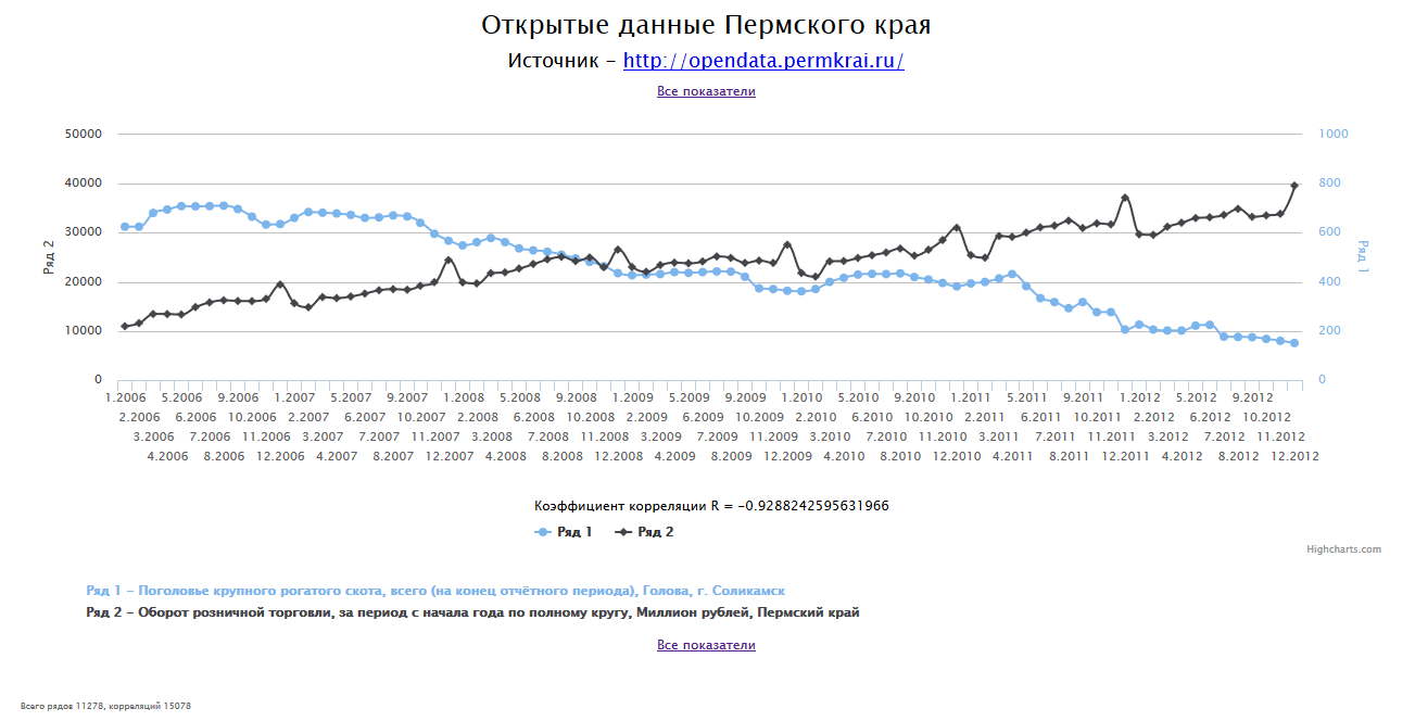
The site opendata.permkrai.ru published about 1,400 statistical indicators for various areas of the region’s life. What can be done with this data? The first thought that came to my mind was to create an analogue of the Spurious Correlations site (false correlations).
TL; DR:
Sources: github.com/yakov-bakhmatov/odpr
Application: odpr.bakhmatov.ru
Methods of obtaining and data formats are described on the page for developers . In short, the web service provides a description of the metadata (list of indicators, list of “cubes” - additional parameters of indicators, such as OKATO, OKVED, countries of the world, etc., a list of indicator-cube pairs) in xml format and the data itself (by a pair of indicator identifiers and cube) in xml and csv formats.
To simplify the initial analysis with “eyes”, I chose the csv format. In this format, entries have the form
The calendar level is a number from 1 to 5 (1 - year, 2 - half year, 3 - quarter, 4 - month, 5 - day).
A quick analysis revealed the following problems:
All these problems are one way or another solved, we proceed to implement the idea.
For each pair of indicators with the same calendar level and overlapping date ranges, we calculate the Pearson correlation coefficient. We select those pairs whose correlation coefficient modulus is greater than 0.9 (| r |> 0.9). When you open (or update) the web application page, we show random-pair charts constructed in one coordinate system.
You also need a list of all available pairs with a search or filter.
Appendix I wanted to create a fast, trying to stay in time s horizons Hackaton. Here is my selection of tools:
First, the data needs to be downloaded from the source. Here the first trouble awaited - after downloading several dozen data files, the opendata.permkrai.ru website began to give a 500th error. I had to stretch this stage into several approaches.
Secondly, I decided to limit myself to a “cube” of OKATO.
In total, 1151 files were downloaded with a total capacity of 256 MiB.
Next, each file was parsed, the lines were grouped by set (calendar level; indicator; OKATO).
Lines not belonging to the Perm Territory were discarded.
Duplicates, missed periods were deleted. The values of the indicators "normalized".
After this stage, 11468 data series remained.
Nothing complicated here. We calculate the correlation coefficient between two series, if these series belong to different indicators, have the same calendar level, have at least 8 points in the intersection of date ranges.
It turned out 129,507 pairs with a correlation coefficient of more than 0.9 (or less than -0.9).
Generally speaking, almost 130 thousand pairs is a lot. In a reasonable amount of time, such a number of graphs simply cannot be watched.
But the fact is that inside the indicator there can be a very small difference between the series (and the correlation coefficient, on the contrary, is large - close to 1). If the exponent X contains n rows and the exponent Y contains m rows, then there will be n * m correlating pairs, although one pair is enough to illustrate the relationship.
We are correcting. We group all the pairs according to the set (the indicator of the first member of the couple; the indicator of the second member of the couple; the sign of the correlation coefficient) and leave one representative from each group.
After that, 19,390 pairs remained in 11,278 rows of 501 indicators.
The resulting graphs can be viewed in two ways. You can refresh the page and get a random schedule every time. You can go to the list of all indicators and select the one you are interested in.
The site will be available until a couple hundred rubles allotted to it run out. Sources are available on github, if desired, everyone will be able to deploy the application for themselves and experiment with the data.
The application was created just for fun for three evenings. Another evening spent writing this article. We can assume that I met the day. Hackathon was a success!
The site opendata.permkrai.ru published about 1,400 statistical indicators for various areas of the region’s life. What can be done with this data? The first thought that came to my mind was to create an analogue of the Spurious Correlations site (false correlations).
TL; DR:
Sources: github.com/yakov-bakhmatov/odpr
Application: odpr.bakhmatov.ru
Initial data
Methods of obtaining and data formats are described on the page for developers . In short, the web service provides a description of the metadata (list of indicators, list of “cubes” - additional parameters of indicators, such as OKATO, OKVED, countries of the world, etc., a list of indicator-cube pairs) in xml format and the data itself (by a pair of indicator identifiers and cube) in xml and csv formats.
To simplify the initial analysis with “eyes”, I chose the csv format. In this format, entries have the form
Calendar Level; Date; Metric Name; Advanced Cube Options; Value
The calendar level is a number from 1 to 5 (1 - year, 2 - half year, 3 - quarter, 4 - month, 5 - day).
A quick analysis revealed the following problems:
- For some indicators, there is little data - one or two records. Such indicators just need to be discarded.
- There is data related to other regions of Russia. Such lines need to be filtered out.
- A large number of values have been increasing since the beginning of the year. If you display them on the chart, you get a “saw”. It is better to “normalize” these values so that each of them contains numbers related to the specified quarter / month, and not to the period from the beginning of the year.
- There are data gaps - information is not available for all months / quarters in a year and not for all consecutive years. I discarded years with missed months / quarters, and excluded indicators with missed years.
- Duplicate metrics.
All these problems are one way or another solved, we proceed to implement the idea.
Application idea
For each pair of indicators with the same calendar level and overlapping date ranges, we calculate the Pearson correlation coefficient. We select those pairs whose correlation coefficient modulus is greater than 0.9 (| r |> 0.9). When you open (or update) the web application page, we show random-pair charts constructed in one coordinate system.
You also need a list of all available pairs with a search or filter.
Tools
Appendix I wanted to create a fast, trying to stay in time s horizons Hackaton. Here is my selection of tools:
- server side - clojure + http-kit;
- client part - clojurescript for a list of indicators, a highcharts library for displaying charts;
- the best and most proven nosql repository is simple files in the native clojure edn format.
Process
Data loading
First, the data needs to be downloaded from the source. Here the first trouble awaited - after downloading several dozen data files, the opendata.permkrai.ru website began to give a 500th error. I had to stretch this stage into several approaches.
Secondly, I decided to limit myself to a “cube” of OKATO.
In total, 1151 files were downloaded with a total capacity of 256 MiB.
Data preparation
Next, each file was parsed, the lines were grouped by set (calendar level; indicator; OKATO).
Lines not belonging to the Perm Territory were discarded.
Duplicates, missed periods were deleted. The values of the indicators "normalized".
After this stage, 11468 data series remained.
Correlation Calculation
Nothing complicated here. We calculate the correlation coefficient between two series, if these series belong to different indicators, have the same calendar level, have at least 8 points in the intersection of date ranges.
It turned out 129,507 pairs with a correlation coefficient of more than 0.9 (or less than -0.9).
Postprocessing
Generally speaking, almost 130 thousand pairs is a lot. In a reasonable amount of time, such a number of graphs simply cannot be watched.
But the fact is that inside the indicator there can be a very small difference between the series (and the correlation coefficient, on the contrary, is large - close to 1). If the exponent X contains n rows and the exponent Y contains m rows, then there will be n * m correlating pairs, although one pair is enough to illustrate the relationship.
We are correcting. We group all the pairs according to the set (the indicator of the first member of the couple; the indicator of the second member of the couple; the sign of the correlation coefficient) and leave one representative from each group.
After that, 19,390 pairs remained in 11,278 rows of 501 indicators.
Web application
The resulting graphs can be viewed in two ways. You can refresh the page and get a random schedule every time. You can go to the list of all indicators and select the one you are interested in.
Conclusion
The site will be available until a couple hundred rubles allotted to it run out. Sources are available on github, if desired, everyone will be able to deploy the application for themselves and experiment with the data.
The application was created just for fun for three evenings. Another evening spent writing this article. We can assume that I met the day. Hackathon was a success!