Three things novice conversion optimizers forget about
- Transfer
 When novice optimizers get started, they tend to get carried away by the tempting perspectives offered by A / B testing, and start experimenting by changing the colors of the buttons and thinking about how to better compose the texts . But all this individually can bring improvement in results by no more than 30-50%. If you are not such a trading giant as Amazon, you will have to do much more than just change the color of the buttons. What exactly? About this - later in the translation of the article from Smriti Chawla!
 The success of a site does not depend on tactics, but on a well-thought-out strategy - namely, how well you know the reaction of users to your design.
There are three main areas where novice optimizers make mistakes.
The logical order of information organization
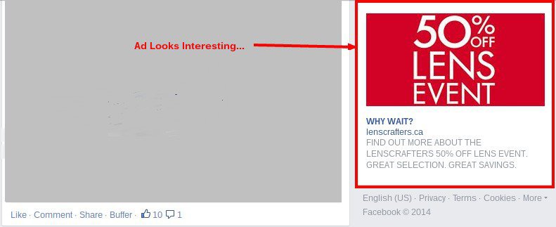
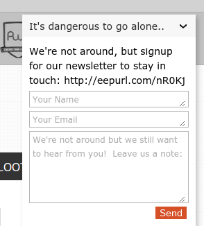
Once you click on the first banner on Google or Facebook and it becomes obvious that most of the leaders of web business perceive their banners and pages tied to them as disparate individual information platforms. There is no symmetry, no plot, no connection between pages as the user travels from the banner to the site. You click on a banner that attracts you, and you get to a site on which there is not a word about what interests you. It is necessary to understand the psychology of the user: when he clicks on the banner, he is waiting for the justification of his expectations, and this moment of waiting must be saved in it and everything must be done so as not to disappoint him. A good example of how to do this is the Loot Crate website.
Here's what the banner looks like:
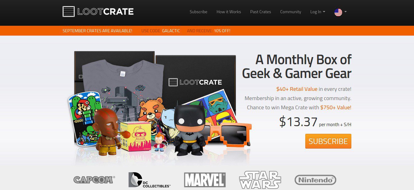
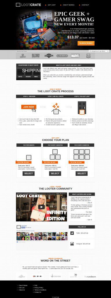
And here is the page attached to it:
When you scroll down the page, you understand that the logic of the location and content of the information on the page is the key to success:
- brand names - in separate frames;
- price - close-up;
- data relevance;
- video and text certificates;
- like box for facebook.
In other words, if the task of the banner is to attract attention and interest, then the task of the page is to answer all questions and provide comfortable conditions for the purchase, namely, to receive answers to the following questions:
- What is a product?
- What's the price?
- How long to wait for delivery?
- What can I get as a gift?
- Can I buy more than one unit?
- Do people usually like this product?
- Is the product approved by the media?
If the client wants to know more about the goods, for example, about what he ordered last time, this can easily be done in the corresponding section of the site, which is immediately given a convenient link, as well as links to detailed instructions for use, to frequently asked questions and the community web page.
If everything is done correctly, the page resembles, rather, a dialogue with the buyer, rather than just a piece of information, which should serve as just a hook-bait.
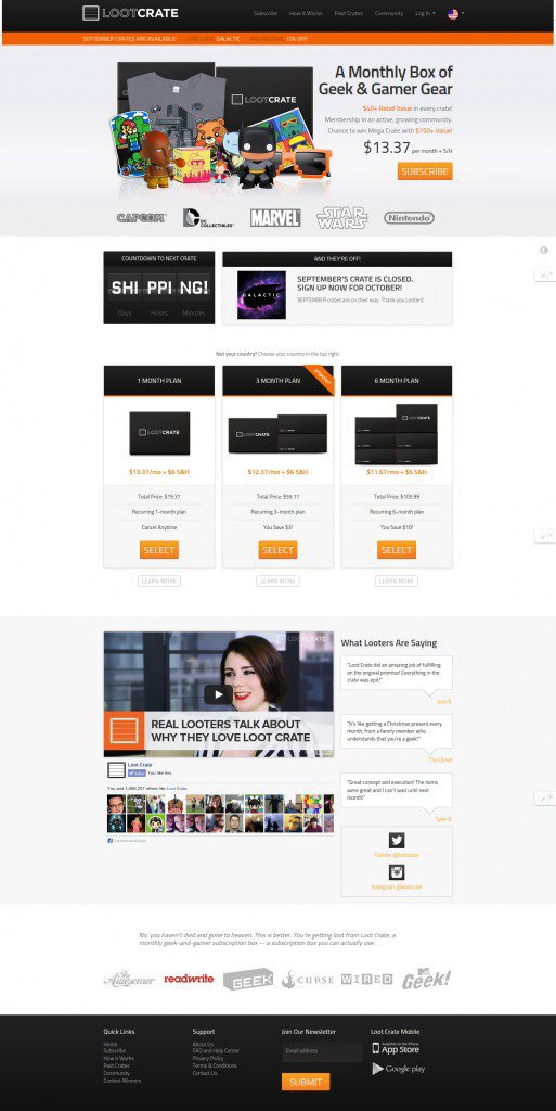
The Loot Crate page is a good example of dialogue. However, if you look at the same page in an earlier version, we will see the following.
Olark’s chat and feedback window allowed them to interact with visitors in real time.
The updated version features Paste crates and Community Pages. This turned out to be its main advantages.
In addition, “hero photo” was added, which helped to better understand the essence of Loot Crate, and a navigation system that made it easier to search for communities. Section "How does it work?" removed from the main page because the link to it was already on one of the pages of the site. The text was also changed under a hot offer: there were “6-8 products”, it became “more than 40% + retail value”.
How exactly to arrange page elements so that they follow in a "logical order"?
Of course, when you are just starting to get acquainted with the principles of optimization, it is difficult to understand what exactly is meant by the logic of the organization.
One method is testing customer behavior. It is necessary to think over the design in such a way that buyers can “think out loud” as if all the way from the banner to the site. During the observation, pay attention to the questions that they have, arrange them in order of priority, think over the answers to them and consider all this when you next improve the design.
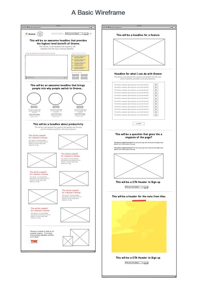
GrooveHQ's Alex Turnbull accomplished this task by interviewing several experts and their most active customers. It was to them that he asked questions about the original version of the design of the start page. After gaining more than 10 opinions, several wireframes were created (based on the responses received in the order in which they appeared). This has been included in the subtitles of the page.
If you need more thorough recommendations on how to organize this kind of feedback, Marketing Experiments offers the following optimization procedure:
- Optimize your product presentation (Opr).
- Optimize your product value presentation (Oprn).
- Optimize feeds (Ocnn - covered later).
Optimization of product presentation
In accordance with this sequence, the start page should primarily focus on product optimization. This means that the product should be presented as clearly and simply as possible for perception. Are the pictures successfully selected that show what the product is or how it works, why it is needed and what result can be achieved with it? Is the text in sufficient detail describing the advantages of each function of the product and answers all questions that customers may have, or at least provides a link to a source from which everything can be found out in more detail?

Each element of the page should give more and more useful information about the product. There should be nothing superfluous and unsaid. The text should be composed taking into account the characteristics of your target audience, for example, if the majority of your clients are people with higher education, try not to allow jargon and create text with a more classical content.
Optimization of the presentation of product value.
This implies optimization of typography, contrast, improvement of the text in terms of its perception and impact on conversion, highlighting the most critical characteristics of the product.
Give emphasis to each item, depending on how much it affects the final decision process. And do not be fooled by the fact that simply by increasing the buttons or changing their colors, you can attract more attention to them. You should also think carefully about which particular products you will allocate in order to prevent chance and isolating products that are not worth it, so as not to destroy the confidence of the buyer.
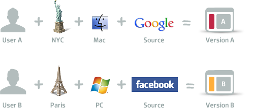
Beginning optimizers do not take into account the preferences of their target audience in terms of using the Internet.
The combination of age, gender, location, level of education, level of user income plays a big role in how to design a page, and what tactics to apply.
Take Brookdale Living's, for example. Their website offers retirement community options for retirees, therefore, their main goal is to increase user activity when working with the “Find Community” search box. In the original, this window was quite non-functional and contained only search filtering capabilities.
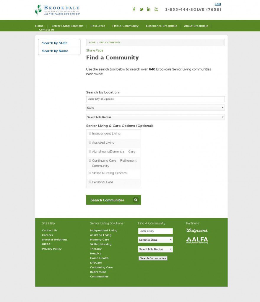
Brookdale Living's contacted a conversion conversion agency. Fathom took up the A / B test and figuring out which version of the search box would give more results.
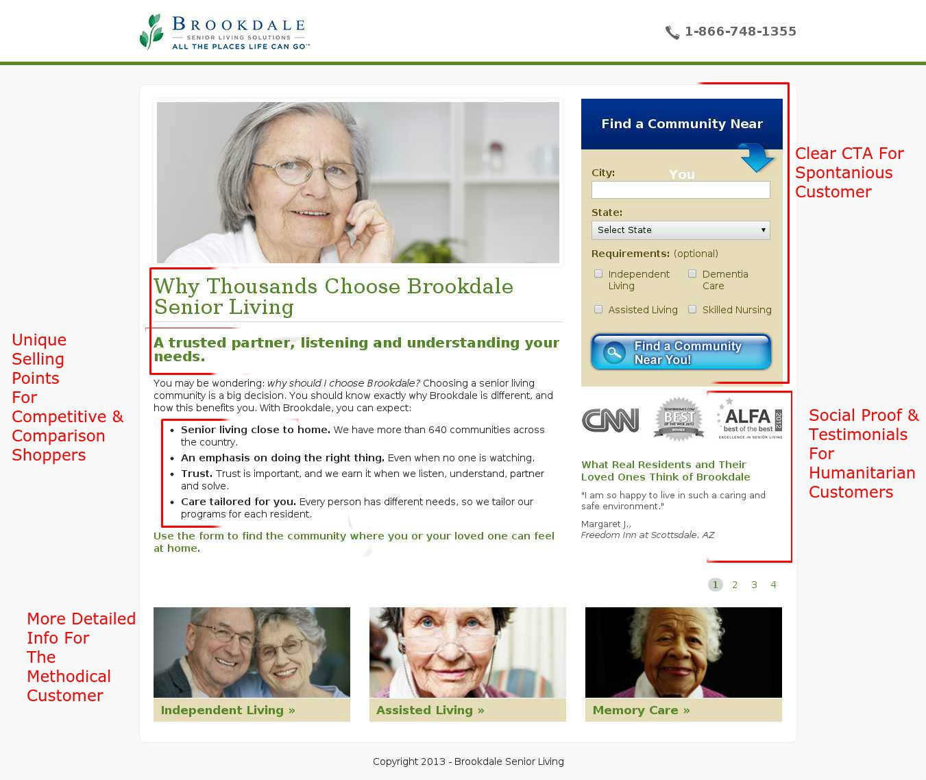
Two alternative site options were proposed using the “most successful” start page templates from Fathom. The result was a breakdown of users:
- methodical buyer (or conservative);
- spontaneous buyer (or activist);
- a humane buyer (or good-natured);
- innovative buyer.
The only difference between the proposed options was that on one page there was a simple static picture of an old woman, while on the other there was a video in which satisfied customers shared their enthusiastic reviews about the Brookdale community.
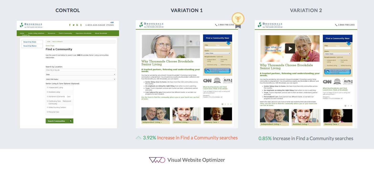
Since a large number of cases proved that the use of video on pages gives a more tangible increase in conversion, Fathom suggested that the video option would undoubtedly be more advantageous. However, in practice, the version with a static image overtook the version with the video and gave a much more noticeable increase in conversion.
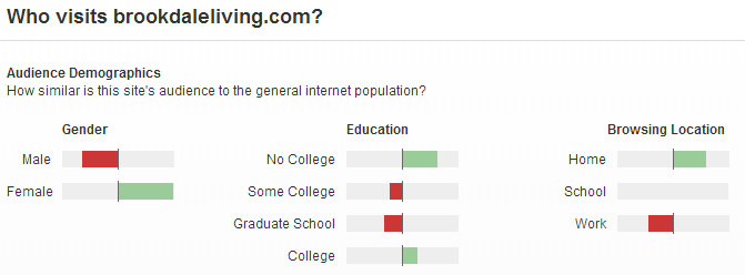
The fact is that Brookdale's main target audience is female housewives, most of whom do not have higher education. According to the information provided by Pew Research, there is a correlation between what level of education a user has and what type of data transfer is used on his network. Users without higher education rarely use broadband data. Due to the fact that the video is much “heavier” than the picture (slower loading), it turned out that the page with the picture was more in demand than the page with the video.
Of course, this case requires further repeated confirmation by experience, but if this is indeed so, then special attention should be paid during testing to how to reduce page loading time and to focus on the search window or on the invitation to make a call.
You can also experiment with creating a lighter version of the page for regions with a low Internet connection speed and more voluminous for areas with broadband data transfer technology.
Optimization of the channels where most of your visitors come from.
The optimization strategy directly depends on the motivation of people using different devices and traffic sources.
Consider, for example, the case with Marketing Sherpa, where Alex Corzo from Ritz-Carlton managed to increase conversion by 40% by redirecting users checking email from iPhones to a page version optimized for viewing on a mobile device.
When Alex realized that it was necessary to find out the percentage of people who use a mobile phone to check mail, he made a request to the analysis department, and it turned out that 2.8% of the email traffic was from mobile phones, and 90% of this traffic was from iPhones.
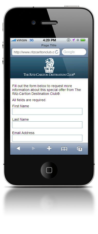
Despite the fact that it is believed that it is necessary to optimize pages for most devices, the Alex team decided not to spend time on this and focused on optimizing for their users, focusing on two criteria:
- light weight and simplicity (due to the reduction in image size while maintaining maximum information);
- Optimization for faster downloads, given that the mobile Internet is slower than usual.
The first page gave a good result and, to make sure that this was not an exception to the rule, they created four more such pages, which resulted in an increase in conversion by 40% on average (for users of iPhones).
The team decided to go further and included more media applications in the next development, but, unfortunately, there was no big difference between using simple pages and media, which proves once again: you can never be sure of anything without checking in practice or testing .
Beginning optimizers focus on small details that do not affect a significant increase in conversion.
Betfair is a web-known tote platform that uses VWO to test the start page and increase the number of registrations on the site.
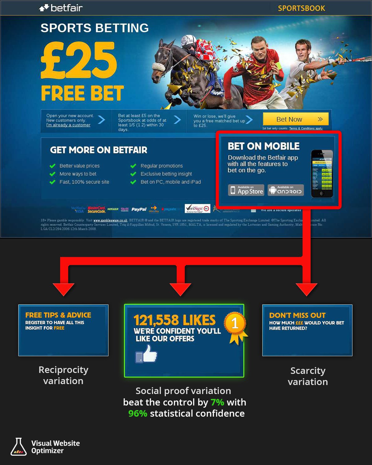
Their team decided to increase conversion by using three different variations of each section of the site, offering to download their mobile applications.
They suggested that downloading the application could distract users from registering (the primary goal of the conversion) and decided to replace this tactic with persuasion. The result met all expectations - all the variations turned out to be more advantageous than the original page, and the winner was the one that took into account the user feedback.
In conclusion
Do not confuse the hypothesis with conjecture. It is necessary to take into account both quantitative and qualitative data in order to select the appropriate site design that will not only attract visitors, but also correctly and timely present the necessary information, thereby prompting actions that increase your conversion.
Without testing, it is impossible to understand exactly how the result is improved, and for what reason. And without this, in turn, it is impossible to make progress in optimization.
High conversion to you!