Product Design Digest, September 2018
The digest collects fresh articles on interface design, as well as tools, patterns, cases and historical stories since 2009. I carefully filter a large stream of subscriptions so that you can upgrade your professional skills and better solve work tasks. Previous issues: April 2010-August 2018 .
The most elegant memo on working with interface animation from Taras Skytskyi. He reviews real-world situations in working with digital products, rather than abstract laws from the world of classical animation, and all this with illustrative examples. Translation .
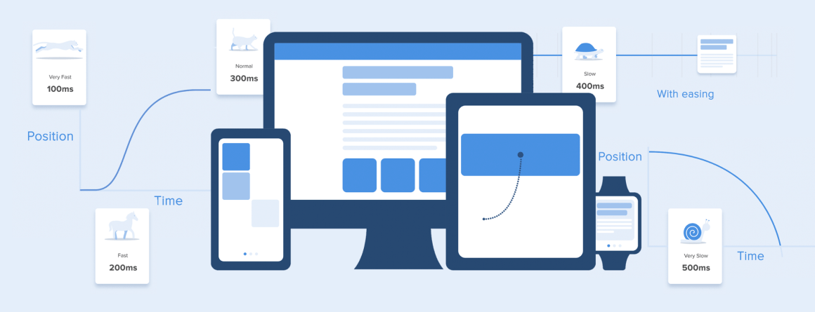
Jonas Naimark from Google shows basic approaches to interface animation. Capacious and in the case.
Rachel McConnell from Deliveroo has some simple, easy-to-understand tips on writing good names for buttons in the interface.
A good overview of the types of dark patterns from Suzanne Scacca.
Xinyi Chen and Yuxuan (Tammy) Zhou from the Nielsen / Norman Group describe approaches to quick authorization via a QR code or a one-time code in Chinese mobile applications.
Suzanne Scacca gives advice on how to prepare a mobile version of the site for holiday sales.
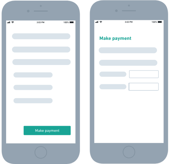
Kim Flaherty of the Nielsen / Norman Group gives advice on the timely mention of additional payments when purchasing goods in online stores. The store risks not only disrupting the current sale, but also discourage the buyer from returning for a long time.
Edward Scott describes problems in forms with fields in several columns. Users lose the thread and skip them.
Matthäus Niedoba is working on the Cinema4D interface and gives tips on how to implement a slider to adjust the gradient.
Apple announced new iPhone XS, XS Max and XR phones. Although it is sad to see that the whole world has stumbled and is ready to eat humus with spoons (screens with a “bang”, worsening the landscape mode, have become the norm), nobody has canceled the design for them.
In the very first days, we managed to generate a lot of templates for submitting layouts:
iPhone XS and XS Max from Lstore , Apply Pixels , Virgil Pana and Pixeden .
iPhone XR from Apply Pixels and Pixeden .
The resolution and density of the screen of new phones are in the official guidelines. The most important:
iPhone XS - 1125px × 2436px (5.8 ″, @ 3x)
iPhone XS Max - 1242px × 2688px (6.5 ″, @ 3x)
iPhone XR - 828px × 1792px (6.1 ″, @ 2x) The
current UI Kit for Sketch, Adobe XD, Photoshop and Keynote is on the Apple website.
Bonus: Benjamin Mayo describes problems with the first version of iOS applications running on MacOS .

Apple Watch as a platform for third-party applications were not so popular (even fresh templates were not found quickly), but they showed their 4th generation with a larger screen and modified dials on the new watchOS 5 ( review ). They also strive for framelessness. Screen dimensions :
44mm - 368px × 448px
40mm - 324px × 394px

In general, it's time to update the portfolio, and the fact that you are like suckers with an outdated iPhone X
PS How to write correctly - Xs or XS? Apparently, the underscore title XS, but even in the Apple guidelines is still different, so we are waiting for the installation.
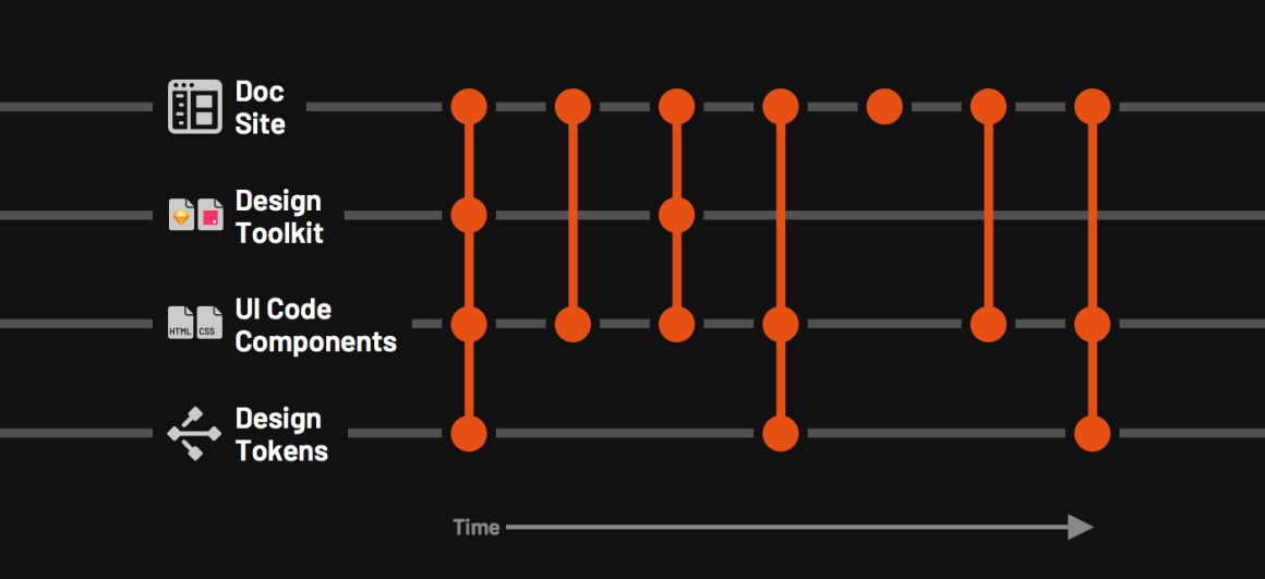
A series of articles by Nathan Curtis on the process of updating design systems. How to build a release cycle , versioning at different levels (library of components, components themselves, design patterns and tokens), roll out new versions and where to start.
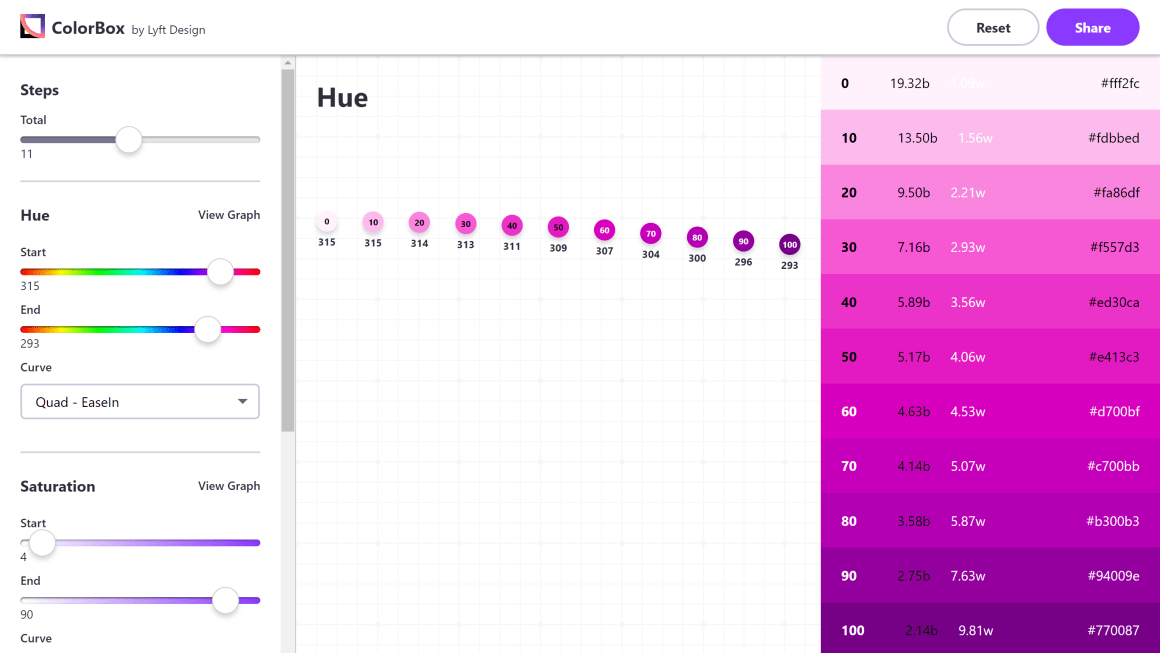
Lyft design team has made a powerful color palette generator for its design system, which provides flexibility, but at the same time algorithmic predictability and support for sufficient contrast. Kevyn Arnott talks about how it was created .
A large collection of components on ReactNative.
Financial Times
Discovery Education .
A good review of Wear OS with a bunch of screenshots of the interface .
NomNom e-book on how to work with feedback from users in different channels and turn it into product insights.
Alan Klement once again explains why the concept of “progress” is key to the Jobs to Be Done method.
Raluca Budiu of the Nielsen / Norman Group describes the psychological principle of blindness to change. Given it, you can achieve better visibility of the interface elements.
An experimental tool helps translate Sketch layouts into components on React. It facilitates splitting the screen into separate patterns, each of which can have nesting and logic of behavior.

Product out of beta . And Modou Lo listed the most raw places of the current version .
Dropbox Zach Johnston collected a few examples of what can be done with real data .
September update . Resizing layouts with adaptability, spelling checker, improved prototypes and animation.
A detailed analysis of the publication Prototypr and instructions for working with external content .
They promise an improved interface and a dark theme. The most important thing is to simplify working with variable properties in characters, so the same color redefinition will be less crutch. Jon Moore in a wild delight, described the new approach in more detail . And also a hint at simplifying the insertion of real data into layouts.

6Spiral : allows you to draw spirals.
Visual Inspector Scribble : collaboration between designers and interface writers.
Walmart's Travis Folck talks about the design team's sketch library .
Many improvements to the editor and the possibilities of animation.
The application for Mac helps to do video work with the interface for product promo videos. Video work .
Another service for a spectacular presentation of interface screens in devices.
The company launches a competitor InDesign - gradually bites off more and more from the Adobe product line. The beta version is already available and free for now. Video demonstration .
Product out of beta. Like FramerX, it is sharpened for a design system in the correct sense - the designer uses a visual representation of React-components, and not a banal UI Kit.
The tool helps to optimize the logo for different representations in digital products and printing.
Another tool for prototyping and animation. Looks average, imports only PSD and SVG, but you can add to the heap.
Supports import of prototypes made by the internal Sketch functionality .
The beta version is already possible to try. You can import layouts from Sketch.
O'Reilly has published the book by David Farkas and Brad Nunnally “UX Research” at the end of 2016. They publish chapter 7 of it, dedicated to finding respondents for user research.

Nielsen / Norman Group conducted a survey among its readers on the topic of quantitative research methods that they use. The sample is limited, but the results are still interesting.
Oleg Yakubenkov shows how you can change the sample of users for A / B tests and simplify obtaining reliable results due to this.
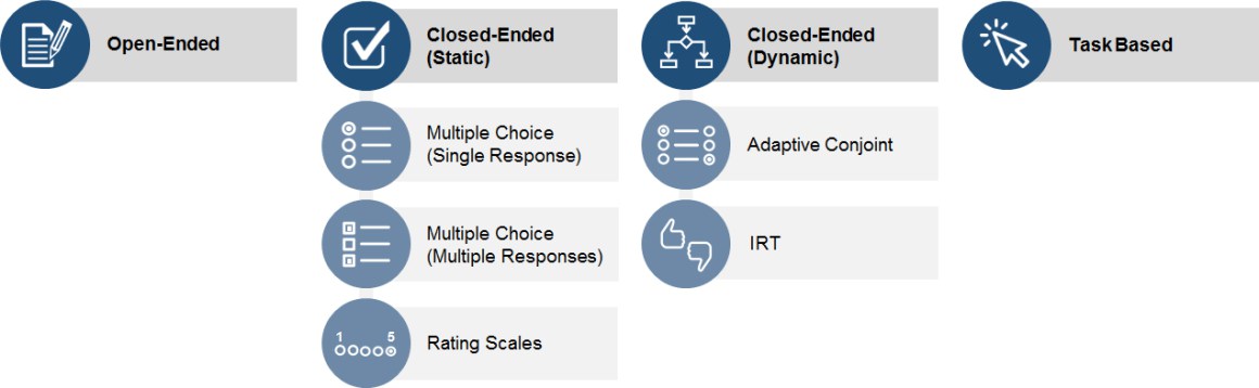
Memo Jeff Sauro on the main types of questions for user questionnaires.
A group of Facebook user researchers talks about the approach to immersing company managers in the lives of users. They organize trips to various cities and countries where they dive into the environment for a better understanding of the audience.
Hossein Raspberry talks about paired usability testing when more and less experienced users decide the scenarios together. As a result, in their interaction, the gaps between experience are more clearly visible.
Memo Jim Ross on the types of user research, involving observation of the user.
Jeff Sauro offers several approaches to the interpretation of the SUS metrics, which shift the bare numbers into clear categories (including those linked to the NPS).
The script for the spectacular animation of the gallery with transitions diagonally .
Examples of unusual effects of pointing the cursor on the link .
The color-adjust specification in the proposed CSS Color Module Level 4 allows you to control the color display on the user's device — often the browser itself decides how to display it.
The UXmatters column on DesignOps, in which Jennifer Fabrizi (Travelers), Leo Frishberg (Home Depot Quote Center), Pabini Gabriel-Petit (UXmatters) and Tobias Komischke (Honeywell) give their vision of the term.
Morgane Peng talks about how the design team of the bank Societe Generale.
Josh Saito talks about the collaborative practices and techniques of the Dropbox Paper design team that help them keep their spirits up.
Arin Bhowmick from IBM talks about the design of creative spaces for designers and co-design sessions with product teams.
Dave Malouf reflects on the topic of user maturity and company research.
A brief interview with the head of Google Sundar Pichai, in which there are few details about the design of the device in the company. Sparsely, but useful from a person at the helm.
Added support for Adobe Illustrator (on the approach of Figma and InVision Studio) and opened their SDK . They have accumulated a good experience with the layouts of different tools and made a universal format that contains data from all possible tools.
The service promises to help teams keep working layouts and other design resources.
Seriously updated site tool .
Christina Wodtke not bad describes different approaches to the comparative analysis of competitors before starting work on a product.
E-book on the design sprints from InVision. The author is Richard Banfield, who has already published a book on the subject .
Jake Knapp conducted a meta-design sprint for the New York Times. As part of the company's annual hackathon, 13 teams simultaneously solved their tasks using the methodology.
Bonus: A story about a design sprint that Agency Useful conducted for Kaspersky Lab .
Hannah Lee talks about Chrome’s browser redesign for its 10th anniversary. More about the nuances of working with the visual design of the top panel and especially the address bar, but meticul enough to understand the scale of the complexity of the product, some of which grin, they say, "yes, what can I do here."
Bonus: Interview with Alex Ainslie on the redesign of Google Chrome .

2 billion iOS devices
Adam Cutler, Milena Pribić and Lawrence Humphrey from IBM prepared a set of ethical rules for creators of interfaces and products in general with artificial intelligence. Announcement from the authors .
Jason Bailey talks about the history of generative art from abstract artists to neural networks.
Kathryn Whitenton and Raluca Budiu continue the story of the Nielsen / Norman study of voice assistants. An interesting paradox - although users describe many problems in working with them, in general, they are often satisfied. One of the main reasons is that users themselves have limited the range of usage scenarios in which smart helpers are predictable.
Google Assistant has learned to understand two languages at the same time.
A series of concepts of augmented reality based on Apple ARKit from Nathan Gitter.
Juan J. Ramirez writes about the problems of 3D Touch on the iPhone, which was removed from the new model Xr. Developers sluggishly responded to the technology, and in terms of ergonomics a lot of questions to it.
The service offers educational tasks for design from non-existent customers to get their hands on novice designers.
InVision greatly updated the blog, the whole mass of useful information became clearer.
Danil Mekhanoshin opened his coffee shop and comic book store, so he looked at the situation from the other side - it is useful for the designer to understand the daily problems of the business in order to be heard.
InVision Documentary is now available online.
Cisco design team blog.
Tatyana Smirnova leads the @mosdesign channel in the Telegram with announcements of meetings, conferences and other events in Moscow about design. For example, a poster for September , on the approach of October. Many started similar selections, but faded with time. I myself would like to do this in my digest, but I spend too much time on it too. I hope Tanya has enough patience for a long time
Bonus: on November 5, I will take part in a question and answer session from the online intensive Design Line . The group also includes Creative People, ONY, Red Collar, Agima, High School Branding and others.
Patterns and best practices
Guide in ux
The most elegant memo on working with interface animation from Taras Skytskyi. He reviews real-world situations in working with digital products, rather than abstract laws from the world of classical animation, and all this with illustrative examples. Translation .
Motion design doesn't have to be hard.
Jonas Naimark from Google shows basic approaches to interface animation. Capacious and in the case.
Let's do this! How to write better calls to action
Rachel McConnell from Deliveroo has some simple, easy-to-understand tips on writing good names for buttons in the interface.
Dark Patterns And Other Design No-Nos For Mobile
A good overview of the types of dark patterns from Suzanne Scacca.
Mobile Login Methods Help Avoid Password Roadblocks
Xinyi Chen and Yuxuan (Tammy) Zhou from the Nielsen / Norman Group describe approaches to quick authorization via a QR code or a one-time code in Chinese mobile applications.
Get Your Mobile Site Ready For The 2018 Holiday Season
Suzanne Scacca gives advice on how to prepare a mobile version of the site for holiday sales.
How to Display Taxes, Fees, and Shipping Charges on Ecommerce Sites
Kim Flaherty of the Nielsen / Norman Group gives advice on the timely mention of additional payments when purchasing goods in online stores. The store risks not only disrupting the current sale, but also discourage the buyer from returning for a long time.
Form Field Usability: Avoid Multi-Column Layouts (13% Get It Wrong)
Edward Scott describes problems in forms with fields in several columns. Users lose the thread and skip them.
Design better gradients
Matthäus Niedoba is working on the Cinema4D interface and gives tips on how to implement a slider to adjust the gradient.
Design systems and guidelines
IPhone XS, XS Max and XR Templates
Apple announced new iPhone XS, XS Max and XR phones. Although it is sad to see that the whole world has stumbled and is ready to eat humus with spoons (screens with a “bang”, worsening the landscape mode, have become the norm), nobody has canceled the design for them.
In the very first days, we managed to generate a lot of templates for submitting layouts:
iPhone XS and XS Max from Lstore , Apply Pixels , Virgil Pana and Pixeden .
iPhone XR from Apply Pixels and Pixeden .
The resolution and density of the screen of new phones are in the official guidelines. The most important:
iPhone XS - 1125px × 2436px (5.8 ″, @ 3x)
iPhone XS Max - 1242px × 2688px (6.5 ″, @ 3x)
iPhone XR - 828px × 1792px (6.1 ″, @ 2x) The
current UI Kit for Sketch, Adobe XD, Photoshop and Keynote is on the Apple website.
Bonus: Benjamin Mayo describes problems with the first version of iOS applications running on MacOS .
Apple Watch as a platform for third-party applications were not so popular (even fresh templates were not found quickly), but they showed their 4th generation with a larger screen and modified dials on the new watchOS 5 ( review ). They also strive for framelessness. Screen dimensions :
44mm - 368px × 448px
40mm - 324px × 394px
In general, it's time to update the portfolio, and the fact that you are like suckers with an outdated iPhone X
PS How to write correctly - Xs or XS? Apparently, the underscore title XS, but even in the Apple guidelines is still different, so we are waiting for the installation.
Releasing Design Systems
A series of articles by Nathan Curtis on the process of updating design systems. How to build a release cycle , versioning at different levels (library of components, components themselves, design patterns and tokens), roll out new versions and where to start.
Colorbox
Lyft design team has made a powerful color palette generator for its design system, which provides flexibility, but at the same time algorithmic predictability and support for sufficient contrast. Kevyn Arnott talks about how it was created .
Awesome Reactnative UI - Awesome React Native UI components updated weekly
A large collection of components on ReactNative.
Examples of design systems
Financial Times
Discovery Education .
Google Wear OS
A good review of Wear OS with a bunch of screenshots of the interface .
Understanding the user
The Practical Handbook to Building Better Feedback Loops
NomNom e-book on how to work with feedback from users in different channels and turn it into product insights.
Progress - The Core of Jobs to be Done
Alan Klement once again explains why the concept of “progress” is key to the Jobs to Be Done method.
Change Blindness in UX - Definition
Raluca Budiu of the Nielsen / Norman Group describes the psychological principle of blindness to change. Given it, you can achieve better visibility of the interface elements.
Design and design of interface screens
React Proto
An experimental tool helps translate Sketch layouts into components on React. It facilitates splitting the screen into separate patterns, each of which can have nesting and logic of behavior.
FramerX
Product out of beta . And Modou Lo listed the most raw places of the current version .
Dropbox Zach Johnston collected a few examples of what can be done with real data .
Adobe XD
September update . Resizing layouts with adaptability, spelling checker, improved prototypes and animation.
A detailed analysis of the publication Prototypr and instructions for working with external content .
Sketch 52 (beta)
They promise an improved interface and a dark theme. The most important thing is to simplify working with variable properties in characters, so the same color redefinition will be less crutch. Jon Moore in a wild delight, described the new approach in more detail . And also a hint at simplifying the insertion of real data into layouts.
Plugins and articles
6Spiral : allows you to draw spirals.
Visual Inspector Scribble : collaboration between designers and interface writers.
Walmart's Travis Folck talks about the design team's sketch library .
Principle 4.0
Many improvements to the editor and the possibilities of animation.
Trailer
The application for Mac helps to do video work with the interface for product promo videos. Video work .
Cleanmock
Another service for a spectacular presentation of interface screens in devices.
Affinity publisher
The company launches a competitor InDesign - gradually bites off more and more from the Adobe product line. The beta version is already available and free for now. Video demonstration .
Alva
Product out of beta. Like FramerX, it is sharpened for a design system in the correct sense - the designer uses a visual representation of React-components, and not a banal UI Kit.
Logo Lab
The tool helps to optimize the logo for different representations in digital products and printing.
Mokup
Another tool for prototyping and animation. Looks average, imports only PSD and SVG, but you can add to the heap.
Marvel
Supports import of prototypes made by the internal Sketch functionality .
Axure RP 9
The beta version is already possible to try. You can import layouts from Sketch.
User research and testing, analytics
How to recruit for user research
O'Reilly has published the book by David Farkas and Brad Nunnally “UX Research” at the end of 2016. They publish chapter 7 of it, dedicated to finding respondents for user research.
Quantitative UX Research in Practice
Nielsen / Norman Group conducted a survey among its readers on the topic of quantitative research methods that they use. The sample is limited, but the results are still interesting.
Why your A / B tests take longer than they could
Oleg Yakubenkov shows how you can change the sample of users for A / B tests and simplify obtaining reliable results due to this.
4 Classes of Survey Questions
Memo Jeff Sauro on the main types of questions for user questionnaires.
Want empathetic leaders? Take them to the source
A group of Facebook user researchers talks about the approach to immersing company managers in the lives of users. They organize trips to various cities and countries where they dive into the environment for a better understanding of the audience.
Case Study: Adapting a Software Development Technique for Usability Testing
Hossein Raspberry talks about paired usability testing when more and less experienced users decide the scenarios together. As a result, in their interaction, the gaps between experience are more clearly visible.
The Role of Observation in User Research
Memo Jim Ross on the types of user research, involving observation of the user.
5 Ways to Interpret a SUS Score
Jeff Sauro offers several approaches to the interpretation of the SUS metrics, which shift the bare numbers into clear categories (including those linked to the NPS).
Visual programming and browser design
New scripts
The script for the spectacular animation of the gallery with transitions diagonally .
Examples of unusual effects of pointing the cursor on the link .
Work with color on the web
The color-adjust specification in the proposed CSS Color Module Level 4 allows you to control the color display on the user's device — often the browser itself decides how to display it.
UX strategy and management
DesignOps
The UXmatters column on DesignOps, in which Jennifer Fabrizi (Travelers), Leo Frishberg (Home Depot Quote Center), Pabini Gabriel-Petit (UXmatters) and Tobias Komischke (Honeywell) give their vision of the term.
Societe Generale's Morgane Peng on collaboration, constraints, and chaos
Morgane Peng talks about how the design team of the bank Societe Generale.
How to stay scrappy
Josh Saito talks about the collaborative practices and techniques of the Dropbox Paper design team that help them keep their spirits up.
Designing a place for designers
Arin Bhowmick from IBM talks about the design of creative spaces for designers and co-design sessions with product teams.
Measuring your Research Operations Maturity
Dave Malouf reflects on the topic of user maturity and company research.
How Google CEO Sundar Pichai thinks about design and privacy
A brief interview with the head of Google Sundar Pichai, in which there are few details about the design of the device in the company. Sparsely, but useful from a person at the helm.
Team interaction
Avocode
Added support for Adobe Illustrator (on the approach of Figma and InVision Studio) and opened their SDK . They have accumulated a good experience with the layouts of different tools and made a universal format that contains data from all possible tools.
Chipmunk
The service promises to help teams keep working layouts and other design resources.
Abstract
Seriously updated site tool .
Product management and analytics
Comparative Research Done Right
Christina Wodtke not bad describes different approaches to the comparative analysis of competitors before starting work on a product.
Methodologies, procedures, standards
Enterprise Design Sprints
E-book on the design sprints from InVision. The author is Richard Banfield, who has already published a book on the subject .
How To Run 13 Designed Inside - Once Maker Week At The New York Times
Jake Knapp conducted a meta-design sprint for the New York Times. As part of the company's annual hackathon, 13 teams simultaneously solved their tasks using the methodology.
Bonus: A story about a design sprint that Agency Useful conducted for Kaspersky Lab .
Cases
Unboxing Chrome
Hannah Lee talks about Chrome’s browser redesign for its 10th anniversary. More about the nuances of working with the visual design of the top panel and especially the address bar, but meticul enough to understand the scale of the complexity of the product, some of which grin, they say, "yes, what can I do here."
Bonus: Interview with Alex Ainslie on the redesign of Google Chrome .
Trends
Market statistics (first half of 2018)
2 billion iOS devices
Algorithmic design
Everyday Ethics of AI
Adam Cutler, Milena Pribić and Lawrence Humphrey from IBM prepared a set of ethical rules for creators of interfaces and products in general with artificial intelligence. Announcement from the authors .
Why Love Generative Art?
Jason Bailey talks about the history of generative art from abstract artists to neural networks.
Voice Interfaces
The Paradox of Intelligent Assistants: Poor Usability, High Adoption
Kathryn Whitenton and Raluca Budiu continue the story of the Nielsen / Norman study of voice assistants. An interesting paradox - although users describe many problems in working with them, in general, they are often satisfied. One of the main reasons is that users themselves have limited the range of usage scenarios in which smart helpers are predictable.
Google Assistant
Google Assistant has learned to understand two languages at the same time.
What I Learned Making 5 ARKit Prototypes
A series of concepts of augmented reality based on Apple ARKit from Nathan Gitter.
Why does Apple's 3D Touch fail miserably?
Juan J. Ramirez writes about the problems of 3D Touch on the iPhone, which was removed from the new model Xr. Developers sluggishly responded to the technology, and in terms of ergonomics a lot of questions to it.
For general and professional development
FakeClients - Generate Fake Design Client Briefs
The service offers educational tasks for design from non-existent customers to get their hands on novice designers.
InVision Inside Design
InVision greatly updated the blog, the whole mass of useful information became clearer.
How I opened a coffee shop and why every designer should try
Danil Mekhanoshin opened his coffee shop and comic book store, so he looked at the situation from the other side - it is useful for the designer to understand the daily problems of the business in order to be heard.
People and companies in the industry
Design Disruptors
InVision Documentary is now available online.
Cisco Design Community
Cisco design team blog.
Conference proceedings
Design poster
Tatyana Smirnova leads the @mosdesign channel in the Telegram with announcements of meetings, conferences and other events in Moscow about design. For example, a poster for September , on the approach of October. Many started similar selections, but faded with time. I myself would like to do this in my digest, but I spend too much time on it too. I hope Tanya has enough patience for a long time
Bonus: on November 5, I will take part in a question and answer session from the online intensive Design Line . The group also includes Creative People, ONY, Red Collar, Agima, High School Branding and others.
Subscribe to a digest on Facebook , VKontakte , Telegram or by mail - there fresh links appear every week. Thanks to everyone who shares the links in the group, especially Gennady Dragun, Pavel Skripkin, Dmitry Podluzhny, Anton Artyomov, Denis Efremov, Alexey Kopylov, Taras Brizitsky, Yevgeny Sokolov and Anton Oleynik.