A First Look at the Design of Twenty Fifteen New Standard WordPress Theme
- Transfer
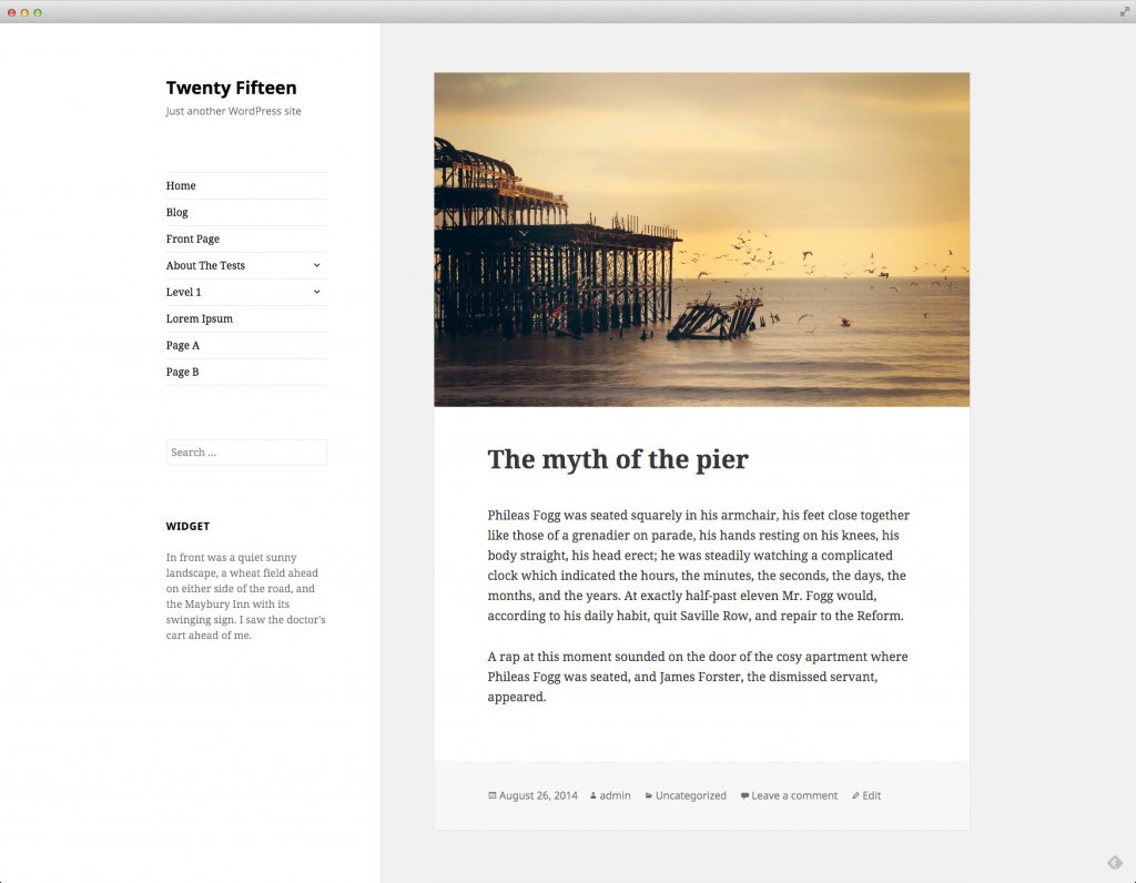
Konstantin Obenland presented the design of a new standard WordPress theme called Twenty Fifteen on the Make WordPress Core blog yesterday. Matt Mullenweg turned to Takashi Irie, the theme designer at Automattic, to design for a new standard theme. By the way, he also did the design of Twenty Fourteen.
It is already known that Twenty Fifteen will be a blog topic. Description from the designer:
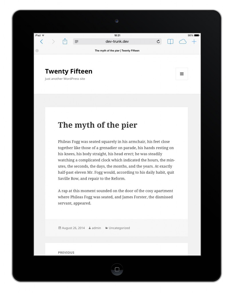
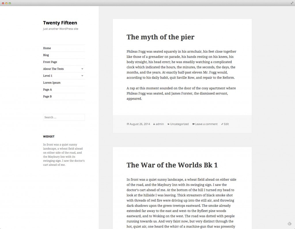
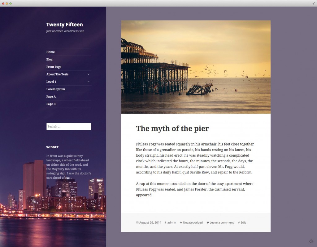
Twenty Fifteen is a clean and simple blogging theme. Particular attention is paid to typography, due to which the theme turns text into the main element of the user interface. Twenty Fifteen uses Noto Sans and Noto Serif from Google - font families designed to look harmonious in any language, which is especially important for WordPress and its active internationalization.
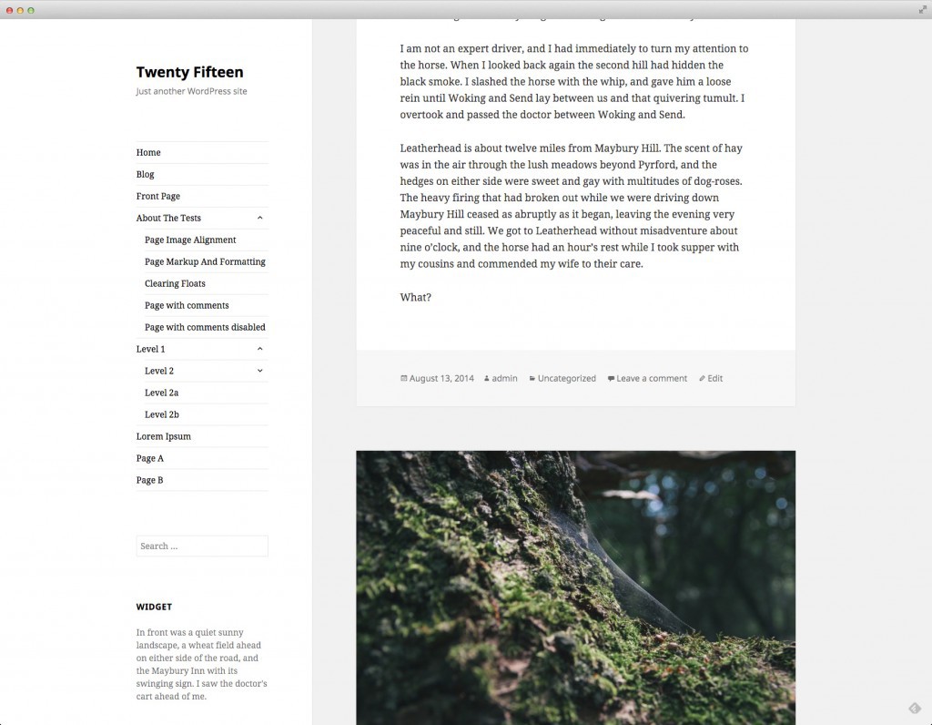
The screenshots presented show that Twenty Fifteen uses the sidebar on the left and the empty space is harmoniously distributed, which allows you to completely concentrate on the content:

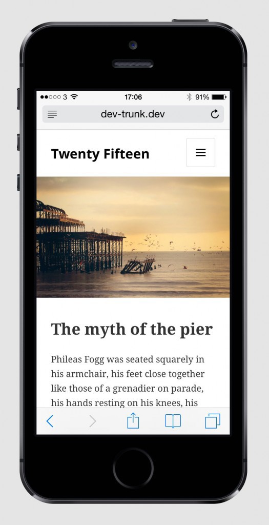
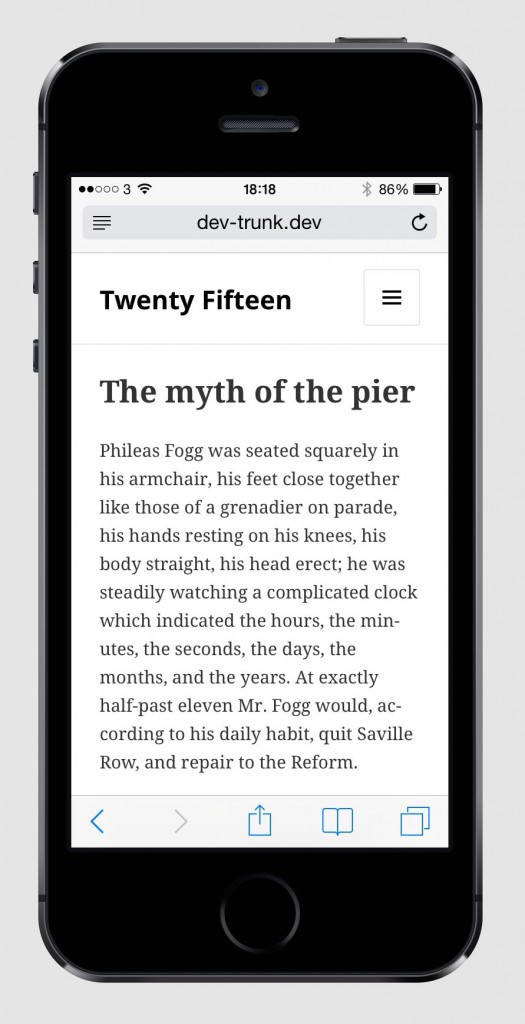
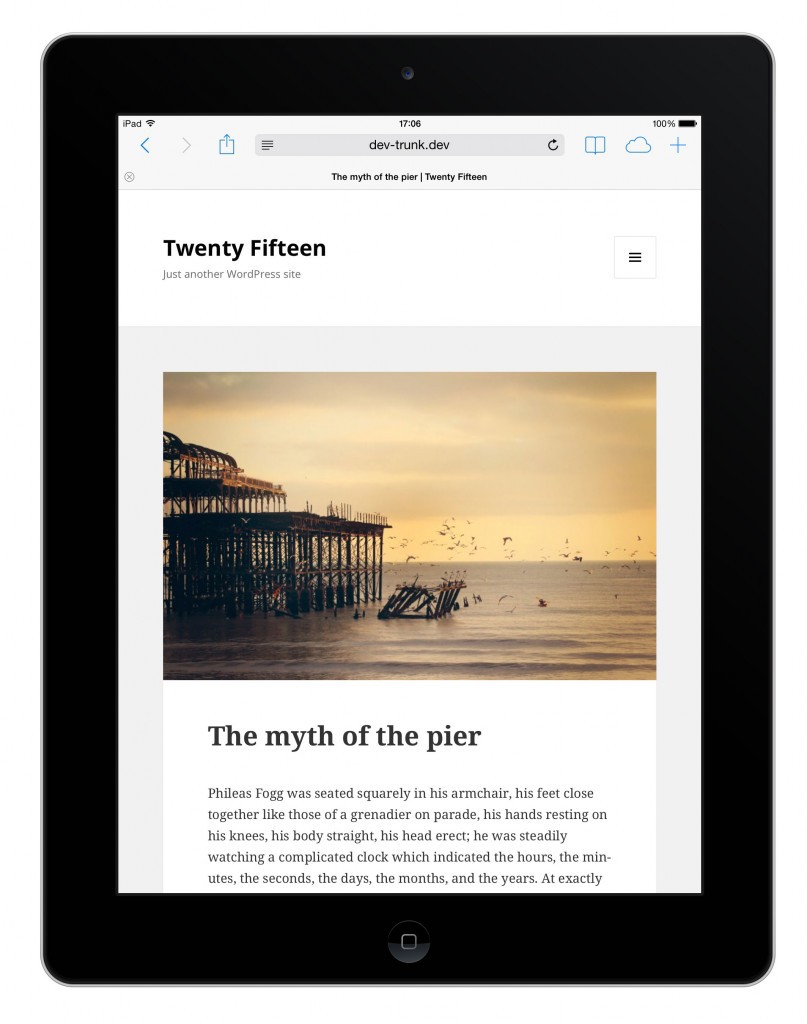
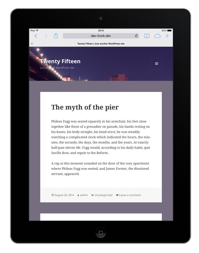
Also in the new topic there will be an opportunity to add custom images for the background and for the site header. Obenland shared with the community a few more screenshots of the design, among which there is an example of how the theme will look on mobile devices. Images are clickable (middle mouse button - open in a new tab, for some reason the habr does not support target = "_ blank"):
 |  |  |
 |  |  |
 |  | |
 |  |  |
The design of Twenty Fifteen is done on the principle of mobile first. Obenland reports that design development is nearing completion. After the design is completed, the developers will do coding and then add a new theme to the kernel. After that, everyone can test the topic and report bugs found. The final version of Twenty Fifteen will be included in WordPress 4.1, the release of which is scheduled for December this year.
