RDC T-shirt Design Competition
Yesterday, the qualifying round of the Russian Design Cup competition , organized by Mail.Ru Group, ended . Out of 118 participants, 20 people went to the next round. From the very beginning, he was offered a difficult task:
20XX year. Social networks have slowed down. It’s not so important for people to share their every step with the whole world. They are tired of making reposts of news, seals, demotivators and sick children. Social networks have become hostage to a huge number of their users and any major changes are associated with serious risks. In one of the three largest social networks in Russia, management decided to radically redesign their product. You were invited to a meeting of the most important people of the company, and said that you are ready to take a chance and take a fresh look at what a social network can be. You have time until August 11th to offer a solution to this problem. Illustrate your ideas, work out one of the use cases that will show how your approach benefits millions of people.
The approach to solving the problem for all the winners of the tour was very interesting and often extraordinary - that's why they won. The highest average score was received by the works of Dominic Levitsky , Alexei Kipin , Andrey Stoleshnikov , Dmitry Alyabyev and Vitaliy Yakimchuk .
Congratulations to the winners and recall that the first round of the competition has already begun, and before its end there are less than 10 days left!
In parallel with the qualifying round, we decided to hold an additional mini-competition for the design of the official RDC T-shirt. In total, the contestants sent 33 works, of which the jury selected the most successful works, in their opinion.
 Nikita Obukhov, creative director of the FNKPNK studio, a stern and demanding judge, singled out only one work by Sergey Osokin.
 “Of all, in my opinion, it is best suited:
- funny;
- stylish;
- There is a connection of ideas and topics.
I chose purely intuitively - trying on myself mentally (would I wear such a T-shirt or not). I would put it on :) ".

 Lena Dronova, art director at Innova, approached the choice of work in the same way as Nikita:
 “I chose according to the principle of“ what I would wear myself. ” Beautiful T-shirts rule. ”
For herself, Lena identified five t-shirt designs. She was the first to choose Osokin’s work, but we won’t duplicate it here, okay? :)
“Everything is there - both the logo, and“ Russianness ”, and adobe, plus Seryozha tried and gathered this into a single illustration. Sales!"
Maxim Yurkin
's work : “Good work with form and letter. The metaphor is not read immediately, but it is still very beautiful. ”

The work of Vladislav Kashuba:
"The pixel coat of arms and St. Basil's Cathedral - an understandable and beautiful move."

The work of Dmitry Alyabyev:
“It is very subtle and straightforward incomprehensible. For those in the subject. I would go to her house. ”

The work of Max Laptev:
“Ah, well done! It's like wearing a t-shirt with a picture of your child. I wouldn’t take it off at all. ”
 Alisher Yakupov, the head of the design department at Odnoklassniki, singled out 4 t-shirt designs from all the works. The first was the work of Max Laptev: "The work is ridiculous, but this is not the print that I would like to wear on myself, feeling pride in participating in the competition."
 The work of Mikhail Bukharov:
"A vivid illustration, which is interesting to consider, finding new details."

The work of Alexander Chebotaryov:
"Calligraphic prints always look interesting on T-shirts."

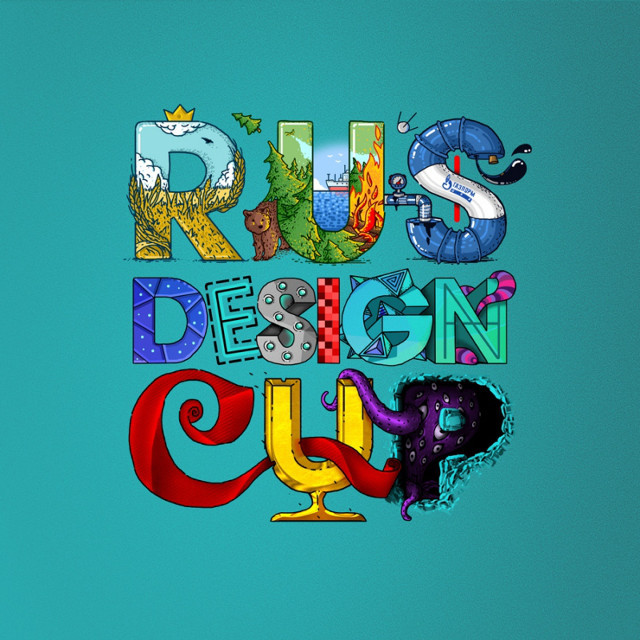
Maxim Yurkin's work (see the beginning of the post):
“More than just a T-shirt, he proposed an image and a visual language. We (the organizers) really liked the sign, so we decided to use it as the basis of the corporate identity of the competition next year. ”
 Platon Dneprovsky, founder and head of UIDG, noted several works:
 “I chose those that:
- look harmonious on their own (composition);
- without straightforward references to Russian symbols such as eagles and flags;
- without the same very direct references to computer interfaces such as icons and windows;
“With an idea, but without an overwhelming originality for its own sake.”
The work of Pavel Turchin: The

work of Ilnur Nazyrov: The

work of Eugene Katsuba: The

work of Vladimir Lavrentyev:

And the work of Dmitry Alyabyev, which was already mentioned above.
 Yuri Vetrov, head of the design and interface design team at Mail.Ru Group, also expressed his opinion:
“I can’t decide which of the two t-shirts is better. Maxim Yurkin’s version is very systematic and draws on the entire identity of the contest. But the version of Misha Bukharov is warmer and closer - a beautifully drawn rebus on the theme of all the images associated with the name RDC. In my personal pile of T-shirts there are more than just such options.
I also like light and unobtrusive, but subtle stylization and among the options there were several good works at once. My favorite is from Denis Efanova, who uses the style of pseudo-GUI interfaces and software design 80s-90s. It is drawn perfectly, and although the approach itself pops up every now and then here and there, it does not get mass popularity. In the same sense, I liked what Alexander Shulman and Vladislav Kashuba did. ”
The work of Denis Efanov: The

work of Alexandra Shulman:

The work of Vladislav Kashuba:

These works were to the liking of the jury of the Russian Design Cup competition. And the work of Maxim Laptev won , and he will receive the Wacom Intuos Pro M Medium tablet as a reward. Of course, this does not mean that all other work is bad. It seems to us that each of the presented works has its own interesting solutions, ideas, style. Someone approached the task with humor, someone almost academically, someone laid down a deep idea that you won’t understand right away. In general, well done!
Which T-shirts do you like most? Do you agree with the jury?