Introducing the new plugin for Grafana - Statusmap panel
Grafana has the ability to show status , Grafana has the ability to display data over time . However, paradoxically, Grafana has so far not had a convenient way to show status in time !
We present our plugin - Statusmap panel . It allows you to visually display the status of a set of objects for a selected period of time. As an example demonstrating the work of the plug-in, imagine a lot of locations where coffee is prepared for someone:
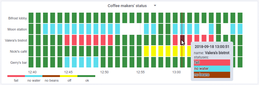
You can see how Nikki saves electricity, Gerry quickly replenishes water, Valera’s coffee machine often messes up, and on Bifrost Wi-Fi is clearly better. than at the lunar station, where, it seems, with water very tight.
Looks interesting? But let's start with how we all came to this.
For better visualization of data, we set ourselves a simple task: to display the states of the set timeseries over a period of time. Under the set of objects refers to different timeseries: they may differ in the set of labels and name. In this case, the timeseries values should be convenient, i.e. without crutches, displayed in text and color.
Examples of the use of such visualization that are relevant to our business are the health of Kubernetes servers or platforms, the results of HTTP services checks. So in the company "Flant" a plug-in to Grafana was born called Statusmap. Reflecting on the great variety of possibilities of its use for other tasks, we quickly took it upon ourselves to share the code with the world community. But did nobody really solve this problem before us?
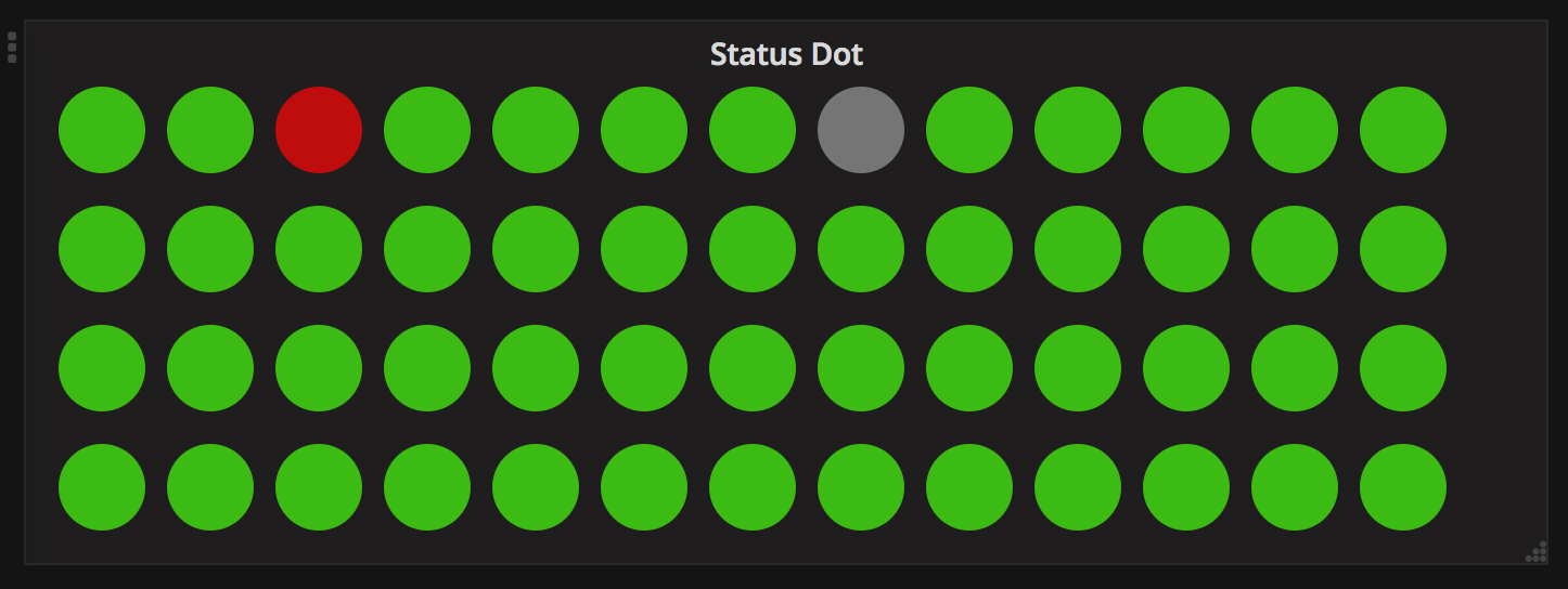
The task is really popular, so we did not become pioneers in it. It all started with the fact that we had several dashboards with cool plugins of the Status Panel and Status Dot . These plug-ins allow you to display the current state of a set of objects, for example, hosts or sweets ... or coffee machines in different parts of the world.

Everything went well until we wanted to see the statuses of these objects in time. The first, simplest solution was to add a regular graph with a check mark stacked .
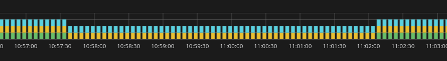
As planned, the Status Panel + stacked Graph would allow to see the state of the objects “for now” and the development of the situation over time. However, the stacked Graph is not very visual:
We tried to adapt the standard Heatmap - it did not work out: the plugin works with the Y axis only at the level of values and does not know how to display labels there. Then we tried the following plugins for Grafana:
According to the results of all the research we have formulated the following requirements for the plugin:
Let me now make a small digression about Heatmap, Prometheus and discrete statuses ...
Classic heatmap is a 3-D graph:
The standard plugin Heatmap displays the Z axis in color - for example, from white to red or through a green-yellow-red gradient. This works very well for continuous values: response time, queue length, number of requests to the server ... In the case of discrete statuses for a set of objects, you need the following: display the names of objects that we monitor along the Y axis, and show observed objects for each object along the Z axis currently statuses ... But stay! What does a lot of object statuses mean at the moment of time? I'll try to describe.
Those who use Prometheus with Grafana know about
The first thing that comes to mind - to use aggregation functions - eg
Further, it would seem simple: take the number of zeros, ones, twos, etc. within one minute ... and we have excellent data to display on the chart! But Prometheus has its own view on this:
Everything works fine if there are two values in the metric:
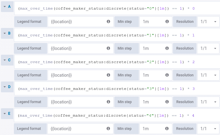
What to do with a metric that has several values? The note “ Composing range vector functions in PromQL ” gave the idea to turn a metric with discrete values into metrics with labels. This can be done using the following recording rule:
This rule transforms the metric
Usually the statuses are defined in advance, so you can create a set of queries in order not to skip the necessary values. The legend of all requests must match in order to group the values:
Now, if the coffee machine has been turned off for 30 minutes (status off -
Well: we figured out how to aggregate data on discrete statuses and not lose information. It remains to figure out how to combine the data based on the legend and draw it on the panel.
Of course, we didn’t immediately come to what was described above, but when it all came together, it became clear that, in fact, there was not enough rendering mechanism. Now there is such a mechanism - the Statusmap panel plugin , which can do the following:
The result is a very convenient representation of the status of several objects . And you can see both the current status (these are the rightmost baskets) and the status of the object in time.
The source code of the Grafana Statusmap plugin is distributed under the free MIT license (by analogy with other plugins for Grafana) . At the moment it is available in our GitHub .And we sincerely hope that in the near future it will get into the repository of the plug-ins Grafana . UPDATED (03/10/18): The plugin is accepted into the official Grafana directory.
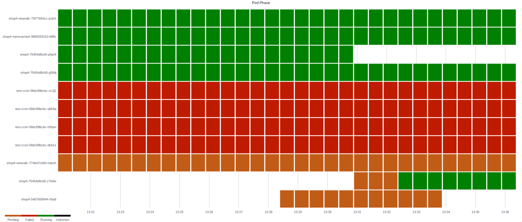
And finally, an illustration of how a Statusmap helps to visualize data with status of pods from the Kubernetes production cluster:
Read also in our blog:
We present our plugin - Statusmap panel . It allows you to visually display the status of a set of objects for a selected period of time. As an example demonstrating the work of the plug-in, imagine a lot of locations where coffee is prepared for someone:
You can see how Nikki saves electricity, Gerry quickly replenishes water, Valera’s coffee machine often messes up, and on Bifrost Wi-Fi is clearly better. than at the lunar station, where, it seems, with water very tight.
Looks interesting? But let's start with how we all came to this.
What for?
For better visualization of data, we set ourselves a simple task: to display the states of the set timeseries over a period of time. Under the set of objects refers to different timeseries: they may differ in the set of labels and name. In this case, the timeseries values should be convenient, i.e. without crutches, displayed in text and color.
Examples of the use of such visualization that are relevant to our business are the health of Kubernetes servers or platforms, the results of HTTP services checks. So in the company "Flant" a plug-in to Grafana was born called Statusmap. Reflecting on the great variety of possibilities of its use for other tasks, we quickly took it upon ourselves to share the code with the world community. But did nobody really solve this problem before us?
Why not ready?
The task is really popular, so we did not become pioneers in it. It all started with the fact that we had several dashboards with cool plugins of the Status Panel and Status Dot . These plug-ins allow you to display the current state of a set of objects, for example, hosts or sweets ... or coffee machines in different parts of the world.
Everything went well until we wanted to see the statuses of these objects in time. The first, simplest solution was to add a regular graph with a check mark stacked .
As planned, the Status Panel + stacked Graph would allow to see the state of the objects “for now” and the development of the situation over time. However, the stacked Graph is not very visual:
- The color indicates different timeseries, not the values that are displayed in color for the Status Dot or Status Panel. That is, the colors for the two graphs are not the same and this is confusing;
- if it appears among the values
null, the graphics fail.
We tried to adapt the standard Heatmap - it did not work out: the plugin works with the Y axis only at the level of values and does not know how to display labels there. Then we tried the following plugins for Grafana:
- Carpet plot - groups the values by day and by the selected fragment of the day;
- Discrete Panel is a good plugin, but we need to discretely show statuses over time;
- Status By Group Panel is a good improvement to the Status panel, which allows you to display many statuses, but still without the features we need.
According to the results of all the research we have formulated the following requirements for the plugin:
- selected clear line of graphics for each object;
- the name of the object is displayed on the Y axis and is set in the legend field;
- there can be several statuses on one object - in such cases the most significant will be displayed in color, and the rest will be displayed in the tooltip;
- display baskets (buckets) with a width not less than the specified (5 px), since in single-pixel inconvenient to direct the mouse;
- manual color management - the ability to set the color of each numeric value from a discrete set.
Let me now make a small digression about Heatmap, Prometheus and discrete statuses ...
A bit of theory
Classic heatmap is a 3-D graph:
- the X axis is delayed time
- Y-axis - possible values of a certain value,
- Z axis - the number of observed values at a given time.
The standard plugin Heatmap displays the Z axis in color - for example, from white to red or through a green-yellow-red gradient. This works very well for continuous values: response time, queue length, number of requests to the server ... In the case of discrete statuses for a set of objects, you need the following: display the names of objects that we monitor along the Y axis, and show observed objects for each object along the Z axis currently statuses ... But stay! What does a lot of object statuses mean at the moment of time? I'll try to describe.
Those who use Prometheus with Grafana know about
stepor the intervalsetting on the Query tab . If you specify there 1m, and you collect data at intervals of 5s, then when you perform a simple metric querycoffee_maker_statusPrometheus returns every 12th value, and 11 values on the graph can not be seen. How to improve the situation? The first thing that comes to mind - to use aggregation functions - eg
*_over_time(coffee_maker_status[1m]). What exactly is the function to take? Time to figure out how status is presented in Prometheus metrics. In most cases, the status is indicated by a certain set of values. For example, for there coffee_maker_statusmay be such status values:- 0 - ok,
- 1 - off,
- 2 - no beans,
- 3 - no water,
- 4 - fail.
Further, it would seem simple: take the number of zeros, ones, twos, etc. within one minute ... and we have excellent data to display on the chart! But Prometheus has its own view on this:
coffee_maker_status[1m]- this is a range vector, and therefore expressions like max_over_time(coffee_maker_status[1m]==2)or count_values_over_time(coffee_maker_status[1m], 3)that would very much fit are impossible. Everything works fine if there are two values in the metric:
0(status was not observed) and 1(status was observed) - and the status itself is stored in the label. Then you can make such queries: (max_over_time(coffee_maker_status{status="3"}[1m]) == 1) *3What to do with a metric that has several values? The note “ Composing range vector functions in PromQL ” gave the idea to turn a metric with discrete values into metrics with labels. This can be done using the following recording rule:
- record: coffee_maker_status:discrete
  expr: |
    count_values("status", coffee_maker_status)
This rule transforms the metric
coffee_maker_statuslike this: if a value arrives 3, Prometheus creates a metric coffee_maker_status:discrete{status="3"}with a value of 1. And so for each observed value. Usually the statuses are defined in advance, so you can create a set of queries in order not to skip the necessary values. The legend of all requests must match in order to group the values:
Now, if the coffee machine has been turned off for 30 minutes (status off -
1), and the rest of the time was working (status ok - 0), then we will have information about shutdown, t. to. The plugin will receive two values with one legend at a time: 0from query A and 1from query B.Well: we figured out how to aggregate data on discrete statuses and not lose information. It remains to figure out how to combine the data based on the legend and draw it on the panel.
Statusmap plugin
Of course, we didn’t immediately come to what was described above, but when it all came together, it became clear that, in fact, there was not enough rendering mechanism. Now there is such a mechanism - the Statusmap panel plugin , which can do the following:
- the values at each point in time are grouped into baskets by matching the text of the legends specified in Query ;
- each text of the legend corresponds to its own line on the graph and the text is displayed as a label on the Y axis, and empty values are displayed with a space or as
0: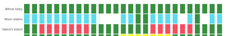
- for any value you can set the exact color of the basket:
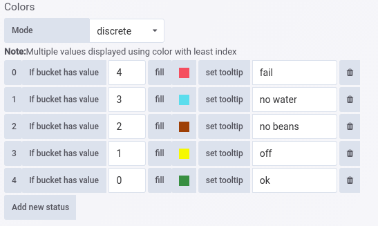
- if there are several values in the basket, the color will be taken for the value that is defined above on the Colors tab , and when you hover over the basket, all values that fall into it are displayed:

- The plugin can generate
intervalPrometheus for a request so that the baskets do not turn into pixel lines.
The result is a very convenient representation of the status of several objects . And you can see both the current status (these are the rightmost baskets) and the status of the object in time.
Where to get?
The source code of the Grafana Statusmap plugin is distributed under the free MIT license (by analogy with other plugins for Grafana) . At the moment it is available in our GitHub .
And finally, an illustration of how a Statusmap helps to visualize data with status of pods from the Kubernetes production cluster:
PS
Read also in our blog: