Laughter and the sin of pseudo-rating
Yesterday, the news caught my eye: "country X takes% some place in the ranking of good countries." News as news, ratings of this type are done regularly and in large numbers. But the news indicated a list of "best" countries and a source site. The data presented there causes a healthy laugh, and the calculation method is perplexing. About ratings and data manipulation this post.
Rating Leaders
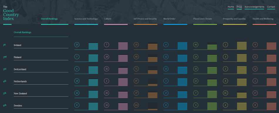
So, which countries are the best compilers in the opinion of?
- Ireland
- Finland
- Switzerland
- Netherlands
- New Zealand
- Sweden
- Great Britain
- Norway
- Denmark
- Belgium
This is the Top 10. The list is already rather strange, countries are usually small, and no memories come to mind of their “good” and “bad” deeds. It’s all the more interesting to go to their website and look at the complete lists and calculation methods.
Website
We look at their site . Hipster fashion design is already suspicious, okay, let's call it nitpicking and not take it into account. We look at the FAQ rating:
The Good Country Index tries to measure how much each country on earth contributes to the planet and to the human race.
The Good Countries Index is trying to measure the contribution to the planet and humanity of every country on Earth.
Try thinking of “good” as a measure of how much a country contributes to the common good. So in this context “good” means the opposite of “selfish”, not the opposite of “bad”.
Try to think of “good” as how much the country invests in the common good. In this context, “good” is the antonym of “selfish”, not the antonym of “bad”
OK, it is presented as a kind of rating of the countries altruism. Nothing is clear from the overall rating, let's see the rating by industry.
Industry Ratings
Numbers are only in numbers of a rating. The initial data are presented by some incomprehensible bars without indicating a value, magnitude, order, or even at least something meaningful. Which is sad and suspicious.
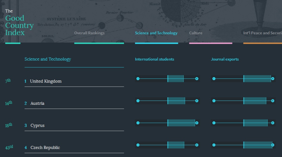
Science and technology
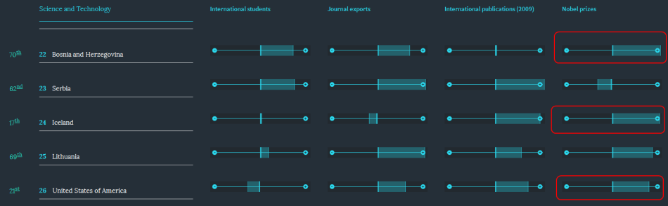
Top 10: United Kingdom, Austria, Cyprus (!), Czech Republic, Israel, Switzerland, Finland, Sweden, Hungary, New Zealand.
Evaluation criteria: international students, export of journals, international publications of 2009, Nobel laureates, patents.
You can already laugh. Cyprus with third place receives high marks in the categories of "foreign students", "export of journals", "Nobel laureates." Do you know at least one Nobel laureate from Cyprus? Google - only one . The United States is in 26th place, behind the Nobel laureates in Bosnia and Herzegovina and Iceland.
Culture
Top 10: Belgium, Netherlands, Malta (!), Austria, Germany, Estonia, Ireland, Czech Republic.
Criteria: export of “creative goods” and “creative services”, contribution to UNESCO, freedom of movement and freedom of the press. It is difficult to understand how the last two points relate to culture, but in any case, Malta's third place is puzzling. Regardless of how you consider culture to be artifacts of the film industry, indie gamedev or the weight of published books, Malta gets the highest score for some reason.
International peace and security
Top 10: Egypt (!), Jordan, Tanzania (!), Lesotho, Uruguay, Togo, Benin, Paraguay, Nigeria, Ecuador.
Criteria: peacekeepers, contribution to the UN peacekeeping budget, international conflicts, arms exports, Internet security.
To be honest, at that moment I got the feeling that the rating was drawn backwards, and the first place is the worst. But having scrolled the list all the way down, I noticed that in the tail there are also no prominent countries - Lithuania, Latvia, Hungary, Azerbaijan.
And now, attention, at the very bottom in small print are the data sources and the methodology for their processing. I hope everyone remembered that usually very unpleasant and unexpected things are written in small print in advertisements and contracts? Let's get a look:
All data is 2010 data unless otherwise indicated. Countries receive scores on each indicator as a fractional rank (0 = top rank, 1 = lowest) relative to all countries for which data is available. The actual simple ranks per category are based on the mean fractional ranks on the 5 indicators per category (subject to maximum 2 missing values per category). The overall rank is based on the average of the category ranks.
All data refer to 2010 unless otherwise indicated. Countries receive points for each indicator as a fractional rank (0 = highest, 1 = lowest) relative to all other countries for which data are available. Simple ranks for categories are based on fractional ranks for five indicators per category (up to two parameters may be absent). The final rank is based on the average rank of the categories .
It is a pity (although I think it was done on purpose) that there is no example of calculation. Because it is not clear how they consider this “fractional rank” - is it a fraction of the sum? Or something like distribution? In general, the lack of formulas directly hints at the dishonesty of the authors. What other problems can be highlighted here?
- Values are divided by the GDP of countries. The need for this is not justified. It can be assumed that the authors wanted to calculate something like “how much each citizen gives to world prosperity from his salary,” but GDP is a very rough approximation to such a calculation. Further, why, for example, is the number of peacekeepers divided by GDP? In military matters, absolute figures are more important, why do ten peacekeepers from a rich country turn out worse than one from a poor country (if the GDP of a poor country is eleven times less than a rich one, will it be)?
- The mechanism for converting a “fractional rank” to a “simple rank” is not shown at all.
- Why, when calculating the “simple rank”, the average of the ranks by category is taken? Why will a country that has made a big contribution in some area lose it due to lagging in other areas? Why isn’t using a simple amount of points, if you have once “normalized” to GDP?
Important ratings cheat
Ratings have one very deceptive property - without absolute data they become much less informative. Consider an example grotesque for clarity:
Rating of 5 countries on the availability of utilities, number of days without hot water. Countries A, B, C, D, E, F, G. Country C ranked third in the ranking. She seems to be in a good position, right? Now let's see the initial data:
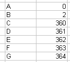
Agree, in this case, the third place in the ranking is worth little.
Conclusion
If you see any rating, no matter which country takes its place in it, relate to the data with a certain degree of criticality, try to think about where this data was received from, how it was processed, so as not to become a victim of dishonest manipulators.