How I made a power control widget for my browser-based space flight simulator
Today I made a small snippet of code for myself and decided to share its contents and the history of its creation with the community.
I searched the Internet for quite some time in order to find at least something similar to what I needed, but the Internet has still not encountered such a problem apparently or no one has decided to create such a widget. Probably no one needed.
To start, I’ll say what I really wanted:
I need a slider - an analogue of the volume control, combined with a progress bar. A kind of power control component of something, combined with a simultaneous indication of this power. Sometimes the power can exceed the set limit of 100% - you need to display this level and correctly calculate the percentage. Sometimes the power can go below zero (I don’t know if it can - but just in case, I have provided such an opportunity) and this level also needs to be displayed. Moreover, the device that we regulate may not be inert and accelerate at the speed with which we set the value. If you pressed the afterburner button on an airplane, then the engines will go into afterburner mode after a while. That is, you must separately set the progress bar value and also separately obtain-set the current value of the slider slider.
Maybe I’m a fig seeker, but in the end I freaked out - I decided to make my own:
Here is a link to the result, and under the cat a description of the process
First, create a widget frame:
I’ll make a reservation right away - I would like to be as independent as possible from jquery.js and jqueryui.js - so I did not design this widget as a jQuery plugin.
For drag and drop everything is commonplace: on mousedown, we save the state, on mouseup, we reset it.
There are quite a few auxiliary variables that set the position only in the right place of this canvas. In the widget, in addition to its main part, you also need to add the output of accurate information - the current value of the progress bar and slider. I decided to do this inside the canvas, although here we come across quite understandable problems with the positioning of the text. Text output - a little later.
For the slider control itself, we select some area from this canvas. We will have it limited:
something like this:
Let me remind you that the Bezier curve contains three points in the input parameters. The fourth point is the current one, we must go to it using moveTo.
the general meaning of drawing such a curve:
We get a beautiful frame with rounded ends.
Now we start the magic:
In order to draw a zone of negative interest and a zone of afterburner we will use clips. A clip is simple, first we create a path inside which drawing takes place, and then we repeat drawing a border with only one difference - we will not circle this path, but fill it with the desired color from the inside. It sounds corny and simple, it also looks not complicated.
First we define, where to draw it, all that is to zero - we draw in a separate color.
Create a drawing area
And fill the same bezier with the desired color.
By analogy, we act with an area above 100%.
We need to set the value on the widget and pick it up, converting the coordinates of the mouse cursor to a percentage and vice versa.
I wrote two very simple functions for this:
Want to make both visual and accurate? Please, but then you can not do without text data.
We will draw the text to the right of the indicator line. Separately, we will draw the state of the slider, separately the progress bar. I think you can experiment with the location, but for now let's do it.
To begin with, we will display the percentage, and not how it is implemented inside - that is, we multiply by one hundred.
That is, they received separately the whole, separately fractional parts. We will draw them in different sizes, but first we’ll generally calculate which font is better for us. I decided to make a simple dependency that does not work too well in some conditions:
Ready-made indicator can be used. Color settings for it can be set directly. Unfortunately, the decision to use canvas did not leave us with wide opportunities to paint it using css, but canvas has other advantages - in particular, it can be used to attach additional strokes and rulers to this indicator. Fortunately, canvas can very accurately draw geometric shapes.
For those who want to pick it up or use it, I leave the address of the repository github.com/stavenko/power-control-widget. Today this widget worked with only one browser - Google Chrome, and I honestly am not sure that events will work correctly in other browsers. In particular, events may not have mouse coordinates in offsetX variables. And it was very convenient - no need to calculate the coordinates - they are immediately given relative to the top-left of the container.
That’s all for today.
I searched the Internet for quite some time in order to find at least something similar to what I needed, but the Internet has still not encountered such a problem apparently or no one has decided to create such a widget. Probably no one needed.
To start, I’ll say what I really wanted:
I need a slider - an analogue of the volume control, combined with a progress bar. A kind of power control component of something, combined with a simultaneous indication of this power. Sometimes the power can exceed the set limit of 100% - you need to display this level and correctly calculate the percentage. Sometimes the power can go below zero (I don’t know if it can - but just in case, I have provided such an opportunity) and this level also needs to be displayed. Moreover, the device that we regulate may not be inert and accelerate at the speed with which we set the value. If you pressed the afterburner button on an airplane, then the engines will go into afterburner mode after a while. That is, you must separately set the progress bar value and also separately obtain-set the current value of the slider slider.
Maybe I’m a fig seeker, but in the end I freaked out - I decided to make my own:
Here is a link to the result, and under the cat a description of the process
Getting started
First, create a widget frame:
var PowerControlWidget = function(settings){
     this.container = settings.container || undefined ;
     this.canvas = document.createElement('CANVAS');
     this.canvas.height = this.height;
     this.canvas.width = this.width;
	this.container.appendChild(this.canvas);
	this.ctx = this.canvas.getContext('2d');
        // --- Набор полезных функций
	this.set_value(0);
	this.redraw()
}
I’ll make a reservation right away - I would like to be as independent as possible from jquery.js and jqueryui.js - so I did not design this widget as a jQuery plugin.
Event handling
For drag and drop everything is commonplace: on mousedown, we save the state, on mouseup, we reset it.
var self = this;
this.canvas.addEventListener("mousedown", function(event){
		self.mouse_down = true;
		self.value = event.offsetX;
		if(event.offsetX < self.padding_left_right){
			self.value = self.padding_left_right;
		}
		if(event.offsetX > self._line_width - self.padding_left_right){
			self.value = self._line_width - self.padding_left_right;
		}
		self._percent_value = self._get_percent(self.value);
		self.redraw();
		self.onchange(self._percent_value, self.progress_value);
	})
	this.canvas.addEventListener("mouseup", function(event){
		self.mouse_down = false;
		self._percent_value = self._get_percent(self.value);
		self.redraw();
		self.onchange(self._percent_value, self.progress_value);
	})
	this.canvas.addEventListener("mousemove", function(event){
		if (self.mouse_down){
			self.value = event.offsetX;
			if(event.offsetX < self.padding_left_right){
				self.value = self.padding_left_right;
			}
			if(event.offsetX > self._line_width - self.padding_left_right){
				self.value = self._line_width - self.padding_left_right;
			}
			self._percent_value = self._get_percent(self.value);
			self.redraw();
			self.onslide(self._percent_value, self.progress_value);
		}
	})
There are quite a few auxiliary variables that set the position only in the right place of this canvas. In the widget, in addition to its main part, you also need to add the output of accurate information - the current value of the progress bar and slider. I decided to do this inside the canvas, although here we come across quite understandable problems with the positioning of the text. Text output - a little later.
Start drawing
For the slider control itself, we select some area from this canvas. We will have it limited:
- this._line_width - Width of the slider
- left-right indent
- indent from top to bottom
something like this:
this._draw_border = function(){
		var b = this.padding_top_bottom; // вспомогательный параметры для кривой безье.
		var a = this.padding_left_right;
		var w = this._line_width - ( 2 * a );
		var h =  this.height - (2*b);
		this.ctx.beginPath();
		this.ctx.moveTo(a,b);
		this.ctx.bezierCurveTo(a+(w/2), b, w-(w/2)+a, b, a+w, b );
		this.ctx.bezierCurveTo(a+w+a, b, a+a+w, b+h, a+w, b+h );
		this.ctx.bezierCurveTo( w/2+a, b+h, w/2+a,b+h, a, b+h);
		this.ctx.bezierCurveTo( 0, b+h, 0,b, a,b);
		this.ctx.closePath();
		this.ctx.strokeStyle = this.border_color;
		this.ctx.stroke(); // рисуем границу нужным цветом
	};
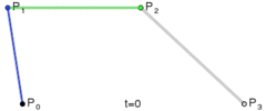
Let me remind you that the Bezier curve contains three points in the input parameters. The fourth point is the current one, we must go to it using moveTo.
the general meaning of drawing such a curve:
We get a beautiful frame with rounded ends.
Now we start the magic:
In order to draw a zone of negative interest and a zone of afterburner we will use clips. A clip is simple, first we create a path inside which drawing takes place, and then we repeat drawing a border with only one difference - we will not circle this path, but fill it with the desired color from the inside. It sounds corny and simple, it also looks not complicated.
First we define, where to draw it, all that is to zero - we draw in a separate color.
var zero = this._get_x(0); // Магическое число ноль в исходном коде ставить можно
Create a drawing area
			this.ctx.beginPath();
			this.ctx.rect(0,0, zero, this.height);
			this.ctx.clip();
And fill the same bezier with the desired color.
			this.ctx.beginPath();
			this.ctx.bezierCurveTo(a+(w/2), b, w-(w/2)+a, b, a+w, b );
			this.ctx.bezierCurveTo(a+w+a, b, a+a+w, b+h, a+w, b+h );
			this.ctx.bezierCurveTo( w/2+a, b+h, w/2+a,b+h, a, b+h);
			this.ctx.bezierCurveTo( 0, b+h, 0,b, a,b);
			this.ctx.fillStyle = this.below_z_color;
			this.ctx.fill();
			this.ctx.closePath();
			this.ctx.restore();
By analogy, we act with an area above 100%.
A little bit about computing
We need to set the value on the widget and pick it up, converting the coordinates of the mouse cursor to a percentage and vice versa.
I wrote two very simple functions for this:
	this._get_percent = function(x){
		var a = this.padding_left_right; // отступы слева и справа
		var w = this._line_width - (2*a); // ширина слайдера
		return ((x - a) * this._range/ w)+this.starting_percent ;
                // Вычитаем из координат мыши ширину отступа, умножаем на разброс от стартового процента до конечного, делим на ширину слайдера и добавляем стартовый процент.
	};
	this._get_x = function(p){
		var a = this.padding_left_right;
		var w = this._line_width - (2*a);
		return a+ (p - this.starting_percent) * w / this._range;
// Наоборот
	};
Well, a little bit about drawing text
Want to make both visual and accurate? Please, but then you can not do without text data.
We will draw the text to the right of the indicator line. Separately, we will draw the state of the slider, separately the progress bar. I think you can experiment with the location, but for now let's do it.
To begin with, we will display the percentage, and not how it is implemented inside - that is, we multiply by one hundred.
		var val = this._percent_value * 100
		var int = Math.floor(val);
		var frac = Math.floor((val - int)*100);
That is, they received separately the whole, separately fractional parts. We will draw them in different sizes, but first we’ll generally calculate which font is better for us. I decided to make a simple dependency that does not work too well in some conditions:
		var base_font_size = this.height - (this.padding_top_bottom*2) ; // размер шрифта целой части
		var add_font_size = Math.floor(base_font_size / 2); // размер шрифта дробной части
		var base_marg = base_font_size *2; // Отступ слева
		this.ctx.save()
		this.ctx.translate(this._line_width+ this.padding_top_bottom,  this.height-this.padding_top_bottom);
		this.ctx.fillStyle = "#000";
		this.ctx.font = base_font_size + "pt Arial";
		this.ctx.textAlign = "end"; // Алигн по концу строки
		this.ctx.fillText("" + (int), base_marg, 0 )
		this.ctx.textAlign = "center";
		this.ctx.font = (base_font_size -2) + "pt Arial";
		this.ctx.fillText(",", base_marg+1,0 )
		this.ctx.font = add_font_size + "pt Arial";
		this.ctx.textAlign = "start"; // Алигн по началу строки
		this.ctx.fillText("" + (frac), base_marg+3, 0 )
		this.ctx.restore();
Conclusion
Ready-made indicator can be used. Color settings for it can be set directly. Unfortunately, the decision to use canvas did not leave us with wide opportunities to paint it using css, but canvas has other advantages - in particular, it can be used to attach additional strokes and rulers to this indicator. Fortunately, canvas can very accurately draw geometric shapes.
For those who want to pick it up or use it, I leave the address of the repository github.com/stavenko/power-control-widget. Today this widget worked with only one browser - Google Chrome, and I honestly am not sure that events will work correctly in other browsers. In particular, events may not have mouse coordinates in offsetX variables. And it was very convenient - no need to calculate the coordinates - they are immediately given relative to the top-left of the container.
That’s all for today.