12 little-known CSS features
- Transfer
 CSS is not a very complicated language. But even if you have been writing style sheets for many years, there are probably times when you learn something new: properties or values that you have never used, details of a specification that you had no idea about.
 In the process of working with CSS, I constantly find something interesting, so I decided to write a post and share my knowledge with you. True, keep in mind that not everything that will be discussed has immediate practical significance, but, just in case, it will come in handy on the farm.
color not only text colors
Let's start with simple things. The property is
colorused by developers constantly. Those of you with less CSS experience might not have known that this property determines more than just the color of the text!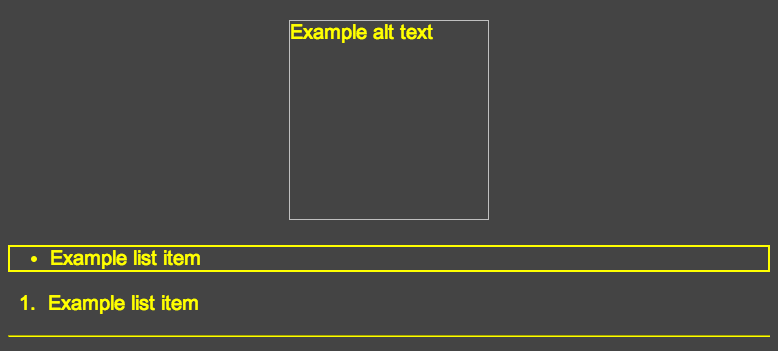
HTML
<imgalt="Example alt text"width="200"height="200"><ul><li>Example list item</li></ul><ol><li>Example list item</li></ol><hr>CSS
body {
  color: yellow;
  background: #444;
  font-size: 20px;
  font-family: Arial, sans-serif;
  text-align: center;
}
ul {
  border: solid 2px;
  text-align: left;
}
ol {
  text-align: left;
}
hr {
  border-color: inherit;
}
Note that in CSS, the property
color:yellowis only used once for an element body. As you can see, everything turned yellow:- Alternate text in place of missing image
- Border for list items
- Bulleted list marker
- Sort List Number
- Element
hr
Interestingly, by default, the element
hrdoes not inherit the value of the property color, but this can be achieved by setting the border-colorvalue to the property inherit. As for me, this is a bit strange behavior. The demonstrated is confirmed by the specification :
This property describes the foreground color of the text content of the element. In addition to this, it can be indirectly used by other properties that take on color values.
I have not yet figured out what this “foreground” is, but if you know something, write about it in the comments. As I understand it, the foreground in this case refers to the color of the text itself, and not the background, as well as non-background elements - approx. translator.
Property visibilitymay mattercollapse
You must have used the property
visibilitymore than once. “Normal” values are visible(by default for all elements) and hiddenwhich hides the element, leaving a place for it (unlike display:none). The third, rarely used meaning is
collapse. It works the same way as hiddenfor all elements except table rows, columns and their groups. In the case of table elements, it is assumed that the value collapsewill hide them similarly display:nonein such a way that other contents of the table are located in the place they previously occupied. 
Expected Behavior
Unfortunately, not all browsers handle this value the same way. For this reason, CSS-Tricks doesn’t recommend it at all.use this property. Try the demo .
From what I discovered:
- In Chrome, there is no difference between
collapseandhidden(see this bug report and comments ) - In Firefox, Opera and IE 11
collapse, it seems to work as it should: a row of the table is deleted, and the one that was lower goes up
Now you know a little more, however, due to the different behavior of browsers,
visibility:collapseit hardly makes sense to use.New property values background
In CSS 2.1, shorthand property
backgroundincludes five values of the following properties: background-color, background-image, background-repeat, background-attachmentand background-position. Starting with CSS 3, three more values were added, so this property now looks like this:background: [background-color][background-image][background-repeat][background-attachment][background-position] / [background-size][background-origin][background-clip]Pay attention to the slash, which is put there like a short record of the property
fontand border-radius[link]. This slash will allow you to include the value background-sizeafter background-positionin those browsers that support it. You can also add two more values: background-originand background-clip. Final syntax:
.example {
     background: aquamarine url(img.png)
              no-repeat
              scroll
              center center / 50%
              content-box content-box;
}
You can try it here .
New values work in all modern browsers, however, you should not forget about the old people, offering an adequate replacement.
The property cliponly works on absolutely positioned elements.
Surely you are aware of the property
clip. It is used like this:.example {
clip: rect(110px, 160px, 170px, 60px);
}
This rule will “crop” an element from four sides by the specified number of pixels. The only caveat is that the element to which you apply this property must be positioned absolutely.
.example {
    position: absolute;
    clip: rect(110px, 160px, 170px, 60px);
}
Now look how the property
clipstops working if we remove the absolute positioning of the element. In addition,
position:absoluteyou can also use position:fixed, because, according to the documentation, the fixed elements also qualify as “absolutely positioned”.Vertical percentages are calculated relative to the width of the container, not its height.
At first it’s hard to understand, and I wrote about it . Perhaps you know that the lengths of the elements, indicated as a percentage, are calculated based on the length of their container. So, the upper and lower inner margins (padding) and the same outer margins are also calculated based on the width of the container, not its height.
Check out the demo .
Notice that the nested element has three indents defined as a percentage (upper and lower inner indents and lower outer indent). The slider only changes the width of the container. However, its change affects the calculation of indents. The dependence on the width of the container is shown in the output values on the page.
Border property
We have all done this:
.example {
  border: 1px solid black;
}
A property
bordercombines the values of properties border-width, border-styleand border-colorin a single design. But do not forget that each of the properties whose value it contains borderis itself an abbreviated notation. So, for example, it border-widthcan be written as follows:.example {
border-width: 2px5px1px0;
}
Thus, we will set a different frame width for all four sides of the element. The same applies to
border-styleand border-color. Something so terrible can be obtained: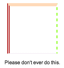
HTML
<divclass="box"></div><p>Please don't ever do this.</p>CSS
body {
  font-family: Arial, sans-serif;
}
.box {
  width: 150px;
  height: 150px;
  margin: 20px auto;
  border-color: peachpuff chartreuse thistle firebrick;
  border-style: solid dashed dotted double;
  border-width: 10px3px1px8px;
}
p {
  text-align: center;
}
You can go even further and set these values individually using characteristics
border-left-style, border-top-width, border-bottom-colorand so on. The trick is that with the help
borderyou can not set different values for different sides. Thus, it turns out something like a shortened record inside a shortened record inside a shortened record.Property text-decorationis now abbreviated
I knew that something from this list would certainly turn your head. And the specification says that now it is a standard.
a {
  text-decoration: overline aqua wavy;
}
This feature can now contain the values of three properties:
text-decoration-line, text-decoration-colorand text-decoration-style. Unfortunately, Firefox is the only browser that supports new properties, but at the same time (apparently, to ensure backward compatibility) does not support abbreviated syntax. 
Expected Result.
Try this demo in Firefox. It uses new properties individually. You need to be careful with them, because at this time browsers will not be able to parse additional values for the property
text-decorationand simply skip it. And this is not good from the point of view of backward compatibility.The property border-widthsupports key values.
This, of course, not something out of the ordinary, and is not new, however, besides the usual widths (eg.
5pxOr 1em) border-widthsupports three key values medium, thinand thick. In fact, the initial value of the property
border-widthis medium. The value is shown below thick: 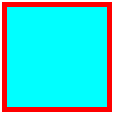
The CSS specification does not specify a specific width for key values, however, all browsers use
1px, 3pxand 5pxaccordingly."Nobody is using border-image"
Not so long ago I wrote about a property
border-imageon SitePoint . It is supported by all modern browsers, with the exception of IE 10 and below. But who cares? border-image- a very funny property that allows you to frame the container with a certain image. 
Also see the demo .
Unfortunately, it
border-imageis one of the new products that is not very popular. Although, maybe I'm wrong. If you have any usage examples, border-imagewelcome to comment!There is such a property empty-cells
And it is supported by all browsers, including IE 8:
table {
  empty-cells: hide;
}
I think you already understood that this property is used in relation to tables. It tells the browser to hide or show empty cells. Try this demo .
In this case, I deliberately set a frame border on the cells and added small indents so that the difference between the two states was visible, although in some cases changing this property may not have any visual effect.
Property font-stylesupports valueoblique
The most used values for this property are
normaland italic. But there is also oblique. 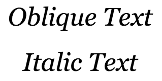
And what does that mean? Why does the text look the same as if it were written in italics?
The specification explains this behavior as follows:
... selects a font marked as oblique, otherwise italic.
The description of italics in the specification is about the same. The term “oblique” - from typography, denotes, in fact, oblique text, but not a real Italian.
CSS treats oblique text in such a way that the value is
obliqueinterchangeable with italic(as the specification says) until the font used has a separate oblique font. I do not know fonts that would have an oblique style, but I could be wrong. (It’s wrong. I can’t give specific font names myself (they definitely exist), but in the comments on the original article they give the Helvetica font as an example, - approx. Translator)As I understand it, a font cannot have both styles: italic and oblique at the same time, since oblique is an artificial replacement for italics in those fonts that don't have it. (Here, too, it is somewhat doubtful, especially with regard to replacing italics - approx. Translator)
So, if I am not mistaken when the font does not have italics, the value of the property
font-style:italicwill actually show us the value of the property font-style:oblique. Thank you very much Ogi for comments regarding the confusion in the terminology, now this has been fixed and instead of “headset” - “style”, and instead of “Italian” - “italics” - approx. translator
word-wrap - the same as overflow-wrap
The property is
word-wrapused less frequently, but in some cases it may be useful. A very common example is breaking up a long continuous line of text to avoid going outside the container. Since this property was invented by Microsoft, it is supported by all browsers, including IE from version 5.5.
Despite cross-browser accessibility and proper support, W3C decided to replace the property
word-wrapwith overflow-wrap: apparently, they considered the previous name to be incorrect. overflow-wraphas the same meanings as word-wrap, and the latter is now regarded as "alternative." Despite the fact that support is
overflow-wrapstill not widespread, do not worry, because we can still useword-wrap: Browsers support it, including for backward compatibility. As for
overflow-wrap- there already when all the popular browsers are updated, but for now I see no reason to change something.How much new have you learned from all this?
At least something is good. Surely cool guys know most, if not all of the above. But less advanced developers find this very useful.
Welcome to the comments!