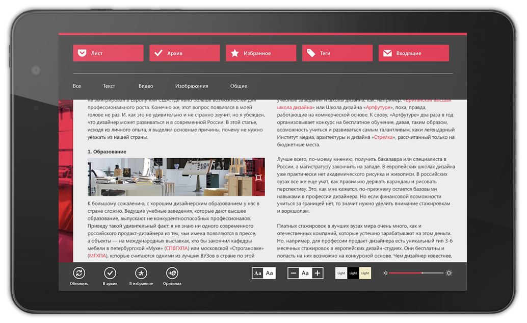
Pocket app concept for Windows
Surely everyone is familiar with Pocket - an application that allows you to save interesting materials from the network for later reading. Pocket is present on all major platforms except Windows and Windows Phone. Now we are talking about the official client. In the Windows store and in the Windows Phone store, there are quite a lot of unofficial clients that allow you to use the service. What is the POKI app worth ?
However, for Windows there is still no adequate client that could provide full access to all the functions of the service. And since in e-Legion we love WP and W8 and have a lot of development expertise for these platforms, our designer Vladimir Morochkovsky decided to demonstrate what Pocket for Windows can be.
The key to success of any application is navigation and interface logic. The application can be arbitrarily beautiful, but if it has illogical navigation and does not solve the user's tasks, it will be deleted.
Windows provides two principles for organizing navigation: a flat model and a hierarchical one.

Most users use Pocket read-only. It looks like this: I add material, then I read it, then either transfer it to the archive or to my favorites. Thus, I do not place tags, I do not use the inbox and other functions.
It turns out that all rarely used functions are best taken outside the main script (add / read / delete). From all this it follows that navigation is best suited here, in which the hierarchical model will dominate.
Another interesting and convenient scenario that allows you to implement Windows 8.1 is adding materials to the sheet.
If someone tried IE 10 to surf the Internet in tablet mode, they will confirm how really convenient it is.

I don’t know how the work on products at Microsoft works, but the IE 10 team did a really cool thing.
Another interesting feature that the panel with charms allows you to implement is the application search.
Yes, with the advent of Windows 8.1, the search has changed a bit. Now developers are encouraged to do a standard search built into the application page. The most striking example is the application store (Windows store).

But no one has canceled the convenient and more ergonomic “combined search”. How does he work?

The essence of the “combined search” is that the entire search, whether it is a search on the contents of a computer or a search on an application, lives in one place - in the SEARCH charm button.
This approach offers the widest range for performing searches.

Everything is cool too. All the same miracle buttons come to the rescue. Open the material, click share, select the channel, send.

Moreover, all these scenarios make life easier for users, designers and developers.
And the output is a clean interface ... zen.
I believe that all the hype around the tiled interface in the context of “not convenient, not clear, sucks” is contrived and exaggerated.

Well, see for yourself how the “tiled approach” captures all possible interfaces. Sites, applications, payment terminals. Yes, any interface. And the point here is not at all that Microsoft - well done, invented everything, but picked it up. Not. It’s just very logical and timely.
Dead Tile is a dead application. It is like a window from which nothing is visible.

A tile is an entry point. The connecting channel between the user and your application. It is the tile that motivates the user to launch the application at the moment when the application wants to get the user's attention.
In the case of Pocket, the tile scrolls the list of the last three materials added. In the format picture + text.

Using the Pocket application concept as an example, I showed 5 main advantages of Windows 8.1, which allow using minimal efforts to make the application convenient and unique without losing functionality on the way.
The full concept can be viewed here . Behind WP and W8 applications directly in e-Legion . And, of course, I will be happy to answer questions in the comments.
However, for Windows there is still no adequate client that could provide full access to all the functions of the service. And since in e-Legion we love WP and W8 and have a lot of development expertise for these platforms, our designer Vladimir Morochkovsky decided to demonstrate what Pocket for Windows can be.
Navigation
The key to success of any application is navigation and interface logic. The application can be arbitrarily beautiful, but if it has illogical navigation and does not solve the user's tasks, it will be deleted.
Windows provides two principles for organizing navigation: a flat model and a hierarchical one.
Most users use Pocket read-only. It looks like this: I add material, then I read it, then either transfer it to the archive or to my favorites. Thus, I do not place tags, I do not use the inbox and other functions.
It turns out that all rarely used functions are best taken outside the main script (add / read / delete). From all this it follows that navigation is best suited here, in which the hierarchical model will dominate.
Adding Material
Another interesting and convenient scenario that allows you to implement Windows 8.1 is adding materials to the sheet.
If someone tried IE 10 to surf the Internet in tablet mode, they will confirm how really convenient it is.
I don’t know how the work on products at Microsoft works, but the IE 10 team did a really cool thing.
Search
Another interesting feature that the panel with charms allows you to implement is the application search.
Yes, with the advent of Windows 8.1, the search has changed a bit. Now developers are encouraged to do a standard search built into the application page. The most striking example is the application store (Windows store).
But no one has canceled the convenient and more ergonomic “combined search”. How does he work?
The essence of the “combined search” is that the entire search, whether it is a search on the contents of a computer or a search on an application, lives in one place - in the SEARCH charm button.
This approach offers the widest range for performing searches.
Share material
Everything is cool too. All the same miracle buttons come to the rescue. Open the material, click share, select the channel, send.
Moreover, all these scenarios make life easier for users, designers and developers.
And the output is a clean interface ... zen.
Living tiles
I believe that all the hype around the tiled interface in the context of “not convenient, not clear, sucks” is contrived and exaggerated.
Well, see for yourself how the “tiled approach” captures all possible interfaces. Sites, applications, payment terminals. Yes, any interface. And the point here is not at all that Microsoft - well done, invented everything, but picked it up. Not. It’s just very logical and timely.
Dead Tile is a dead application. It is like a window from which nothing is visible.
A tile is an entry point. The connecting channel between the user and your application. It is the tile that motivates the user to launch the application at the moment when the application wants to get the user's attention.
In the case of Pocket, the tile scrolls the list of the last three materials added. In the format picture + text.
Summary
Using the Pocket application concept as an example, I showed 5 main advantages of Windows 8.1, which allow using minimal efforts to make the application convenient and unique without losing functionality on the way.
The full concept can be viewed here . Behind WP and W8 applications directly in e-Legion . And, of course, I will be happy to answer questions in the comments.