Promo site for a mobile application. Part 1
Disclaimer
Not everyone thinks about making a website for their mobile application.
Those who think about it cannot decide what should be on the site in order for it to become a seller.
I am sure that my advice will not be a revelation for you, just, as it often happens, you can’t always look at your work from the side and take into account moments that are simply not visible with a “blinded look”.
Why do we need a promotional site when there are application stores, thematic media, social, banner networks, etc. etc.?
Of course, there are a bunch of other ways to attract attention to your mobile application and increase the number of installations, the site is one of such methods, though not the most effective, but it certainly should not be at the end of your list of priorities.
A mobile application site is an integral element of its promotion.
Search traffic can bring a significant percentage of total installations in the long run to ignore it. If you skillfully use various “calls to action” and maintain the content being updated, you can make your application a “mini-market” from your site.
Technical support for users of the application is also more convenient to bind to the site.
If you are planning to conduct a marketing study of the users of your mobile application, the site can help with this.
Contests in social networks can also be advertised through the site and so on.
More important than the question of “what,” can only be “when”
The site of the mobile application should appear during its development, and not after.
The beta version of your product is a unique opportunity to begin to form a loyal audience of your users before the release, not to mention the advantages of open testing to refine the mobile application itself.
Test your legendary
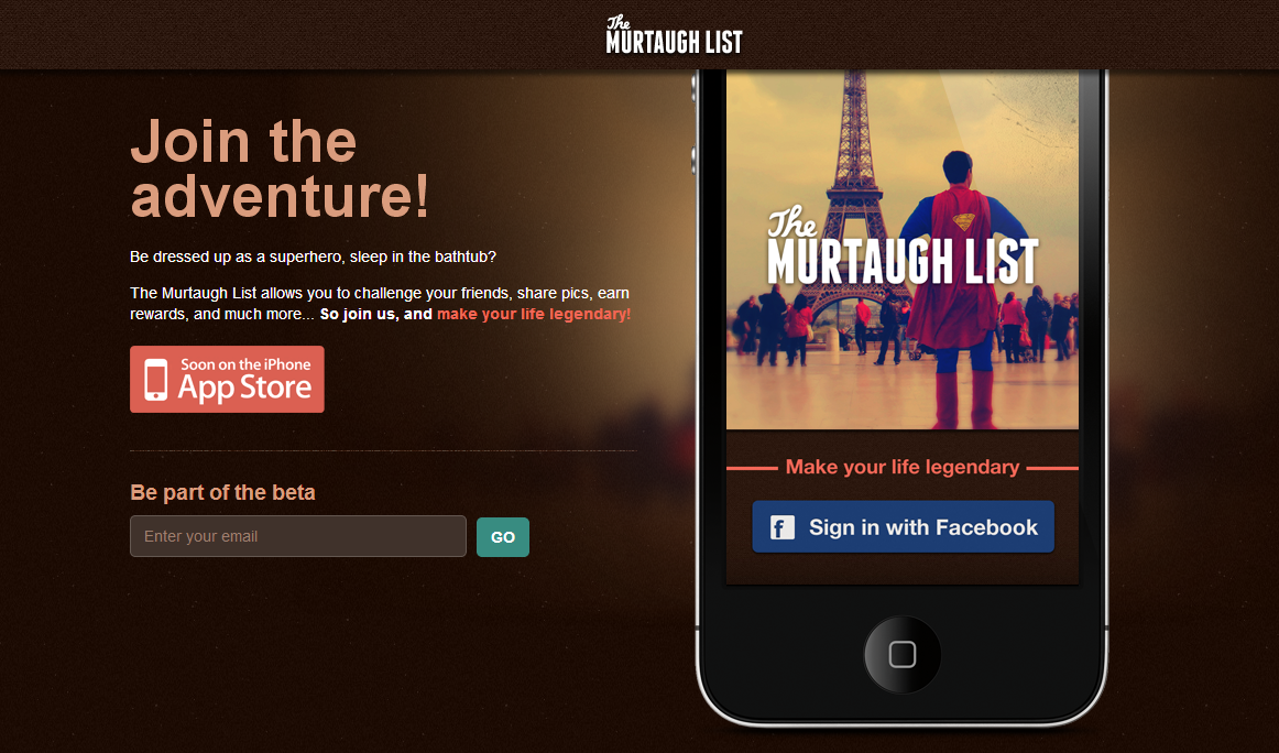
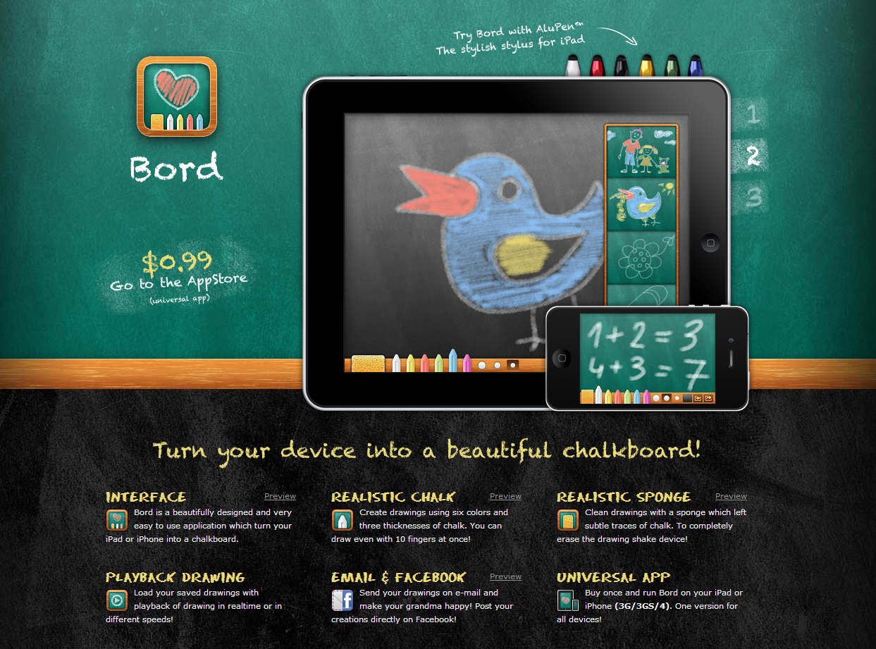
Immersion in the atmosphere through design.
Many people think that visitors do not like to read texts, this is not entirely true. It’s just that the Internet community has become so selective that it gives you from 1 to 3 seconds (maximum) to interest yourself in the contents of your site.
Each person receives a dose of up to 6,000 advertising messages per day (heard at one of the conferences), of course, the brain has adapted to reject not quite the right information even at the stage of its preview.
A design that catches the mood of the user, or evokes the necessary emotion and talks about the main purpose of your mobile application without words, significantly increases the chances of your site being viewed.
Those who have once experienced such a situation or experience similar fears will not pass by this site.

Anyone who loved to draw with chalk on asphalt or a blackboard will not remain indifferent.
Read about Trevor van Gorp's presentation of emotional design and unusualStephen Anderson's Interface Design Tool
All designers should familiarize themselves with the theory of light by Joseph Albers (Josef Albers).
Think of the texts on the site as a conversation with the
SEO user should be smart, thought concise, texts simple, but emotional.
You can read about the information style, learn from the leading media of your subject or ...
just write what the user will receive from your application without loud or abstruse words, participial or complex speech turns.
I'm sure you know everything about bulleted lists, paragraphs, intriguing headlines, but remember one thing:
The more the text of your site looks like a conversation with a user, the more interesting it will be for him to communicate with you. No moralizing, assurances, warnings, long and confusing reasoning. Be interesting conversationalists.
Twitter format for the message on the main page
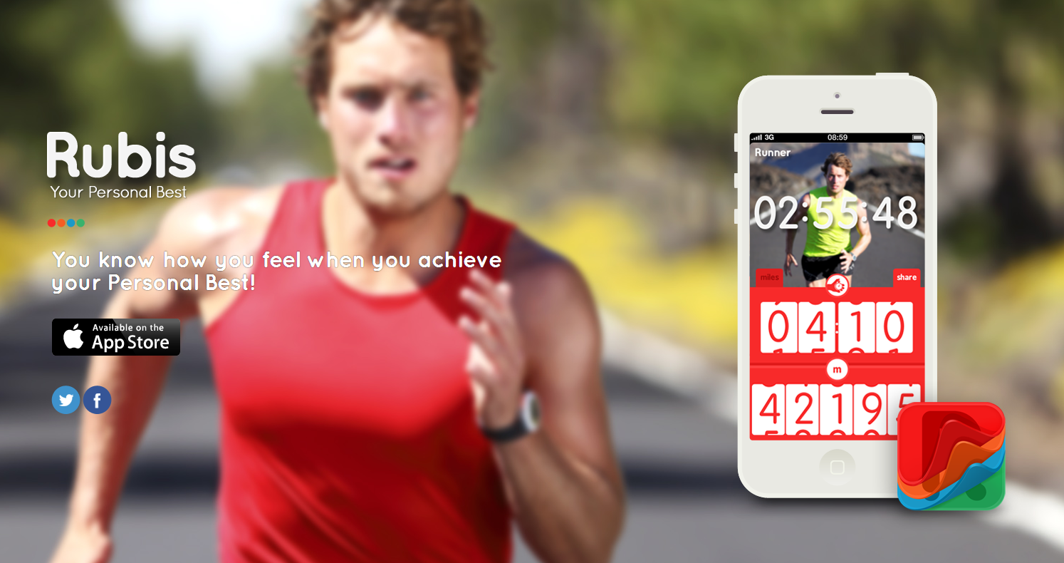
Place the story about your application in one tweet (140 characters with spaces), choose the main advantage of your application and connect it with the main need of its target audience with the help of feelings and emotions.
You know how you feel when you achieve your Personal Best!
Limited Web version for the lazy, directly on the site, without installation
Most promo sites for mobile applications look like a one-page site looking down, almost always flat in design, sometimes with parallax, where you only need to press one button, or one to choose depending on the mobile religion: “Android app on Google Play” / ”Download on the App Store”.
What do you want to surprise the average user "fed up" with free applications with, who is too lazy to press one button? Installing a free application on a smartphone is perceived by some individuals as something from the category: “Well, okay, persuaded, I'll see it be so”.
Suggest an alternative. A limited Web version of the mobile application directly on the site, which does not even need to be installed and, yes, write something extraordinary on the button.
Browse challenges online

80% of people are visuals, show them a video about your application
Vision is the main organ of senses and with the development of 3D animation, augmented reality and other visualization technologies, the dominant of the visual apparatus in the process of life will only be strengthened.
You have not noticed for yourself that it’s easier for you to watch a YouTube video about how to handle a particular thing than to read the instructions that come with it.
Interesting in the plot (this is the first), short in duration (this is the second), a beautifully shot (this is the third) video about your application will tell more about it than text that is read diagonally, with headlines or in separate phrases.
Nontrivial mobile app development
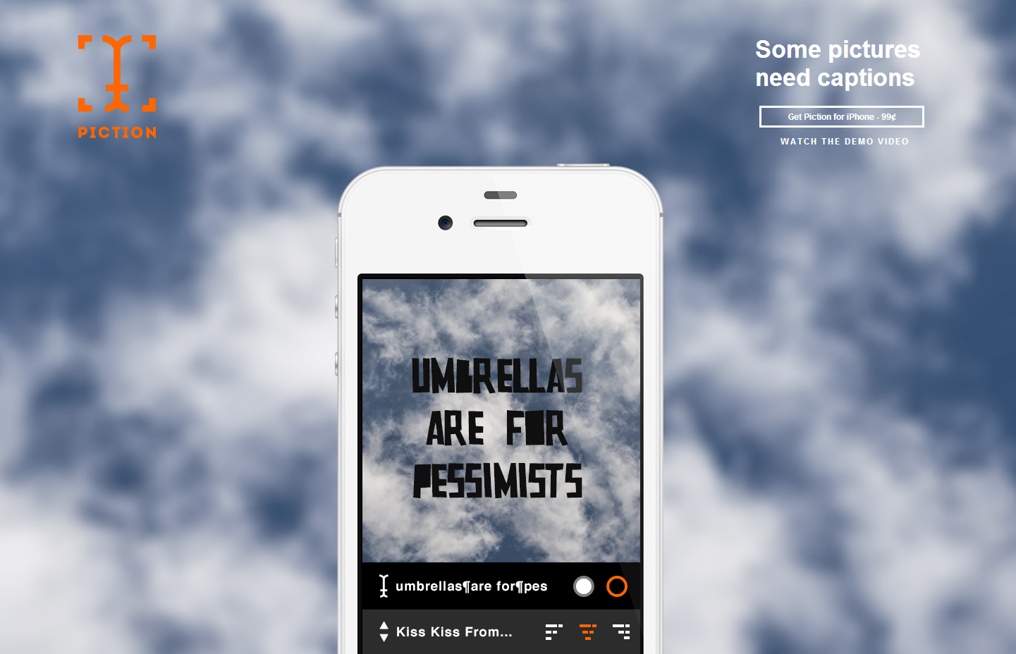
If the idea of the application is so simple and understandable that you can talk about it without words, show it.
No comment
Give visitors the opportunity to talk about the application in the social. networks
Despite the obviousness of this point, some developers of promo sites either completely forget about the social activity of their visitors, or place buttons on social networks where they still need to be found.
Do not limit yourself to buttons, give the site visitor the opportunity to log in to it through an account in one of the popular social networks in exchange for tangible benefits from this action.
Feedback - Fast and Unobtrusive
Promo sites are focused on one action, in the case of promotional sites for mobile applications - this is the button “Android app on Google Play” and (or) “Download on the App Store”.
Keep in mind that when you ask a visitor, for example, to leave contacts to participate in testing a developed mobile application, this should be one text field for e-mail.
No matter what you think about your application, you still won’t be believed
The so-called “Social proof” is very important for the promotion site, but it must be correct. Confidence levels for reviews, like circles on the water, the farther the weaker. Most of all, you trust yourself, then family members, close friends, good friends, and so on. You, as a developer, are in last place with the user, and customers of applications from your portfolio are in the last but one.
Another thing is recognized industry experts, whose names are on everyone’s lips. They violate the above logic and invade the trust of users. Contact them, get interested in your project, pay money for testing, because they will not take money from you for the test.
No self-respecting Internet resource, especially with a name, will write a review for an application that is unworthy, their business reputation and professional ratings are definitely not worth the money, do not even hope.
It is also necessary to do this because it will be a good test of the ambitions of your mobile application for success.
APProved

A or B?
Do not neglect A / B testing.
As a rule, the developers of a promotional website provide 2 options for the concept of your landing page. If both are standing, do not make a choice now, implement both options and test on visitors. Web analytics will tell you which option is the most successful and what you can borrow from the least successful.
Even the length of the landing page matters, Brian Honigman discusses this in a Long vs. article Short Landing Page - Which One Works Better?
In conclusion, the
site for a mobile application will be judged on the application itself.
With fierce competition in application stores, a promotion site can become a kind of bridge between search results and a page in the store with the only difference being that you already clicked on the “Android app on Google Play” / ”Download on the App Store” button something like it.
We pass from theory to practice in the next post: " Promo site for a mobile application. Part 2 "
Not everyone thinks about making a website for their mobile application.
Those who think about it cannot decide what should be on the site in order for it to become a seller.
I am sure that my advice will not be a revelation for you, just, as it often happens, you can’t always look at your work from the side and take into account moments that are simply not visible with a “blinded look”.
Why do we need a promotional site when there are application stores, thematic media, social, banner networks, etc. etc.?
Of course, there are a bunch of other ways to attract attention to your mobile application and increase the number of installations, the site is one of such methods, though not the most effective, but it certainly should not be at the end of your list of priorities.
A mobile application site is an integral element of its promotion.
Search traffic can bring a significant percentage of total installations in the long run to ignore it. If you skillfully use various “calls to action” and maintain the content being updated, you can make your application a “mini-market” from your site.
Technical support for users of the application is also more convenient to bind to the site.
If you are planning to conduct a marketing study of the users of your mobile application, the site can help with this.
Contests in social networks can also be advertised through the site and so on.
More important than the question of “what,” can only be “when”
The site of the mobile application should appear during its development, and not after.
The beta version of your product is a unique opportunity to begin to form a loyal audience of your users before the release, not to mention the advantages of open testing to refine the mobile application itself.
Test your legendary
Immersion in the atmosphere through design.
Many people think that visitors do not like to read texts, this is not entirely true. It’s just that the Internet community has become so selective that it gives you from 1 to 3 seconds (maximum) to interest yourself in the contents of your site.
Each person receives a dose of up to 6,000 advertising messages per day (heard at one of the conferences), of course, the brain has adapted to reject not quite the right information even at the stage of its preview.
A design that catches the mood of the user, or evokes the necessary emotion and talks about the main purpose of your mobile application without words, significantly increases the chances of your site being viewed.
Those who have once experienced such a situation or experience similar fears will not pass by this site.
Anyone who loved to draw with chalk on asphalt or a blackboard will not remain indifferent.
Read about Trevor van Gorp's presentation of emotional design and unusualStephen Anderson's Interface Design Tool
All designers should familiarize themselves with the theory of light by Joseph Albers (Josef Albers).
Think of the texts on the site as a conversation with the
SEO user should be smart, thought concise, texts simple, but emotional.
You can read about the information style, learn from the leading media of your subject or ...
just write what the user will receive from your application without loud or abstruse words, participial or complex speech turns.
I'm sure you know everything about bulleted lists, paragraphs, intriguing headlines, but remember one thing:
The more the text of your site looks like a conversation with a user, the more interesting it will be for him to communicate with you. No moralizing, assurances, warnings, long and confusing reasoning. Be interesting conversationalists.
Twitter format for the message on the main page
Place the story about your application in one tweet (140 characters with spaces), choose the main advantage of your application and connect it with the main need of its target audience with the help of feelings and emotions.
You know how you feel when you achieve your Personal Best!
Limited Web version for the lazy, directly on the site, without installation
Most promo sites for mobile applications look like a one-page site looking down, almost always flat in design, sometimes with parallax, where you only need to press one button, or one to choose depending on the mobile religion: “Android app on Google Play” / ”Download on the App Store”.
What do you want to surprise the average user "fed up" with free applications with, who is too lazy to press one button? Installing a free application on a smartphone is perceived by some individuals as something from the category: “Well, okay, persuaded, I'll see it be so”.
Suggest an alternative. A limited Web version of the mobile application directly on the site, which does not even need to be installed and, yes, write something extraordinary on the button.
Browse challenges online
80% of people are visuals, show them a video about your application
Vision is the main organ of senses and with the development of 3D animation, augmented reality and other visualization technologies, the dominant of the visual apparatus in the process of life will only be strengthened.
You have not noticed for yourself that it’s easier for you to watch a YouTube video about how to handle a particular thing than to read the instructions that come with it.
Interesting in the plot (this is the first), short in duration (this is the second), a beautifully shot (this is the third) video about your application will tell more about it than text that is read diagonally, with headlines or in separate phrases.
Nontrivial mobile app development
If the idea of the application is so simple and understandable that you can talk about it without words, show it.
No comment
Give visitors the opportunity to talk about the application in the social. networks
Despite the obviousness of this point, some developers of promo sites either completely forget about the social activity of their visitors, or place buttons on social networks where they still need to be found.
Do not limit yourself to buttons, give the site visitor the opportunity to log in to it through an account in one of the popular social networks in exchange for tangible benefits from this action.
Feedback - Fast and Unobtrusive
Promo sites are focused on one action, in the case of promotional sites for mobile applications - this is the button “Android app on Google Play” and (or) “Download on the App Store”.
Keep in mind that when you ask a visitor, for example, to leave contacts to participate in testing a developed mobile application, this should be one text field for e-mail.
No matter what you think about your application, you still won’t be believed
The so-called “Social proof” is very important for the promotion site, but it must be correct. Confidence levels for reviews, like circles on the water, the farther the weaker. Most of all, you trust yourself, then family members, close friends, good friends, and so on. You, as a developer, are in last place with the user, and customers of applications from your portfolio are in the last but one.
Another thing is recognized industry experts, whose names are on everyone’s lips. They violate the above logic and invade the trust of users. Contact them, get interested in your project, pay money for testing, because they will not take money from you for the test.
No self-respecting Internet resource, especially with a name, will write a review for an application that is unworthy, their business reputation and professional ratings are definitely not worth the money, do not even hope.
It is also necessary to do this because it will be a good test of the ambitions of your mobile application for success.
APProved
A or B?
Do not neglect A / B testing.
As a rule, the developers of a promotional website provide 2 options for the concept of your landing page. If both are standing, do not make a choice now, implement both options and test on visitors. Web analytics will tell you which option is the most successful and what you can borrow from the least successful.
Even the length of the landing page matters, Brian Honigman discusses this in a Long vs. article Short Landing Page - Which One Works Better?
In conclusion, the
site for a mobile application will be judged on the application itself.
With fierce competition in application stores, a promotion site can become a kind of bridge between search results and a page in the store with the only difference being that you already clicked on the “Android app on Google Play” / ”Download on the App Store” button something like it.
We pass from theory to practice in the next post: " Promo site for a mobile application. Part 2 "