 September 24, 2018 at 15:58
BottomAppBar implementation. Part 3: Behavior for Android
- Transfer
- Tutorial
BottomAppBar is one of the new Android Material components that were introduced at Google I / O 2018 . By moving the Navigation Drawer and application menu to the bottom of the screen, BottomAppBar radically changes the look of Android applications.
In the first and second parts of our series of articles about BottomAppBar, we met with BottomAppBar and discussed its attributes. We also explained how to implement Navigation Drawer and application menus within the BottomAppBar.
Behavior
According to Material Design, application components are not static. They can move or transform, i.e. to have some kind of behavior. Material Design also forms a framework for this behavior. In this article, we will discuss the implementation details of the recommended behavior for the BottomAppBar, which is presented on the guidelines page for the BottomAppBar .
Layout
The first guideline describes the layout of the BottomAppBar. Here's what is suggested :
For application screens of different meanings, you can change the layout and set of menu items in BottomAppBar. For example, you can display more or less menu items, depending on what is best for the particular screen.
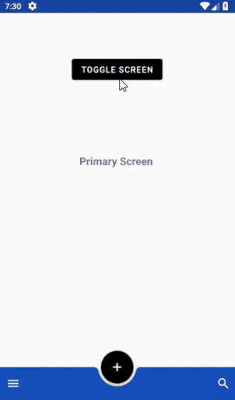
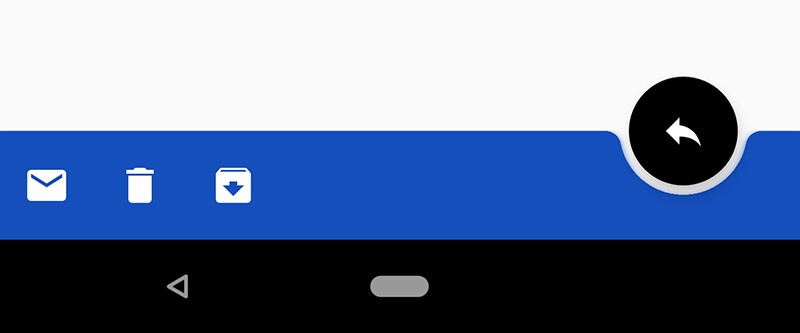
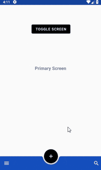
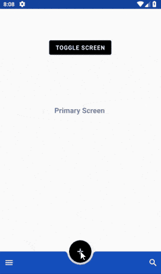
Based on this guideline, it is recommended to use the BottomAppBar layout on the main screens , showing several menu items and a centered FAB (Floating Action Button). On the secondary screens , the transition to which is carried out from the main ones, the BottomAppBar layout should consist of a right-aligned FAB and several additional menu items. Transitions between these two screens should be performed properly. Gif on top demonstrates this guideline.
Now let's see how this behavior can be implemented. We have two xml files in the folder res/menufor the menu of each screen:
When there is a transition between screens, for example, by pressing the TOGGLE SCREEN button in our case, the layout of the BottomAppBar, including the menu and FAB, should change. Here is the basic code for this behavior of the BottomAppBar layout:
// Hide navigation drawer icon
bottom_app_bar.navigationIcon = null
// Move FAB from the center of BottomAppBar to the end of it
bottom_app_bar.fabAlignmentMode = BottomAppBar.FAB_ALIGNMENT_MODE_END
// Replace the action menu
bottom_app_bar.replaceMenu(bottomappbar_menu_secondary)
// Change FAB icon
fab?.setImageDrawable(baseline_reply_white_24)
If you want to make animated transitions, you need additional code. You can study the source code attached at the end of this article in which you will find animation.
Scrolling
Scrolling is an important behavior trigger for components such as BottomAppBar. On the Material Design guidelines page, the following behavior is recommended for this case:
When scrolling, a BottomAppBar may appear or disappear:
- Scrolling down hides the BottomAppBar. If it had FAB, it disconnects from the panel and remains on the screen.
- Scrolling up shows the BottomAppBar and reattaches it to the FAB if it was there.
Below is a demonstration of the behavior of the BottomAppBar when scrolling.
To use this behavior, BottomAppBar and FAB must be direct children of CoordinatorLayout . Then we enable hideOnScroll and set the scroll flags for the BottomAppBar:
This is enough to implement this behavior of the BottomAppBar.
Elevation
Each component in the Material Design world has an elevation similar to our physical world. At the BottomAppBar, the elevation is 8dp , and the content of the screen itself rises to 0dp . FAB in a static state rises by 12dp . The two components that we will recall in this article, Navigation Drawer and Snackbar, rise 16dp and 6dp respectively.
Typically, Snackbar is a component for notifying the user that pops up from the bottom of the screen. But if there is a BottomAppBar or Navigation Drawer on the screen, the behavior of the Snackbar should change. In these cases, the Snackbar should be shown above the lower components. Here is a demo and related code to implement:
private fun displayMaterialSnackBar() {
        val marginSide = 0
        val marginBottom = 550
        val snackbar = Snackbar.make(
                coordinatorLayout2,
                "FAB Clicked",
                Snackbar.LENGTH_LONG
        ).setAction("UNDO") {  }
        // Changing message text color
        snackbar.setActionTextColor(ContextCompat.getColor(this, R.color.colorSnackbarButton))
        val snackbarView = snackbar.view
        val params = snackbarView.layoutParams as CoordinatorLayout.LayoutParams
        params.setMargins(
                params.leftMargin + marginSide,
                params.topMargin,
                params.rightMargin + marginSide,
                params.bottomMargin + marginBottom
        )
        snackbarView.layoutParams = params
        snackbar.show()
}
As we already mentioned, Navigation Drawer rises by 16dp , which means - according to the guideline -
Menus falling out of the BottomAppBar (e.g. Navigation Drawer) open as modal windows one level higher than the BottomAppBar itself.
The following is the implementation of our Navigation Drawer:

Navigation Drawer is a modal window and therefore follows the implementation rule above.
Details of the implementation of this behavior are as follows. In the folder res/menu, an xml menu file must be created for the Navigation View , which will be used in the Navigation Drawer:
Then a layout file should be created for the fragment using the Navigation Drawer:
This layout file contains the Navigation View and other components that make up the layout for the Navigation Drawer. To create this layout, we need a fragment class that extends BottomSheetDialogFragment:
class BottomNavigationDrawerFragment: BottomSheetDialogFragment() {
    override fun onCreateView(inflater: LayoutInflater, container: ViewGroup?, savedInstanceState: Bundle?): View? {
        return inflater.inflate(R.layout.fragment_bottom_navigation_drawer, container, false)
    }
    override fun onActivityCreated(savedInstanceState: Bundle?) {
        super.onActivityCreated(savedInstanceState)
        navigation_view.setNavigationItemSelectedListener { menuItem ->
            // Bottom Navigation Drawer menu item clicks
            when (menuItem.itemId) {
                // R.id.nav1 -> context!!.toast(getString(R.string.nav1_clicked))
            }
            // Add code here to update the UI based on the item selected
            // For example, swap UI fragments here
            true
        }
    }
}
When you click on the Navigation Drawer icon, an instance of this fragment is created, which is shown as a modal window:
override fun onOptionsItemSelected(item: MenuItem?): Boolean {
        when (item!!.itemId) {
            android.R.id.home -> {
                val bottomNavDrawerFragment = BottomNavigationDrawerFragment()
                bottomNavDrawerFragment.show(supportFragmentManager, bottomNavDrawerFragment.tag)
            }
        }
        return true
}
This article concludes our series of articles about the BottomAppBar. You can find the source code for this article on Github . Comment and ask questions.
← Implementation of BottomAppBar. Part 1: Material components for Android
← Implementation of BottomAppBar. Part 2: Menu and Navigation Drawer Control