HeadHunter Evolution on iOS

Our team has recently released an updated HeadHunter app for iOS . With this release, in addition to the updated interface and redesigned code, the long-awaited opportunities for editing a resume, updating the date of its publication and changing visibility have appeared. We also added an experimental ability to create resumes from scratch.
Since its birth in February 2012, the application has had a difficult childhood.
The first version of the application was developed by external contractors. However, our relationship with them did not work out, and for some time the application lived its own independent life. And in February 2013, our mobile development team took over it, which by this time was already actively developing the HeadHunter application for Android .
The first version of the application had:
- about 16 thousand users (judging by the downloads);
- an incredible number of falls;
- unknown number of real users and their problems.
As you know, people who were very loyal to the hh.ru service could use such an application, so it was decided to go to a new qualitative level.
“Everybody get out of the dusk!” (C)
First of all, I wanted to make it so that users could use the application that was already available at that time without frequent crashes. To do this, you had to stop working blindly. Therefore, we picked up the debugger, catching and correcting the most obvious errors that we could reproduce.
From an instrumental point of view, we used the leak detection tools provided with xcode. About it there are some sensible articles on Habré .
Next, we organized the distribution of the application through hockeyapp.net. In addition to distribution, this service gives clear crash notifications. It also supports crash notifications directly to the bugtracker: in our case, the integration option with jira came up.
To have detailed technical statistics, including the number of errors, we added statistics from flurry.com to the application.
After that, the application became public in March 2013 under version 1.2.
In total, it took us 3 public releases to cure most of the crashes, refactor the code, and thereby make the application behavior noticeably more stable.
However, when updating the application with new functionality in January 2014, we received an even more incredible number of caches. But this time we were fully equipped: the presence of monitoring and a reporting system for errors helped us to very quickly catch and fix more crashes. The next update, released 7 working days later, including the review in the store, was already stable after the first release.
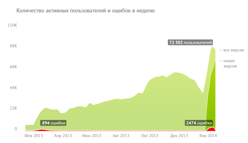
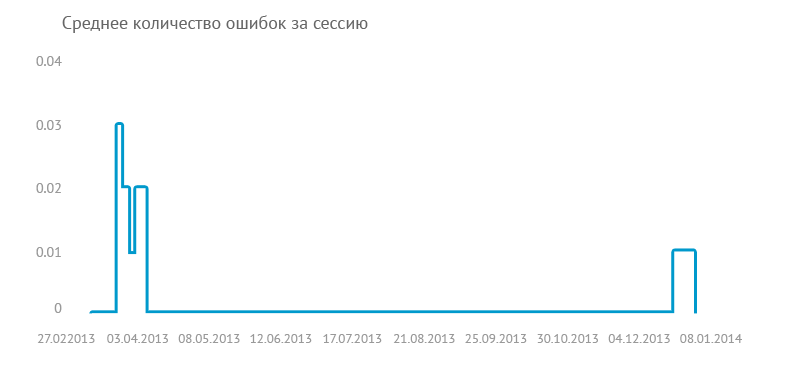
As you can see on the graph, we started with ~ 900 crashes per week (upper graph), there was a crash in every 50th session of the launched application. (bottom graph) (graphs obtained from flurry.com).
If you look at the chart, it looks scary only the absolute number of caches. Relatively multiply grown audience, the application was more stable than its predecessor.
The next step in setting up the work of the team will be not a reactive response to errors, but a proactive one.
Note on the organization of testing: with varying success, we managed to use hockeyapp to demonstrate intermediate results within the company. It has a rather complicated connection scheme for new users. As a result, we have a well-established scheme with two iOS applications in hockeyapp: one for daily updates and demonstration of results within the development team, the other for demonstration to a wider audience of testers, updated every 2-4 weeks.
But testing on some stable and large group of alpha testers on our own failed to organize. I will be glad to hear the experience of readers how they organize this kind of testing.
“To start from scratch, you need to crawl up for a long time” (c)
After stabilizing what we already had, we started a full redesign of the application, since in order to convert it to a new design, we had to rework all the code.
Incremental update failed. It’s just not possible to release a half-redesigned application - there will be too many interface differences. Making changes in two codebases at once is an expensive solution, fraught with code inconsistencies. By that time, two new conditions arrived that needed to be taken into account:
- The hh.ru API version was released (not yet public, but it was already necessary to run it in combat conditions);
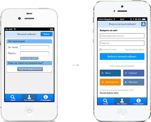
- The site has implemented the possibility of authorization through social networks.
We still did not have a ready-made application with a new design, and it was still far from the release, a significant part of the reviews concerned authorization errors. This encouraged us to experiment: to release a quick release on the old code base, in which to implement work on the new API and authorization through social networks.
By mid-September 2013, we quickly prepared and released such an update. After that, in October, we launched a joint promo for mobile applications in the form of a smartapp banner, which gave a noticeable increase in both the installations of both applications and the number of active users.
This release provided a controversial but valuable experience. At the junction of the new API and authorization, we got a decent amount of errors. The response to this update was a wave of low ratings in the App Store from users.
What we have learned from this (in fact, all conclusions are captainism confirmed by personal experience):
- don't make hasty releases :)
- positive reviews are rarely written, but negative ones are easy.
If you look at the whole picture with key metrics, there is a positive trend:
- there was an increase in the number of active audiences relevant to the growth in the number of attitudes;
- the number of targeted user actions in the application also grew.
This made it clear that a positive trend is present, which means that we are on the right track.
By the way, to monitor user behavior in applications, we use time-tested tools: flurry.com and Google Analytics. We also use Distimo.com for general monitoring of applications for different platforms. Because all these tools provide an API for access to their data - we took advantage of this opportunity and built a small custom statistics, in which we can compare user behavior on several platforms at the same time.
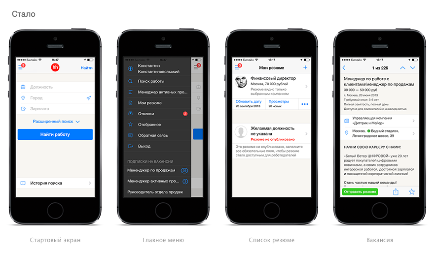
And here he is, the long-awaited
The experience of the previous release gave us excessive caution. We decided not to do it just for the sake of redesign. and added extra value:
- editing resumes;
- updating the date of its publication;
- and as an experiment, we worked on creating a resume.
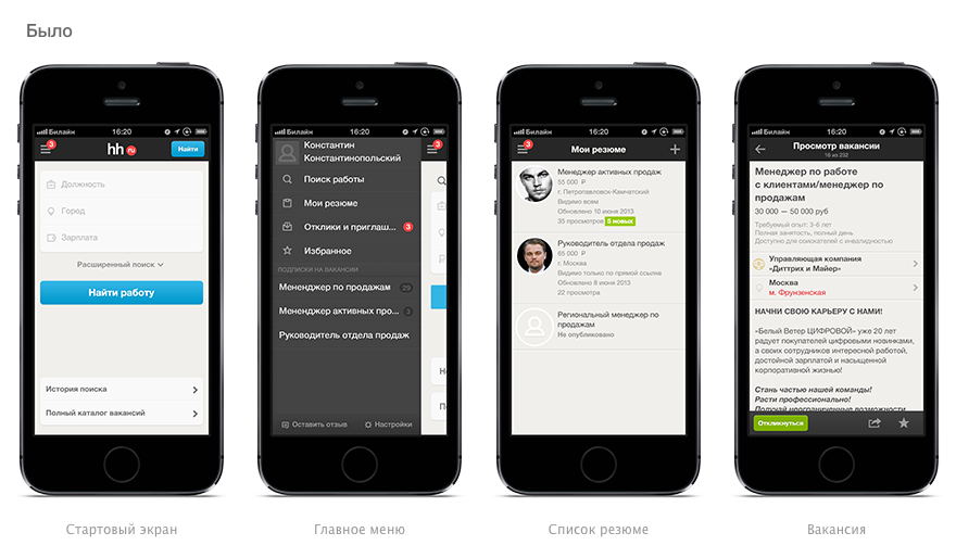
About the redesign, in general, you can write a separate article - there was everything: the test groups, and redrawing each of the layouts many times into several options, and fierce daily discussions of each version of the layout, and live prototypes.
Flinto.com helped us a lot to evaluate the layout of the interface from all the services, which allowed us to prototype the interactive interface very quickly. By the way, we actively used the same service for prototyping the android application and the new version of the mobile site.
As a result, we got such a new design:
Meanwhile, beta iOS 7 appeared on the arena, and we have not yet moved the entire application to new tracks. Therefore, they once again allowed themselves to change everything:
Of particular note is the ability to manage your resume directly from your phone. Inside the team, we went through many stages from “this is a serious process, it is impossible to write a normal resume from the phone” to “this is a very useful thing."
In my opinion, a fairly successful model for editing a professional profile is presented in the LinkedIn application. Colleagues implemented the work with the profile in two modes: viewing and editing, between which the user can switch.
In the hh.ru application, we decided to combine the viewing and editing mode, assuming that the main use case would be to briefly review our resume and make small adjustments and additions (for example, updating work experience).
As a result, the resume editing interface turned out like this: the first screen allows you to quickly view all resumes, and the screen for each property block allows you to immediately make adjustments and additions.
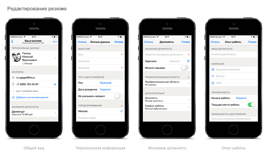
For the experimental possibility of creating a resume, we chose the step-by-step wizard mode, with which you can go through the considerable number of steps that are required to create a high-quality resume. In general, we’ll have to work on the interface for creating a resume, so we will be happy to hear recommendations and suggestions for improving it.
In my opinion, we were able to solve the task of managing the resume in the hh.ru application at a good level. Statistics on events in the application will show the real picture.
Talk to me.
Interaction with users in the AppStore is such a special story.
Compared with the functionality of GooglePlay, the App Store's ability to interact with users, to put it mildly, is limited. The release cycle can be long due to the review. It is impossible to get in touch with users using the platform tools.
Due to the lack of the ability to simply respond to a person, his negativity translates into a low public rating. A dialogue with the user helps to solve his specific problem in typical cases, identify deficiencies and eliminate them.
We started experimenting with helpdesk services integrated directly into the application. Hh.ru already has several ways to interact with users, including solutions from Russian service providers. Unfortunately, none of them provides tools for working in a mobile platform. I had to look for such tools in the global market.
At the moment, we use the helpshift.com service, because it supports the Russian language and simply integrates into the application, although there are several more interesting tools. There are, of course, technical flaws, but we successfully and efficiently solve them together with the service development team.
I must note that the ability to communicate with the user in the application provides several advantages:
- negative user experience is transformed into neutral or positive, instead of splashing into a public assessment without solving the problem;
- The actual feedback on the most important features is easily collected.
- an additional source of information about application shortcomings appears.
I am not yet trying to assess the degree of influence of such a functional on a public assessment, but I can already say unequivocally that it is positive.
Where are we now
“Where have all our adventures led us?” You ask.
Currently we have:
- Over 200,000 app downloads from the AppStore
- MAU in the region of 100,000 - 130,000 users, and the indicator is growing
- AppStore rating for the latest versions of the application ranges between 4 and 5 stars
- application stably enough lives in the top positions of the top of free applications in the category Business in Russia
- The app’s audience is still the most active among all the mobile platforms on which HeadHunter is represented, although not the largest
As you can see from the graphs at the beginning of the article, we still have a pool of errors. And that means we have something to work on. Of course, we plan to continue to engage not only in improving stability, but also introduce new features and not very noticeable immediately, but very useful improvements.
I hope the new application and the experience of its development will be useful to you! We accept thanks to the stars :) I think that the audience of Habr does not need to wish good luck in finding work - she finds professionals herself. Just keep your resume up to date!