Mobile version of Habr. Version 3.0
Perhaps one of you will now be on the mobile version of Habr for the first time, and someone will say the opposite, that " this is the third version and whatever you say, and in 2009 it was the most-most ." Anyway, this time I wanted to make not just the announcement of a new mobile version. It was nice to rewind the time back and remember how it was.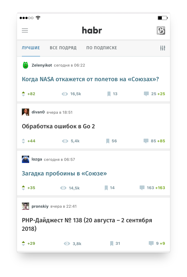 For such a retrospective had to turn to the web archive. Thanks to him in the life of the site can distinguish the following steps:
Birthday mobile version. ID-Schnick posts on Habré just started their way to six-digit values, and in the TM office (then this abbreviation was still deciphered as “Themed Media”) on the Krivokolenny lane the atmosphere of the startup reigned. Shortly before this date in the head of one of the developers (Maxim rossomachin ) the idea to make an experimental lightweight version of “Habr”, which would work better on mobile devices, is born.
Three people (programmer, web technologist and interface designer), two weeks of time and the shortest post-announcement appeared on the site: μHabr (literal quote of the announcement). As they say, nothing superfluous - neither in the announcement, nor on the newbornnyHabréMyHabré. Then this name did not stick, because it was difficult to write correctly and everyone thought it was a habratreker. Therefore, soon the name “Micro-sabr” stuck to the project.
Features of the first mobile version:
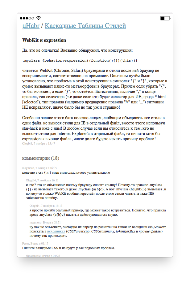
In this version, the functions of authorization, voting and commenting were not available. That is, it could only be used for reading, which, in fact, was required of it at that time. Mikrokhabr differed little from the RSS-aggregator, but did not require a separate application (except the browser).
And she looked like this:
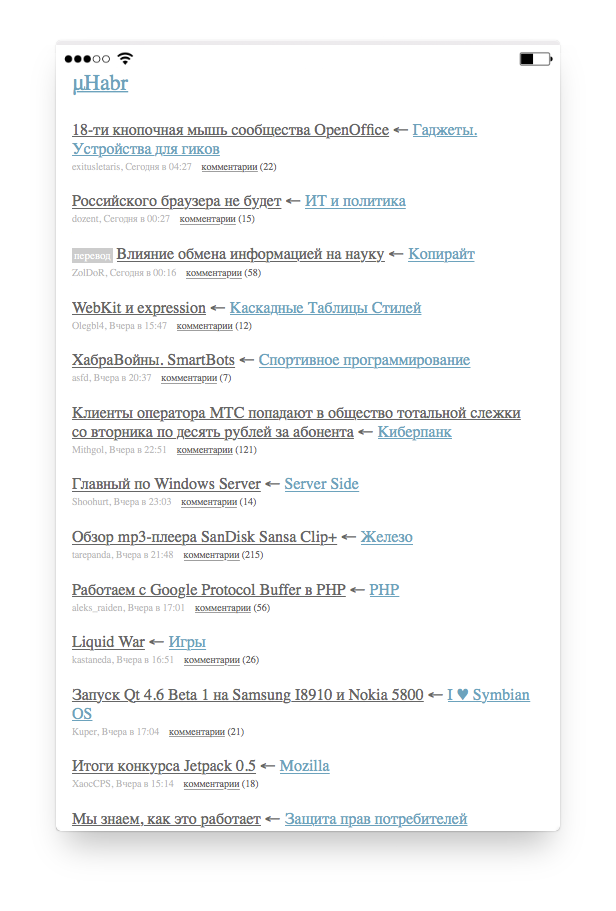
If Mikrokhabr had a Twitter account, then for the next few years he would have looked like a Twitter stone in the forest: the daily "nothing happened today." Well, except that the fonts were brushed once, making them larger and less faded:
 In this form (with minor changes in the layout), the mobile version existed until 2014, since the mobile traffic at that time was quite insignificant.
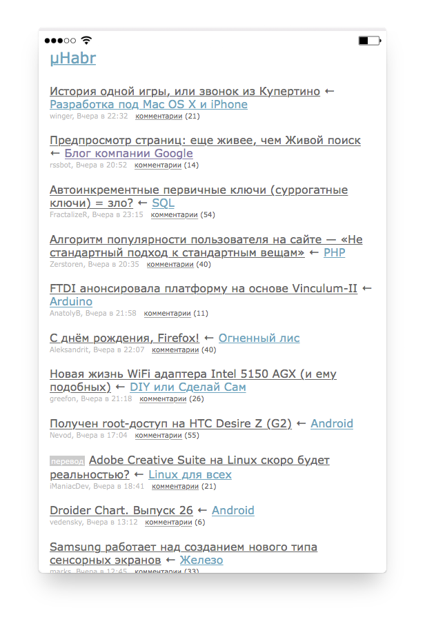
Blogs that were previously on Habré, with a slight movement of the hand turned into elegant hubs. Each publication has become possible to attach to several hubs, so the list of hubs had to be moved under the title. The mobile version is still a primitive reader - the boom of mobile traffic did not happen then and the entire runet unanimously ignored the solutions for phones.

From 2009 to 2014, the mobile version of Habr remained a simple reading room. However, the growth of the mobile audience made it necessary to upgrade the mobile phone to the second version, which we did on June 10, 2014. This is not so much a hobby experiment of one of the employees as a deliberate work of a group of persons by prior agreement.
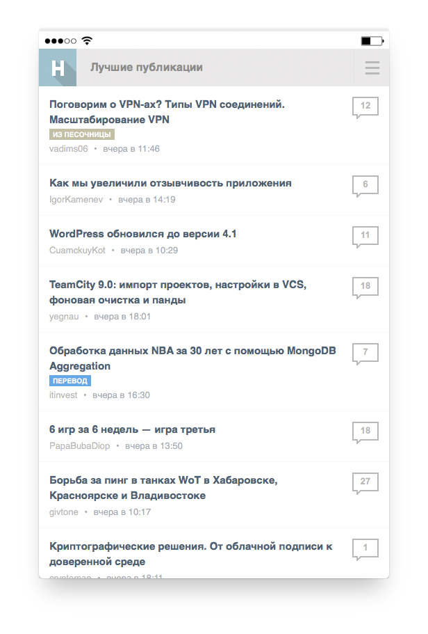
If earlier diagonals of screens (and their resolutions) of various PDAs were not specifically allowed to play with indents, by 2014 the smartphones had seized theiron throne of the empire . With the new typography and more air indentation, it was already difficult to display 40 publications per page, so their number was reduced to 10. The name “Mikrokhabr” no longer appears anywhere - everywhere instead of it is the “mobile version”.
Despite the fact that it was primarily a facelift (since the previous design is obsolete), the new mobile phone has acquired new features: authorization has appeared, and therefore the ability to track new comments on those publications that the user has already read. Also an opportunity to go to the desired hub or company blog.
 In the same year, the official Habr's application was released, released under three platforms at once (freaked out): iOS, Android and Windows Phone. The functionality is similar: authorization, reading tapes, subscribing to hubs, voting-favorites-comments.
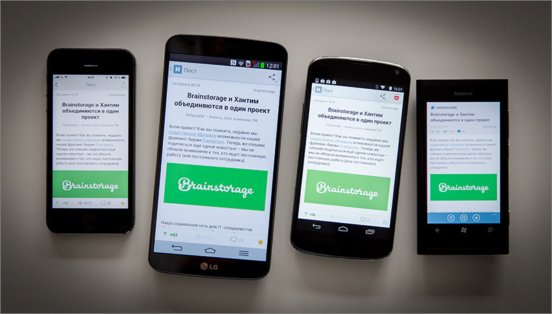
In an iOS application, the user's avatar has a small Easter egg that hardly anyone has found in all the time.
At the end of 2014 there was another important event in the history of Habra - from him gemmated Geektimes. Some users were very sensitive to the subsequent separation of publications into two sites, therefore, in order to somehow alleviate this, we made TM Feed - a kind of bridge between the two sites. The same mobile version, but with the ability to select one or both sites as a source. Well, or all three (when “Megamind” also appeared in 2015 ).
A few years after the separation of projects, we decided to take a course on the big Internet. It would have been many times more difficult to go there on several ships than on one big icebreaker, so it was decided to reunite all previously separated projects. And the easiest way to start it was to combine content projects, since they were as similar and close in structure as possible. At the same time, there was no need for TM Feed, so it disappeared from the top menu.
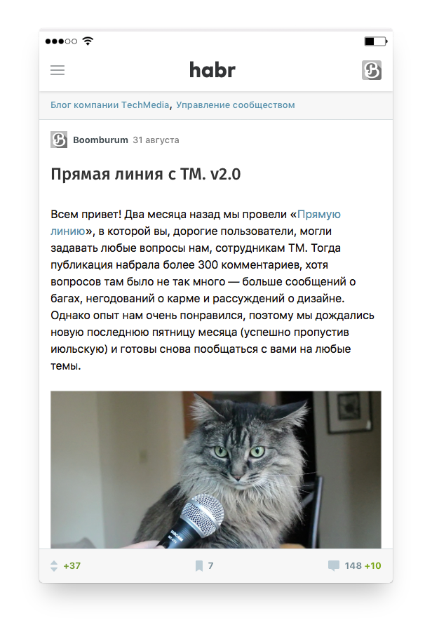
Having stayed with Habr alone, we decided to refresh its mobile version, which, in fact, has been unchanged since 2014. It was difficult to do this on the old version due to the large number of the inherited long-distance code, so it was decided not to make cosmetic repairs, but to overhaul: redraw everything from scratch, rewrite the whole backend and front-end.
If 2 weeks passed from idea to launch in 2009, then in 2018 we couldn’t afford such a hurry and tried to do everything “grown-up”: it took a few months for beta testing alone, which was attended by more than 7,000 people. And, as you understand, not in vain - thanks to him, that is, you, we managed to fix a lot of bugs in the mobile version: from small inconspicuous bugs to giant goliath beetles. And today, with the ringing of the bells of the first-graders, we decided to finally be released.
The motto we tried to adhere to: a mobile version ≠ a stripped-down version. Therefore, to the previous requirement (convenient reading of publications) added some new features and laid the foundation for further scaling. From the new:
The owners of Tesla bitterly admit that the new mobile version is significantly faster than their electric cars :)
And we must understand that for the time being we will release the basic version of the mobile Habr, but not the final one: we will be “overgrown with meat” and new features later.
Well, go? We created: m.habr.com
April 22, 2009
Birthday mobile version. ID-Schnick posts on Habré just started their way to six-digit values, and in the TM office (then this abbreviation was still deciphered as “Themed Media”) on the Krivokolenny lane the atmosphere of the startup reigned. Shortly before this date in the head of one of the developers (Maxim rossomachin ) the idea to make an experimental lightweight version of “Habr”, which would work better on mobile devices, is born.
Three people (programmer, web technologist and interface designer), two weeks of time and the shortest post-announcement appeared on the site: μHabr (literal quote of the announcement). As they say, nothing superfluous - neither in the announcement, nor on the newborn
Features of the first mobile version:
- Each page weighed an average of 5 kilobytes (excluding content)
- The complete lack of advertising and unnecessary elements
- Each page contained 40 links to publications.
- Good on all major mobile platforms.
In this version, the functions of authorization, voting and commenting were not available. That is, it could only be used for reading, which, in fact, was required of it at that time. Mikrokhabr differed little from the RSS-aggregator, but did not require a separate application (except the browser).
And she looked like this:
2010
If Mikrokhabr had a Twitter account, then for the next few years he would have looked like a Twitter stone in the forest: the daily "nothing happened today." Well, except that the fonts were brushed once, making them larger and less faded:
2013
Blogs that were previously on Habré, with a slight movement of the hand turned into elegant hubs. Each publication has become possible to attach to several hubs, so the list of hubs had to be moved under the title. The mobile version is still a primitive reader - the boom of mobile traffic did not happen then and the entire runet unanimously ignored the solutions for phones.
2014. Version 2.0 and Mobile Application
From 2009 to 2014, the mobile version of Habr remained a simple reading room. However, the growth of the mobile audience made it necessary to upgrade the mobile phone to the second version, which we did on June 10, 2014. This is not so much a hobby experiment of one of the employees as a deliberate work of a group of persons by prior agreement.
If earlier diagonals of screens (and their resolutions) of various PDAs were not specifically allowed to play with indents, by 2014 the smartphones had seized the
Despite the fact that it was primarily a facelift (since the previous design is obsolete), the new mobile phone has acquired new features: authorization has appeared, and therefore the ability to track new comments on those publications that the user has already read. Also an opportunity to go to the desired hub or company blog.
In an iOS application, the user's avatar has a small Easter egg that hardly anyone has found in all the time.
2015. TM Feed
At the end of 2014 there was another important event in the history of Habra - from him gemmated Geektimes. Some users were very sensitive to the subsequent separation of publications into two sites, therefore, in order to somehow alleviate this, we made TM Feed - a kind of bridge between the two sites. The same mobile version, but with the ability to select one or both sites as a source. Well, or all three (when “Megamind” also appeared in 2015 ).
2017
A few years after the separation of projects, we decided to take a course on the big Internet. It would have been many times more difficult to go there on several ships than on one big icebreaker, so it was decided to reunite all previously separated projects. And the easiest way to start it was to combine content projects, since they were as similar and close in structure as possible. At the same time, there was no need for TM Feed, so it disappeared from the top menu.
2018
Having stayed with Habr alone, we decided to refresh its mobile version, which, in fact, has been unchanged since 2014. It was difficult to do this on the old version due to the large number of the inherited long-distance code, so it was decided not to make cosmetic repairs, but to overhaul: redraw everything from scratch, rewrite the whole backend and front-end.
If 2 weeks passed from idea to launch in 2009, then in 2018 we couldn’t afford such a hurry and tried to do everything “grown-up”: it took a few months for beta testing alone, which was attended by more than 7,000 people. And, as you understand, not in vain - thanks to him, that is, you, we managed to fix a lot of bugs in the mobile version: from small inconspicuous bugs to giant goliath beetles. And today, with the ringing of the bells of the first-graders, we decided to finally be released.
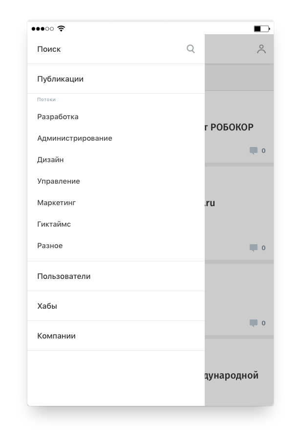
The motto we tried to adhere to: a mobile version ≠ a stripped-down version. Therefore, to the previous requirement (convenient reading of publications) added some new features and laid the foundation for further scaling. From the new:
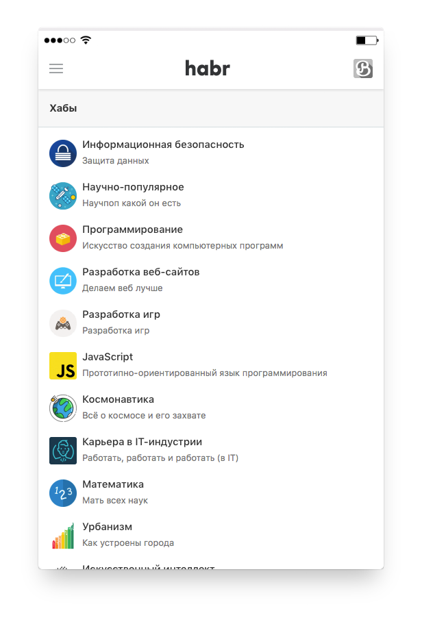
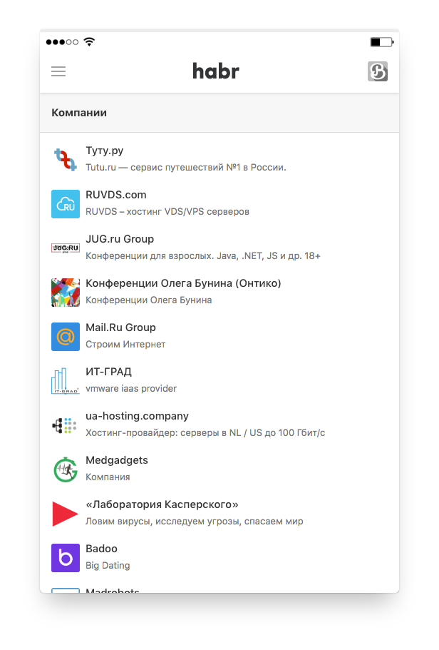
- All entities became available: streams, hubs, lists of companies and users
- Support sorting publications: by subscription, everything and the best (per day / week / month)
- Each publication has a counter of new comments.
- There was a search for publications and users
- At the bottom of the publication, a menu with metrics appeared (when scrolling the page up)
- More convenient vote for comments
About design
“It’s hard to call this work a redesign. In fact, we created a new product, which has only the address of the old one. The main goal was to create a unified visual environment consisting of the graphic style of the project and the repetition of behavioral scenarios. ”
// Designer
About technology
“The old mobile version worked with jQuery on the front end and PHP with the Blitz template engine on the backend. New built on more modern and well-proven technology. Namely, Vue and the whole stack around it (vuex, vue-router, vue-meta, vue-server-render), Express and Node.js: there is a frontend in the form of SPA, there is a backend (which renders this SPA for search engines and proxies requests API) and a separate server API. "
// Developers
The owners of Tesla bitterly admit that the new mobile version is significantly faster than their electric cars :)
And we must understand that for the time being we will release the basic version of the mobile Habr, but not the final one: we will be “overgrown with meat” and new features later.
Well, go? We created: m.habr.com