BottomAppBar implementation. Part 1: Material Components for Android
- Transfer
- Tutorial
BottomAppBar is one of the new Android Material components that were introduced on Google I / O 2018 . This is essentially an extension to the Toolbar component . The new BottomAppBar is located at the bottom of the application window, in contrast to the toolbar, which is located in its upper part. With this paradigm, the Material Design team is awaiting a new user experience (UX). BottomAppBar is much more accessible to the user compared to a regular toolbar. By moving the control panel and menu to the bottom of the application, BottomAppBar offers a completely new design for Android applications.
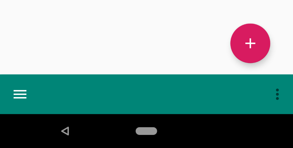
Together with BottomAppBar, the location of the Floating Action Button (FAB) has also changed (the Russian floating action button ). FABs can now be placed either by “crashing” into BottomAppBar, or by overlapping it.
This article will demonstrate the implementation of the fundamentals of BottomAppBar along with new FAB placement options.
Customization
For a start, small initial settings are required.
You can find a detailed explanation of how to enable Material components for your Android project on this page . In addition, in this tutorial you need to use Android Studio 3.2 or higher .
Below are the necessary configuration steps.
1.Add the Google Maven repository to the file build.gradle.
allprojects {
    repositories {
      jcenter()
      maven {
        url "https://maven.google.com"
      }
    }
  }
2. Add a dependency for the material components in the file build.gradle. Keep in mind that the version is updated regularly.
implementation'com.google.android.material:material:1.0.0-alpha1'3. Set the quality compileSdkVersionand targetSdkVersionversion of the API minimum for Android P (ie, 28 and above).
4.Make sure your application inherits the Theme.MaterialComponents theme so that BottomAppBar uses the latest style. Alternatively, you can style the BottomAppBar when declaring a widget in an XML layout file as follows:
style=”@style/Widget.MaterialComponents.BottomAppBar”Implementation
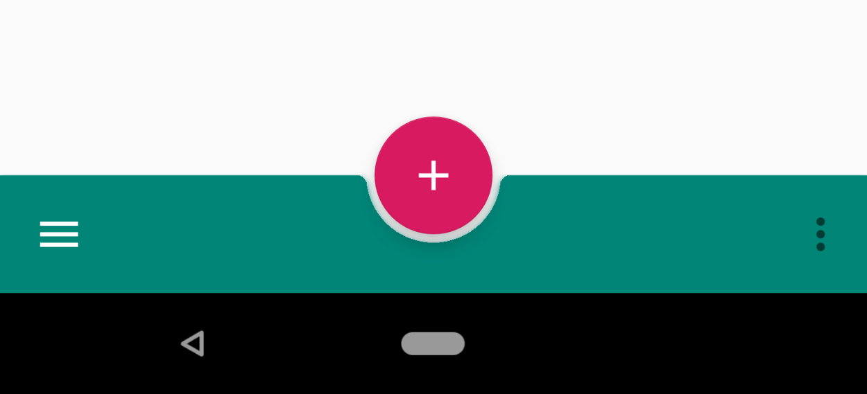
You can add BottomAppBar to your layout as follows. Also BottomAppBar must be a child element of CoordinatorLayout .
<com.google.android.material.bottomappbar.BottomAppBarandroid:id="@+id/bottom_app_bar"android:layout_width="match_parent"android:layout_height="wrap_content"android:layout_gravity="bottom"app:backgroundTint="@color/colorPrimary"app:fabAlignmentMode="center"app:fabAttached="true"app:navigationIcon="@drawable/baseline_menu_white_24"/>
You can bind FAB to BottomAppBar by specifying the idBottomAppBar element in the attribute app:layout_anchorof the FAB element. BottomAppBar can envelop a FAB or FAB can overlap a BottomAppBar.
<com.google.android.material.floatingactionbutton.FloatingActionButtonandroid:id="@+id/fab"android:layout_width="wrap_content"android:layout_height="wrap_content"android:src="@drawable/baseline_add_white_24"app:layout_anchor="@id/bottom_app_bar" />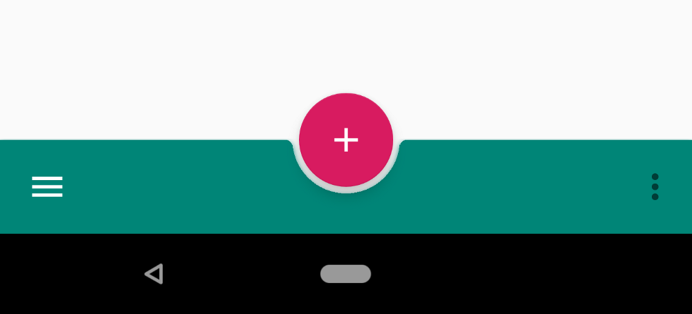
BottomAppBar Attributes
The table below shows the BottomAppBar attributes.
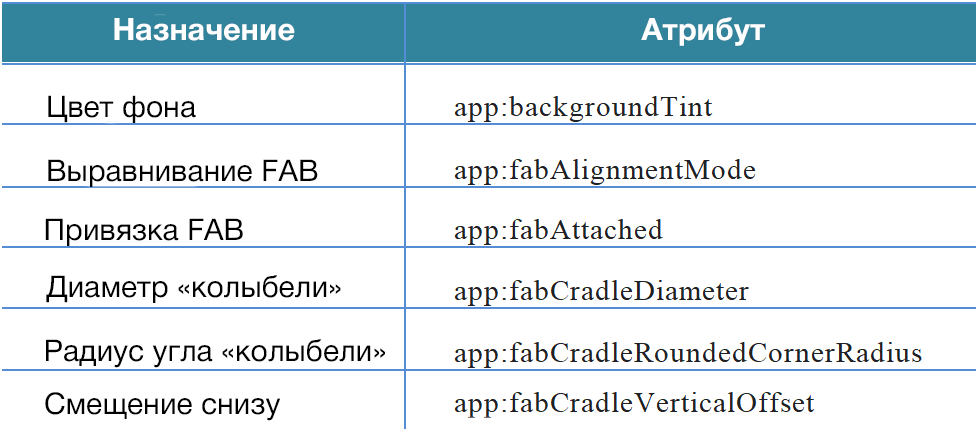
backgroundTint
This is the BottomAppBar background color setting attribute.
fabAlignmentMode
The attribute defines the position of the FAB (either in the center or at the end of the BottomAppBar). Below is the FAB alignment at the end of the BottomAppBar.

fabAttached
The attribute is intended to bind FAB to BottomAppBar and can be true or false . Although the material design guidelines do not recommend placing FAB outside of BottomAppBar, this option is available. Below is the situation when the attribute is fabAttachedset to false .
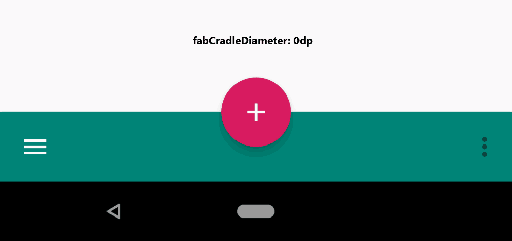
fabCradleDiameter
Specifies the diameter of the “cradle” containing the FAB.
fabCradleRoundedCornerRadius
Sets the corner radius at the meeting point of the cradle and the horizontal part of the BottomAppBar.

fabCradleVerticalOffset
Indicates the "cradle" offset from below.

Here is the entire XML layout file that was used for the examples above.
<?xml version="1.0" encoding="utf-8"?><androidx.constraintlayout.widget.ConstraintLayoutxmlns:android="http://schemas.android.com/apk/res/android"xmlns:app="http://schemas.android.com/apk/res-auto"xmlns:tools="http://schemas.android.com/tools"android:layout_width="match_parent"android:layout_height="match_parent"tools:context=".MainActivity"><TextViewandroid:layout_width="wrap_content"android:layout_height="wrap_content"android:text="Hello World!"app:layout_constraintBottom_toBottomOf="parent"app:layout_constraintLeft_toLeftOf="parent"app:layout_constraintRight_toRightOf="parent"app:layout_constraintTop_toTopOf="parent" /><androidx.coordinatorlayout.widget.CoordinatorLayoutandroid:layout_width="match_parent"android:layout_height="match_parent"><com.google.android.material.bottomappbar.BottomAppBarandroid:id="@+id/bottom_app_bar"android:layout_width="match_parent"android:layout_height="wrap_content"android:layout_gravity="bottom"app:backgroundTint="@color/colorPrimary"app:fabAlignmentMode="center"app:fabAttached="true"app:navigationIcon="@drawable/baseline_menu_white_24"/><com.google.android.material.floatingactionbutton.FloatingActionButtonandroid:id="@+id/fab"android:layout_width="wrap_content"android:layout_height="wrap_content"android:src="@drawable/baseline_add_white_24"app:layout_anchor="@id/bottom_app_bar" /></androidx.coordinatorlayout.widget.CoordinatorLayout></androidx.constraintlayout.widget.ConstraintLayout>We have dealt with the basics of the new Android Material component - BottomAppBar, as well as new FAB features. The BottomAppBar widget is not in itself difficult to use, because it extends the usual Toolbar, but it drastically changes the approach to designing an application interface.
The second and third parts of this series about BottomAppBar will be devoted to working with menus and navigation and implementing various BottomAppBar behaviors in accordance with the principles of Material Design.
→ Implement BottomAppBar. Part 2: Navigation Drawer Menu and Control
→ Implement BottomAppBar. Part 3: Behaviors for Android