Material 2.0 for developers. Overview of new components
In May, for the first time on Google I / O, we saw Material Design 2.0. The Google team conducted a major refactoring and released an updated design library. It has new components and animations. We have been following the development of Material Components since the very beginning. Now everything is at the RC1 stage, and will be released soon. Under the cat review of new and updated UI-components for those who have not tried them in the work, but is interested.
Android X instead of support library
"How is it already zadprokateyti? I didn’t even have time to try it, ”said one of my friends when I learned about moving the Material Components into a new package. Indeed, support.design will no longer be supported, and com.google.android.material will replace it.
As part of the Android X project, Google refactored the entire support library and architectural components. You can read more in their blog . Here is an example of some packages:
old package
android.support. @
android.databinding. @
android.design. @
new package
androidx. @
androidx.databinding. @
com.google.android.material. @
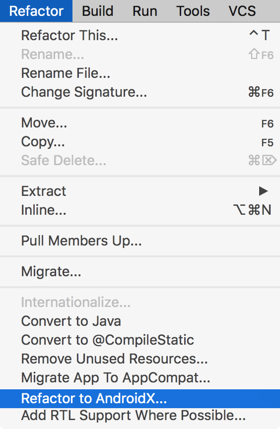
Fortunately, for a “soft” move to a new library, a tool will appear in the studio that allows you to automatically update all dependencies. Now it is already available in Android Studio Canary 3.3 . It is designed to automatically find all dependencies in imports, in gradle files, in XML and in Proguard.
Material library
All the old UI components from the Support Library have moved to the Material library, and new components have appeared. Add a new dependency to the project:
implementation'com.google.android.material:material:1.0.0-rc01'Backward compatibility with Support is not expected. We'll have to get rid of all the other dependencies where the word support is found, and replace them with the corresponding ones from Android X. Otherwise, the project simply won't build up due to a lot of conflicts. For the test build, I even had to replace Glide with Picasso, because the first one pulls and android support. On a large project, manually doing this will be inconvenient.

However, for testing Material Components, we can use support: design version 28-beta, where Google has kindly duplicated all relevant components. Despite this, the 28 version of the Support library will be the last, and in the future its support will stop. And now let's look at the new components, and the modified old ones.
Bottomomappbar
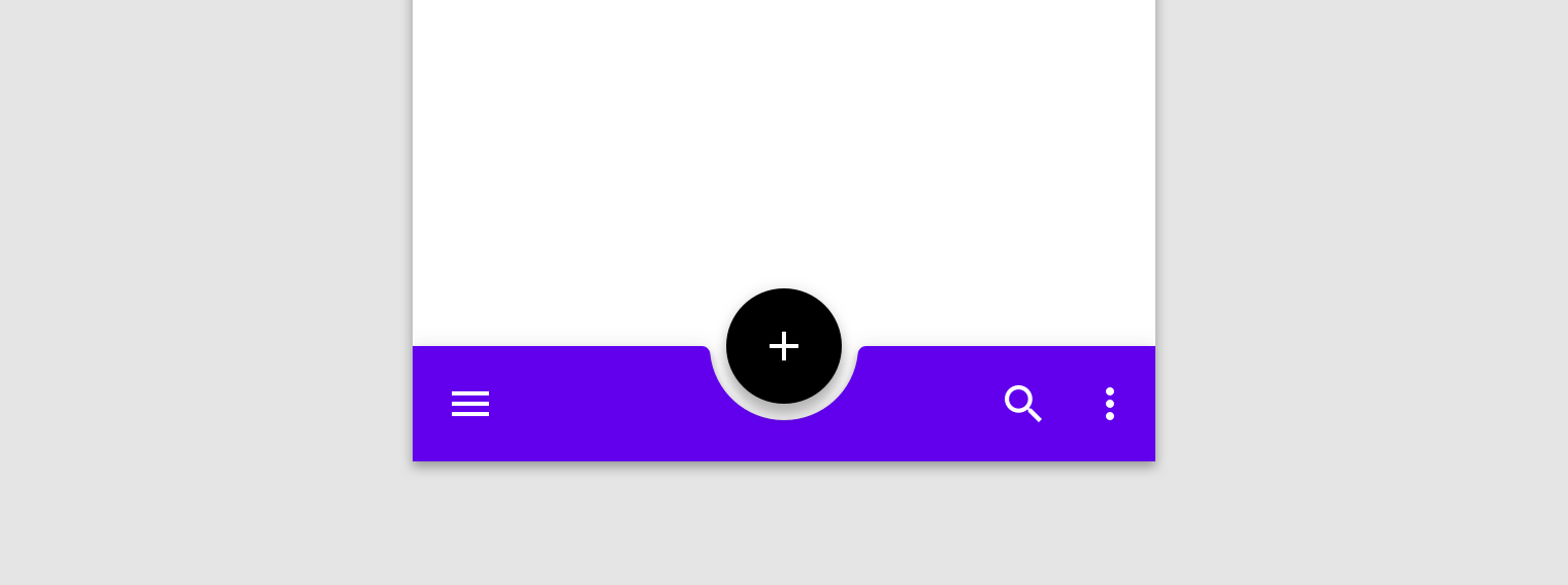
BottomAppbar is something similar to the Appbar, only with the ability to attach a Floating Action Button and a cutout under it. Designed to work inside the CoordinatorLayout.
Here are some parameters that we can customize:
- app: backgroundTint - color of the filled space
- app: fabAlignmentMode - position FAB
- app: fabCradleMargin - indent between FAB and BottomAppbar
- app: fabCradleRoundedCornerRadius - rounding at the corners of the cut for FAB
- app: fabCradleVerticalOffset
- app: hideOnScroll
<com.google.android.material.floatingactionbutton.FloatingActionButtonandroid:layout_width="wrap_content"android:layout_height="wrap_content"app:layout_anchor="@id/bottomAppBar"/><com.google.android.material.bottomappbar.BottomAppBarandroid:id="@+id/bottomAppBar"android:layout_width="match_parent"android:layout_height="wrap_content"android:layout_gravity="bottom"app:backgroundTint="@color/colorPrimary"app:fabCradleMargin="4dp"/>At the time of this writing, the BottomAppBar is not fully completed. For example, it is impossible to place NavigationIcon in the center vertically, but, probably, it will be finished soon.
Chips
Chip is another new View in the library. With it, you can conveniently show the enumeration of small objects. For example, filters or any hints for the user. According to the guideline, Chip has the following properties:
- May have a content icon (left).
- May have an icon for deletion (on the right).
- Contains text.
- May be in two states, like CheckBox.
The implementation in the Material library is an extended version of AppCompatCheckBox, and can please us with such customizable parameters:
- app: chipCornerRadius
- app: chipMinHeight
- app: chipBackgroundColor
- app: chipStrokeColor
- app: chipStrokeWidth
- app: rippleColor
- android: text
- android: textAppearance
- app: chipIconVisible
- app: chipIcon
- app: chipIconTint
- app: chipIconSize
- app: closeIconVisible
- app: closeIcon
- app: closeIconSize
- app: closeIconTint
- app: checkable
- app: checkedIconVisible
- app: checkedIcon
- app: showMotionSpec
- app: hideMotionSpec
Pleasantly surprised by the presence of ChipGroup, which is the successor of FlexboxLayout , which is finally included in the design library.
Backdrop
BackDrop is a new Android navigation pattern. There is the main content, which is located in the foreground, and the additional area behind (usually this is the navigation menu). If you need to get to the content from behind, the foreground moves down to the desired level.
Backdrop consists of three elements:
- Toolbar
- Front layout
- Back layout
At the time of this writing, it is not yet implemented in the library, and it is still empty in the corresponding repository . So I had to do my own implementation, wrapping it in the library :
Simply attach the BackdropBehavior to the desired Front Container and give it the Toolbar and Back Container.
XML
<android.support.design.widget.CoordinatorLayoutandroid:layout_width="match_parent"android:layout_height="match_parent"><android.support.v7.widget.Toolbarandroid:id="@+id/toolbar"android:layout_width="match_parent"android:layout_height="wrap_content"/><LinearLayoutandroid:id="@+id/backContainer"android:layout_width="match_parent"android:layout_height="wrap_content"android:orientation="vertical"/><!-- Add BackdropBehavior to this view --><android.support.design.card.MaterialCardViewandroid:id="@+id/foregroundContainer"app:layout_behavior="ru.semper_viventem.backdrop.BackdropBehavior"android:layout_width="match_parent"android:layout_height="match_parent"/></android.support.design.widget.CoordinatorLayout>Kotlin
val backdropBehavior: BackdropBehavior = foregroundContainer.findBehavior() // find behavior
with(backdropBehavior) {
        attachBackContainer(R.id.backContainer) // set back container
        attachToolbar(R.id.toolbar) // set toolbar// set navigation icons for toolbar
        setClosedIcon(R.drawable.ic_menu)
        setOpenedIcon(R.drawable.ic_close)
        // add listener
        addOnDropListener(object : BackdropBehavior.OnDropListener {
            overridefunonDrop(dropState: BackdropBehavior.DropState, fromUser: Boolean) {
                // TODO: handle listener
            }
        })
}
This is just one of the options for implementation. But for my case it was convenient. I think Google’s decision will be slightly different. If you suddenly have any suggestions, you are happy to discuss them in the comments under the article.
MaterialButtons
MaterialButtons - updated more customizable buttons. They have the following options for customization:
- android: inset (Left, Top, Right, Bottom) - indent from the edge of the View
- app: backgroundTint - fill color of the button
- app: backgroundTintMode
- app: icon - you can add an icon, by default to the left of the text
- app: iconPadding
- app: iconTint
- app: iconTintMode
- app: strokeColor - to create buttons with a stroke
- app: strokeWidth
- app: cornerRadius
- app: rippleColor
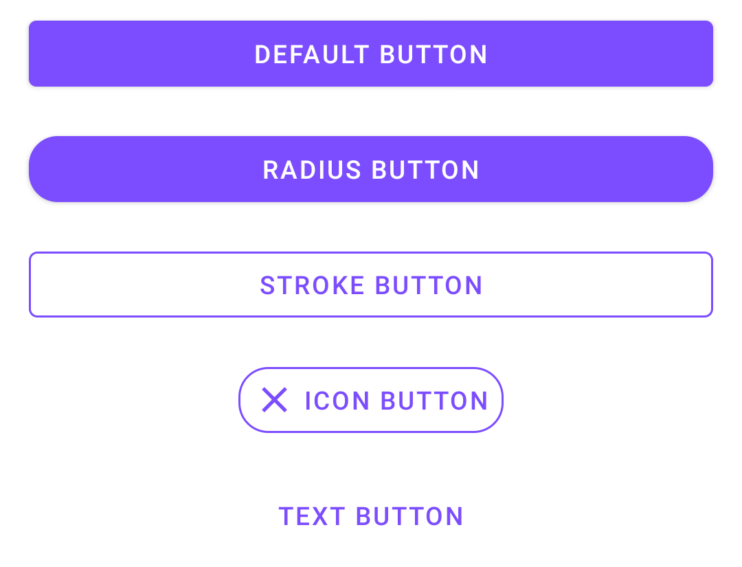
Of course, these styles for buttons can always be made independently. But now customization of buttons works well out of the box, and it is very convenient.
For example, to make a button with a cross, you would have to write two XML files before:
Layout:
<Buttonandroid:layout_width="wrap_content"android:layout_height="wrap_content"android:background="@drawable/bg_button"android:drawablePadding="@dimen/small_gap"android:drawableStart="@drawable/ic_close"android:paddingStart="@dimen/small_gap"android:paddingEnd="@dimen/small_gap"android:drawableTint="@color/colorAccent"android:text="Icon button"/>bg_button.xml
<?xml version="1.0" encoding="utf-8"?><layer-listxmlns:android="http://schemas.android.com/apk/res/android"><item><rippleandroid:color="@color/colorAccent"><itemandroid:id="@android:id/mask"><shapeandroid:shape="rectangle"><solidandroid:color="@color/white"/><cornersandroid:radius="16dp"/></shape></item></ripple></item><item><shapeandroid:shape="rectangle"><strokeandroid:color="@color/colorAccent"android:width="1dp"/><cornersandroid:radius="16dp"/></shape></item></layer-list>Now you can describe the button immediately on the spot:
<com.google.android.material.button.MaterialButtonstyle="@style/Widget.MaterialComponents.Button.TextButton"android:layout_width="wrap_content"android:layout_height="wrap_content"app:cornerRadius="16dp"app:icon="@drawable/ic_close"app:strokeColor="@color/colorAccent"app:strokeWidth="1dp"android:text="Icon button"/>Text fields
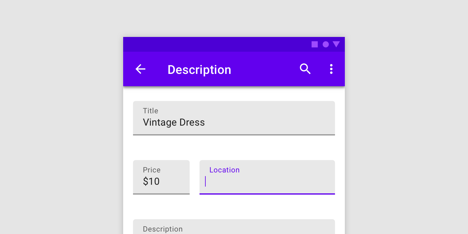
Text Fields has also changed. Now the out-of-the-box text field can add a stroke along the contour, make it flooded with some color, or round individual corners.
As before, you can use a construction from InputLayout with a child EditText, for more convenient to display hints, errors, and other text selection.
- app: boxCornerRadiusTopLeft
- app: boxCornerRadiusTopRight
- app: boxCornerRadiusBottomLeft
- app: boxCornerRadiusBottomRight
- android: hint
- app: hintEnabled
- app: errorEnabled
- app: setError
- app: helperTextEnabled
- app: helperText
- app: passwordToggleEnabled
- app: passwordToggleDrawable
- app: counterEnabled
- app: counterMaxLength
The changes are also not very significant, but custom solutions can now be developed much faster. From a business point of view, speed of development matters, and here Google did pretty well.
MaterialCardView
MaterialCardView is all old CardView, but now with a stroke along the contour, like buttons.
- app: strokeColor
- app: strokeWidth
Total
There are not many significant changes. New customization mechanisms just make it a little easier to do what we all did before. But there was a compatibility issue with the Support library. Library developers will have to move to Android X, which takes a lot of time and nerves. Especially if you consider what code base is now support-oriented. Despite the fact that Google provides a tool to automate the move with the replacement of all imports, it does not work perfectly. Such moves on their projects still have to go through with some difficulties.
At the moment, not all of the declared Material Components are implemented correctly, and some are not implemented at all. We will look, we will try.