 April 17, 2013 at 12:44
Creating a custom component from scratch. Part 2
Introduction
Greetings again, colleagues.
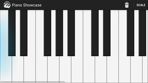
In my previous article, I talked about the basics of creating a custom component using the example of a simple but pretty piano keyboard.
In this article under the cut, we will continue to wind the
- Saving component state when rotating the screen
- adding backlight for overscroll
- passing parameters in XML
- Multi-touch Zoom
Saving component state when rotating the screen
Now we can detect this behavior in our component. If we scroll to any position, then rotate the screen, the scroll will be at zero. Obviously, this is because when you rotate the screen, the Activity is recreated, respectively, and the View is recreated.
The first thing that comes to mind here is to use the method of
onSaveInstanceState()our activity, pull the value of the scroll from the component and save, and later, when re-creating, set the scroll to our component. And it will work, but it can hardly be called the right approach. Imagine that we have not one parameter that needs to be saved, but ten, or not one component, but ten ... with ten parameters.Fortunately, the internal mechanisms of Android already provide for the automatic preservation of the state of all components that have an identifier. After all, you don’t have to do anything to keep the scroll of ListView during rotation, right? So we will take advantage of what is already in the View and we will control the preservation of the state of the component from the inside, and not from the outside.
And this is surprisingly simple. We need to redefine the methods of the class View
onSaveInstanceState()and onRestoreInstanceState(Parcelable state). However, there is a slight difference from the analogues in the activity. There we deal with Bundle, here we have Parcelable. We need to make our own Parcelable class, which must be an inheritor android.view.View.BaseSavedState.public static class SavedState extends BaseSavedState {
int xOffset;
int instrumentWidth; // Зачем я сохраняю это поле станет понятно чуть ниже :)
SavedState(Parcelable superState) {
super(superState);
}
@Override
public void writeToParcel(Parcel out, int flags) {
super.writeToParcel(out, flags);
out.writeInt(xOffset);
out.writeInt(instrumentWidth);
}
public static final Parcelable.Creator CREATOR = new Parcelable.Creator() {
public SavedState createFromParcel(Parcel in) {
return new SavedState(in);
}
public SavedState[] newArray(int size) {
return new SavedState[size];
}
};
private SavedState(Parcel in) {
super(in);
xOffset = in.readInt();
instrumentWidth = in.readInt();
}
}
This is how it looks in our case. Now it remains only to use it:
@Override
protected Parcelable onSaveInstanceState() {
	SavedState st = new SavedState(super.onSaveInstanceState());
	st.xOffset = xOffset;
	st.instrumentWidth  = xOffset;
	return st;
}
protected void onRestoreInstanceState(Parcelable state) {
  if (!(state instanceof SavedState)) {
    super.onRestoreInstanceState(state);
    return;
  }
  SavedState ss = (SavedState) state;
  super.onRestoreInstanceState(ss.getSuperState());
  xOffset = ss.xOffset;
  xOffset = ss.instrumentWidth;
};
Done. If you now rotate the screen, the scroll will not be lost. But there is another small cosmetic detail that I would add. When turning a component in our component, there is a high probability that the keyboard width will change, since our height will change (less in landscape mode), the keys will become narrower or wider. Therefore, our static value xOffset, loaded after reconstitution, needs to be adjusted. This is done very simply. Firstly, we will keep the old width of our keyboard when we recreate it. That is why in the code above I also save the instrumentWidth field in our SavedState.
In our onDraw (), where we initialize the component after changing its size, we add the following modifications:
if (measurementChanged) {
        measurementChanged = false;
	keyboard.initializeInstrument(getMeasuredHeight(), getContext());
	float oldInstrumentWidth = instrumentWidth;
	instrumentWidth = keyboard.getWidth();
	float ratio = (float) instrumentWidth / oldInstrumentWidth; // Рассчитываем отношение новой длины к старой и выравниваем значение
	xOffset = (int) (xOffset * ratio);
}
Now, if our scroll before the turn was, for example, at the beginning of the second octave, it will remain there after the turn.
So, we successfully save the state of our component during rotation. Now we add more visual beauty, namely the effect of the glow on the sides when the scroll reaches the end of the tool.
Glow effect for overscroll
As one would expect, a ready-made component has already been made for us, which knows how to draw these edges correctly, but we need to stick it in and voila correctly. This component is called EdgeEffect . But we will not use it, because it appeared only in ICS. We will use the EdgeEffectCompat class , which is available in the compatibility library and is a wrapper over EdgeEffect. Unfortunately, this means that in versions where the effect is not supported, this class will act as a simple stub and nothing will happen.
So, we need two copies - for the left and right edges.
private EdgeEffectCompat leftEdgeEffect;
private EdgeEffectCompat rightEdgeEffect;
They are initialized in a simple manner in activity.
Now, drawing. Like scrollbars, the effect is drawn on top of all the content, therefore, it is reasonable to place it in the draw () method. Here I honestly admit that what is going on is done by analogy with how it is implemented in the ViewPager class. In general, we can draw the effect in onDraw with exactly the same result, but, in general, it is even more beautiful in my opinion, because in onDraw we draw our own, in draw - system effects.
public void draw(Canvas canvas) {
	super.draw(canvas);
	boolean needsInvalidate = false;
	final int overScrollMode = ViewCompat.getOverScrollMode(this);
	if (overScrollMode == ViewCompat.OVER_SCROLL_ALWAYS
		|| (overScrollMode == ViewCompat.OVER_SCROLL_IF_CONTENT_SCROLLS)) {
	    if (!leftEdgeEffect.isFinished()) {
		final int restoreCount = canvas.save();
		final int height = getHeight() - getPaddingTop() - getPaddingBottom();
		final int width = getWidth();
		canvas.rotate(270);
		canvas.translate(-height + getPaddingTop(), 0);
		leftEdgeEffect.setSize(height, width);
		needsInvalidate |= leftEdgeEffect.draw(canvas);
		canvas.restoreToCount(restoreCount);
	    }
	    if (!rightEdgeEffect.isFinished()) {
		final int restoreCount = canvas.save();
		final int width = getWidth();
		final int height = getHeight() - getPaddingTop() - getPaddingBottom();
		canvas.rotate(90);
		canvas.translate(-getPaddingTop(), -width);
		rightEdgeEffect.setSize(height, width);
		needsInvalidate |= rightEdgeEffect.draw(canvas);
		canvas.restoreToCount(restoreCount);
	    }
	} else {
	    leftEdgeEffect.finish();
	    rightEdgeEffect.finish();
	}
	if (needsInvalidate) {
	    ViewCompat.postInvalidateOnAnimation(this);
	}
}
So what is going on here. First, we check to see if our component supports overscroll, and if so, draw both effects in sequence. The fact is that EdgeEffect does not support the direction in which it is drawn, therefore, in order to correctly display the effect on the left or on the right, we need to correctly rotate our canvas.
if (!leftEdgeEffect.isFinished()) {
    final int restoreCount = canvas.save();
    final int height = getHeight() - getPaddingTop() - getPaddingBottom();
    final int width = getWidth();
    canvas.rotate(270);
    canvas.translate(-height + getPaddingTop(), 0);
    leftEdgeEffect.setSize(height, width);
    needsInvalidate |= leftEdgeEffect.draw(canvas);
    canvas.restoreToCount(restoreCount);
}
Here we are in sequence:
- Save the canvas using canvas.save ()
- calculate its height minus padding and set the effect size using the leftEdgeEffect.setSize (height, width) method;
- We rotate the canvas by 270 degrees and position it correctly.
I want to present this more clearly. Let's remove the canvas transforms:

this is what the default effect looks like. Always down. If we add only a rotation of 270, we will see that the effect is drawn in the right direction, but in the very top corner of the canvas.

And only after adding the offset of the canvas, we see that the effect is in place.

But I ran ahead, because while we have the effect, although it is drawn, it does not activate when scrolling.
Here we need to return to our gesture detector and modify onScroll.
public boolean onScroll(MotionEvent e1, MotionEvent e2, float distanceX, float distanceY) {
	    resetTouchFeedback();
	    xOffset += distanceX;
	    if (xOffset < 0) {
		  leftEdgeEffect.onPull(distanceX / (float) getMeasuredWidth());
	    }
	    if (xOffset > instrumentWidth - getMeasuredWidth()) {
		  rightEdgeEffect.onPull(distanceX / (float) getMeasuredWidth());
	    }
	    if (!awakenScrollBars()) {
		  invalidate();
	    }
	    return true;
}
First, we stopped restricting xOffset to borders, as we did before, plus, we call the onPull method of the corresponding effect.
It is important to note here that since we stopped restricting the xOffset variable here, we need to do this in other places where this may cause an error, for example, in the onDraw and computeHorizontalScrollOffset () methods. There may be a nicer way to do this, but it hasn’t crossed my mind yet.
The final touch we want to add is the absorption of the scroll speed when the edge reaches our glow. To do this, add to our
onDrawfollowing code:if (scroller.isOverScrolled()) {
if (xOffset < 0) {
leftEdgeEffect.onAbsorb(getCurrentVelocity());
} else {
rightEdgeEffect.onAbsorb(getCurrentVelocity());
}
}
// ...
@TargetApi(Build.VERSION_CODES.ICE_CREAM_SANDWICH)
private int getCurrentVelocity() {
if (Build.VERSION.SDK_INT >= Build.VERSION_CODES.ICE_CREAM_SANDWICH) {
return (int) scroller.getCurrVelocity();
}
return 0;
}
Unfortunately, the method
Scroller.getCurrVelocity()is available to us only starting with ICS, so I marked the method as targeting API 14+. Yes, this is far from ideal, but, again, this is what we have. Now, when we try to scroll outside the View, we get a beautiful glow in the style of Holo.
Adding component parameters to XML
Before proceeding directly with adding parameters, I will add a small feature to our component. Let, when you click on the button, we will see a circle with the name of this note.
This is done trivially. I started an array of Note objects
private ArrayList notesToDraw = new ArrayList();
and every time I click on a key, I determine the note by the MIDI code of the key and add it to the array. Details of how this happens can be seen in the code on the github.
Now in the Keyboard class I add the drawOverlays (ArrayList) method
public void drawOverlays(ArrayList notes, Canvas canvas) {
	int firstVisibleKey = getFirstVisibleKey();
	int lastVisibleKey = getLastVisibleKey();
	for (Note note : notes) {
	    int midiCode = note.getMidiCode();
	    if (midiCode >= firstVisibleKey && midiCode <= lastVisibleKey) {
		  drawNoteFromMidi(canvas, note, midiCode, false);
	    }
	}
}
private void drawNoteFromMidi(Canvas canvas, Note note, int midiCode, boolean replica) {
	Key key = keysArray[midiCode - Keyboard.START_MIDI_CODE];
	overlayTextPaint.setColor(circleColor);
	canvas.drawCircle(key.getOverlayPivotX(), key.getOverlayPivotY(), overlayCircleRadius, overlayTextPaint);
	String name = note.toString();
	overlayTextPaint.getTextBounds(name, 0, name.length(), bounds);
	int width = bounds.right - bounds.left;
	int height = bounds.bottom - bounds.top;
	overlayTextPaint.setColor(Color.BLACK);
	canvas.drawText(name, key.getOverlayPivotX() - width / 2, key.getOverlayPivotY() + height / 2, overlayTextPaint);
}
... and draw a note as a circle and text. As you probably already guessed, I did this so that we can configure the parameters of this circle and text via XML.
Let's put the color, circle radius and text size settings into the XML attributes of our View. First, you need to declare them. The tag is used for this.
add this definition to attrs.xml. Now, we have to load them in our component. In the constructor, add the following code
TypedArray pianoAttrs = context.obtainStyledAttributes(attrs, R.styleable.PianoView);
int circleColor;
float circleRadius;
float circleTextSize;
try {
	    circleColor = pianoAttrs.getColor(R.styleable.PianoView_overlay_color, Color.GREEN);
	    circleRadius = pianoAttrs.getDimension(R.styleable.PianoView_overlay_circle_radius, TypedValue
		    .applyDimension(TypedValue.COMPLEX_UNIT_DIP, 24, context.getResources().getDisplayMetrics()));
	    circleTextSize = pianoAttrs.getDimension(R.styleable.PianoView_overlay_circle_text_size, TypedValue
		    .applyDimension(TypedValue.COMPLEX_UNIT_SP, 12, context.getResources().getDisplayMetrics()));
} finally {
    pianoAttrs.recycle();
}
using the getXXX method, we get the value of an attribute of type XXX. If the attribute is missing, the second argument determines the default value.
It remains now to indicate them in our markup. To do this, you first need to declare namespace in the header:,
xmlns:piano="http://schemas.android.com/apk/res-auto"after which we get such a file with markup:In this way, we can make our components as flexible as standard platform components.
Multi-touch Zoom Support
The last thing I wanted to talk about today is basic zoom support with a multi-touch gesture.
To create a zoom effect, we will use the ScaleGestureDetector component . It is absolutely similar to the GestureDetector in terms of use in the code, it is different, only the listener passed to it:
private OnScaleGestureListener scaleGestureListener = new OnScaleGestureListener() {
	@Override
	public void onScaleEnd(ScaleGestureDetector detector) {
	}
	@Override
	public boolean onScaleBegin(ScaleGestureDetector detector) {
	    return true;
	}
	@Override
	public boolean onScale(ScaleGestureDetector detector) {
	    scaleX *= detector.getScaleFactor();
	    if (scaleX < 1) {
		scaleX = 1;
	    }
	    if (scaleX > 2) {
		scaleX = 2;
	    }
	    ViewCompat.postInvalidateOnAnimation(PianoView.this);
	    return true;
	}
};
we got the variable scaleX, which will express the level of our zoom and limit it to 1 and 2.
Another question is how we will zoom in on our keyboard. For this article, I chose the simplest option - just convert the canvas. Yes, this is not perfect, and will lead to distortion of the picture. Correct - based on the value of scaleX, increase the width of the keys, the radius of the circles and text. This is specific to my task and is not related to the zoom as a whole. Therefore, we simply scale the canvas:
canvas.save();
// задаем масштаб канвы
canvas.scale(scaleX, 1.0f);
canvas.translate(-localXOffset, 0);
keyboard.updateBounds(localXOffset, canvasWidth + localXOffset);
keyboard.draw(canvas);
if (!notesToDraw.isEmpty()) {
    keyboard.drawOverlays(notesToDraw, canvas);
}
canvas.restore();
Done, if you make a spreading gesture with your fingers, we will see how the keyboard grows in width:

Conclusion
So the second part of my article series has come to an end. I hope this helps someone quickly figure out the intricacies of creating custom components and improve the quality of their projects.
A finished example is still available on my github: goo.gl/VDeuw .
Also, I strongly recommend that you read this article from the official documentation:
developer.android.com/training/gestures/index.html
In the third article I will try to highlight the issues of optimization, the use of bitmaps instead of programmatically drawing text, circles, and consider what kind of pixel redrawing occurs in our component, and how to get rid of them.
Only registered users can participate in the survey. Please come in.
Need a third part?
- 93.6% Yes 457
- 6.3% No 31