 April 14, 2013 at 01:25
CSS repeating serrated background
For a long time on a hub there were no posts about CSS and I decided to fill this gap. Today we are learning how to make a jagged background using only CSS and no images!
Important requirements for such a fence:
- No images!
- It should calmly stretch horizontally
- Be sure to support uneven background at the substrate
- Background should not require any extra markup. Pseudo-elements will be best avoided (saving is good).
Supported browsers: Chrome, Firefox (> 3.6), Opera (> = 12), Safari (> = 5), IE10.
For IE 7, 8 we will have a fallback as a regular fill. But with IE9 there is a problem - it does not support gradients, but it understands hsla and rgba colors. Truly a "great" browser. Well, it will have to be ignored for now. If someone tells me a good fallback for IE, I will only be grateful.
Well, let's get started.
Our serrated edge will consist of two triangles overlapping each other.

background-image:
        linear-gradient(to bottom right, transparent 50.5%, lightblue 50.5%),
        linear-gradient(to bottom left, transparent 50.5%, lightblue 50.5%);    /* 50.5%, иначе угол будет не острый */
background-repeat: repeat-x, repeat-x;
background-position: 10px 0, 10px 0;  /*  начинаем не с обрезанного угла  */
background-size: 20px 20px, 20px 20px;
To hide all the unpleasant moments below, just lay on top of a solid color.
border-top: 10px solid transparent;  /*  подготовим место под зубчики  */
background-image:
        linear-gradient(lightblue, skyblue),  /*  общий фон блока, всегда идёт первым перекрывая всё что под ним  */
        linear-gradient(to bottom right, transparent 50.5%, lightblue 50.5%),
        linear-gradient(to bottom left, transparent 50.5%, lightblue 50.5%);
background-repeat: repeat, repeat-x, repeat-x;
background-position: 0 0, 10px 0, 10px 0;
background-size: auto auto, 20px 20px, 20px 20px;
background-clip: padding-box, border-box, border-box;  /*  обрезаем края у общей заливки  */
background-origin: padding-box, border-box, border-box, border-box, border-box;  /*  позиционируем зубцы относительно верхней границы, а фон относительно внутреннего отступа  */
Well, that's it. It remains to add the same teeth from below.
border-top: 10px solid transparent;
background-image:
        linear-gradient(lightblue, skyblue),
        linear-gradient(to bottom right, transparent 50.5%, lightblue 50.5%),
        linear-gradient(to bottom left, transparent 50.5%, lightblue 50.5%),
        linear-gradient(to top right, transparent 50.5%, skyblue 50.5%),
        linear-gradient(to top left, transparent 50.5%, skyblue 50.5%);
background-repeat: repeat, repeat-x, repeat-x, repeat-x, repeat-x;
background-position: 0 0, 10px 0, 10px 0, 10px 100%, 10px 100%;
background-size: auto auto, 20px 20px, 20px 20px, 20px 20px, 20px 20px;
background-clip: padding-box, border-box, border-box, border-box, border-box;
background-origin: padding-box, border-box, border-box, border-box, border-box;
Do not forget about fallback:
background-color: lightblue;
background-color: hsla(0, 0%, 0%, 0);
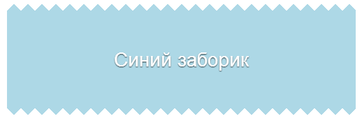
As a result, we got a block with teeth that can be stretched as much as you like. Pseudo-elements are not involved, they can be used, for example, to add the same teeth on the sides.
Demo