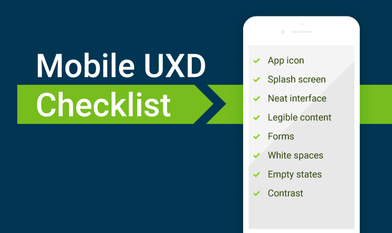
Mandatory checklist for the development of mobile application UX-design
- Transfer
From the translator: This article was originally published by the co-founder of Django Stars, Roman Gaponov, in his English-language blog on Medium. We have translated this review of the main UX-nuances of Mobile and present it to your attention.
The article will help developers who are engaged in the field of mobile UX-design, get useful tips and tricks. We will tell about the key points that need to be checked during the development process. The material also tells how to avoid the “designer traps”.

Do not consider it shameful to spend some of your own time and effort to create custom icons for your application. It will make it recognizable among other relevant user request programs in the application catalog and on the end-user mobile device.
The icon should be made simple, but at the same time attracting attention. Do not forget to also test its visibility on various wallpaper. It should look cool, regardless of the background image.
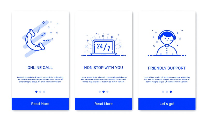
First decide for yourself whether you really need it. Think of the user case of your application. If the program is designed for quick access to data, this one. If it was created in order to encourage the user to perform certain actions, is another. Do not use a boot screen that simply wastes user time and has no specific purpose. Try to make it useful - at least to show the progress bar download the application. A good start option is the application Share the Meal .

“Simplicity is the basis of refinement” - this is true. Make design elements simple so that it is easy to interact with. Each button, shape, image, or any other part of the interface should be harmonious, not cluttering the space. Show the main elements on the main screen, hide all secondary ones.

The text should be accessible to the user so that he can read without magnification. The recommended font size is specified in the recommendations of both Apple and Google.
They should be as comfortable and easy to use as possible. The height and width of the input fields should follow Apple and Google recommendations. Forms should be clear so that the user knows exactly what needs to be done now and what the next step will be.
Autocomplete is a good way to save time for the user, while using autocorrection is an extra headache. And finally, try to avoid entering manual data where it is possible (for example, when determining the address via GPS).

In case we are talking about a selling application such as an online store, a delivery service, or something similar, the images should be of the highest quality to show what you want to sell. Zoom in photos is a great idea, because users will be able to understand what kind of product they are offered. Select the default image that will be shown in full size and show clickable icons that will allow the user to enlarge the image. True, it is worth thinking about your target audience, specifying from which region it is. The fact is that the Internet in some countries is not very fast, and detailed images will not load properly.
Yes, we are talking about the so-called white space - a place where there is nothing: no icons or inscriptions. But this is an important design element, because it allows you to separate the main from the secondary and generally helps the user to navigate to avoid erroneous clicks.
Here we mean empty states - they make the design more aesthetic and provide the user with important information. In order not to miss the significant nuances of working out the interaction, make sure that your users can always understand what needs to be done.
It is worth thinking about the contrast between the main font and the background. This is better perceived by users. The W3C recommends using the following text and image contrast metrics:

Navigation in the application should be intuitive and use the standard elements / techniques of the selected OS. Do not move navigation controls to unexpected places - this will disorient the user. When planning the placement of navigation elements, you should think about the position of the arm / hands. It will differ on the mobile phone and tablet, as well as in the vertical and horizontal orientations of the device.

Decide if you really need both types. I would recommend to refuse the option of changing the layout in applications with complex UX architecture, which has many navigation elements (for example, Facebook even made its Messenger a separate application so that the original interface of the social network application was less cluttered), as this will lead to a noticeable loss of space for content.
In the case of multimedia applications such as YouTube, where the user spends most of his time viewing content, the opposite is true; both modes are needed here. In addition, do not forget that landscape mode forces the user to use both hands for manipulations, which should appropriately affect the positioning of the controls.
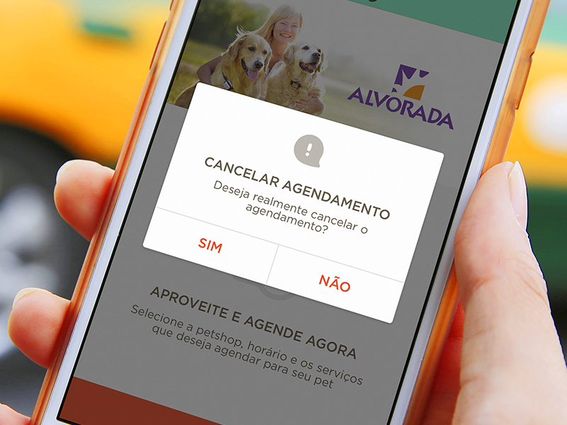
Even if the elements for tapas are large enough and there is free space between them, there is always the possibility of erroneous pressing. Implementing a confirmation for actions to remove something is very important. (And, of course, do not forget that there should be a cancel button.)

Yes, you can ask users to express their opinion about the application. But do not repeat the request every five minutes. Avoid this.
The article will help developers who are engaged in the field of mobile UX-design, get useful tips and tricks. We will tell about the key points that need to be checked during the development process. The material also tells how to avoid the “designer traps”.
Skillbox recommends: an online course for UX-analytics We
remind: for all Habr readers - 10 000 discount when writing to any Skillbox course using the promo code “Habr”.
Application icon
Do not consider it shameful to spend some of your own time and effort to create custom icons for your application. It will make it recognizable among other relevant user request programs in the application catalog and on the end-user mobile device.
The icon should be made simple, but at the same time attracting attention. Do not forget to also test its visibility on various wallpaper. It should look cool, regardless of the background image.
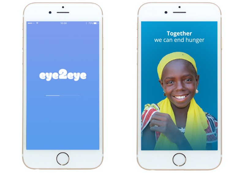
Splash screen
First decide for yourself whether you really need it. Think of the user case of your application. If the program is designed for quick access to data, this one. If it was created in order to encourage the user to perform certain actions, is another. Do not use a boot screen that simply wastes user time and has no specific purpose. Try to make it useful - at least to show the progress bar download the application. A good start option is the application Share the Meal .
Convenient interface
“Simplicity is the basis of refinement” - this is true. Make design elements simple so that it is easy to interact with. Each button, shape, image, or any other part of the interface should be harmonious, not cluttering the space. Show the main elements on the main screen, hide all secondary ones.
Content is important
The text should be accessible to the user so that he can read without magnification. The recommended font size is specified in the recommendations of both Apple and Google.
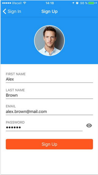
Forms
They should be as comfortable and easy to use as possible. The height and width of the input fields should follow Apple and Google recommendations. Forms should be clear so that the user knows exactly what needs to be done now and what the next step will be.
Autocomplete is a good way to save time for the user, while using autocorrection is an extra headache. And finally, try to avoid entering manual data where it is possible (for example, when determining the address via GPS).
Images
In case we are talking about a selling application such as an online store, a delivery service, or something similar, the images should be of the highest quality to show what you want to sell. Zoom in photos is a great idea, because users will be able to understand what kind of product they are offered. Select the default image that will be shown in full size and show clickable icons that will allow the user to enlarge the image. True, it is worth thinking about your target audience, specifying from which region it is. The fact is that the Internet in some countries is not very fast, and detailed images will not load properly.
Do not forget about empty space
Yes, we are talking about the so-called white space - a place where there is nothing: no icons or inscriptions. But this is an important design element, because it allows you to separate the main from the secondary and generally helps the user to navigate to avoid erroneous clicks.
Skips
Here we mean empty states - they make the design more aesthetic and provide the user with important information. In order not to miss the significant nuances of working out the interaction, make sure that your users can always understand what needs to be done.
Colour contrast
It is worth thinking about the contrast between the main font and the background. This is better perceived by users. The W3C recommends using the following text and image contrast metrics:
- The contrast ratio of a small text should be at least 4.5: 1 relative to the background;
- the similar indicator for the big text - from 3: 1.
Navigation
Navigation in the application should be intuitive and use the standard elements / techniques of the selected OS. Do not move navigation controls to unexpected places - this will disorient the user. When planning the placement of navigation elements, you should think about the position of the arm / hands. It will differ on the mobile phone and tablet, as well as in the vertical and horizontal orientations of the device.
Portrait / landscape layout
Decide if you really need both types. I would recommend to refuse the option of changing the layout in applications with complex UX architecture, which has many navigation elements (for example, Facebook even made its Messenger a separate application so that the original interface of the social network application was less cluttered), as this will lead to a noticeable loss of space for content.
In the case of multimedia applications such as YouTube, where the user spends most of his time viewing content, the opposite is true; both modes are needed here. In addition, do not forget that landscape mode forces the user to use both hands for manipulations, which should appropriately affect the positioning of the controls.
Delete confirmation
Even if the elements for tapas are large enough and there is free space between them, there is always the possibility of erroneous pressing. Implementing a confirmation for actions to remove something is very important. (And, of course, do not forget that there should be a cancel button.)
Do not beg for evaluation
Yes, you can ask users to express their opinion about the application. But do not repeat the request every five minutes. Avoid this.
Skillbox recommends:
- Practical course Mobile Application Design (feat. Redmadrobot!).
- Annual online course "Profession Web Developer" .
- Practical two-month course UX-design .