 February 17, 2016 at 18:44
All CSS vertical alignment methods
I think many of you who had to do the layout have faced the need to align elements vertically and know what difficulties arise when aligning an element in the center.
Yes, there is a special property
vertical-alignwith many values for vertical alignment in CSS . However, in practice, it does not work at all as expected. Let's try to figure it out. Compare the following approaches. Alignment with:
- tables
- indentation
line-height,- stretching
- negative
margin, transform,- pseudo-element
flexbox.
As an illustration, consider the following example.
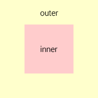
There are two elements
div, with one of them embedded in the other. We give them the corresponding classes - outerand inner.The challenge is to align the inner element to the center of the outer element.
First, consider the case when the dimensions of the external and internal blocks are known . Add an internal rule element
display: inline-block, and external - text-align: centerand vertical-align: middle. I recall that alignment applies only to elements that have a display mode
inlineor inline-block. Set the dimensions and the background colors for the blocks to see their borders.
.outer {
    width: 200px;
    height: 200px;
    text-align: center;
    vertical-align: middle;
    background-color: #ffc;
}
.inner {
    display: inline-block;
    width: 100px;
    height: 100px;
    background-color: #fcc;
}
After applying the styles, we will see that the indoor unit is aligned horizontally, but not vertically:
http://jsfiddle.net/c1bgfffq/
Why did this happen? The fact is that the property
vertical-alignaffects the alignment of the element itself, and not its contents (except when it applies to table cells). Therefore, applying this property to an external element did not produce anything. Moreover, applying this property to the inner element will also not give anything, since the line blocks ( inline-block) are aligned vertically relative to neighboring blocks, and in our case we have one line block. To solve this problem, there are several techniques. Below we consider each of them in more detail.
Table alignment
The first solution that comes to mind is to replace the external block with a table from one cell. In this case, alignment will be applied to the contents of the cell, that is, to the indoor unit.
http://jsfiddle.net/c1bgfffq/1/
The obvious minus of this solution is that, from the point of view of semantics, it is incorrect to use tables for alignment. The second minus is that to create a table you need to add one more element around the external block.
Minus Origin can be partially removed by replacing the tag
tableand tdon divand setting the display mode in tabular CSS..outer-wrapper {
display: table;
}
.outer {
display: table-cell;
}Nevertheless, the external block will still remain a table with all the ensuing consequences.
Indenting
If the heights of the indoor and outdoor units are known, then the alignment can be set using the vertical indentation of the indoor unit using the formula: (H outer - H inner ) / 2.
.outer {
    height: 200px;
}
.inner {
    height: 100px;
    margin: 50px 0;
}
http://jsfiddle.net/c1bgfffq/6/
Minus of the solution - it is applicable only in a limited number of cases where the heights of both blocks are known.
Aligning with line-height
If it is known that the inner block should occupy no more than one line of text, then you can use the property
line-heightand set it equal to the height of the outer block. Since the content of the inner block should not be wrapped to the second line, it is recommended that you add rules white-space: nowrapand overflow: hidden..outer {
height: 200px;
line-height: 200px;
}
.inner {
white-space: nowrap;
overflow: hidden;
}http://jsfiddle.net/c1bgfffq/12/
This technique can also be used to align multi-line text, if you override the value for the indoor unit
line-heightand add rules display: inline-blockand vertical-align: middle..outer {
height: 200px;
line-height: 200px;
}
.inner {
line-height: normal;
display: inline-block;
vertical-align: middle;
}http://jsfiddle.net/c1bgfffq/15/ The
disadvantage of this method is that the height of the external block must be known.
Stretch Alignment
This method can be applied when the height of the outdoor unit is unknown, but the height of the indoor unit is known.
To do this, you need:
- set the external block relative positioning, and the internal - absolute;
- add rules to the inner block
top: 0andbottom: 0, as a result, it will stretch to the entire height of the outer block; - set the value
autofor the vertical padding of the indoor unit.
.outer {
    position: relative;
}
.inner {
    height: 100px;
    position: absolute;
    top: 0;
    bottom: 0;
    margin: auto 0;
}
http://jsfiddle.net/c1bgfffq/4/
The essence of this technique is that setting the height for the stretched and absolutely positioned block causes the browser to calculate the vertical indentation in equal proportions, if their value is set to
auto. http://www.w3.org/TR/CSS2/visudet.html#abs-non-replaced-height
Minus of this method - the height of the indoor unit must be known.
Aligning with negative margin-top
This method is widely known and is used very often. Like the previous one, it is applied when the height of the outer block is unknown, but the height of the inner one is known.
It is necessary to set the relative positioning of the external unit, and the absolute position of the internal one. Then you need to move the indoor unit down half the height of the outdoor unit
top: 50%and raise up half its own height margin-top: -H inner / 2..outer {
position: relative;
}
.inner {
height: 100px;
position: absolute;
top: 50%;
margin-top: -50px;
}http://jsfiddle.net/c1bgfffq/13/
Minus of this method - the height of the indoor unit must be known.
Aligning with transform
This method is similar to the previous one, but it can be applied when the height of the indoor unit is unknown. In this case, instead of setting a negative indentation in pixels, you can use the property
transformand raise the indoor unit using the function translateYand value -50%..outer {
position: relative;
}
.inner {
position: absolute;
top: 50%;
transform: translateY(-50%);
}http://jsfiddle.net/c1bgfffq/9/
Why in the previous method it was impossible to set the value in percent? Since the percentage values of the property
marginare calculated relative to the parent element, a value of 50% would equal half the height of the outer block, and we needed to raise the inner block to half its own height. The property is just right for this transform. The disadvantage of this method is the limited support for the property by
transformolder versions of the IE browser.Pseudo-alignment
This is the most universal way that can be applied when the heights of both blocks are unknown.
The essence of the method is to add a lowercase block in
inline-blockheight inside the external block 100%and set it to vertical alignment. In this case, the height of the added block will be equal to the height of the external block. The indoor unit will be aligned vertically with respect to the added, and therefore external unit. In order not to violate the semantics, it is recommended to add the line block using the pseudo-element
beforeor after..outer:before {
display: inline-block;
height: 100%;
vertical-align: middle;
content: "";
}
.inner {
display: inline-block;
vertical-align: middle;
}http://jsfiddle.net/c1bgfffq/10/ The
disadvantage of this method is that it cannot be applied if the indoor unit has absolute positioning.
Alignment with Flexbox
The most modern way of vertical alignment is to use Flexible Box Layout (popularly known as
Flexbox). This module allows you to flexibly control the positioning of elements on the page, arranging them almost any way. Aligning the center for Flexbox is a very simple task. The external unit must be set
display: flex, and the internal - margin: auto. And it's all! Beautiful, is not it?.outer {
display: flex;
width: 200px;
height: 200px;
}
.inner {
width: 100px;
margin: auto;
}http://jsfiddle.net/c1bgfffq/14/
Minus of this method - Flexbox is supported only by modern browsers.
Which way to choose?
It is necessary to proceed from the statement of the problem:
- For vertical alignment of the text, it is better to use vertical indentation or property
line-height. - For absolutely positioned elements with a known height (for example, icons), a method with a negative property is ideal
margin-top. - For more complex cases when the height of the block is unknown, you need to use a pseudo-element or property
transform. - Well, if you are so lucky that you do not need to support older versions of the IE browser, then, of course, it is better to use it
Flexbox.