 December 5, 2012 at 08:43
Focus point in responsive images
Today, there are several techniques for adapting images for viewing on screens of any size. Most of them come down to simple scaling. In this article, we’ll look at a slightly trickier way — focusing on specific points.
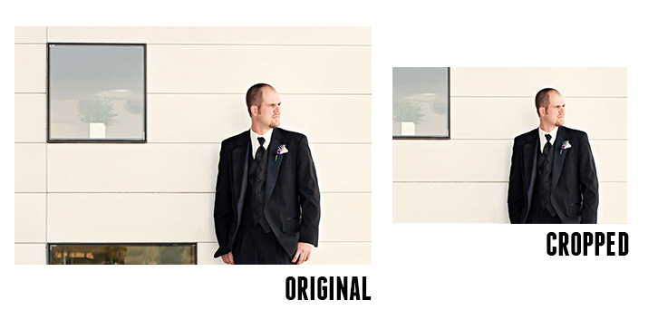
Focal Point is an HTML / CSS framework introduced on GitHub by Adam Bradley. One of the easiest ways to work with responsive images is to crop sides that don't fit on the screen. However, you can accidentally crop the usable image space. Using Focal Point, you can specify important focus points of the image that will not be cropped:

The principle of operation is quite simple: the entire image is divided by a special grid in a 12x12 ratio:

Now you need to select the focus point on the image using impromptu coordinates. This is usually the face in the photo. It is necessary to count from the center of the grid, in the above example, the face is located three cells above and three to the right of the center:

Let's move on to the code. The markup is quite simple, focal-point and the coordinates of the focal point are indicated in the block classes. The disadvantage of the framework is the need to enclose the image in two divs:
The result is a beautiful and correct scaling of the adaptive image:

Here are two live examples of such adaptive images. The resulting markup is not too cumbersome, HTML:
CSS:
As for cross-browser compatibility, the method works in all modern browsers, including IE8. If you look deeper into the principle of the framework, then everything turns out to be quite simple: all classes of coordinates of focus points are registered in CSS using media queries:
Therefore, in the case of a small number of images that need to be scaled on the site, you can do without the entire Focal Point framework by simply using the right part of CSS. DesignShack
website examples .
Focal Point is an HTML / CSS framework introduced on GitHub by Adam Bradley. One of the easiest ways to work with responsive images is to crop sides that don't fit on the screen. However, you can accidentally crop the usable image space. Using Focal Point, you can specify important focus points of the image that will not be cropped:
The principle of operation is quite simple: the entire image is divided by a special grid in a 12x12 ratio:
Now you need to select the focus point on the image using impromptu coordinates. This is usually the face in the photo. It is necessary to count from the center of the grid, in the above example, the face is located three cells above and three to the right of the center:
Let's move on to the code. The markup is quite simple, focal-point and the coordinates of the focal point are indicated in the block classes. The disadvantage of the framework is the need to enclose the image in two divs:

The result is a beautiful and correct scaling of the adaptive image:
Here are two live examples of such adaptive images. The resulting markup is not too cumbersome, HTML:
Focal Point
Lorem ipsum...
Focal Point
Lorem ipsum...

CSS:
* {
  margin: 0;
  padding: 0;
  -webkit-box-sizing: border-box;
  -moz-box-sizing: border-box;
  -ms-box-sizing: border-box;
  box-sizing: border-box;
}
.column {
  float: left;
  overflow: auto;
  padding: 20px;
  width: 50%;
}
h1  {
  text-transform: uppercase;
  font: bold 45px/1.5 Helvetica, Verdana, sans-serif;
}
p {
  margin-bottom: 20px;
  color: #888;
  font: 14px/1.5 Helvetica, Verdana, sans-serif;
}
@media all and (max-width: 767px) {
  p {
    font-size: 12px;
  }
  h1 {
    font-size: 35px;
  }
}
@media all and (max-width: 550px) {
  h1 {
    font-size: 23px;
  }
}
As for cross-browser compatibility, the method works in all modern browsers, including IE8. If you look deeper into the principle of the framework, then everything turns out to be quite simple: all classes of coordinates of focus points are registered in CSS using media queries:
@media all and (max-width: 767px) {
    /* 4x3 Landscape Shape (Default) */
    .focal-point div {
        margin: -3em -4em;
    }
    /* Landscape up (Total 6em) */
    .up-3 div {
        margin-top:    -1.5em;
        margin-bottom: -4.5em;
    }
    .right-3 div {
        margin-left:  -6em;
        margin-right: -2em;
    }
}
Therefore, in the case of a small number of images that need to be scaled on the site, you can do without the entire Focal Point framework by simply using the right part of CSS. DesignShack
website examples .