Q & A about Start Screen in Windows 8
With the release of Windows 8, personal computer users were divided into 2 warring camps: the first like the changes in the system interface, the others are categorically against it.
I will try to put all the points above 8, tell about my vision of the problem, comment on the whole list of questions that people ask from topic to topic, which are simply impossible to answer for the ten thousandth time.

Q: What is wrong with the old start-up?
ABOUT:The guys from Microsoft, collecting statistics on their OS, came to an interesting conclusion - they used the launch in Windows 7 mainly for the Search Box. The launch itself was terribly uncomfortable, it was impossible to do almost anything in it. Bill Gates' company realized that it was time to change a lot, since all the start-up functionality could be replaced with a bunch of superbar + searchbox. Many did so, and I am no exception. But the place on the superbar was over, I had to put the left clone of the Eplovian “shelf”.
Q: Well, you could do something really worthwhile, beautiful and comfortable. Why is everything so?
ABOUT:Microsoft has set a goal - to make a universal OS for tablets, phones and PCs. Simple, concise and comfortable. You must admit that the best solution was right in front of you: “this button”, which was no longer necessary with each new release, was ideal for changing the graphical interface to a tablet.
Q: Fullscreen launch is disgusting, so much empty space. What for?
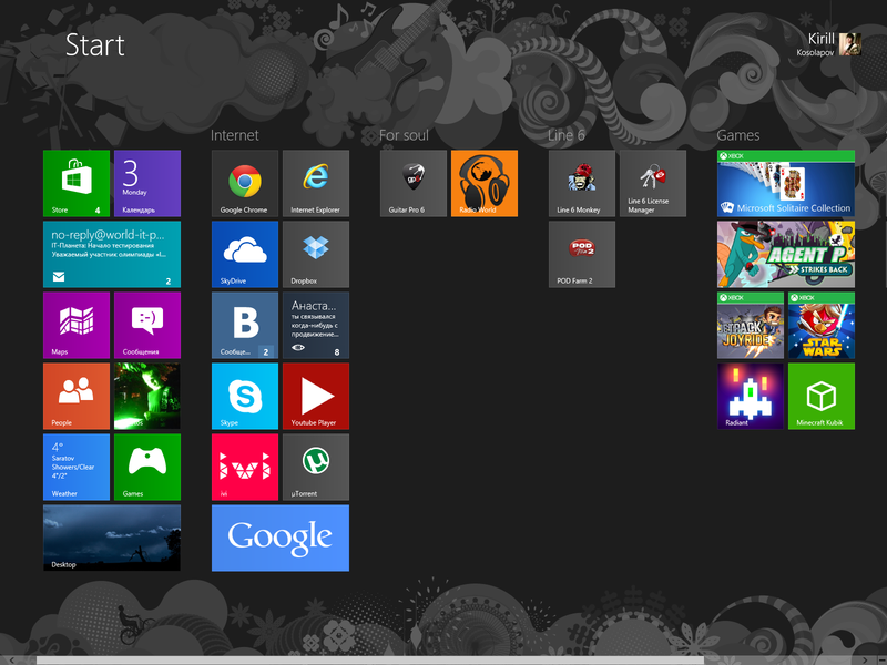
A: Then, so that the start menu can be configured exactly as it is convenient for you. Group icons and tiles. For me, it has become a native and convenient analogue of the “shelf”.
But if you do not like it, then you can not use it, just as you did not use it before.
Q: Where did the search go?
ABOUT:The search works the same way - start typing something from the keyboard in the start screen and you will instantly see grouped results by application, settings, documents and, which is important, in any installed metro application. This separation is good or it’s up to you to decide. But the new search has become many times faster and more functional.
Q: I do not understand the meaning of tiles.
A: Tiles are an innovative idea that they were not afraid to demonstrate in the new operating system.
Tiles are shortcut widgets that allow the application to show at its discretion the most important information for you. This is a natural evolution of shortcuts - static images with a link.
Q: All these metro applications are not convenient when using the mouse! How am I supposed to be now?
ABOUT:No way. Nobody forces you to use them - they will never replace the desktop environment. Microsoft understands this very well.
Q: Is there anything new besides the subway and quick start?
A: In the explorer, for example, a Ribbon ribbon appeared with the most important and frequent settings - including the checkboxes “show extensions of registered files” and “show hidden files” (just click View-> Show X) We
also made a single file manager . Improved time determination when copying a file, made a speed graph.
And also made a new Task Manager. Convenient with the charts, but they have not deleted the old one either, you can call it by writing its name in the run window (win + r).
IN:2 control panels, the shutdown and restart button is not clear where. Why is everything so?
A: Alas, not everything is as smooth as we would like. Microsoft had to split the settings into “Metro Settings” and “Normal Control Panel”. And in order to please the touch screens, the main computer settings were transferred to the Charm panel.
Including for ideological reasons.
Q: Why didn’t they give users a choice, do we want all this or not?
A: Microsoft is a commercial company, and by no means least of all is thinking about promoting its promising areas.
I hope I answered the most important questions about the metro environment on desktops.
Please send all typos / errors in PM. And also to supplement the article with your sore questions.
I will try to put all the points above 8, tell about my vision of the problem, comment on the whole list of questions that people ask from topic to topic, which are simply impossible to answer for the ten thousandth time.

Q: What is wrong with the old start-up?
ABOUT:The guys from Microsoft, collecting statistics on their OS, came to an interesting conclusion - they used the launch in Windows 7 mainly for the Search Box. The launch itself was terribly uncomfortable, it was impossible to do almost anything in it. Bill Gates' company realized that it was time to change a lot, since all the start-up functionality could be replaced with a bunch of superbar + searchbox. Many did so, and I am no exception. But the place on the superbar was over, I had to put the left clone of the Eplovian “shelf”.
Q: Well, you could do something really worthwhile, beautiful and comfortable. Why is everything so?
ABOUT:Microsoft has set a goal - to make a universal OS for tablets, phones and PCs. Simple, concise and comfortable. You must admit that the best solution was right in front of you: “this button”, which was no longer necessary with each new release, was ideal for changing the graphical interface to a tablet.
Q: Fullscreen launch is disgusting, so much empty space. What for?
A: Then, so that the start menu can be configured exactly as it is convenient for you. Group icons and tiles. For me, it has become a native and convenient analogue of the “shelf”.
But if you do not like it, then you can not use it, just as you did not use it before.
Q: Where did the search go?
ABOUT:The search works the same way - start typing something from the keyboard in the start screen and you will instantly see grouped results by application, settings, documents and, which is important, in any installed metro application. This separation is good or it’s up to you to decide. But the new search has become many times faster and more functional.
Q: I do not understand the meaning of tiles.
A: Tiles are an innovative idea that they were not afraid to demonstrate in the new operating system.
Tiles are shortcut widgets that allow the application to show at its discretion the most important information for you. This is a natural evolution of shortcuts - static images with a link.
Q: All these metro applications are not convenient when using the mouse! How am I supposed to be now?
ABOUT:No way. Nobody forces you to use them - they will never replace the desktop environment. Microsoft understands this very well.
Q: Is there anything new besides the subway and quick start?
A: In the explorer, for example, a Ribbon ribbon appeared with the most important and frequent settings - including the checkboxes “show extensions of registered files” and “show hidden files” (just click View-> Show X) We
also made a single file manager . Improved time determination when copying a file, made a speed graph.
And also made a new Task Manager. Convenient with the charts, but they have not deleted the old one either, you can call it by writing its name in the run window (win + r).
IN:2 control panels, the shutdown and restart button is not clear where. Why is everything so?
A: Alas, not everything is as smooth as we would like. Microsoft had to split the settings into “Metro Settings” and “Normal Control Panel”. And in order to please the touch screens, the main computer settings were transferred to the Charm panel.
Including for ideological reasons.
Q: Why didn’t they give users a choice, do we want all this or not?
A: Microsoft is a commercial company, and by no means least of all is thinking about promoting its promising areas.
I hope I answered the most important questions about the metro environment on desktops.
Please send all typos / errors in PM. And also to supplement the article with your sore questions.
