Development of an editor for creating web sites / landing pages (experience)
- Tutorial
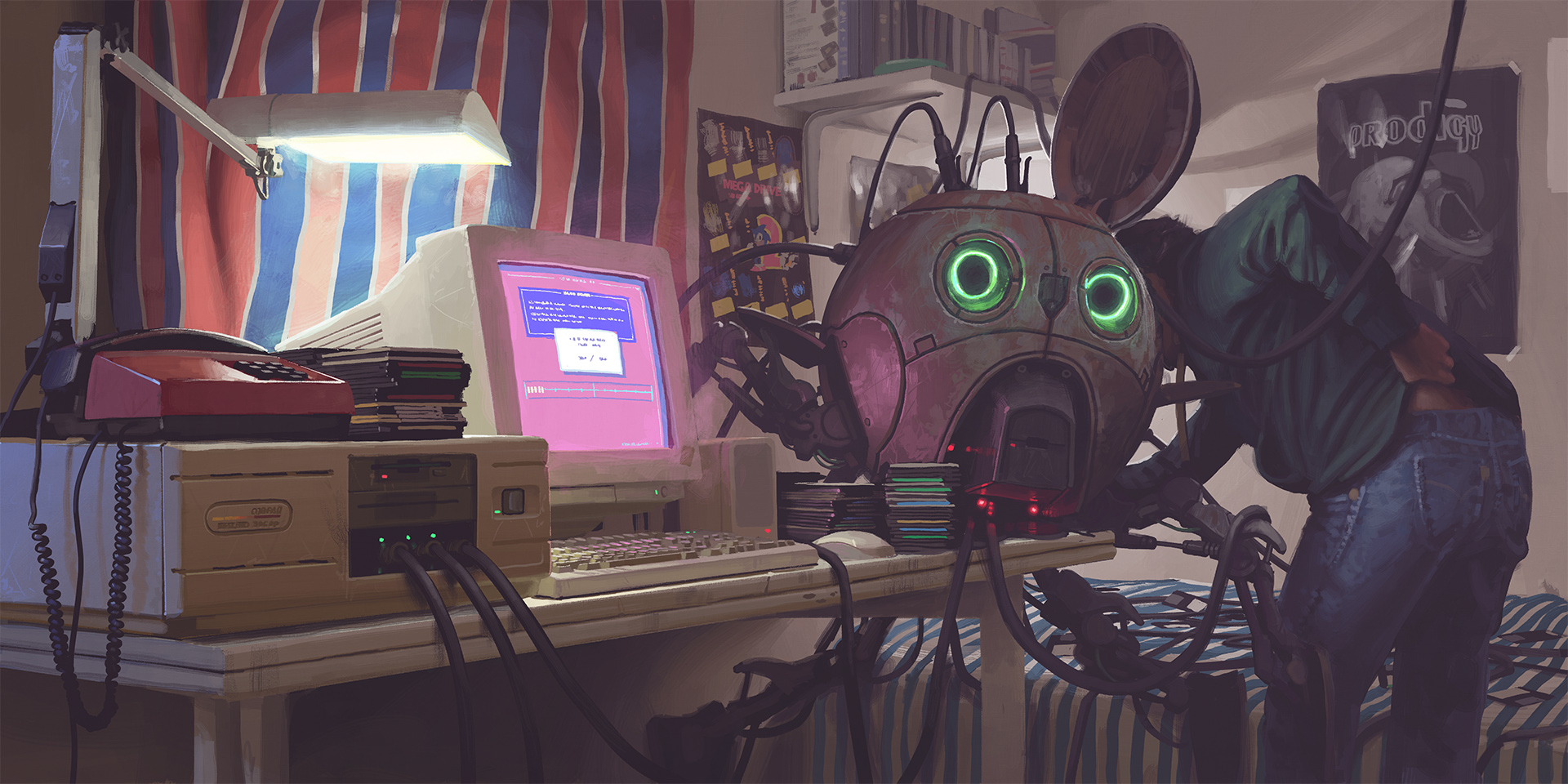
(Art by http://www.simonstalenhag.se/ )
Background / Disclaimer
Hello everyone, this article is in fact material for my performance on Monday at the marathon in Kiev. But do not think that you are the audience on which I work out the text, it's just easier for me to prepare.
I'm currently a front-end developer at Conductor / WeWork. We do not develop editors, as I, in the evenings, do not develop such things. This is more about the experience that I received on a past project in the company UTI (abbreviated), util, uti-…. It was a long time ago, but as it turns out, the topic is relevant to this day, as are the jambs associated with it.
This is usually about the site business cards, landings, and less functional sites, but of course not about the back office or admin.
UTIEditor special for you <3
Why do we need such editors?
There are quite a lot of answers to this question, many of you, I am sure, guess so.
I will answer this question from the point of view of UTI, a company that provides website development services.
UTI is essentially a company of consumer goods. I am sure that everybody worked in such a time, a dozen business card sites per person, a dozen online stores and a branded cherry - its own CMS.
You made another landing page, a business card site and gave it to the client, and he resorts in a day and asks to change the text. After another day, change the background color and add just one picture. For the client, it looks like something simple and fast. It's hard to argue with that, it is. But for you, this means that you need to pull the developer / designer out of his current tasks. Not to mention the work of a manager who spends time on communication. Accordingly, you invoice and it is not small. The customer is indignant and complains. The next time you think in advance about such things and start asking questions, lay the editing functionality in the TOR.
It is probably worth going to discuss this functionality, because it is very different.
I would like to add that I will not include such CMS as WrodPress, Drupal in this conversation, we will concentrate on the market of editors.
Wilds UTI
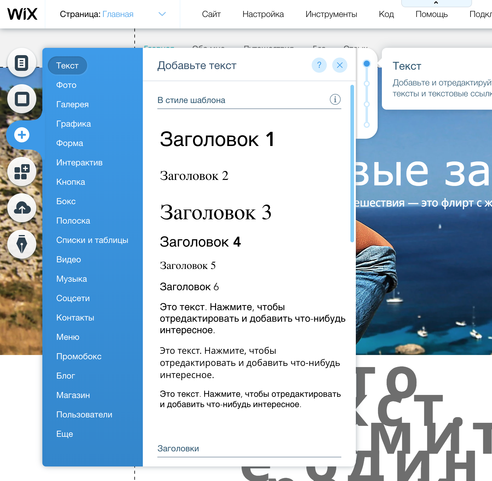
The first thing that comes to mind is to make a form where the user can change what he wants:
The name of the fields is not a bit of real life, but you have caught the essence.
From the point of view of the company, she fulfilled her duty and even took care of "customization". But this approach still has a number of limitations.
Advantages of this approach:
- Easy to implement
- Easy to use
- Solves the problem
Cons of this approach:
- There is no possibility to change the design
- No way to change behavior
- No positioning
- You can edit, only, what was put in the form
Have you thought about СKEeditor yet ? The star of all time. By complaining this is the next step to improve the editable content on the site.
There is a kind of possibility to format the text and even insert some additional elements. Somewhere in this place, before I came to the company, the guys had an idea, to make a page editor with drag and drop right in CKEditor. I unfortunately do not have anything left that I could show, but you try to imagine this horror :)
But at the moment, in 2018, so to speak, CKEditor has advanced a bit in this direction, which is quite funny. What is not a full page?
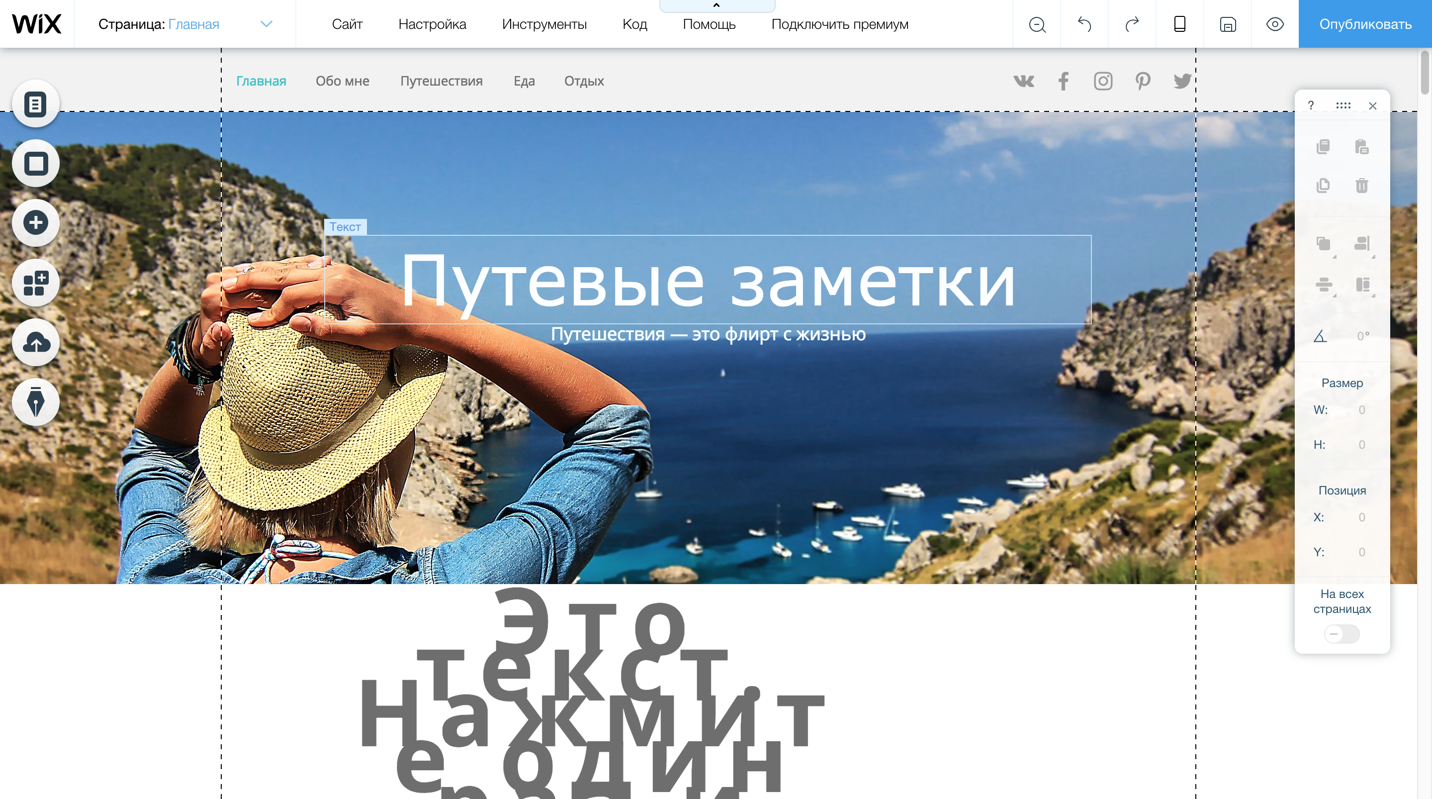
But all this was not convenient both in development and in use. And knowing only backbone and jquery, I already boldly called myself a front-end developer and decided to offer them to develop a full-fledged editor, like Wix, Squarespace, Tilda, LPGenerator ... Then they were in fact my competitors. But since UTI is a no-name company, they did not know about it. And they did not know and will not know. Although the marathon sponsor is Wix. Oh, this is just a coincidence.
They did not know, because everything in the classics - the company did not care about the project.
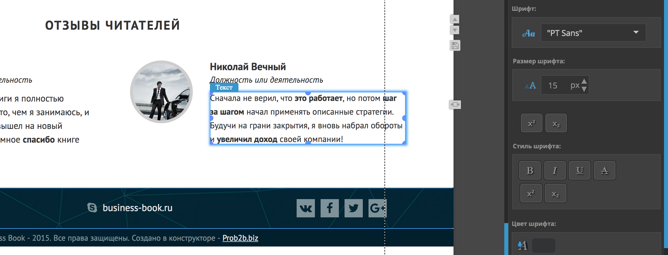
These are two screencasts, they are not ideal, with jambs, but I am sure they will provide a general idea of the editor.
On this project I was alone. Designer, product manager, front and back, and there were no tests and no. But the truth was the manual testers who, when they joined the company, were tempered in the fire of the reactor. Testers of course were fun. What would you understand the level - once, one of them knocked out:
And I filed a bug, they say the site does not work. The guy just dropped the internet cord from the system unit :)
Every time I had to explain something new, what can be done in the editor, what is impossible and why it works like that, and that’s how it is. In fact, for me it was fun. A kind of first line of feedback. There were practically no customers and the editor evolved for the most part thanks to them.
Does anyone have any idea what stack I used? The app looks great, solid so to speak. It is not buggy as it was not buggy 5 years ago.
Oh, and what a smart CI / CD process I have. In prod left as much as you want once a day. Codenamed Filezilla, drag and drop, repeat. First you connect via FTP using filezilla, do a build, download the current build, put it in a folder called backup, upload a new build, and check if anyone died there. If all the same died, then upload the file from the backup folder. But to be honest, the moment with backup, I did not always depend on a set of new functionality. And given that the editor was in several projects, to say that I went into each one and checked if it fell there, that I would not. Did we still use svn, adds flavor?
What about the stack?
Backbone + jquery + 0 tests.
Module, asynchronous loading ala code spliting and serverside rendering. Then such terms were not particularly used, it was a de facto simple optimization. But now is the time marketing in open source and its revolution!
What would you understand, Wix of the time, now is not very different from the Wix editor. Is that more templates, blanks and finished components. They migrated the reactor, completely or not, I do not know. It is absolutely buggy in the same way, only already on MacBooks with RAM from 16gigs, with a cooler rendering system called Virtual House and cool web engines. In projects of this scale, tools do not play a special role, this is more a conversation about architecture and UI / UX. And UI / UX is much more important. It depends on the complexity of implementation, performance and the level of desire to kill yourself when creating a web site by your editor. Clients will generally be far from development, far from all these CSS rules, properties, DOM attributes and parameters. Among them will be more or less knowledgeable people who will serve your customers and continue to divert them.
Clients, if they give them the perfect editing tool, will still not be able to use it. Their crafts will look something like this:
This is true and not true, since the web is just difficult for the humanities, and on the other hand, somewhere there is an ideal UI / UX that will allow you to click a button to make a website, do what you want.
But sometimes it is impossible and have to look for a middle ground.
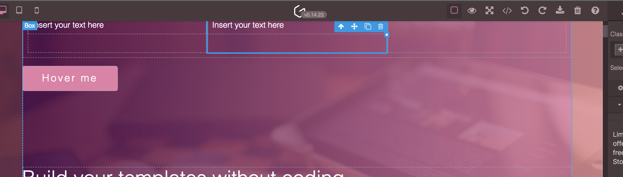
Visual HTML editor
The initial task was this - do it the same way as in CKEditor, so that you can move the elements (text, pictures) and somehow edit / format them.
Also one of the main requirements was the ability to load custom HTML, for further work.
I started by making elements on a draggable page. That is, the user could move them. At first, everything seemed fine, but the more different pieces I tried, the worse it looked. The fact is that custom HTML can be completely arbitrary and not predictable. This leads to the problems of the elementary drag and drop task, the impossibility of understanding what the user has chosen for the element and even it is banal to have control over the page. It was chaos.
Grapesjs allows you to upload your HTML. The text is wrapped in obvious tags, he sees, and the text that is just in body, he does not feel:
Restrictions
Making it possible to upload your HTML, and edit it, is of course a bold move. From the point of view of the user, this is a great freedom. But here is a wonderful example of how things are on the web - A Blue Box .
I am sure there are not even all implementation options. The fact is that the same things in terms of semantics can be implemented in completely different ways, using completely different approaches. And imagine, on the page, something more complicated than a blue square. The same picture can be added to the page using the <img /> tag or set using the background. The button can be <button>, or it can be convoluted <div> or the same image. And how to understand which editing tool to show?
No
00 limit
The next choice is to prohibit a particular layout, make a styling guide or prohibit the loading of custom HTML. Of course we chose the second :)
Limit 01
Since we have banned loading custom HTML, we need our own components / elements, and this is the first step to the real editor.
Limit 02
Since the user will work with a number of our elements, we must prohibit the editor to work with not "our elements" and teach them how to work with them.
Work environment
Not the most interesting topic, but important. I really like the photoshop interface. There are a number of panels, and a workspace. You can manipulate the work area as you want, it is centered and, depending on the size, you can scroll both horizontally and vertically.
Just a lot of me touched my design Google Web Designer:
By the way, is it some kind of Google editor, did someone use it?
The most difficult thing is to split the page in this way. I am not a CSS expert, and this time it was much easier for me, but then it was dancing with tabular layout. Before we go any further, let's see what kind of working area laites are in general.
Photoshop
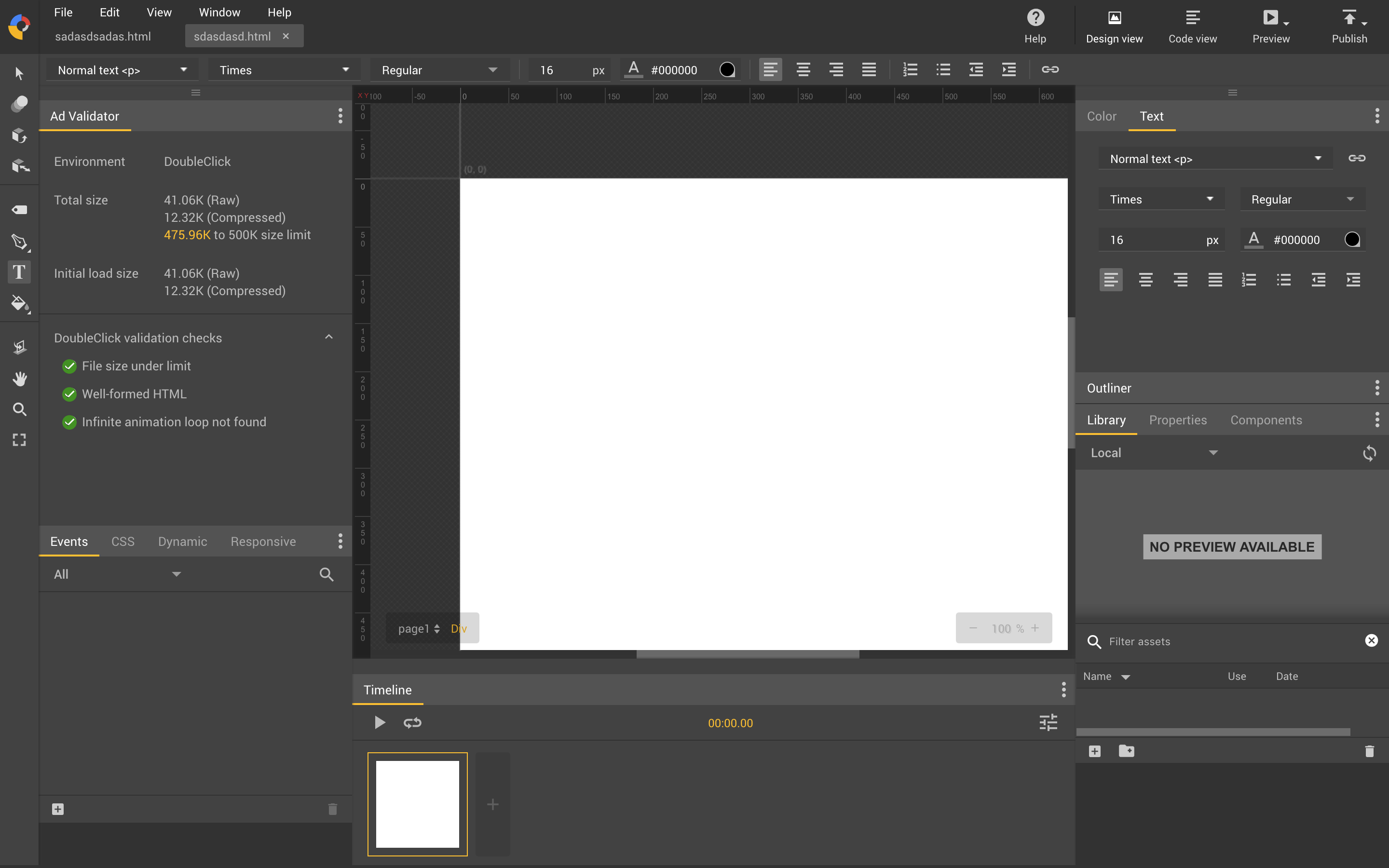
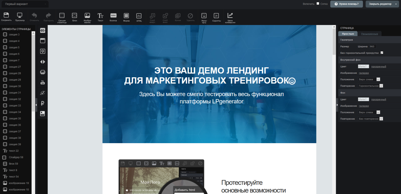
LPGenerator
My creation
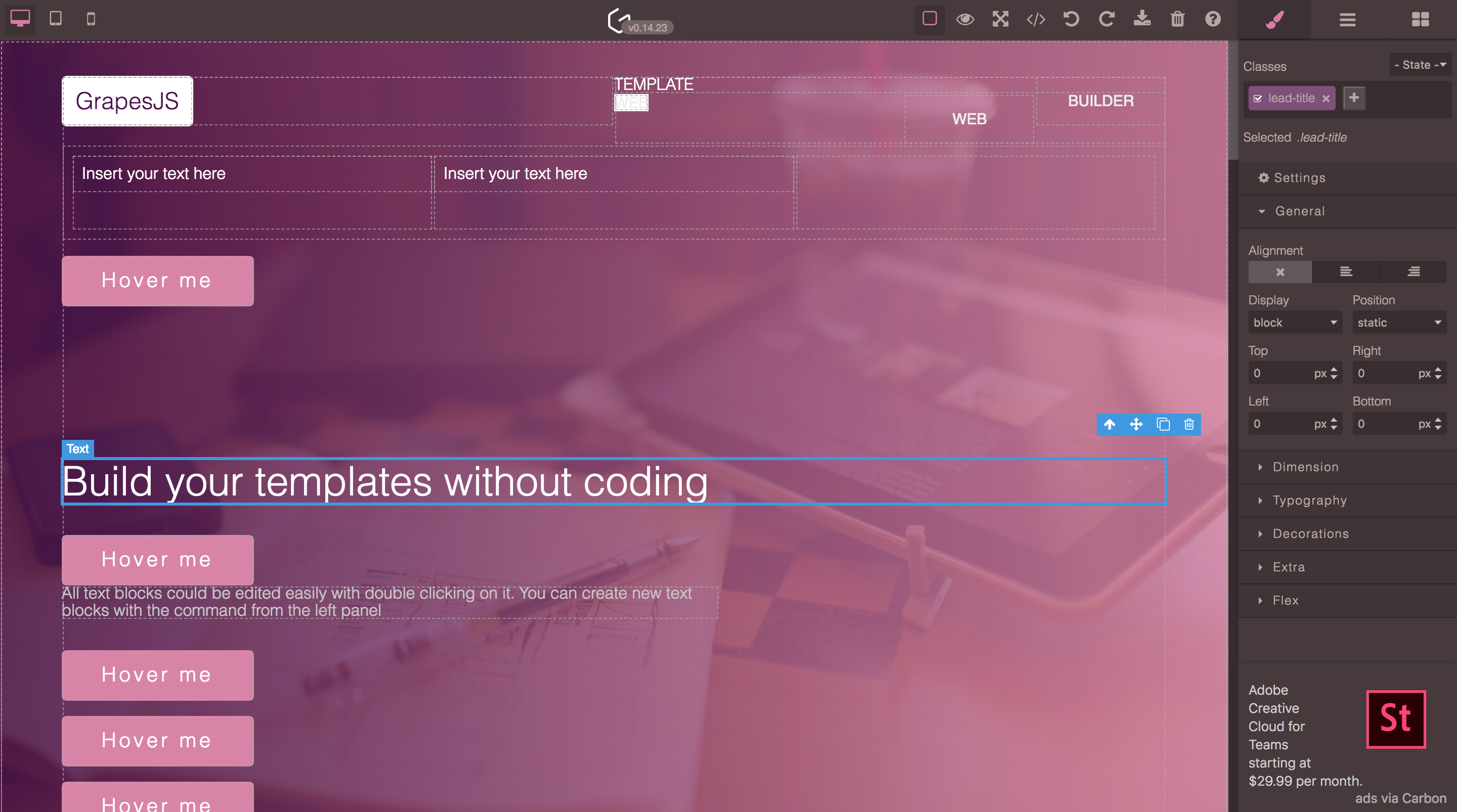
Grapesjs
In fact, we have already discussed this laayut above. On the left are frequently used tools, on the right are the parameters, on the top is something extra, on the bottom is the information bar. The most obvious option, but at the same time overloaded for the user. He is afraid of all these buttons, as if he is in the cockpit and he needs to make an emergency landing.

So overwhelmed to hide everything
Wix
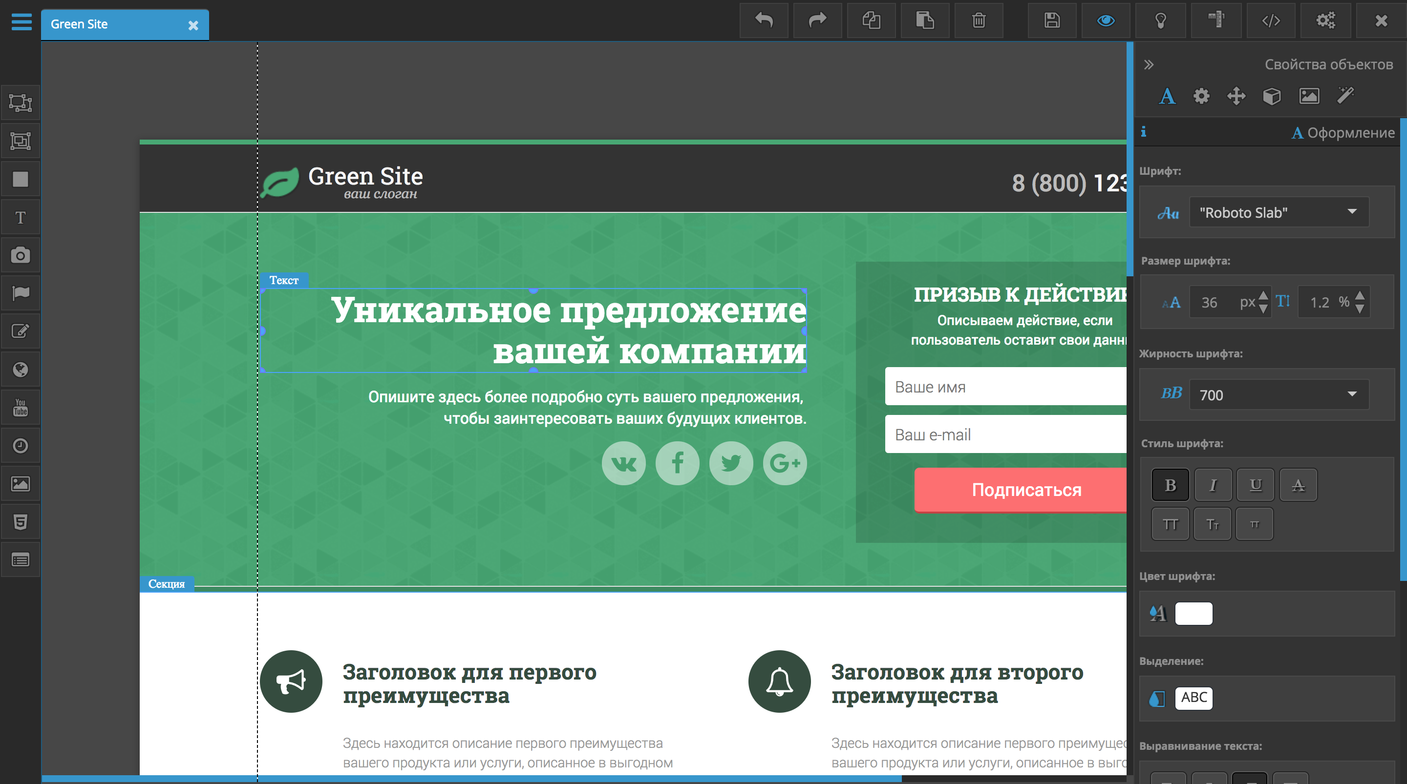
For 5 years, the design of Vicks has changed little. Going into the LPGenerator, you immediately realize that you can drag an element to the page, see the settings and so on. In the case of Wix, everything is initially hidden. This is a good approach. The fact is that the user does not need to see what he most likely will not need at the moment. But here you need to keep a balance. Wix.com has too many elements that you can add to the page and that’s why they made a whole gallery of elements. But of course, obvious things like text or a button could be put on one of the panels for quick access.
When you click on an element, additional functionality appears above it, which refers to the element.

Implement such a thing that hemorrhagic, we will talk about this later.
Minimalist
Squarespace
The minimal design, the work area occupies most of the screen, from the interface the most necessary minimum. The tool kit is very strange. For example, this is how the first screen with a button is edited:
The button here is represented by text.
By itself, the editing mode is very similar to the preview, and only with a double click on some screens, it turns out to go into editing mode.
At the same time, the editor moves us to another part of the application.
I eat groot
Tilda
Editing the site, you seem to be on it. Very similar to Wordpress and its top panel with editing / publishing functionality and so on. But at the same time, the functionality is not as stop as that of Squarespace and the same text is much easier to edit.
To add something, you need to click on +. Move the button to any place convenient for you, it just will not work. Everything is limited.
The consequence of this are such galleries with a bunch of different variants of the same element.
As you could understand, I'm a fan of photoshop. I once suffered with a table layout, but now 2018 and for educational purposes, we can give a damn about support and implement barking on CSS Grids.
If someone is not familiar with CSS grids, then this is one of the latest ways to lay out page layup. If Flexbox is preferable to use for menus, molds and other elements, then CSS Grids, it feels great in global things.
This is not a CSS Grids tutorial, so I’ll explain in a nutshell, but without mega details.
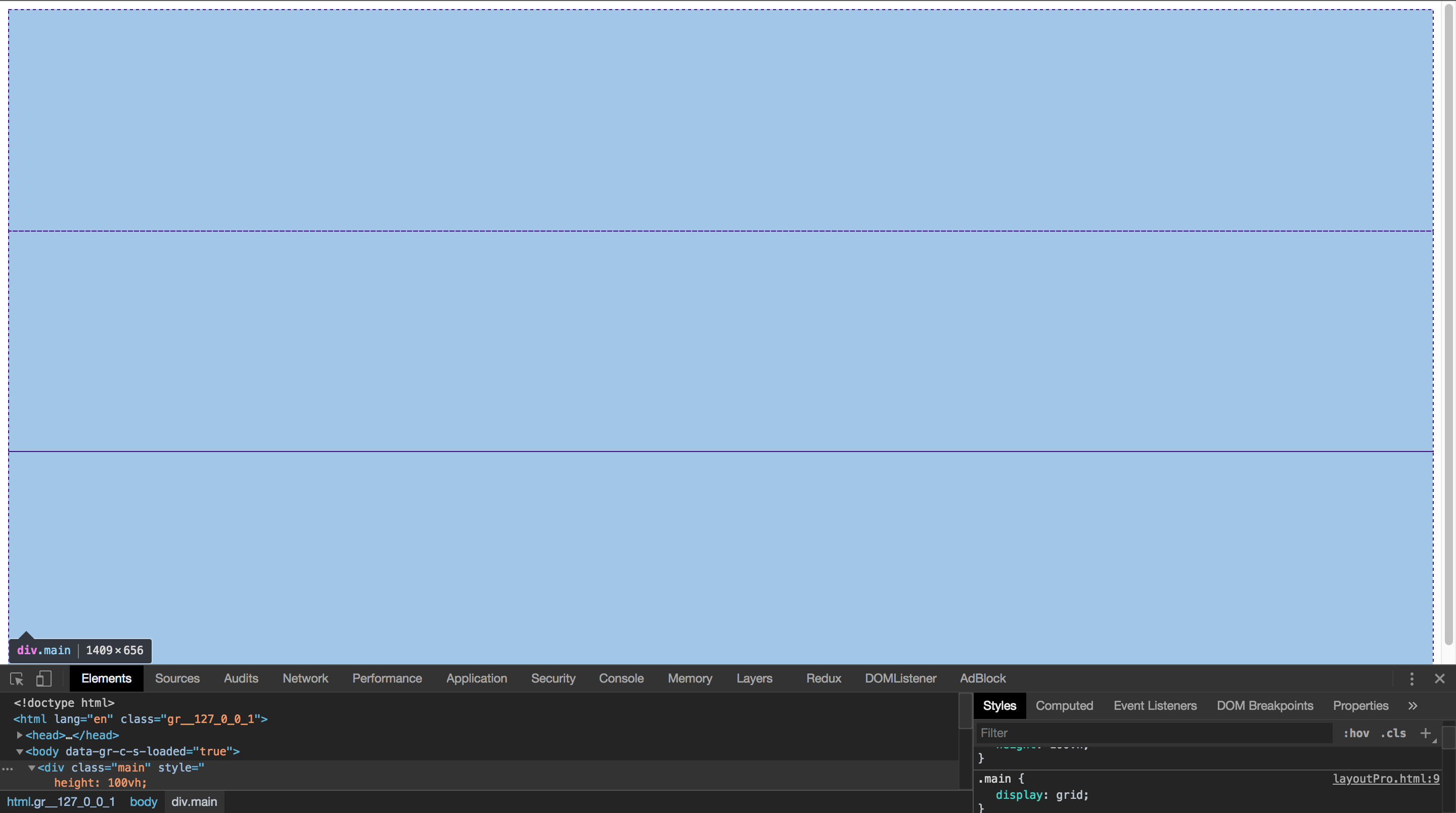
And so our task is to make the left and right panels, and in the middle of the working area where the content of the web site will be displayed.
Working with grids is a little easier in FireFox, which is strange, but chrome is lagging behind in this business. In one of the past articles I have already talked about this.
What does the grid inspection in chrome look like:
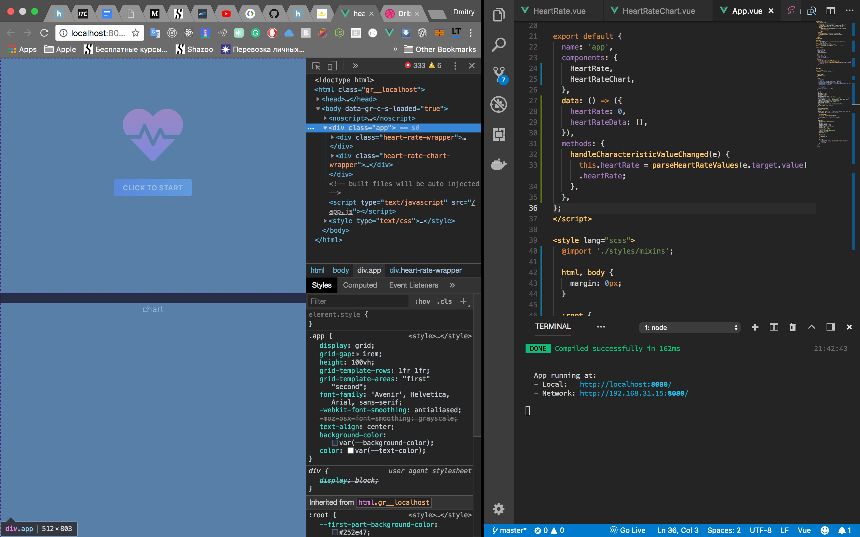
At the same time in the mace:
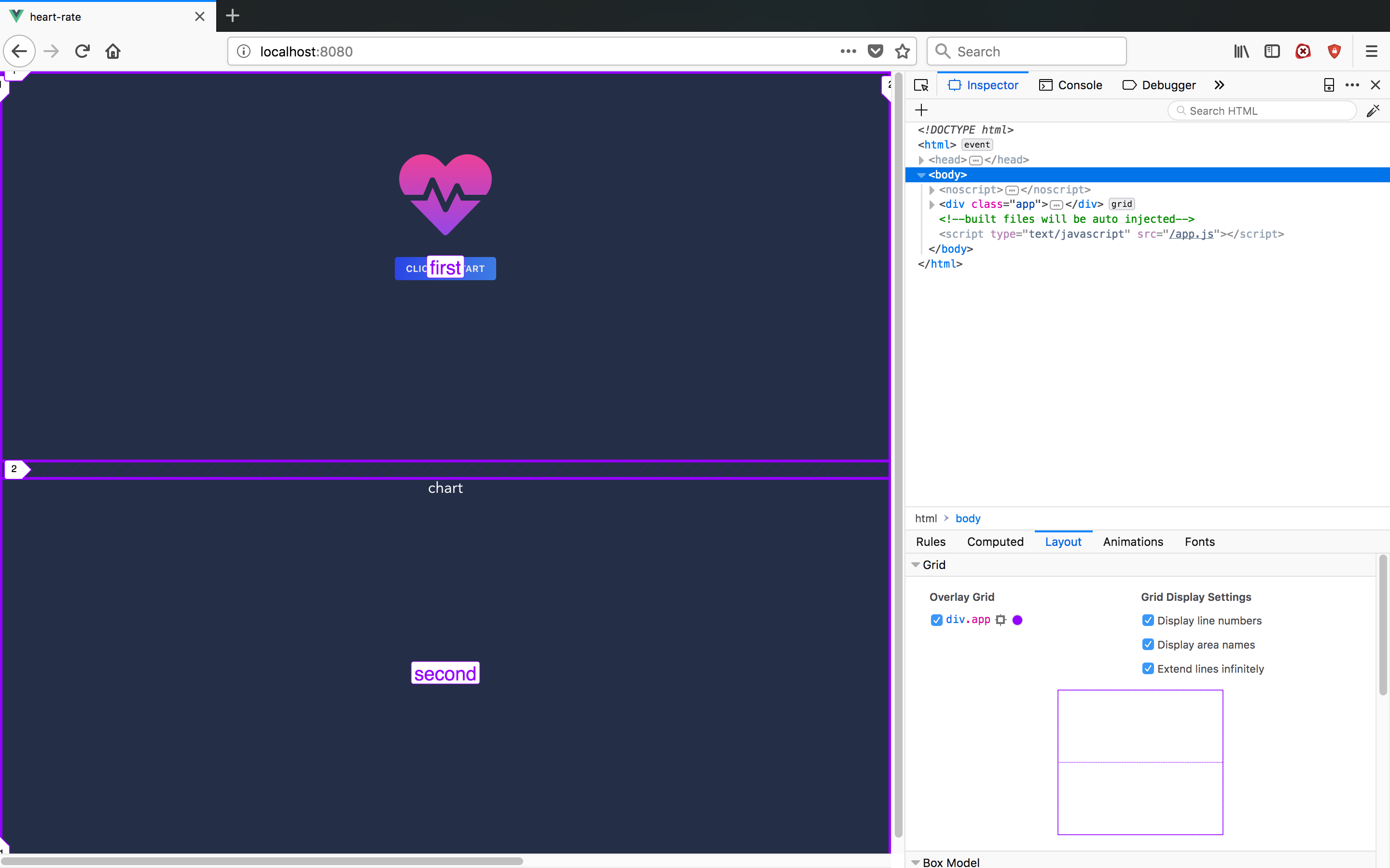
There is a mini grid view, semantic column / row labels are shown. So if you want more information, use FireFox for now. Strange, I feel recommending this browser. Bugzilla time has passed.
Let's start with simple markup.
<div class="main">
 <div class="left"></div>
    <div class="content">
      <div class="site"></div>
    </div>
 <div class="right"></div>
</div>
.left - the left pane
.content - the middle where the site will be displayed.
right - the right pane

As long as it is small on what it looks like We want our interface to be equal to Viewport. This can be done with help height: 100%, but there are also viewport units vhand vw. We will use them.
.main {
  height: 100vw;
}
By default, children are converted to strings. This is a kind of flexbox axis. We need to specify the columns, it can be done in the following way:
.main {
      display: grid;
      /* grid-template-columns: 1fr 2fr 1fr; */grid-template-columns: minmax(200px, .4fr) minmax(560px, 2fr) minmax(200px, .4fr);
    }
By trial and error I came to a rather complicated template. The function minmaxallows you to set the maximum and minimum sizes. frThis is a universal unit, which saves us from counting the sizes in pixels or percentages. The fact is that such properties as grid-gapaffect the size of a similar border. frdesigned to save us from this pain.
A little tint and remove marginon body, it bothers us a little:
body {
      margin: 0px;
 }
.left, .content, .right {
      box-sizing: border-box;
      border: solid 1px;
    }
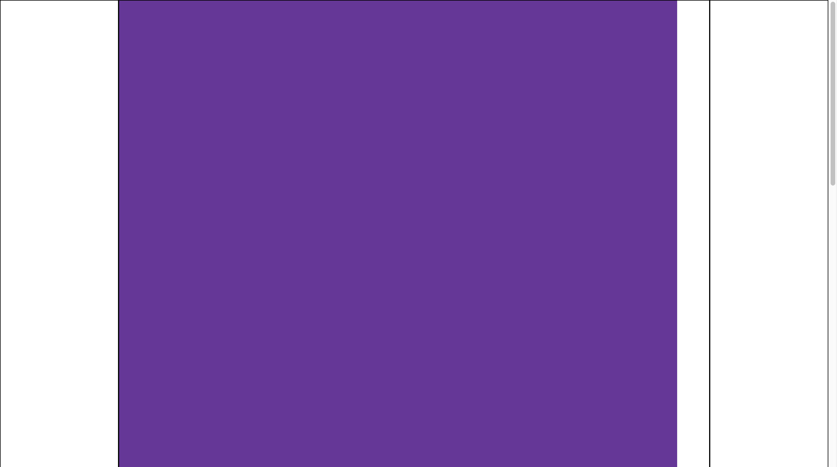
Super. But it was the easiest part. Now we need to make the workspace. .siteThis is our imaginary site. Let's make it into a standard 960px and highlight it.
.site {
  height: 2000px;
  width: 960px;
  background: rebeccapurple;
}
If you squeeze this thing, it's still more fun:
But
.content {
   overflow: scroll;
}
Solves the problem. Only the aesthetic part remains. Indentation.
This can be done using margin:
  margin: auto;
  margin-top: 20px;
  margin-bottom: 20px;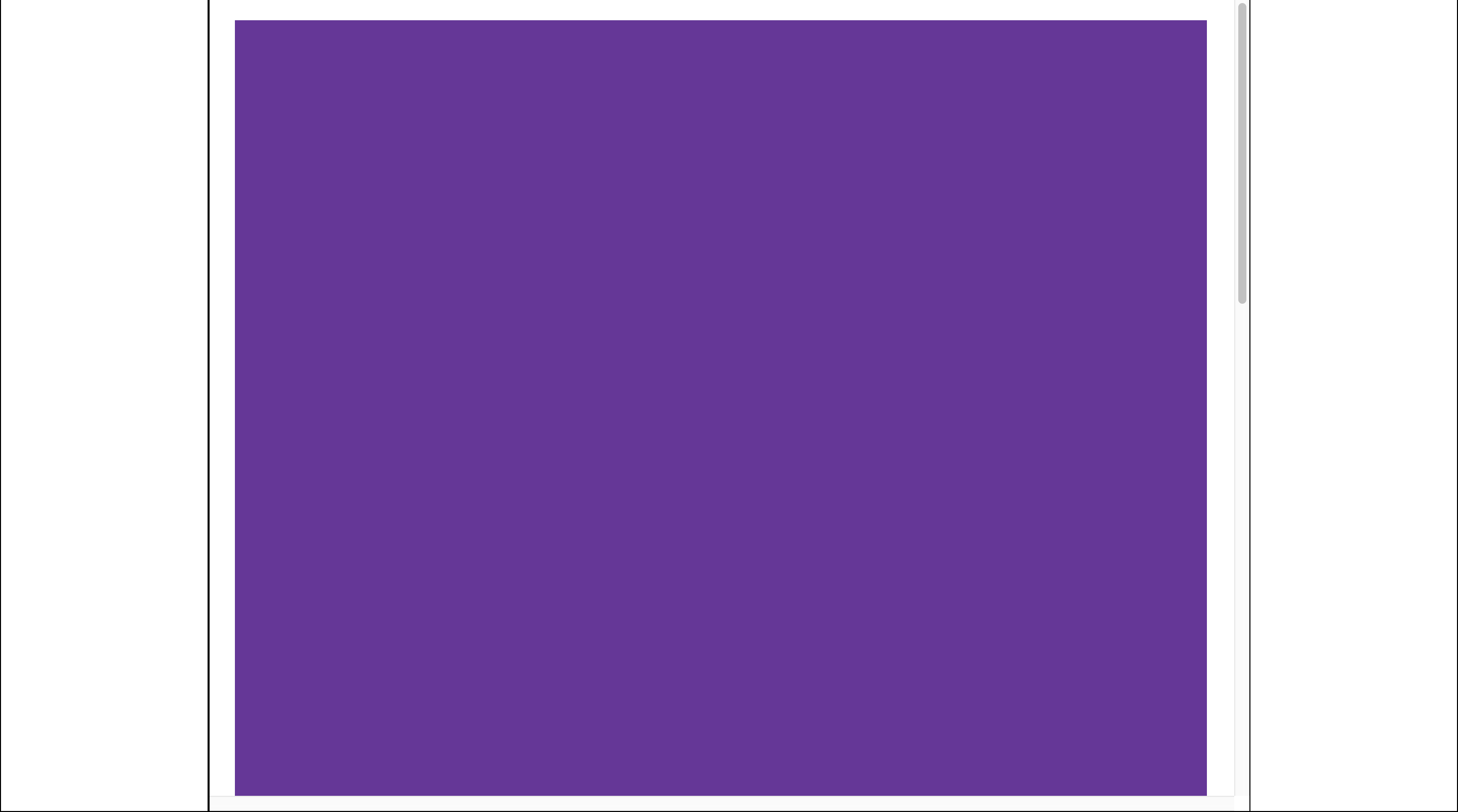
20pxfew or many decide you already. But there is another problem. If the screen is too small, there will be no padding on the left and right. Since it maring: autowill be crowded. The first thing that comes to mind is to ask margin-leftand margin-right, but here is another joke. Indent will be only at the left side. If you skip to the right, then it will not be there. This is such a feature.
Without going into details, you can fix it using display: inline-block. Yeah. But at the same time, we will break down margin: autowhich behaves very well with large screen sizes. The next most obvious solution is to use Media Queries. On large screens display: block + margin: auto, on small ones display: inline-block; margin-left/right: 20px.
 .site{
      height: 2000px;
      width: 960px;
      margin: auto;
      margin-top: 20px;
      margin-bottom: 20px;
      background: rebeccapurple;
    }
    @media(max-width: 1350px) {
      .site {
        display: inline-block;
        margin: 20px;
      }
    }
Something like that. If someone has a better idea, welcome to the comments.
Site display
Layout is ready, now you need to display the site that the user will edit. This is a very important thing. A number of decisions depend on it. Display a site for editing after the fact, in two ways. In document, where is your editor's interface or in iframe. Both options have positive and not very positive properties.
Same document
It is easier, both mentally and technically. But much more problematic in the future. The fact is that if you add, and you add, the ability to insert custom CSS and JS, your editor will be blown up after a few minutes.
Users who did not explain how to use the mug:

Encapsulated CSS is not yet a reality like it was 5 years ago. There are options, but they are either too heavy or do not fully protect. When the user skews the entire interface and accidentally deletes all of their work, they will blame you. Running a little ahead, when you decide to add a number of your ready-made templates, your developers will suffer with this. How not to override some style. Now if you look at Tilda, they have trouble with this.
Take for example the first UI of this editor. Text formatting buttons:
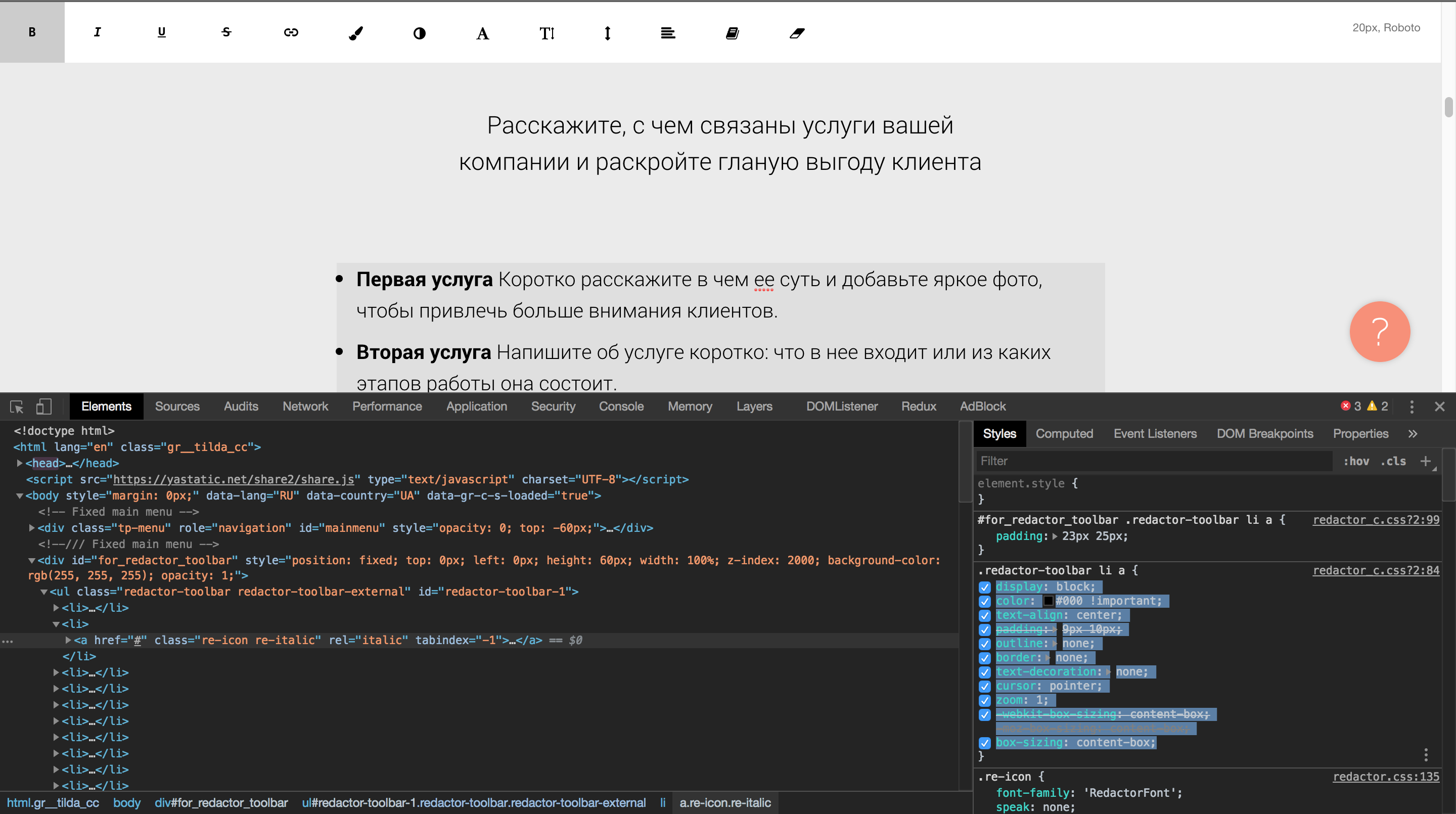
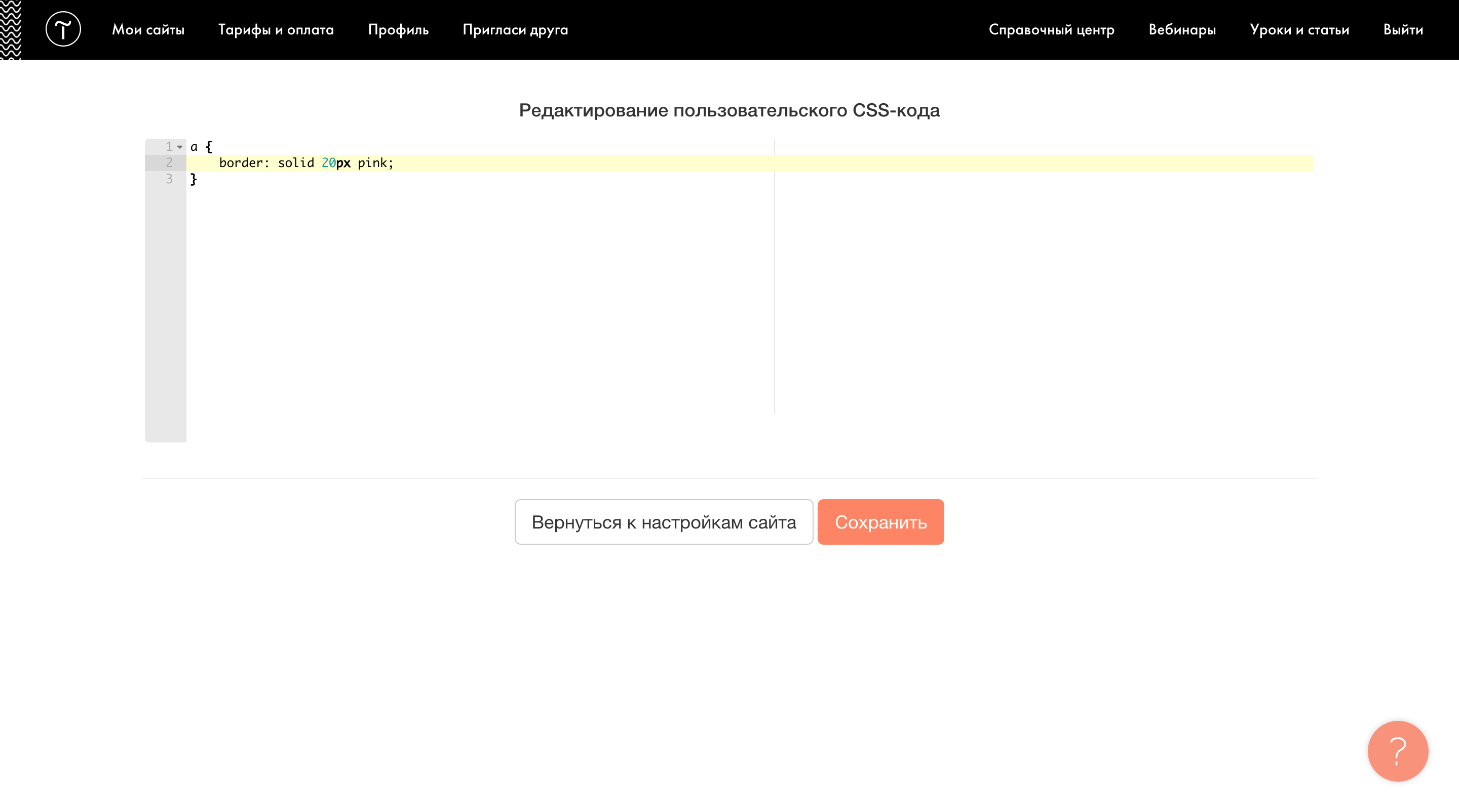
Do you see these styles? !importanton color? These styles are not needed at all, if you turn them off, nothing will change. In any case, redefining them is very simple by inserting custom HTML into the site page:
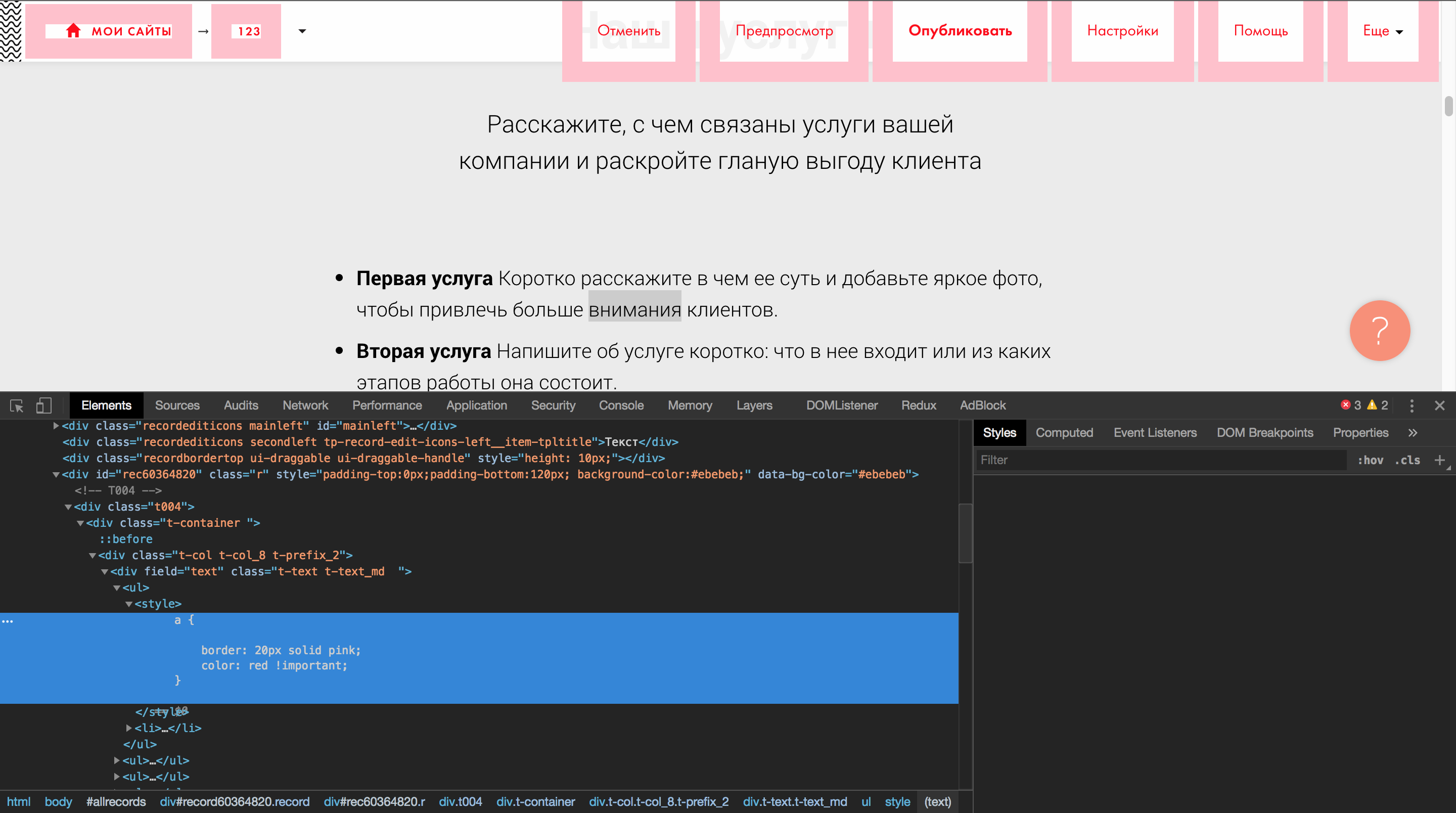
I admit, I inserted this code into manual. But I found a free 2-week period with the ability to insert custom HTML and CSS, and achieved exactly the same effect.
How can you? Just imagine, you bought services to develop a site in Tilda for n thousand dollars, and you wanted to set your own style for links. Everything, the user cannot edit the site any more. Well, I exaggerate with the boarders, but you can imagine any other style, not to mention the custom JS. And the conflict extends to even some nested interface, although it is obvious.
Not allowing users to insert their own code will be the solution to this problem. But in the real world it is almost impossible. You will not do custom integration for each user. This is possible with fat clients. But not when you have 90% of the functionality is 5-10 bucks.
Iframe
Almost completely encapsulate the page will help us iframe. Perhaps this is the only place where I used for iframeso long. We can reach content iframeand even vice versa, if they are on the same domain. That's why we have everything under control. But all such encapsulation puzzles us a little. For example, the selection of elements, which we will discuss later. Select it elements at the interface level positioning above iframe, or in the most iframe?
Of course it will be easier to do it in the most iframe. The fact is that when scrolling content, you do not have to update the position of the selection / think about the cunning layout (although better so), and an additional interface. But computing whether your interface overlaps, the editor interface will be easier if you render these things over iframein one document. For this example, Grapesjs combines these two approaches:
Selection occurs by elements in iframe, and additional functionality, sensitive to overlapping, is rendered over iframe.

But to support your styles, you will have to import iframeeverything you need. Immediately you will have to attach the boot screen, so that the user does not see the site / interface is not made up.
Wix <head>
Therefore, you should understand that doing this is only necessary when editing. And do not forget about the user style or you will again have problems.
Grapesjs class which I "accidentally" updated the border:
Grapesjs adds a class gjs-comp-selectedwhen it is selected , which is well visible during the inspection and believe it will be the first thing the user will copy for customization.
Select items
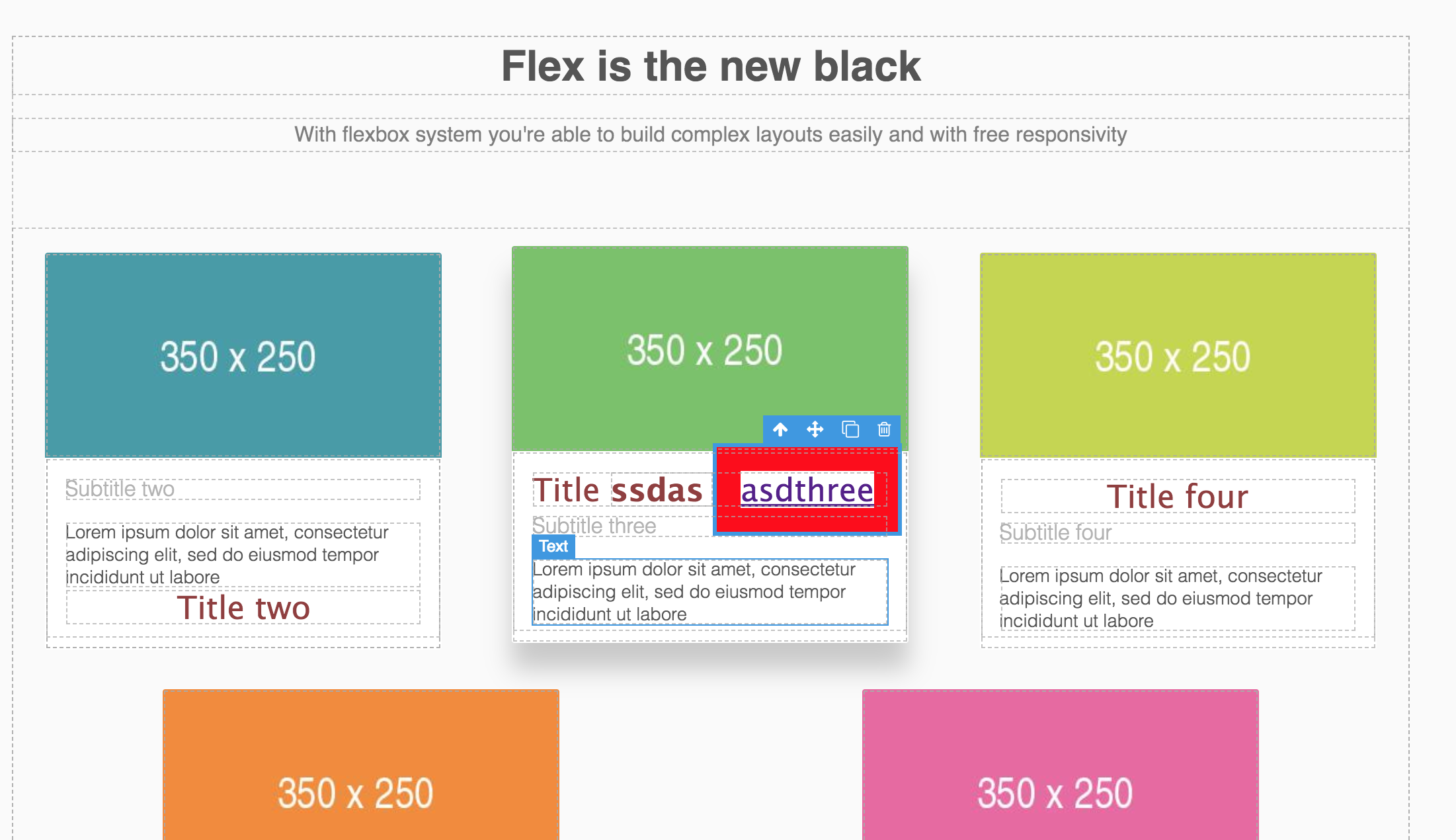
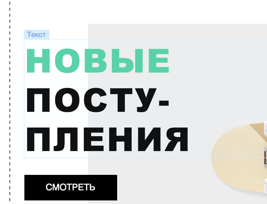
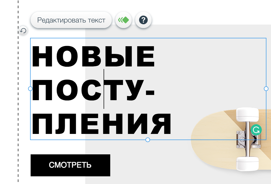
We are a little ahead of ourselves, because we have not yet understood how to teach the editor to see elements on the page, but this will not prevent us. Before delving into a more technologically complex topic, let's see how technologically difficult it is to make the selection of elements on the page :) Do you think it is difficult? If you are very self-confident, then this is how all the above-mentioned editors deal with this with the example of text:
My editor
Tilda
Grapesjs

Google Web Designer
Wix
And when editing
Part of the text is not visible at all. Okay. From the point of view of the front-end developer, this is a feature.

The fact is that editors allocate for the most part a DOM model. But judge for yourself, you as a user, far from the development of sites, think it is ok? No, it is not ok. Content is more than what the editor shows you. In the case of some, there is a chance of losing the ability to select an item. It is normal for a browser to be allocated in this way for developers, this is true by specification.
What the user sees (blue, the text made transparent, for obvious problems), which is highlighted by editors, browsers (red):

Chrome
Firefox
When selecting text in FF, chrome does not know how.
So why such a joint in all editors? In my experience I will say that this is noodles on the ears of product managers and / or testers. Everyone who works on the editor, as a rule, is unlikely to bet line-height: 1px, or try to play with different styles and sizes of text. They have zamylennye eyes and such shoals at first glance, the elementary remain in the blind zone. And customers believe, they face during the first minutes.
From the point of view of UI / UX, this may not be a technically understandable thing, and such implementation details are usually left to the discretion of the developer.
So is it possible to make the selection user friendly? Any ideas how to highlight an item?
It is necessary to include such things as selection.margin, padding, border. Sizing model is not simple:
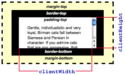
From my sandbox:

Perhaps the most useful information I extracted from msdn:
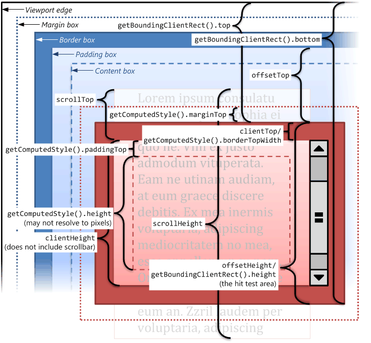
But even here there is no answer to our question.
Let's try what the DOM provides to us first. We have this layout:
    font-size: 54px;
    line-height: 0px; /* сделайте сколько хотите, суть не в этом */
    border: 10px solid;
    padding: 10px;
The size of visible content is 62px, the browser shows us 40px. How to get 62px?
getBoundingClientRect returns us - 40px
clientHeight - 20px
scrollHeight - 41px
You can play with mathematics for a very long time, but I did not find solutions using this approach.
But, like ~ 5 years ago, I knew that the solution to the selection of the text. Well, look, if you select the text, the selection is exactly the same as we need:

Not a good example, but the height with which we have the main problem - everything is cool. But how to allocate as it does some kind of systemic magic?
After so many years, I googled (learned!), Unfortunately as I googled and the link was lost, but here’s the solution:
 const range = document.createRange();
 let rangeRect;
 range.selectNode(elm);
 rangeRect = range.getBoundingClientRect();
Create range, select node, and take from rangeClientRect. Voila! And the selection works for everything. You can select whole pieces of the page ( https://developer.mozilla.org/en-US/docs/Web/API/Range ).
Both in height and width, the perfect selection.

(The selection in the editor will be a blue border, no background. I selected the text to show the system selection.)
Another less important part of the selection is how to show it? Any ideas? Ways a bunch. Starting from the boarder, ending with an additional floating element.
First of all, decide to do it in iframeor above iframe, we spoke about the pros and cons above.
Border does not fit, as it adds the size of the element and that if the user sets his border element? Same thing outline, Grapesjs sins by making a selection through it.
In my case, I used :: before, but this is also not cool. The most reliable way to do this is either 4 strips, and position them along the edges (which will later be elements of the element reysing), or a block on top. Choose the best of these two options, maximum combining them. Too much positioning on the page is not help in optimizing an already overloaded UI. So, the more multi-functional things you position, the better.
It's not all
We just implemented the selection. But this selection at the level of "brought and saw." There are still two problems with it that I will leave to you to think for yourself. They are not so nasty.
- Element dimensions change when editing. You need to monitor this and update the selection. This is what my editor and Google Web Designer are ill with. Not always, but often.
- To make a label / selection on an element, letting the user know what the element is, you need to know for yourself what it is. On this element must be initialized in your editor. From this depends on the performance editor. There can be more than one hundred elements on a page, and simply taking and initializing everything at the start is not always the best idea. But in the case of my editor, like ok. haha Initialization can be done on click, on hover, on the theory of frequency of use.
Editing
Since we are talking about the selection of the text as an example, let's quickly go through its editing.
In fact, the text is the second important part in the editor after picture and selection :)
Well, how to make it so that when I selected part of the text and clicked on some formatting functionality, I formatted the selected text exactly?
If you are the son of my mother's girlfriend and a brilliant developer, then you will surely say - wrap the selected text. Oh, and you will be right, approximately as if Ilon answered that to build a rocket === to hire a hundred engineers.
Wrapping selected text is not easy. As a result, there will be a bunch of tags, and how to merge them with the next selection and formatting is a big question. I studied the same CKEditor for a long time and found a miracle:
contentEditable( https://developer.mozilla.org/en-US/docs/Web/API/HTMLElement/contentEditable )
This is a pancake editor in the browser. He does not just give us the opportunity to write text, but also to format it.
Related articles:
- https://developer.mozilla.org/en-US/docs/Web/Guide/HTML/Editable_content/Rich-Text_Editing_in_Mozilla
- https://developer.mozilla.org/en-US/docs/Web/Guide/HTML/Editable_content
This API allows you to execute formatting commands on selected text:
bool = document.execCommand(aCommandName, aShowDefaultUI, aValueArgument)Changing colors, indents, inserting links, custom styles and more can be done with this tool.
There are small cross browser quirks. Now they are less and less, but then, chrome and grease in some cases gave out different wrappers for changing color and so on. This is of course a little disturbed if the user edited the text in different browsers. But this was solved by a hand crutch. Just a little corrected tag after the execution of the command.
contentEditablecan be used not only for cool text editing. In some browsers, there is a functionality for working with pictures and tables. This got in the way. But when I made my own tables, I really wanted to use it. But it was all very funky and not stable.
At that time, it contentEditablewas a very famous pain, thanks to contributors CKEditor, CodeMirror, and others. They were actively crying in their blogs about differences in implementation. At that moment I ran into cross-browser problems, mostly because of this part of the functionality.
Many site editors made a tricky move, which I had a weakness to try too. Edit the text is not directly on the page, but in a separate place and using the ready-made editor, the same CKEditor. But believe me, it is not easy. The fact is that you will face a problem that oh, how to solve it is not easy. You need to be able to display the text in another iframejust like it appears on your page. You will need to collect all the styles, provide the same background. And the background is important, the user wants to see how his text will look until the end of editing / formatting. Then I did not give up contentEditableand threw all the developments in this direction. It is better to recover contentEditable. Here is Wix, 2018. They seem to have their own editor, but the text is edited in a transparentiframe. By the way, it was one of the options to provide a background :) It seems everything is ok, but the text is cut off, and sometimes styles are lost. He opened the text for editing, then closed it, and he lost the color that he had before. I met this in one of the default templates. Such diseases are common to all editors who decide to go this way. All layout options are simply not visible at the time of development, and even long after.
Before editing:
Just clicked to the side and left the edit:
That is, there is a moment with getting the style back.
Resize Items
Perhaps the only thing I want to say on this score is that if you pull the left / top of the element, as you increase the height / width you need to update its position. Since the coordinates 0,0on the page are in the upper left corner:

(svg / dom element)
Work with elements, VC ++, MVC and all that.
Before becoming a web developer or, more precisely, before the web became an actual growth area for a specialist, I was playing with Visual C ++, C #, Delphi, and others. And somehow it turned out that with the knowledge of Backbone and the question of how we would work with the elements on the page, I did not hesitate for a second to give an analogy from the above languages / technologies / frameworks.

Buttons have a view, they are somehow displayed, there is a model with parameters, such as текст, цветand so on. Elements also have a controller that handles events:

I do not know if this is a real listing, but it seems to be convincing.
This approach has been used for a very long time and may not have CSS, it is very flexible and convenient in developing applications and even with a visual editor.
Backbone, in its essence, is a small library giving us views (Models), Models (Model) and collections (Collection). So there is a kind of controller (Router). As a controller, the View is usually used. MV *, MVV, if you remember that.
So, it was very successful to use Backbone to implement a similar approach. First of all, I implemented the View of a typical element. He had a model with a number of CSS properties. Since the elements are usually different, I inherit from this element and implement the View for each element I need.
When clicking on any of the elements, the editor tried to understand whether the element already has a View. Many View and Model elements were created when the page was loaded. Typically, this was a custom large components that the editor could not understand without help. Although there was a special attribute for such elements with a hover with a selection, the user saw reasonable text without a full View on the element. If not, there was an attempt to find a suitable class. If this did not work, it looked .parentfrom the element on which they made the click.
When the View was located, initialization and writing of the View and Model occurred, in the data-attribute for quick access. Accordingly, immediately after the click, the Model was transferred to all the tools that could be used to edit the item and update it to reflect the current state of the item. Given that Backbone is not as smart as React, in the DOM update, you can imagine the performance of this solution. But in fact, even then there were no lags. There were 50-100 pieces of tools per item and somehow everything is ok.
Plus, of course, the rerender of the whole tool did not occur, but the manual update of HTML was clearly done. So, that the code is more, but the re-rendering performance directly depended on me. And none of your virtual dom, will not overtake vanilla JS in speed. This is not convenient in development - a fact. BUT !, in such size projects it is conditional. Otherwise it will be like Wix, flicker like a Christmas tree when scrolling and hovering into completely different parts of the application:
When scrolling:

When hovering on the left elements of the top menu:

When working with tools, from the menu on the page:

This is still ok screenshots, turn on the display of redrawing and work with it. This is fantastic. But React.
In my CSS editor is stored inline, so many editors still do. But this is a bad approach that worsens performance, reading HTML, and leads to a number of problems with further work. But to admit, this is a very easy to implement approach.
The most correct solution is to create a unique class for each edited element and write <style>its styles to the tag. How to implement it and organize already a little to go beyond the articles, perhaps another time. There is no plowed field of options and opportunities.
Data storage
You can store data in data-attributes, html and on the server. I'm talking about data that! == styles. For example, a subscription form in html can store data about a stock. If the data is better not to be shown so simply, then the form may have an ID, according to which the server itself understands which mailing it belongs to and sends the data to the right place.
Editing / Preview / Viewing
It is necessary to distinguish between these states. Interface, models should not exist in the preview and viewing. You should not even spend traffic on them. It's easy, something worth remembering.
Just think about the different animations and the same hover effects on the buttons. At the time of editing, they are terribly annoying. They must be disabled.
React? Polymer? Vue (born later)? Angular (joke!)?
The second and third options for working with elements on the page that I did not have time to implement on that project, when React became popular and Polymer just came out, there were React components and Web Components.
Web components perhaps, that would simplify the work with data (Polymer), and they would be easier to manipulate. The web components themselves are very seductive in this project. Their encapsulated nature has many advantages. But then there was only Shady DOM about which I wrote quite a while , so that this idea disappeared. In fact, there would be little confusion, and all these polyfiles were harder.
React
Honestly I have no idea :) But let's think about it. Rendering a React into an iframe and then working with it is no problem at all:
const rootElement = document.getElementById("root").contentDocument.body;
ReactDOM.render(<App />, rootElement);
You can save simply HTML, at the expense of ReactDOM.hydrate (element, container [, callback]) , as if on the front after server-side rendering, connect to the DOM React. All events and stuff will work. That's cool. But of course, in fact, everything on the page will have its own idea in Virtual DOM whether you want it or not. It hits performance.
It is possible to organize work with elements and tools, by means of standard approaches. Redux, Flux, Mobx at your disposal. But it turns out that each element will also be connected to the Redux store, which is not good.
I was once afraid to add Marrionett to the project. This is a small backbone shell. And then such expenses. But this is not known.
There is only one problem that can affect a lot. How to add elements to the page? Suppose we drag new items written in React onto the page. How to embed them correctly in the DOM? Do each element have an array of child elements? To do ReactDOM.hydrateafter changing the HTML? So you can do, given our next topic that you need to discuss finally.
Responsive and Adaptive
At that time there were no such concepts. Well, maybe I'm lying, they have already been used, but were not so well known to everyone. Then there are also rules for layout based on 960px. That is, the site was placed on any screen, and if there was more space, then there was some kind of thoughtful background. With the growing popularity of smartphones, the situation has changed.
In my editor, you can clearly see the dotted bars that mark the boundaries of the site. Going beyond them is your risk and fear.

In fact, it is an element or elements with positioning relative. All elements added to the page are positioned relative to this. No adaptability and elasticity of design. In fact, EVERYTHING is positioned absolutely. The user can move elements infinitely wherever he wants.

(test interface in different languages)
This is a plus for him, but also a big minus. He can do things when the site does not turn out to understand that very quickly, the site is very fragile with this approach. And he does not have a normal layout.

Limit 03
Provide ready-made pieces, screens. Landing has a concept of screens. We called it a section.

This is still the same 960px, but more structured. The user can not take and accidentally pull the floor of the page trash.
Far from going, I will say that then adaptability and responsiveness then was not in the editors. Wix, and at the moment solves this in a very dumb way. Maybe I stumble upon old templates, but somehow they are at the very top and I like them just like any other.
It was decided that they have two versions of the template. Yes Yes. If you are changing to a larger version, for example, just the same text color, switching or squeezing the browser to a mobile one - these changes will not be.

It is interesting to talk with the first line of those. support in this respect :)
12 friends layout, flex, grids.
12 column system, you know? Click https://grapesjs.com/ , and you will immediately understand what I mean .

This restriction, which somewhat limits the user in freedom, but allows him to create cool sites if he masters this tool. The user is forced to use the blocks that the editor gives him, place the elements in only certain places, and so on. The user is less likely to shoot himself. For us as developers, it is a holiday.
Blanks, templates and paid service / help, muddy people around
But no matter how cool to make the perfect tool. Users don't care about the light bulb on all your layout elements and how they should move the elements. Website creation is a creative work and, as a rule, those who are not lucky enough to work in your editor think absolutely not about how to make a website clearly. By this there are blanks and templates. And the more of them, the worse you do with UI / UX.


Users can at least somehow get a ready-made site in a couple of clicks, and changing only the text, color, pictures - to get the desired result.
Separate conversation is a layer of business that makes websites on such tools. This is for example how to set up advertising in Google. It seems to be simple, a lot of tutorials, and hundreds of thousands make third companies on this.
so
I just wish you good luck. Making an editor is not really rocket sinns. The main thing is UI / UX. Working with the text is not such an easy task, I did not even mention the undo / redo functionality, it is rather difficult to make it. Well, or simply, if you dump the HTML of the entire page in localStorage ... No, of course I did not.

Rocket Sainz teach users to use it. My editor works from strength on two projects, it is used by different audiences, but it’s not known how comfortable it is for them and for the result to their expectations. If you have questions, I will be glad to answer in comments, lichke.
PS letters a lot and I'm not a poet. I will fix, all the shoals and tautologies that I find. But do not hesitate to write in PM, thanks :)