 October 10, 2012 at 14:32
Popular About Pseudo-Elements: Before and: After
- Transfer
- Tutorial
The : before and : after pseudo-elements allow you to add content (styles) before and after the element to which you have been applied.

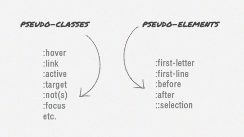
In total there are several types of pseudo-elements: : first-line , : first-letter- , :: selection , : the before and : the after . This article details the last two as the most useful.
Pseudo-elements appeared back in CSS1, but went to release only in CSS2.1. At the very beginning, a single colon was used in the syntax, but CSS3 uses a double colon to distinguish it from pseudo-classes:
But in any case, modern browsers can understand both types of pseudo-element syntax, except for Internet Explorer 8, which accepts only one colon. Therefore, it is safer to use one.
The : before and : after elements will not be generated, i.e. will not be visible in the page code, therefore they are called pseudo-elements.
Using pseudo-elements is extremely simple:: before is added before the desired element, and : after is added after.
To add content inside pseudo-elements, you can use the CSS-property content .
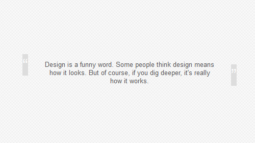
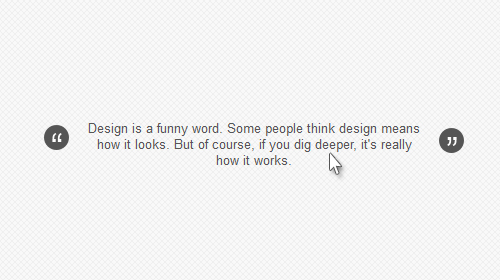
A simple example: you need to add quotation marks for a quote:

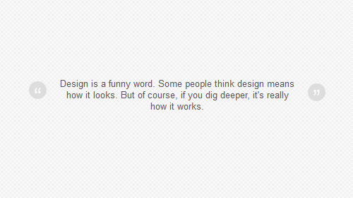
You can apply the same styles to the pseudo-element as to the “real” ones: changing the color, adding the background, adjusting the font size, aligning the text, etc.
The created elements are inline elements by default , therefore, when specifying the height or width, you must set display: block :
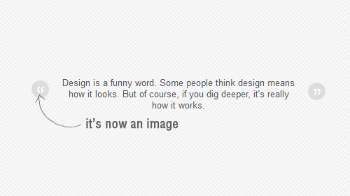
Also inside the pseudo-element, you can use a picture instead of plain text, and even add a background image.
In this example, the content property contains an empty string, this is necessary, otherwise the pseudo-element will not display correctly.
Pseudo-elements can be used together with pseudo-classes, in our example this will help to add the hover effect to the quotes:
You can also use the transition property to smoothly change the color of quotes:
Unfortunately, this only works fine in recent versions of Firefox.
See a demo of the example from this article.
Three examples of using pseudo-elements: before and: afte:


In total there are several types of pseudo-elements: : first-line , : first-letter- , :: selection , : the before and : the after . This article details the last two as the most useful.
Browser Syntax and Support
Pseudo-elements appeared back in CSS1, but went to release only in CSS2.1. At the very beginning, a single colon was used in the syntax, but CSS3 uses a double colon to distinguish it from pseudo-classes:
But in any case, modern browsers can understand both types of pseudo-element syntax, except for Internet Explorer 8, which accepts only one colon. Therefore, it is safer to use one.
An example of using pseudo-elements
:before
    Это основной контент.
:after
The : before and : after elements will not be generated, i.e. will not be visible in the page code, therefore they are called pseudo-elements.
Using
Using pseudo-elements is extremely simple:: before is added before the desired element, and : after is added after.
To add content inside pseudo-elements, you can use the CSS-property content .
A simple example: you need to add quotation marks for a quote:
blockquote:before {
    content: open-quote;
}
blockquote:after {
    content: close-quote;
}
Styling Pseudo Elements
You can apply the same styles to the pseudo-element as to the “real” ones: changing the color, adding the background, adjusting the font size, aligning the text, etc.
blockquote:before {
    content: open-quote;
    font-size: 24pt;
    text-align: center;
    line-height: 42px;
    color: #fff;
    background: #ddd;
    float: left;
    position: relative;
    top: 30px;
}
blockquote:after {
    content: close-quote;
    font-size: 24pt;
    text-align: center;
    line-height: 42px;
    color: #fff;
    background: #ddd;
    float: rightright;
    position: relative;
    bottombottom: 40px;
}
The created elements are inline elements by default , therefore, when specifying the height or width, you must set display: block :
blockquote:before {
    content: open-quote;
    font-size: 24pt;
    text-align: center;
    line-height: 42px;
    color: #fff;
    background: #ddd;
    float: left;
    position: relative;
    top: 30px;
    border-radius: 25px;
    /** define it as a block element **/
    display: block;
    height: 25px;
    width: 25px;
}
blockquote:after {
    content: close-quote;
    font-size: 24pt;
    text-align: center;
    line-height: 42px;
    color: #fff;
    background: #ddd;
    float: rightright;
    position: relative;
    bottombottom: 40px;
    border-radius: 25px;
    /** define it as a block element **/
    display: block;
    height: 25px;
    width: 25px;
}
Also inside the pseudo-element, you can use a picture instead of plain text, and even add a background image.
blockquote:before {
    content: " ";
    font-size: 24pt;
    text-align: center;
    line-height: 42px;
    color: #fff;
    float: left;
    position: relative;
    top: 30px;
    border-radius: 25px;
    background: url(images/quotationmark.png) -3px -3px #ddd;
    display: block;
    height: 25px;
    width: 25px;
}
blockquote:after {
    content: " ";
    font-size: 24pt;
    text-align: center;
    line-height: 42px;
    color: #fff;
    float: rightright;
    position: relative;
    bottombottom: 40px;
    border-radius: 25px;
    background: url(images/quotationmark.png) -1px -32px #ddd;
    display: block;
    height: 25px;
    width: 25px;
}
In this example, the content property contains an empty string, this is necessary, otherwise the pseudo-element will not display correctly.
Use with Pseudo-Classes
Pseudo-elements can be used together with pseudo-classes, in our example this will help to add the hover effect to the quotes:
blockquote:hover:after, blockquote:hover:before {
    background-color: #555;
}
Adding a transition effect
You can also use the transition property to smoothly change the color of quotes:
transition: all 350ms;
-o-transition: all 350ms;
-moz-transition: all 350ms;
-webkit-transition: all 350ms;
Unfortunately, this only works fine in recent versions of Firefox.
See a demo of the example from this article.
A bit of inspiration
Three examples of using pseudo-elements: before and: afte:
Fascinating shadows
3D Button
Stacked image effect