 October 9, 2012 at 16:41
CSS Inner Shadows
- Transfer
- Tutorial
Regular shadows are easy to implement using box-shadow or text-shadow. But what if it is necessary to make inner shadows? This article describes how to make such shadows with just a few lines of code.
First of all, let's look at two main ways to implement shadows in CSS.
The box-shadow construct contains several different values:
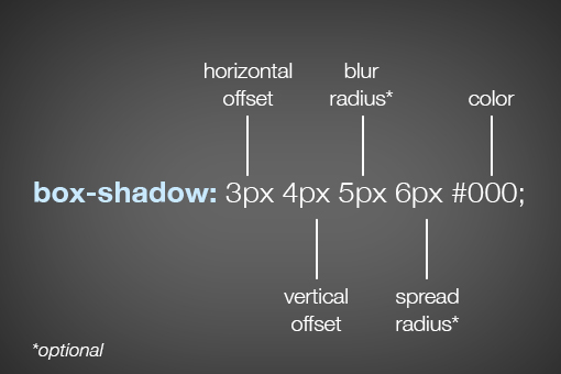
Horizontal offset and vertical offset - horizontal and vertical offset, respectively. These values indicate in which direction the object will cast a shadow:

Blur radius and spread radius are a bit more complicated. What is their difference? Let's take a look at an example with two elements, where the blur radius values differ:
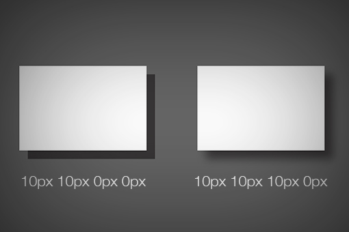
The edge of the shadow just blurs. For different values of spread radius, we see the following:

In this case, we see that the shadow is scattered over a large area. If you do not specify values for blur radius and spread radius, then they will be equal to 0.
The syntax is very similar to box-shadow :

The values are similar, only there is no spread-shadow . Usage example:

To “turn” a shadow inside an object, you need to add inset to CSS:
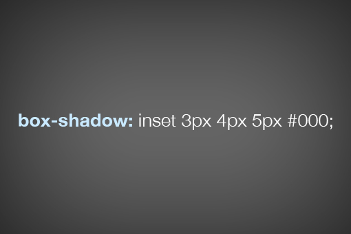
Having understood the basic syntax of box-shadow, it’s very easy to understand the principles of implementing internal shadows. The values are the same, you can add color (RGB to hex):

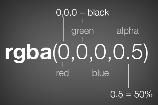
Color in RGB format, alpha value is responsible for the transparency of the shadow:
Adding an inner shadow to an image is a bit more complicated than a regular div . To get started, here is the usual picture code:
It is logical to assume that you can add a shadow like this:
But the shadow is not visible:

There are several ways to solve this problem, each of which has its pros and cons. Consider two of them. The first is to wrap the image in a regular div :

Everything works, but you have to add a bit of extra HTML and CSS markup. The second way is to set the background image of the desired block:
Here's what happens when using inner shadows:

To implement the inner shadow of the text, simply adding inset to the code does not work:

To solve, first apply the dark background and light shadow to the h1 header :
Here's what happens:

Add the secret background-clip ingredient , which cuts off everything that goes beyond the text (onto a dark background):

It turned out almost what is needed. Now just darken the text a bit (alpha), and the result:

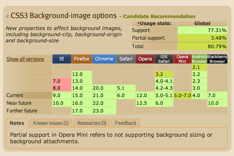
You can check background-clip support by browsers on caniuse .
Syntax
First of all, let's look at two main ways to implement shadows in CSS.
box-shadow
The box-shadow construct contains several different values:
Horizontal offset and vertical offset - horizontal and vertical offset, respectively. These values indicate in which direction the object will cast a shadow:
Blur radius and spread radius are a bit more complicated. What is their difference? Let's take a look at an example with two elements, where the blur radius values differ:
The edge of the shadow just blurs. For different values of spread radius, we see the following:
In this case, we see that the shadow is scattered over a large area. If you do not specify values for blur radius and spread radius, then they will be equal to 0.
text-shadow
The syntax is very similar to box-shadow :
The values are similar, only there is no spread-shadow . Usage example:
Inset in box-shadow
To “turn” a shadow inside an object, you need to add inset to CSS:
Having understood the basic syntax of box-shadow, it’s very easy to understand the principles of implementing internal shadows. The values are the same, you can add color (RGB to hex):
Color in RGB format, alpha value is responsible for the transparency of the shadow:
Images with Shadows
Adding an inner shadow to an image is a bit more complicated than a regular div . To get started, here is the usual picture code:

It is logical to assume that you can add a shadow like this:
img {
  box-shadow: inset 0px 0px 10px rgba(0,0,0,0.5);
}
But the shadow is not visible:
There are several ways to solve this problem, each of which has its pros and cons. Consider two of them. The first is to wrap the image in a regular div :
div {
  height: 200px;
  width: 400px;
  box-shadow: inset 0px 0px 10px rgba(0,0,0,0.9);
}
img {
  height: 200px;
  width: 400px;
  position: relative;
  z-index: -2;
}
Everything works, but you have to add a bit of extra HTML and CSS markup. The second way is to set the background image of the desired block:
div {
  height: 200px;
  width: 400px;
  background: url(http://lorempixum.com/400/200/transport/2);
  box-shadow: inset 0px 0px 10px rgba(0,0,0,0.9);
}
Here's what happens when using inner shadows:
Inset in text-shadow
To implement the inner shadow of the text, simply adding inset to the code does not work:
To solve, first apply the dark background and light shadow to the h1 header :
h1 {
  background-color: #565656;
  color: transparent;
  text-shadow: 0px 2px 3px rgba(255,255,255,0.5);
}
Here's what happens:
Add the secret background-clip ingredient , which cuts off everything that goes beyond the text (onto a dark background):
h1 {
  background-color: #565656;
  color: transparent;
  text-shadow: 0px 2px 3px rgba(255,255,255,0.5);
  -webkit-background-clip: text;
     -moz-background-clip: text;
          background-clip: text;
}
It turned out almost what is needed. Now just darken the text a bit (alpha), and the result:
Browser support
You can check background-clip support by browsers on caniuse .