May 12, 2012 at 09:17
User experience design: how to build a site for customers, not for yourself
At the end of April, I made a report at RIF 2012 about the stages of user interface design. Since there is no video, I’ll try to present the report in the form of slides with my comments.
I will tell you how the process of developing a site or application looks from the point of view of the designer. As you can only through the interface to improve the user experience of your startup. In the hope of causing the Stockholm syndrome in the audience, I always introduce myself and talk a little about myself.
A few words about me and why such a topic. My name is Denis Kortunov.
- I came from Samara, where I live and work.
- I love screens in everything. If I need to buy, for example, a razor, then I will choose the one with the screen. It seems that this does not affect shaving, but this is a completely different, higher level of user interaction.
- My work is related to interface design. Previously, at Turbomilk, I was more involved in visual design. Among our clients there were many startups for whom we drew interfaces, icons, buttons and characters. What did the process look like? Clients, or, with luck, usability companies, handed us ready-made prototypes, and we drew beautiful interfaces on them.
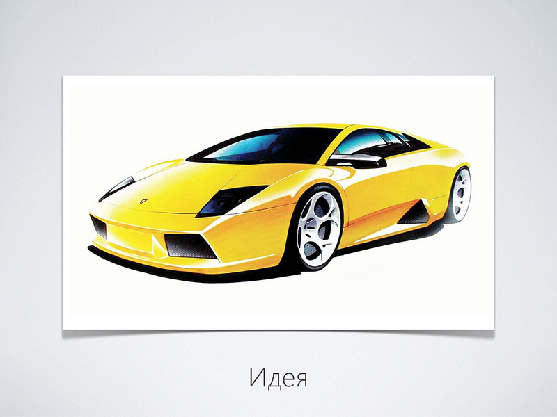
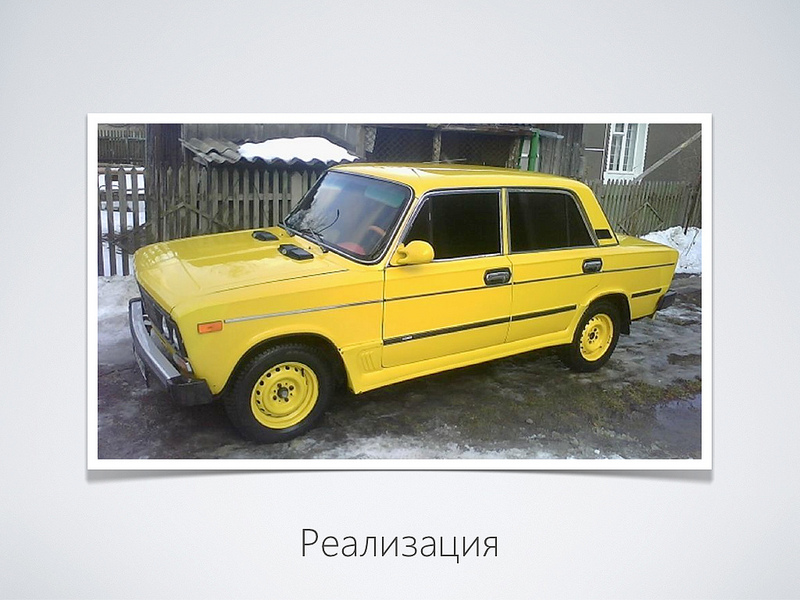
- Now that we have teamed up with Parcsis, I began to design interfaces and user interactions myself. It turned out to be very difficult. But on the other hand, it’s very interesting. There was another degree of freedom to make the project truly successful. So, imagine that you have some kind of startup idea ... For example, to make such a wonderful yellow car that everyone wants to buy. I will not tell you anything new, but the idea without implementation is worth nothing. And the implementation is always difficult ... ... something like this, for example ... There is a void between the idea and the implementation, which for various reasons may be slightly different from the idea ... I am sure that many have come across this.
The same is true for it projects. Where traditionally they first program (make the so-called “engine”), and only then the interface is “pulled” onto it. It turns out the product in the style of "it was so convenient for programmers." But what about the user? .. Fortunately, more and more development teams work on the principle - we first design, and then program. With this approach, firstly, your product becomes more customer-oriented, and secondly, strangely enough, development is cheaper because programmers do not need to solve the problem in a general way. It all starts with a goal. First you decide what you want to do, and then how you can implement it.

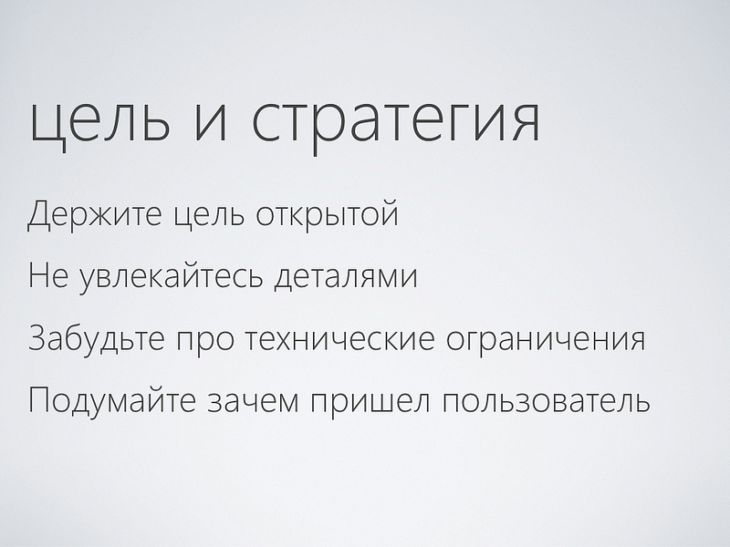
- Firstly, do not be stubborn, do not close the target. In the process of working on a project, you will learn many new nuances and details. Changing goals and strategies is normal.
- Further, at the initial level, do not get carried away with the details. Yes, perhaps it’s sweet to think about something in fine detail, but not now.
- Also, do not think about restrictions. Solve problems as they arrive.
- Think about the customer. Why did he come to you? What can you offer him ... Start with custom scripts. Feel yourself as playwrights and think about how events within your project will be equalized.
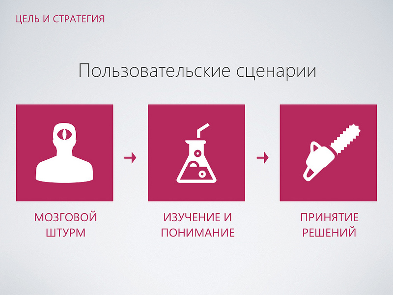
- The first is brainstorming. For example, “how to improve the taxi booking experience.” Generate ideas without any restrictions. You can play this game with colleagues or friends. Put forward the craziest ideas.
“Then highlight the most viable ideas and do the research.” Understand whether this will work for your project. Draw sketches, make storyboards, as animators do.
- In the end, you need to choose and fix some decisions that you will rely on. At this stage, you decide what you will implement and what not. Do not be greedy, start with something simple. Do not be afraid to make decisions, you will have the opportunity to change your mind and remake. This is the charm of the approach: “first design, then programming” - the price of an error is not very large. You can always come back and do something else.

You need to understand who your target audience is. Here are two great gadgets: a vintage Polaroid camera and a modern iPhone. What unites these two gadgets? There is a group of users who really like these things. These are hipsters! What can be done with hipsters? They need to be made happy! .. So there was an application for the Instagram Instagram. It allows you to makeonions to take stylish photos. And then share them with your friends. As a result, most recently Facebook rated the happiness of hipsters at $ 1 billion. Good story.
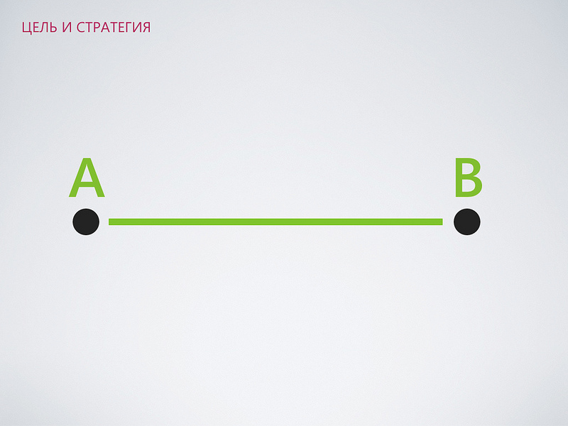
So, you have thought through custom scripts. Let's look at a very simple one: let's say you need to go from point A to point B ...
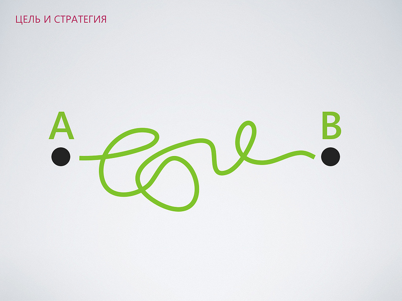
But for some reason, in the real interface everything turns out to be complicated and confusing. How to avoid this?

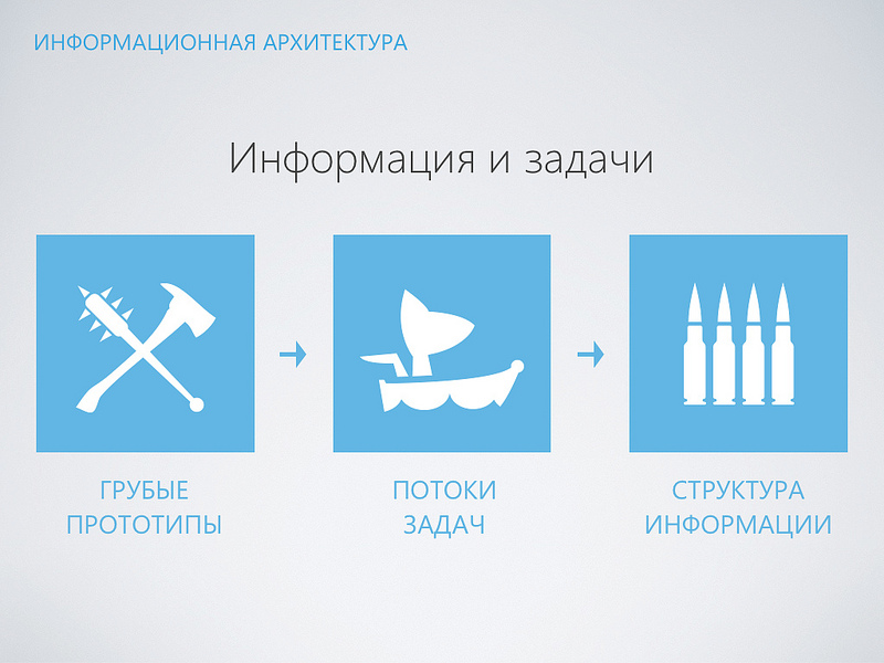
You need to think over the information architecture of your project ... - The project has a lot of disordered information: such as names, prices, dates, images, points on the map. You can recall the good old flowcharts and just draw data streams without getting into details. - In the process, remember the scripts and associate them with your data. “You can start making rude prototypes.” Just draw on paper as you see your interface screen by screen. - Step by step, the prototypes will be more and more detailed. So, the main task at this stage is to connect information and tasks: - We start with rough prototypes. You can simply draw them on paper. It is very effective. - Then we think through the tasks and ways to solve them.


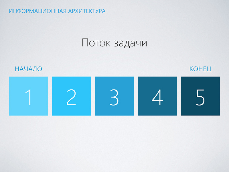
- At the output we get a certain structure of information that we fix. A few words about what a task stream is. With the help of your project, users hope to solve some of their problems. The fewer actions or transitions they need to complete, the more pleasant experience they will receive. Do not pull the user in the details, think about how you can simplify their life. Let this be the stream of the “make a purchase in an online store” task. Before success, you need to go through 5 screens, select something and click. It’s a good idea to think about how to simplify ...
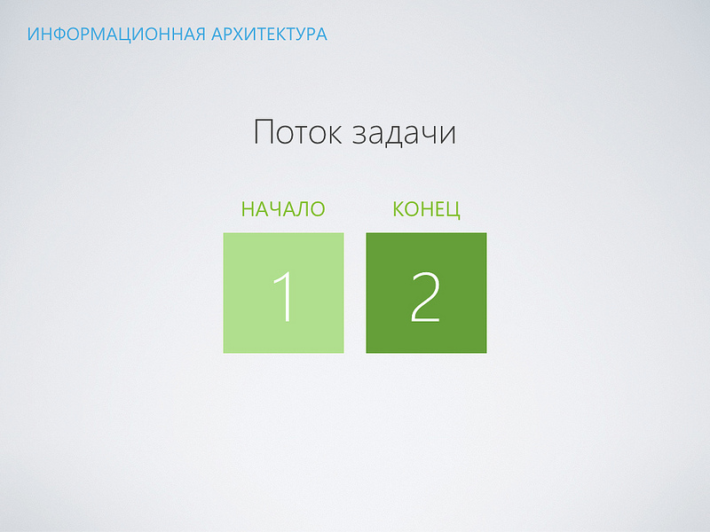
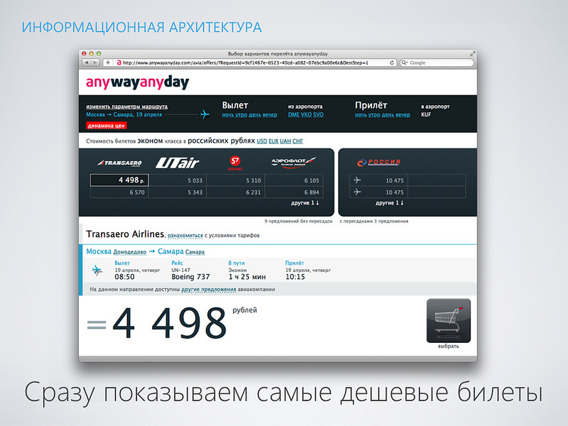
If a specific task in your project will be solved not for 5 steps or efforts, but for 2. The user will be grateful to you. Surely, he already did something similar earlier, will appreciate your efforts and will use your service. In my opinion, the best advertisement. For example, the AnyWayAnyDay service asks you to specify only the direction and date of departure. It immediately shows prices in ascending order. You do not need to enter the departure time, choose a company, filter the results or choose an airport. You can clarify all this, but then ... And now you already see prices and offers from different companies.
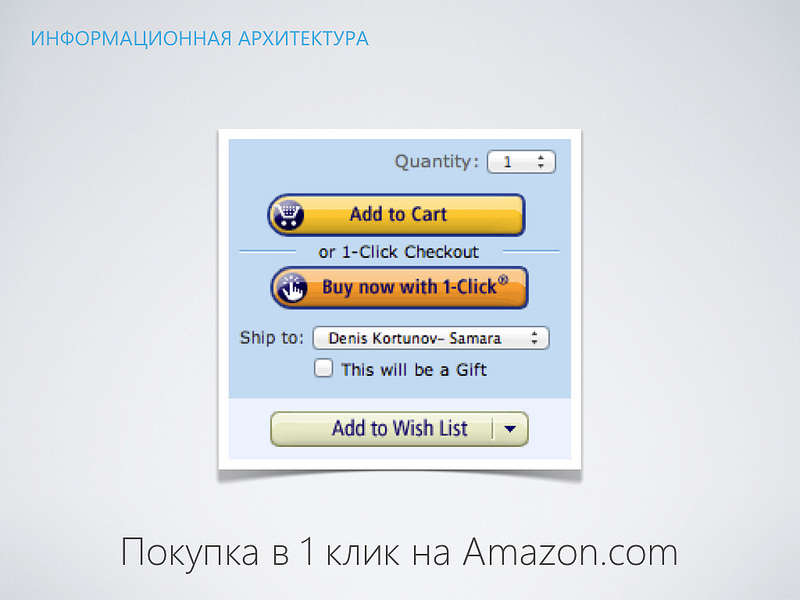
Here's another example of streamlining task flow from Amazon. You can buy items in one click, without using a basket. In the same way, you buy applications from the Apple AppStore, which, incidentally, bought a license for this method from Amazon. The next step is to think over a model of interaction between the user and your interface ... So that the user sees our well-structured information and performs tasks that we have simplified for him. Even if your interface is absolutely static, it is still an interactive design: - Interaction is neither information nor a task - it is a kind of filter to them.
- Thinking how the user will move inside your interface, you will get navigation. Not the traditional “hierarchical menu of sections” with great nesting, but really convenient navigation that the user needs.
- A common mistake of many designers - they do not think how the interface will respond to user actions. They make only a picture. Add movement! It will be much more interesting.
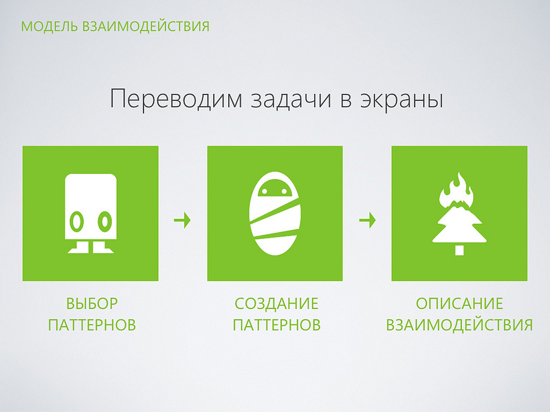
- Try to use someone else's experience, there is nothing wrong with that. Break tasks into smaller ones. Before you, someone has stepped on this rake and solved the problem. But be careful - use only successful patterns.

- We understand our tasks and think what ready-made templates we can apply. For example, it does not make sense to create some kind of revolutionary user registration system, unless your project is all about simplifying the registration process.
- Next you need to create the missing interaction patterns. Here you have to invent and invent.
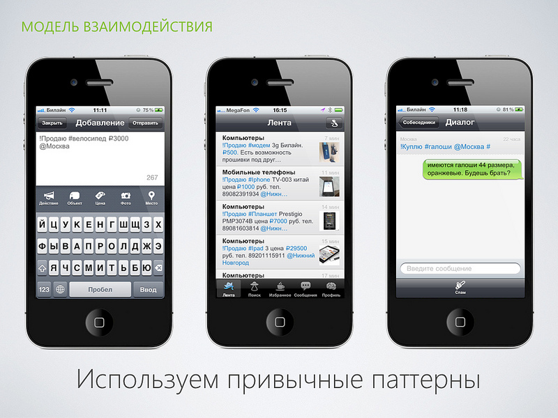
- Describe in a convenient way for you how the interaction will occur. It could be prototypes or some other way that you like. Here, for example, is the Selloby private ad service. It makes the process of creating ads using a smartphone simple. The principle of operation is very similar to Twitter. This way, people who have previously used Twitter can easily understand how everything works.
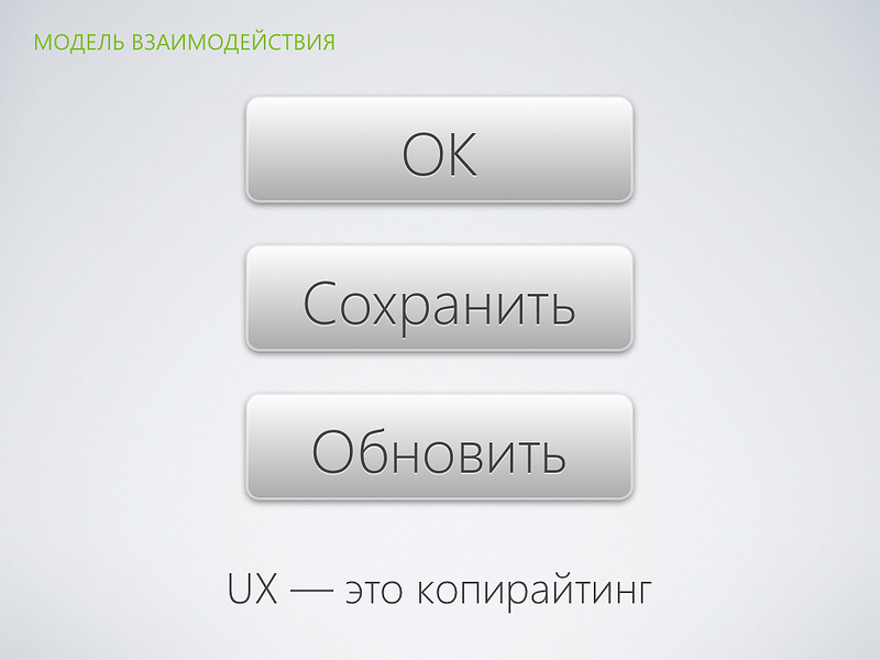
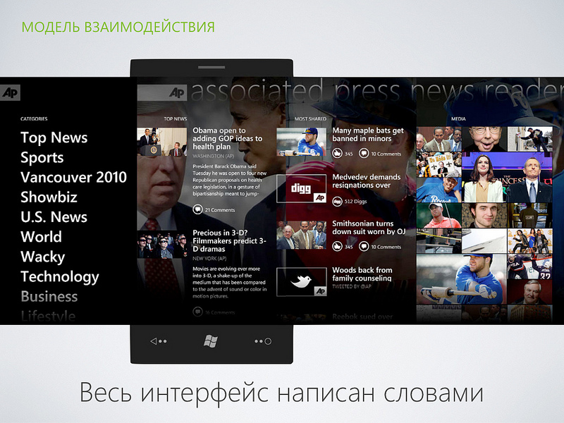
And here is the main page of the legal reference system Pravo.ru - a technique called “gradual disclosure” has been used here. First, we show the user the most important thing - the search bar, as soon as he moves the cursor, additional features will appear. This helps to focus on the essentials. Interface design is copywriting. The best interfaces are not drawn, but written. You will constantly have to think about what to write or what to call the button. Each letter matters ... Here we see an example application for Windows Phone 7. Everything is written in text. But let's not get ahead of ourselves, we have come to the final stage ... The final stage of the work is visual design. Let's talk about trends in visual interface design ...

“Does anyone know what a squemorph or a squemorphic design means? ... I personally did not know.” Although we all use such interfaces.
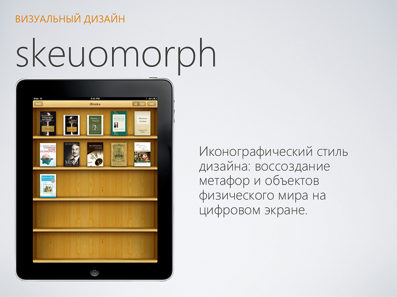
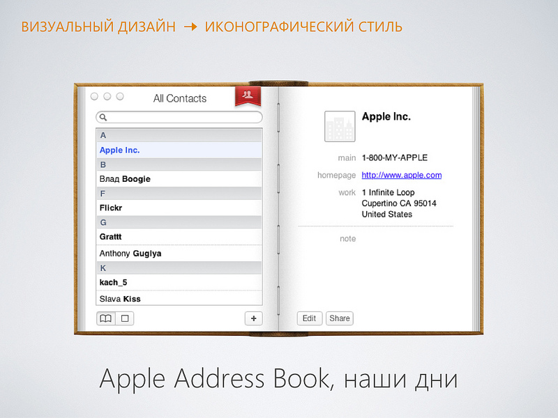
- Now this is a current trend in interface design. We just take real-world objects and transfer to the screen. For example, now this is not an iPad at all, but a bookshelf. You just need to take a book and start reading. Here, for example, is the Address Book application from Mac OS X. It has a leather cover and a bookmark. Here there is a fold of pages and even the strings with which they are stitched. Attention to detail. And here the tablet becomes a synthesizer. Everyone who has previously dealt with this tool will figure out what to do. Let's look at the advantages of this approach: - The interfaces look familiar, it’s immediately clear what to do
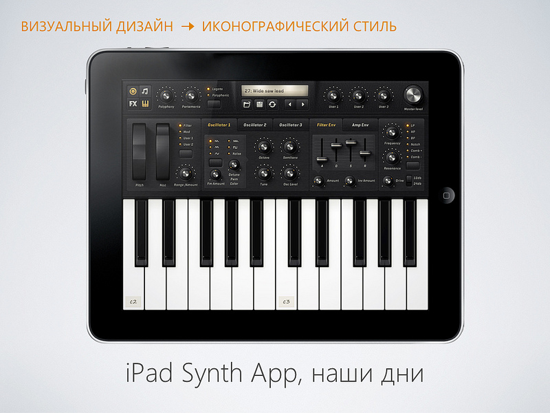
- There are no questions for designers: “For what money was paid ?!” The interface looks “bohato”!
- If the interface is drawn with love, then it is interesting to consider
- Designers will not miss the opportunity to draw highlights and shadows. You don’t really need to think, just hone the technique. The iconographic style has its minuses: - The interface may be inconvenient. After all, we are copying an imperfect world. - This approach may interfere with the implementation of new features and features - Perhaps the non-optimal use of screen space - May be outdated. A striking example is the disk metaphor. A generation has grown up that has never seen floppy disks.
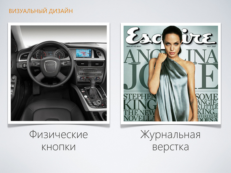
- The physical buttons are cool and clear. But the iconographic is beginning to exhaust its potential. Something new is needed.
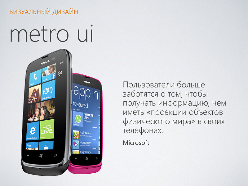
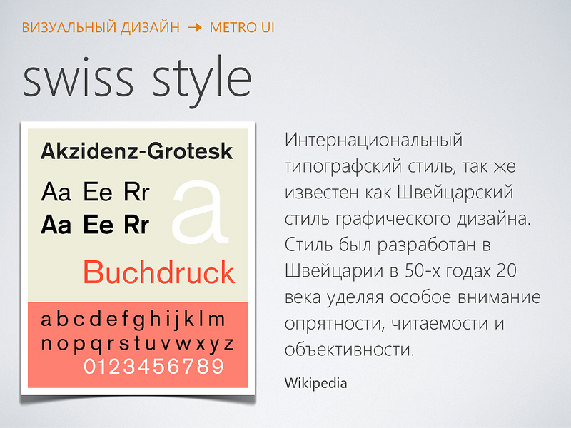
- Microsoft decided to come up with something new. The idea is to abandon the ideology of the “control panel” and start making interfaces in the spirit of “magazine layout” ... So the concept of Metro UI appeared. Fully digital interface, without copying the real world. This is an innovative approach, but the principles themselves are not new ... The basis was “international typographic style” or “Swiss design style”. It appeared in the 50s of the last century, focusing on readability and cleanliness. Now it has become a classic design. But in those days it was a revolution ...
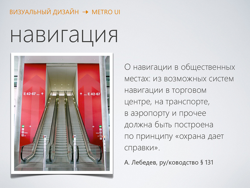
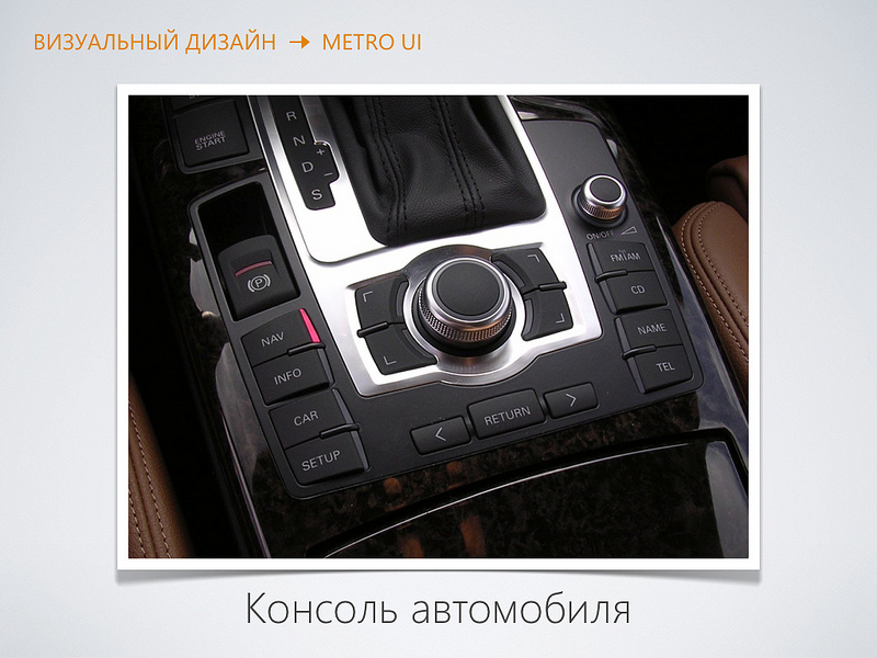
Another area where Metro UI developers drew inspiration is navigation in public places. Airports, public transport, shopping centers. The main task is to not get lost. The Metro UI concept contrasts itself with iconography and copying real-world objects. Immediately discard all textures, highlights and shadows. Merciless simplification. Let's go back to the car console. I am sure that everyone can say where you can click here and that you can twist here. - So are the buttons on the screen. No need to further explain that you can click on it. - But in Metro UI there is a rejection of this approach ...
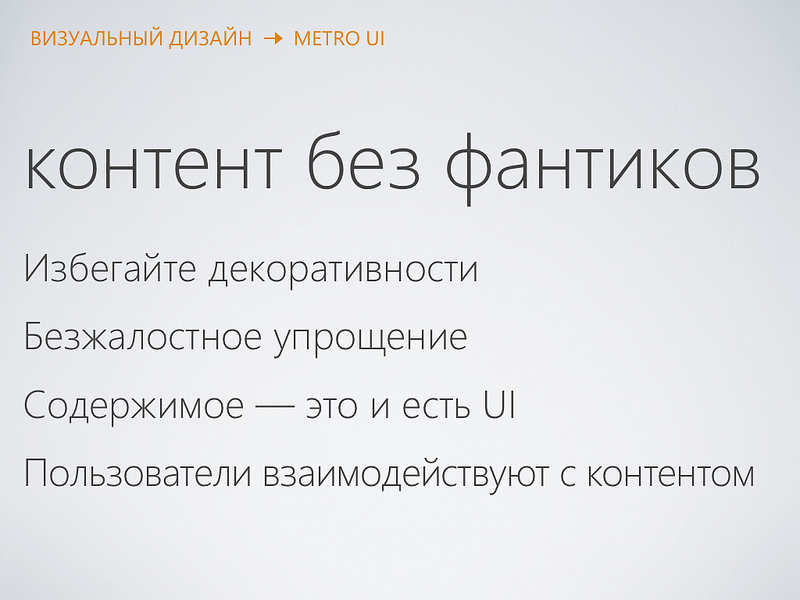

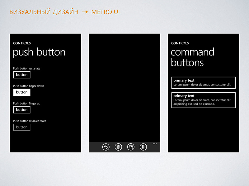
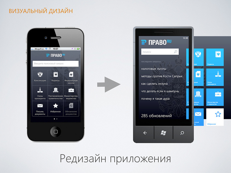
Buttons here are just rectangles and circles. Conceptually! I am sure that inexperienced users have problems with such controls. Windows Phone and Windows 8 platforms have appeared recently. Now the main need is related to the transfer of existing applications. - Here, for example, our Pravo.ru application for iPhone. It needs to be migrated to the WP7 platform. - But how to do that? Just copy the iPhone interface - it will be wrong! - We have to redesign the interface taking into account the principles of Metro UI.
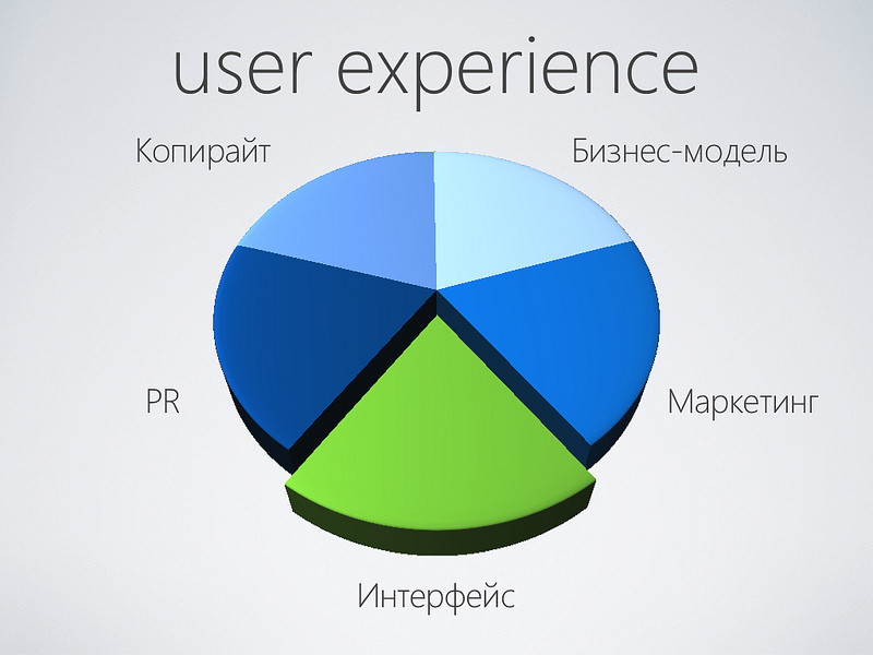
I told you about the steps for creating an interface. But UI design is only one section of the concept of interaction experience. The UX approach can be used in a business model, in marketing, and in copyright. Unfortunately, the time allotted to me is not enough in any way, therefore we will restrict ourselves only to the interface.
- I love screens in everything. If I need to buy, for example, a razor, then I will choose the one with the screen. It seems that this does not affect shaving, but this is a completely different, higher level of user interaction.
- My work is related to interface design. Previously, at Turbomilk, I was more involved in visual design. Among our clients there were many startups for whom we drew interfaces, icons, buttons and characters. What did the process look like? Clients, or, with luck, usability companies, handed us ready-made prototypes, and we drew beautiful interfaces on them.
- Now that we have teamed up with Parcsis, I began to design interfaces and user interactions myself. It turned out to be very difficult. But on the other hand, it’s very interesting. There was another degree of freedom to make the project truly successful. So, imagine that you have some kind of startup idea ... For example, to make such a wonderful yellow car that everyone wants to buy. I will not tell you anything new, but the idea without implementation is worth nothing. And the implementation is always difficult ... ... something like this, for example ... There is a void between the idea and the implementation, which for various reasons may be slightly different from the idea ... I am sure that many have come across this.
The same is true for it projects. Where traditionally they first program (make the so-called “engine”), and only then the interface is “pulled” onto it. It turns out the product in the style of "it was so convenient for programmers." But what about the user? .. Fortunately, more and more development teams work on the principle - we first design, and then program. With this approach, firstly, your product becomes more customer-oriented, and secondly, strangely enough, development is cheaper because programmers do not need to solve the problem in a general way. It all starts with a goal. First you decide what you want to do, and then how you can implement it.
- Firstly, do not be stubborn, do not close the target. In the process of working on a project, you will learn many new nuances and details. Changing goals and strategies is normal.
- Further, at the initial level, do not get carried away with the details. Yes, perhaps it’s sweet to think about something in fine detail, but not now.
- Also, do not think about restrictions. Solve problems as they arrive.
- Think about the customer. Why did he come to you? What can you offer him ... Start with custom scripts. Feel yourself as playwrights and think about how events within your project will be equalized.
- The first is brainstorming. For example, “how to improve the taxi booking experience.” Generate ideas without any restrictions. You can play this game with colleagues or friends. Put forward the craziest ideas.
“Then highlight the most viable ideas and do the research.” Understand whether this will work for your project. Draw sketches, make storyboards, as animators do.
- In the end, you need to choose and fix some decisions that you will rely on. At this stage, you decide what you will implement and what not. Do not be greedy, start with something simple. Do not be afraid to make decisions, you will have the opportunity to change your mind and remake. This is the charm of the approach: “first design, then programming” - the price of an error is not very large. You can always come back and do something else.
You need to understand who your target audience is. Here are two great gadgets: a vintage Polaroid camera and a modern iPhone. What unites these two gadgets? There is a group of users who really like these things. These are hipsters! What can be done with hipsters? They need to be made happy! .. So there was an application for the Instagram Instagram. It allows you to make
You need to think over the information architecture of your project ... - The project has a lot of disordered information: such as names, prices, dates, images, points on the map. You can recall the good old flowcharts and just draw data streams without getting into details. - In the process, remember the scripts and associate them with your data. “You can start making rude prototypes.” Just draw on paper as you see your interface screen by screen. - Step by step, the prototypes will be more and more detailed. So, the main task at this stage is to connect information and tasks: - We start with rough prototypes. You can simply draw them on paper. It is very effective. - Then we think through the tasks and ways to solve them.
- At the output we get a certain structure of information that we fix. A few words about what a task stream is. With the help of your project, users hope to solve some of their problems. The fewer actions or transitions they need to complete, the more pleasant experience they will receive. Do not pull the user in the details, think about how you can simplify their life. Let this be the stream of the “make a purchase in an online store” task. Before success, you need to go through 5 screens, select something and click. It’s a good idea to think about how to simplify ...
If a specific task in your project will be solved not for 5 steps or efforts, but for 2. The user will be grateful to you. Surely, he already did something similar earlier, will appreciate your efforts and will use your service. In my opinion, the best advertisement. For example, the AnyWayAnyDay service asks you to specify only the direction and date of departure. It immediately shows prices in ascending order. You do not need to enter the departure time, choose a company, filter the results or choose an airport. You can clarify all this, but then ... And now you already see prices and offers from different companies.
Here's another example of streamlining task flow from Amazon. You can buy items in one click, without using a basket. In the same way, you buy applications from the Apple AppStore, which, incidentally, bought a license for this method from Amazon. The next step is to think over a model of interaction between the user and your interface ... So that the user sees our well-structured information and performs tasks that we have simplified for him. Even if your interface is absolutely static, it is still an interactive design: - Interaction is neither information nor a task - it is a kind of filter to them.
- Thinking how the user will move inside your interface, you will get navigation. Not the traditional “hierarchical menu of sections” with great nesting, but really convenient navigation that the user needs.
- A common mistake of many designers - they do not think how the interface will respond to user actions. They make only a picture. Add movement! It will be much more interesting.
- Try to use someone else's experience, there is nothing wrong with that. Break tasks into smaller ones. Before you, someone has stepped on this rake and solved the problem. But be careful - use only successful patterns.
- We understand our tasks and think what ready-made templates we can apply. For example, it does not make sense to create some kind of revolutionary user registration system, unless your project is all about simplifying the registration process.
- Next you need to create the missing interaction patterns. Here you have to invent and invent.
- Describe in a convenient way for you how the interaction will occur. It could be prototypes or some other way that you like. Here, for example, is the Selloby private ad service. It makes the process of creating ads using a smartphone simple. The principle of operation is very similar to Twitter. This way, people who have previously used Twitter can easily understand how everything works.
And here is the main page of the legal reference system Pravo.ru - a technique called “gradual disclosure” has been used here. First, we show the user the most important thing - the search bar, as soon as he moves the cursor, additional features will appear. This helps to focus on the essentials. Interface design is copywriting. The best interfaces are not drawn, but written. You will constantly have to think about what to write or what to call the button. Each letter matters ... Here we see an example application for Windows Phone 7. Everything is written in text. But let's not get ahead of ourselves, we have come to the final stage ... The final stage of the work is visual design. Let's talk about trends in visual interface design ...
“Does anyone know what a squemorph or a squemorphic design means? ... I personally did not know.” Although we all use such interfaces.
- Now this is a current trend in interface design. We just take real-world objects and transfer to the screen. For example, now this is not an iPad at all, but a bookshelf. You just need to take a book and start reading. Here, for example, is the Address Book application from Mac OS X. It has a leather cover and a bookmark. Here there is a fold of pages and even the strings with which they are stitched. Attention to detail. And here the tablet becomes a synthesizer. Everyone who has previously dealt with this tool will figure out what to do. Let's look at the advantages of this approach: - The interfaces look familiar, it’s immediately clear what to do
- There are no questions for designers: “For what money was paid ?!” The interface looks “bohato”!
- If the interface is drawn with love, then it is interesting to consider
- Designers will not miss the opportunity to draw highlights and shadows. You don’t really need to think, just hone the technique. The iconographic style has its minuses: - The interface may be inconvenient. After all, we are copying an imperfect world. - This approach may interfere with the implementation of new features and features - Perhaps the non-optimal use of screen space - May be outdated. A striking example is the disk metaphor. A generation has grown up that has never seen floppy disks.
- The physical buttons are cool and clear. But the iconographic is beginning to exhaust its potential. Something new is needed.
- Microsoft decided to come up with something new. The idea is to abandon the ideology of the “control panel” and start making interfaces in the spirit of “magazine layout” ... So the concept of Metro UI appeared. Fully digital interface, without copying the real world. This is an innovative approach, but the principles themselves are not new ... The basis was “international typographic style” or “Swiss design style”. It appeared in the 50s of the last century, focusing on readability and cleanliness. Now it has become a classic design. But in those days it was a revolution ...
Another area where Metro UI developers drew inspiration is navigation in public places. Airports, public transport, shopping centers. The main task is to not get lost. The Metro UI concept contrasts itself with iconography and copying real-world objects. Immediately discard all textures, highlights and shadows. Merciless simplification. Let's go back to the car console. I am sure that everyone can say where you can click here and that you can twist here. - So are the buttons on the screen. No need to further explain that you can click on it. - But in Metro UI there is a rejection of this approach ...
Buttons here are just rectangles and circles. Conceptually! I am sure that inexperienced users have problems with such controls. Windows Phone and Windows 8 platforms have appeared recently. Now the main need is related to the transfer of existing applications. - Here, for example, our Pravo.ru application for iPhone. It needs to be migrated to the WP7 platform. - But how to do that? Just copy the iPhone interface - it will be wrong! - We have to redesign the interface taking into account the principles of Metro UI.
I told you about the steps for creating an interface. But UI design is only one section of the concept of interaction experience. The UX approach can be used in a business model, in marketing, and in copyright. Unfortunately, the time allotted to me is not enough in any way, therefore we will restrict ourselves only to the interface.