May 11, 2012 at 19:05
Symptoms of the epidemic: the course of web design
- Transfer
From the moment that Elliot Jay Stokes sharply urged to destroy the Web 2.0 identity, one could notice the “caramelization” of the network: fewer “glass” buttons, beveled edges, reflections, special offer labels, vulgar gradients with bright colors and diagonal patterns. Everyone was happy to accept the transformation, except perhaps the most inveterate glossy fans. However, design and aesthetics follow only their guided path, and only in web design has one tendency stalled, as another has appeared.
So what is this new epidemic? Let's start by looking at the most common symptoms, many of which you've probably noticed already. They are easy to distinguish, and, as in other disorders, they often appear in combination. (That’s why infection spreads so effectively - when combined, outwardly independent symptoms become much more contagious.)
Please note: the following list is without any specific order and does not reflect the level of contagion or severity, which seems to be the same for everyone. Note also that the examples presented often reflect more than one symptom, making the classification even more difficult.
Seams appear gradually, often as a result of a designer playing with lines and borders, especially with point varieties. A matured seam can be recognized by subtle transitions from dots to lines, reinforced by falling shadows and other effects designed to create a sense of volume. The purpose of the seam is something obscure, but they thrive in environments where appropriate textures are applied, especially fabric and leather, as well as just graininess.
It is difficult to determine the exact cause of the sutures, scientists are sure that the sutures belong to a larger genus of infections known as “skeuomorphism”.

Clockwise from the top: Mina Tran magazine ; Mason Yarnell's publication on the Dribble website; Liam McCabe's publication on the Dribble website.
Borders are a common web design element and therefore difficult to avoid; fortunately, they are usually harmless and have a positive effect on the layout. However, for some reason, one of the varieties of borders - zigzag - in the past few years has spread exponentially and now threatens the natural habitats of less aggressive specimens of borders. It is not known exactly why this happens, although some researchers argue that the pattern, made up of opposed diagonals, has such a seductive effect for designers and clients that the straight borders somewhat lose their charm.

Clockwise from the top: “ Yu Nou Hu ”; Christopher Paul's publication on the Dribble website; publication Megan Fisher on the Dribble website.
Like borders, ribbons have a long history of existence in various forms. However, what we have now is the almost complete predominance of one particular ribbon style, easily defined by a split at one or both ends. Some ribbons are also bent twice, which creates an artificial depth effect and enhances the diagonal effect at the ends. It is unclear whether such ribbons are associated with the zigzag effect, but diagonal lines, along with the ability to evoke memories of past times, seem to be the key to the survival of ribbons.
The danger of ribbons lies mainly in their ability to exist independently of other symptoms (although they thrive in vintage printing companies). This means that ribbons can continue to age your design already and far after the end of the epidemic, even if the symptom seems hidden. In many ways, the situation resembles the web 2.0 design special offer icons.
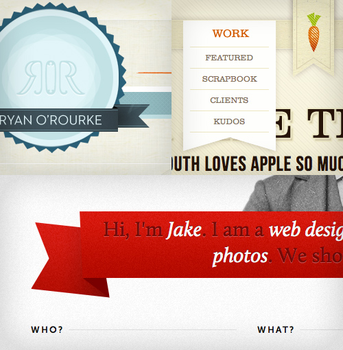
Clockwise from the top: Ryan Rourke website ; Cabage website ; Jake Prespo's website .
The problem is the need for evidence of the predominance of textures in our illustrations and backgrounds due to the completely digital era and the presence of this symptom in our list as one of the most common. Expressed by light grain, dirt and scratches, paper-like surfaces and bend marks, the technique uses the spirit of handmade, but, ironically, it is completely opposite in essence: these are only computer-generated effects or Photoshop brushes.
The prevalence of the use of textures can be explained by a thirst for tactile media (taking into account the peculiarities of touch screens) and envy directed towards the field of work of print designers, who have access to a much more rich palette of materials and surfaces.
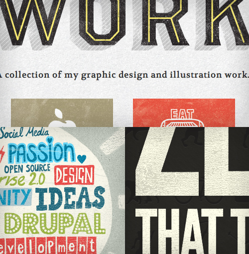
Clockwise from the top: Gerren Lamson site ;Zero application site ; Amazia Labs website .
An article from Smashing Magazine back in 2009 described letterpress as one of the trending trends of the year, and how they turned out to be right. A simple effect has become common and is now a household trick for decorating a print shop online. Letterpress is a relatively harmless symptom that at the beginning of the millennium infected designers of digital interfaces, for example, operating systems and games, which indicates a long incubation period.
Scientists cannot agree on one question: either the infection needs a critical mass to get out of the incubation period, or the infection just needs the right conditions - the shadows of KCC3, to be precise, for the symptoms to appear.

Clockwise from the top: Billy Tamplin website ;Phillip's publication on the Dribble website; Remix website .
After the release of copyright quarantine, this symptom, which attracted the attention of fashionable ladies and gentlemen, was practically eliminated due to the peculiarities of the latest epidemic and its inability to get along with gloss and gloss. But in a new environment suitable for vintage, he was able to find his way back into the visual repertoire. Be that as it may, the illustrations of the 19th century are likely to stay with us for a while, flashing from time to time like a flu virus.

Clockwise from the top: site of Kilian Mouster ; Trent Walton's publication on the Dribble website; Simon Collison website .
After a long period of brightness, the typical color scheme has become paler. You can see the widespread use of brown, dark green, mustard and a general tendency to dirty flowers, although it is believed that this is only a secondary sign of the epidemic. Some scholars even argue that muffled tones, in fact, are not a symptom at all, but only a side effect of other manifestations, as well as sweating is a natural reaction to a fever.
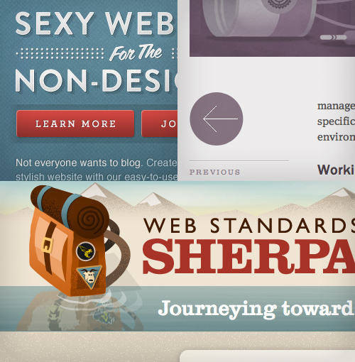
Clockwise from the top: Dave Ruiz's publication on the Dribble website; website "Cognition" ; Sherpa Web Standards website .
The symptom is not new; in fact, this was the standard for the first 500 years of printing before the arrival of Chichold and the new printing house. After that, the principle was quarantined due to its old-fashioned nature, difficulty in reading, and inefficiency. Perhaps this historical connection and vintage symptoms could be what helped such an energetic return to alignment. It is known that in recent years among people, reading habits have not changed (most representatives of Western civilization still read from left to right), and there is no plausible pretext that alignment improves comprehensibility; therefore, no matter what triggers this rebellion, we know that its roots are in subjective emotions, not rational ideas.

Clockwise from the top: Grip Limited website ; Tommy site; site "Visual Republic" .
A circle is a basic form and in fact is not a greater symptom of an epidemic than, for example, a triangle. However, if you put several triangles in a row, you get a zigzag. Similarly, if you enter a circle in the logo, you get a round logo. And if the logo has an inscription made in handwritten type, then, as you correctly understood, you get a Round logo with a handwritten inscription. Not that they were deadly, but they are contagious enough and can be quite detrimental if they get enough carriers.
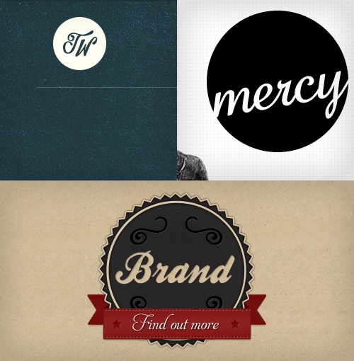
Clockwise from the top: Trent Walton's site ; site "Mercy ; James Seymour-Lock's publication on the Dribble website.
Skeuomorphic details, that is, decorations or design details on the object that are copied from the shape of the object to another environment, are common, especially in mobile applications, and this symptom is one of the defining signs of an epidemic. Cancer mutations in the form of weakly expressed skeuomorphic details, such as seams and letterpress, are possible, but sometimes the details grow and fill the entire interface, swelling with excessive references to physical objects and materials. Nevertheless, according to some researchers, thanks to the work associated with the preparation of graphics and the need for image sources, it is hardly worth expecting the prevalence of skeuomorphic details in the browsers of our desktop computers.
In fact, most scholars attribute the phenomenon to curiosity and predict that some virtual metaphors for real signs will prove their necessity (as happened with the tabs), and some will not. It is interesting that Apple continues to pioneer this technique, while Google finds the strength to avoid imitating physical reality in its interfaces. Perhaps they have a vaccine?
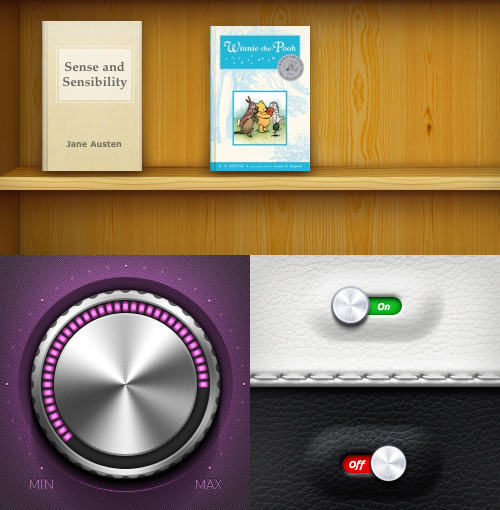
Clockwise from the top: i-Books application ; Publication of the skorky user on the Dribble website Igor Shkarin’s publication on the Dribble website.
To pinpoint the epicenter of a design epidemic (that is, a trend) is not an easy task, especially considering the darkness of symptoms and the infectious nature of the Internet. It is almost impossible to determine the first patient, and, from a pragmatic point of view, it is pointless. You could say that we got a reaction to the aesthetics of Web 2.0 - a thirst for textured surfaces and retro images, sometimes tactile and really looking - like an antidote to glittering impersonality. These are healthy and necessary things to push the design industry forward. A trend, regardless of its source, often serves the purpose of resolving certain problems or crowding out another trend.
Imagine that everyone typically uses sans-serif fonts, strong contrasting colors, and sharp white backgrounds. And now, in such an environment, the designer, in spite of everything, used Clarendon or some other soft serif font to breathe personality into his own site (for example, Grandma’s homemade jam), and then completed it with a choice of earth colors and some wrapping paper textures . The result would inevitably stand out surrounded by other sites: beautiful, emotional, unlike.
Incidentally, the aesthetics of this site inspire another designer who was just working on the site with visitors from all over the world, which showed a new approach to a whole generation of designers who, in turn, intentionally applied it, often without even realizing the context. So the trend was born. And now, oddly enough, there is a constant threat of an epidemic. The more people become infected, the more noticeable the symptoms become; and when the infection reaches a critical mass, the symptoms begin to work against themselves. It is pointless to bring individuality to your creation if everyone does the same.
In today's world of open collaboration, avoiding an epidemic of this magnitude is difficult; therefore, to some extent everyone is subject to it. The symptoms listed above affect not only small or novice designers, but also the elite layers of the design community. This means that although the symptoms are harmless, like a slight fever or snot caused by an influenza epidemic, a viral attack of fashionable details creates constant pressure on our immune system that protects our creativity. Vigilance is important for maintaining a healthy dose of original thoughts.
If you show some of the symptoms, then there is nothing to worry about - it’s easy to catch a cold common here and there, but it’s easy to recover from it. On the other hand, if you observe most of these symptoms at home, you should be careful when doing the next project. Using all the signs as key points in your work can make your portfolio look modern, but this is no different from giving away the creations of your favorite designer, artist or musician to your own. Of course, symptoms of uncertain origin are not protected by copyright, but that is not the point: you should not worry about legality, but honest creativity of the product. The risk is not only that your work will be like an outgoing trend, and in a couple of years the aesthetics will look outdated, but also that, noticing your work,
Although nothing is original, we must all respect the difference between inspiration and imitation. In the words of Jean-Luc Goddard: “No matter where you take it, it matters where.” And if you don’t take it anywhere, then why all this?
Worse, probably, the epidemic had an effect both among clients and then among the design community as a whole. The more designers are infected and the more symptoms of one disease they show, the less your customers will believe that you are able to solve business problems. Gradually, they will begin to exclude you in the early stages (where the real design takes place) and will use your services only to pull the skin on their frame, and gradually the whole profession will come down to the army of decorators.
Now, after we have seen how harmful trends can be, we ask ourselves how to avoid them. Is this even possible? Trends are by definition popular, and there is probably nothing wrong with including them in your product for the sake of increasing representativeness. It is not easy to convince a client to use a non-trending design, and there is a risk of scaring the audience by going against the tide just for the sake of unconventionality. On the other hand, blindly following the example of others has never been a good decision, and unconditional acceptance of fashion trends and thoughtless copying can stifle your creativity, destroy honesty and customer base.
So what to do? Trends are inherent in our society; no matter where - in politics, culture, design, and even religion - where a unanimous opinion goes, your opinion or taste will come there. Alas, in general, avoiding trends seems impossible and pointless, but this means that you are powerless: you can fight this lemming syndrome.
In your design decisions, always and constantly ask the magic question: why am I doing this? Am I doing this just because it looks cool or because it reflects the meaning I'm trying to convey? Why is this ribbon? Does this zigzag add or take away the personality of my site? How are my financial applications and this skin texture related? You will fall victim to the epidemic if you stop asking questions.
Francisco Incast, among other things, states in his article “The Dying Art of Design ” that inspiration requires sweating, and I cannot disagree with it. I was lucky to attend college, where the use of computers in the first year was forbidden, that is, we were forced to use real tools to express ourselves: draw letters by hand, draw our own illustrations, stock up on Panton pens (remember these?), Rape a copier. Our creative potential has grown, and I also learned an important lesson: good design does not come effortlessly, and the best results come from my own experiments.
Remember that being different is often good. Most of the great artists, regardless of their field of activity, stood out enough to be noticed. Who painted the melting clock before Dali? Who had the idea of building a huge wall on the stage before Pink Floyd? Although imitation can be convenient and can guarantee short-term victories, long-term success requires a unique, memorable approach.
To remain creative, it is imperative to remain inquisitive and seeking inspiration everywhere, and not just in sets of trendy themes by WordPress. Read books, conduct research, listen to music that you have not heard before, walk around new places or plunge into a foreign culture. Expanding your own horizons beyond your favorite sites and looking for more than one source of inspiration is critical to create a new and sustainable design.
Finally, in order to understand what is not defined by style, it is most important to study the basic principles of design. A system of gratings, contrast, intelligibility, a combination of images, good text are key components of a successful design, and they are completely independent of momentary trends and styles.
By and large, design is not so much a style, but a presentation of information, and everything - styles, images and typography - should be a reflection of the content, functionality and personality of the product, and not what seems cool right now.
And no matter how good something looks, he also has a place.
Thank You PATOGEN , who drew attention to this article.
Symptoms
So what is this new epidemic? Let's start by looking at the most common symptoms, many of which you've probably noticed already. They are easy to distinguish, and, as in other disorders, they often appear in combination. (That’s why infection spreads so effectively - when combined, outwardly independent symptoms become much more contagious.)
Please note: the following list is without any specific order and does not reflect the level of contagion or severity, which seems to be the same for everyone. Note also that the examples presented often reflect more than one symptom, making the classification even more difficult.
Stitches
Seams appear gradually, often as a result of a designer playing with lines and borders, especially with point varieties. A matured seam can be recognized by subtle transitions from dots to lines, reinforced by falling shadows and other effects designed to create a sense of volume. The purpose of the seam is something obscure, but they thrive in environments where appropriate textures are applied, especially fabric and leather, as well as just graininess.
It is difficult to determine the exact cause of the sutures, scientists are sure that the sutures belong to a larger genus of infections known as “skeuomorphism”.
Clockwise from the top: Mina Tran magazine ; Mason Yarnell's publication on the Dribble website; Liam McCabe's publication on the Dribble website.
Zigzag borders
Borders are a common web design element and therefore difficult to avoid; fortunately, they are usually harmless and have a positive effect on the layout. However, for some reason, one of the varieties of borders - zigzag - in the past few years has spread exponentially and now threatens the natural habitats of less aggressive specimens of borders. It is not known exactly why this happens, although some researchers argue that the pattern, made up of opposed diagonals, has such a seductive effect for designers and clients that the straight borders somewhat lose their charm.
Clockwise from the top: “ Yu Nou Hu ”; Christopher Paul's publication on the Dribble website; publication Megan Fisher on the Dribble website.
Bifurcated ribbons
Like borders, ribbons have a long history of existence in various forms. However, what we have now is the almost complete predominance of one particular ribbon style, easily defined by a split at one or both ends. Some ribbons are also bent twice, which creates an artificial depth effect and enhances the diagonal effect at the ends. It is unclear whether such ribbons are associated with the zigzag effect, but diagonal lines, along with the ability to evoke memories of past times, seem to be the key to the survival of ribbons.
The danger of ribbons lies mainly in their ability to exist independently of other symptoms (although they thrive in vintage printing companies). This means that ribbons can continue to age your design already and far after the end of the epidemic, even if the symptom seems hidden. In many ways, the situation resembles the web 2.0 design special offer icons.
Clockwise from the top: Ryan Rourke website ; Cabage website ; Jake Prespo's website .
Textures
The problem is the need for evidence of the predominance of textures in our illustrations and backgrounds due to the completely digital era and the presence of this symptom in our list as one of the most common. Expressed by light grain, dirt and scratches, paper-like surfaces and bend marks, the technique uses the spirit of handmade, but, ironically, it is completely opposite in essence: these are only computer-generated effects or Photoshop brushes.
The prevalence of the use of textures can be explained by a thirst for tactile media (taking into account the peculiarities of touch screens) and envy directed towards the field of work of print designers, who have access to a much more rich palette of materials and surfaces.
Clockwise from the top: Gerren Lamson site ;Zero application site ; Amazia Labs website .
Letterpress
An article from Smashing Magazine back in 2009 described letterpress as one of the trending trends of the year, and how they turned out to be right. A simple effect has become common and is now a household trick for decorating a print shop online. Letterpress is a relatively harmless symptom that at the beginning of the millennium infected designers of digital interfaces, for example, operating systems and games, which indicates a long incubation period.
Scientists cannot agree on one question: either the infection needs a critical mass to get out of the incubation period, or the infection just needs the right conditions - the shadows of KCC3, to be precise, for the symptoms to appear.
Clockwise from the top: Billy Tamplin website ;Phillip's publication on the Dribble website; Remix website .
Illustrations of the XIX century.
After the release of copyright quarantine, this symptom, which attracted the attention of fashionable ladies and gentlemen, was practically eliminated due to the peculiarities of the latest epidemic and its inability to get along with gloss and gloss. But in a new environment suitable for vintage, he was able to find his way back into the visual repertoire. Be that as it may, the illustrations of the 19th century are likely to stay with us for a while, flashing from time to time like a flu virus.
Clockwise from the top: site of Kilian Mouster ; Trent Walton's publication on the Dribble website; Simon Collison website .
Muted tones
After a long period of brightness, the typical color scheme has become paler. You can see the widespread use of brown, dark green, mustard and a general tendency to dirty flowers, although it is believed that this is only a secondary sign of the epidemic. Some scholars even argue that muffled tones, in fact, are not a symptom at all, but only a side effect of other manifestations, as well as sweating is a natural reaction to a fever.
Clockwise from the top: Dave Ruiz's publication on the Dribble website; website "Cognition" ; Sherpa Web Standards website .
Center or justified text
The symptom is not new; in fact, this was the standard for the first 500 years of printing before the arrival of Chichold and the new printing house. After that, the principle was quarantined due to its old-fashioned nature, difficulty in reading, and inefficiency. Perhaps this historical connection and vintage symptoms could be what helped such an energetic return to alignment. It is known that in recent years among people, reading habits have not changed (most representatives of Western civilization still read from left to right), and there is no plausible pretext that alignment improves comprehensibility; therefore, no matter what triggers this rebellion, we know that its roots are in subjective emotions, not rational ideas.
Clockwise from the top: Grip Limited website ; Tommy site; site "Visual Republic" .
Round logos with handwritten inscriptions.
A circle is a basic form and in fact is not a greater symptom of an epidemic than, for example, a triangle. However, if you put several triangles in a row, you get a zigzag. Similarly, if you enter a circle in the logo, you get a round logo. And if the logo has an inscription made in handwritten type, then, as you correctly understood, you get a Round logo with a handwritten inscription. Not that they were deadly, but they are contagious enough and can be quite detrimental if they get enough carriers.
Clockwise from the top: Trent Walton's site ; site "Mercy ; James Seymour-Lock's publication on the Dribble website.
Skeuomorphic details
Skeuomorphic details, that is, decorations or design details on the object that are copied from the shape of the object to another environment, are common, especially in mobile applications, and this symptom is one of the defining signs of an epidemic. Cancer mutations in the form of weakly expressed skeuomorphic details, such as seams and letterpress, are possible, but sometimes the details grow and fill the entire interface, swelling with excessive references to physical objects and materials. Nevertheless, according to some researchers, thanks to the work associated with the preparation of graphics and the need for image sources, it is hardly worth expecting the prevalence of skeuomorphic details in the browsers of our desktop computers.
In fact, most scholars attribute the phenomenon to curiosity and predict that some virtual metaphors for real signs will prove their necessity (as happened with the tabs), and some will not. It is interesting that Apple continues to pioneer this technique, while Google finds the strength to avoid imitating physical reality in its interfaces. Perhaps they have a vaccine?
Clockwise from the top: i-Books application ; Publication of the skorky user on the Dribble website Igor Shkarin’s publication on the Dribble website.
How did it start?
To pinpoint the epicenter of a design epidemic (that is, a trend) is not an easy task, especially considering the darkness of symptoms and the infectious nature of the Internet. It is almost impossible to determine the first patient, and, from a pragmatic point of view, it is pointless. You could say that we got a reaction to the aesthetics of Web 2.0 - a thirst for textured surfaces and retro images, sometimes tactile and really looking - like an antidote to glittering impersonality. These are healthy and necessary things to push the design industry forward. A trend, regardless of its source, often serves the purpose of resolving certain problems or crowding out another trend.
Imagine that everyone typically uses sans-serif fonts, strong contrasting colors, and sharp white backgrounds. And now, in such an environment, the designer, in spite of everything, used Clarendon or some other soft serif font to breathe personality into his own site (for example, Grandma’s homemade jam), and then completed it with a choice of earth colors and some wrapping paper textures . The result would inevitably stand out surrounded by other sites: beautiful, emotional, unlike.
Incidentally, the aesthetics of this site inspire another designer who was just working on the site with visitors from all over the world, which showed a new approach to a whole generation of designers who, in turn, intentionally applied it, often without even realizing the context. So the trend was born. And now, oddly enough, there is a constant threat of an epidemic. The more people become infected, the more noticeable the symptoms become; and when the infection reaches a critical mass, the symptoms begin to work against themselves. It is pointless to bring individuality to your creation if everyone does the same.
This is dangerous?
In today's world of open collaboration, avoiding an epidemic of this magnitude is difficult; therefore, to some extent everyone is subject to it. The symptoms listed above affect not only small or novice designers, but also the elite layers of the design community. This means that although the symptoms are harmless, like a slight fever or snot caused by an influenza epidemic, a viral attack of fashionable details creates constant pressure on our immune system that protects our creativity. Vigilance is important for maintaining a healthy dose of original thoughts.
If you show some of the symptoms, then there is nothing to worry about - it’s easy to catch a cold common here and there, but it’s easy to recover from it. On the other hand, if you observe most of these symptoms at home, you should be careful when doing the next project. Using all the signs as key points in your work can make your portfolio look modern, but this is no different from giving away the creations of your favorite designer, artist or musician to your own. Of course, symptoms of uncertain origin are not protected by copyright, but that is not the point: you should not worry about legality, but honest creativity of the product. The risk is not only that your work will be like an outgoing trend, and in a couple of years the aesthetics will look outdated, but also that, noticing your work,
Although nothing is original, we must all respect the difference between inspiration and imitation. In the words of Jean-Luc Goddard: “No matter where you take it, it matters where.” And if you don’t take it anywhere, then why all this?
Worse, probably, the epidemic had an effect both among clients and then among the design community as a whole. The more designers are infected and the more symptoms of one disease they show, the less your customers will believe that you are able to solve business problems. Gradually, they will begin to exclude you in the early stages (where the real design takes place) and will use your services only to pull the skin on their frame, and gradually the whole profession will come down to the army of decorators.
What can we do with this?
Now, after we have seen how harmful trends can be, we ask ourselves how to avoid them. Is this even possible? Trends are by definition popular, and there is probably nothing wrong with including them in your product for the sake of increasing representativeness. It is not easy to convince a client to use a non-trending design, and there is a risk of scaring the audience by going against the tide just for the sake of unconventionality. On the other hand, blindly following the example of others has never been a good decision, and unconditional acceptance of fashion trends and thoughtless copying can stifle your creativity, destroy honesty and customer base.
So what to do? Trends are inherent in our society; no matter where - in politics, culture, design, and even religion - where a unanimous opinion goes, your opinion or taste will come there. Alas, in general, avoiding trends seems impossible and pointless, but this means that you are powerless: you can fight this lemming syndrome.
Ask why
In your design decisions, always and constantly ask the magic question: why am I doing this? Am I doing this just because it looks cool or because it reflects the meaning I'm trying to convey? Why is this ribbon? Does this zigzag add or take away the personality of my site? How are my financial applications and this skin texture related? You will fall victim to the epidemic if you stop asking questions.
Invest a little effort
Francisco Incast, among other things, states in his article “The Dying Art of Design ” that inspiration requires sweating, and I cannot disagree with it. I was lucky to attend college, where the use of computers in the first year was forbidden, that is, we were forced to use real tools to express ourselves: draw letters by hand, draw our own illustrations, stock up on Panton pens (remember these?), Rape a copier. Our creative potential has grown, and I also learned an important lesson: good design does not come effortlessly, and the best results come from my own experiments.
Try something else
Remember that being different is often good. Most of the great artists, regardless of their field of activity, stood out enough to be noticed. Who painted the melting clock before Dali? Who had the idea of building a huge wall on the stage before Pink Floyd? Although imitation can be convenient and can guarantee short-term victories, long-term success requires a unique, memorable approach.
Look for sources of inspiration
To remain creative, it is imperative to remain inquisitive and seeking inspiration everywhere, and not just in sets of trendy themes by WordPress. Read books, conduct research, listen to music that you have not heard before, walk around new places or plunge into a foreign culture. Expanding your own horizons beyond your favorite sites and looking for more than one source of inspiration is critical to create a new and sustainable design.
Focus on the basics
Finally, in order to understand what is not defined by style, it is most important to study the basic principles of design. A system of gratings, contrast, intelligibility, a combination of images, good text are key components of a successful design, and they are completely independent of momentary trends and styles.
By and large, design is not so much a style, but a presentation of information, and everything - styles, images and typography - should be a reflection of the content, functionality and personality of the product, and not what seems cool right now.
And no matter how good something looks, he also has a place.
Thank You PATOGEN , who drew attention to this article.