Crypt Fonts
 From monospace fonts I don’t need much. Adequate support for the Cyrillic alphabet. For programming - no blurring. The ability to distinguish between 0 (which is zero) and O. The ability to distinguish between I (which i), l (which L) and | (which is or). For work in a console two-panel - support for pseudo-graphics. However, in the modern world there are not so many such fonts. Where do you get them from?
 Caution! Under the cut - solid anachronisms.
This thought haunted me for quite some time. A bunch of options were tried, and none of them worked. Yes, there is Terminus, but it is impossible to look at its implementation of the Cyrillic alphabet without tears, there is Nouveau IBM - it is almost what you need, but something in it is not so for my eyes. Different variants of converting decent proportional fonts into monospaced fonts did not give acceptable results. The idea of comfortable fonts has been delayed for a while. But not forever.
Today it dawned on me - after all, how qualitatively small fonts were drawn in crackers under DOS! And the pseudographics there are beautiful, like nowhere else. It remains only to get them out of there, and adapt them to modern realities.
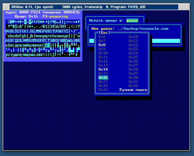
After downloading keyrus.com and another five crack, I began to experiment. Disassembling the crack to find font offsets seemed an ungrateful task. I also refused the idea of whipping up a ripper, since the only thing I remembered was that the zero-bit glyph glyph bitmap in 99% of VGA fonts is 16 zero bytes, and I was not sure of the results of such ripping out because of a guaranteed heap of garbage in the output.
I had to arm myself with dosbox and utilities familiar from the mid-90s. With their help, the desired fonts
were obtained without difficulty. Unfortunately, some of the crack that could be found were passed through then packaged executable files. He did not waste time on them.
Having pulled out fonts, I climbed into Linux to write a converter. As the target format - I don’t remember why, BDF was chosen. The converter itself turned out to be completely trivial - even the glyph bitmaps did not have to be modified in any way, so I can not upload its code. The only question that took some time was the search for the conversion table from CP866 to Unicode, which could be quickly inserted from the code to C.
The result in BDF - with minor modifications - turned out to be quite acceptable.
Both in the terminal and in GUI editors (for example, Sublime Text 2). Under Linux, moreover, this turned out to be the best option, since I did not find the ability to disable antialiasing only for gnome-terminal. Yes, and the lack of line-spacing settings can play a joke with pseudo-graphics - vertical lines will be broken when using ttf.
But ... Damn, I wanted to get these fonts not only under Linux, but also on a poppy, since I have to work simultaneously in two OSs. But poppy - alas and ah - does not support BDF. We begin to dig deeper.
Attempts to generate valid ttfs with raster glyphs have failed. Why - I still don’t know, it requires a careful study of the materiel.
In order not to stagnate - he began to experiment with vectorization. It was obvious that attempts to trace 8x16 glyphs would lead to a lack of acceptable results. It is necessary to scale up. Writing your resizer is too lazy. On the open spaces of the network, what was needed was found - the console utility bdfresize. Assembled, checked operability, scaled to 32x64.
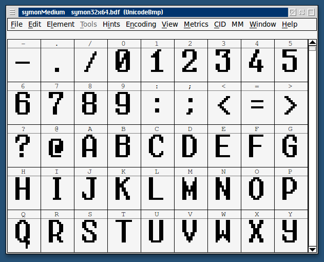
Useful in fontforge tracing. For tracing, we used potrace with the parameters "-z white -a -1". I didn’t select the parameters myself - as was said on the open spaces of the network, “this will split diagonal pixels and suppress conversion from polygons to curves”. To say this in Russian in such a way as to sound adequate, I, unfortunately, find it difficult.
The trace result without additional edits turned out to be square-nested, but without artifacts. Exactly what I wanted to get.

At this stage, all that was left to do was generate ttf and check on the poppy. In the standard terminal, the terminal with Midnight Commander, and in the text editor, everything looked no worse than under Linux (with anti-aliasing disabled, of course).
I decided to stop on this - my font Wishlist calmed down, and I received satisfaction both from the result and from the completed quest.
I don’t post the results of the conversion, because for me the legal aspects in this situation are not clear. I am sure that everyone who has read up to this place is able to get the same fonts - if there is a desire.
PS: Under the OS, which currently occupies a dominant position in the desktop market, the results were not checked due to the lack of such an opportunity.
UPD: converter, sample bdf and ttf uploaded toifolder.ru/28488918
The author is not responsible for the quality of the converter code. No attempt was made to comb her hair.