Two rules for a good iPhone application icon
The iOs app icon is your very first visual contact with the user. Wherever he finds the application in the top, in the search, on the link to the AppStore, first he will pay attention to the application icon. And often it depends on her whether he will go by or on a page with details.
Two simple rules follow from this. I will try to demonstrate them with illustrative examples.

I will not argue that the beauty of an icon is a subjective concept, but the icon must be of high quality. If the icon is sloppy somehow on the knee, the user will expect the same from the application.
Should we expect an excellent interface and functionality from applications with such icons?

And with those?

Making a beautiful icon is very simple, just hire a designer :) and track the good applications in the AppStore yourself.
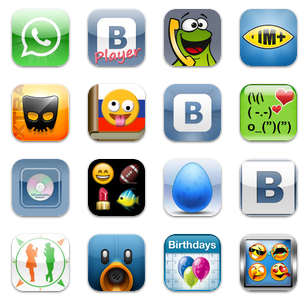
Let's take a look at a small selection from the paid Social Networking top:

When I look at it, the letters WTF are pulsating in my head ?! :) How should the user choose from this variety? Where is the application for audio, where for video, where is the faster client?
What if you put yourself all five, how to distinguish one application from another on the iPhone screen?
If you want your application to download - stand out . Stand out in your category, stand out in the general top.
Unlike the beauty of the icon, the second rule is very simple to check. Take your future icon and "try it on" in the top you need the categories, in the general top and on the iTunes screen. Experiment with color and shape until the icon becomes most visible.
It’s not difficult to do these operations with your hands, but we made an icon testing tool for ourselves . It works as simple as possible: load the future icon, select the country, category and get four pictures. The results of experiments are easy to share with colleagues or the customer. A short summary: in order to increase the conversion rate of application downloads and the activity of its use, the icon should be beautiful and stand out among other applications. Good luck with the apps and more good icons! ;) BTW. We are looking for C # developers to create high-quality mobile applications. UPD And show your icons, if any.

Two simple rules follow from this. I will try to demonstrate them with illustrative examples.

First rule: the icon must be beautiful
I will not argue that the beauty of an icon is a subjective concept, but the icon must be of high quality. If the icon is sloppy somehow on the knee, the user will expect the same from the application.
Should we expect an excellent interface and functionality from applications with such icons?

And with those?

Making a beautiful icon is very simple, just hire a designer :) and track the good applications in the AppStore yourself.
Second rule: the icon should stand out
Let's take a look at a small selection from the paid Social Networking top:

When I look at it, the letters WTF are pulsating in my head ?! :) How should the user choose from this variety? Where is the application for audio, where for video, where is the faster client?
What if you put yourself all five, how to distinguish one application from another on the iPhone screen?
If you want your application to download - stand out . Stand out in your category, stand out in the general top.
Unlike the beauty of the icon, the second rule is very simple to check. Take your future icon and "try it on" in the top you need the categories, in the general top and on the iTunes screen. Experiment with color and shape until the icon becomes most visible.
It’s not difficult to do these operations with your hands, but we made an icon testing tool for ourselves . It works as simple as possible: load the future icon, select the country, category and get four pictures. The results of experiments are easy to share with colleagues or the customer. A short summary: in order to increase the conversion rate of application downloads and the activity of its use, the icon should be beautiful and stand out among other applications. Good luck with the apps and more good icons! ;) BTW. We are looking for C # developers to create high-quality mobile applications. UPD And show your icons, if any.

