 October 31, 2011 at 12:39
CSS3 menu animation
- Transfer

In this article, I would like to show you some tricks for creating effects using CSS3 using a menu example. The idea is to simply composition the elements: the icon, the main name and the secondary name, which will be animated when you hover, using only CSS transitions and CSS animation. We will look at several different effects for the elements.
The icons used in the demo are Web symbols font . Font created by Just Be Nice .
HTML markup
The HTML structure of the menu will be an unordered list, where each element is a link, which in turn includes a span with an icon and a div with a primary and secondary name:
* This source code was highlighted with Source Code Highlighter.Since we use the font for the icons, we will write the corresponding letter for the icon.
CSS
In common styles for all examples, the connection of the character font will be:
@font-face {
 font-family: 'WebSymbolsRegular';
 src: url('websymbols/websymbols-regular-webfont.eot');
 src: url('websymbols/websymbols-regular-webfont.eot?#iefix') format('embedded-opentype'),
 url('websymbols/websymbols-regular-webfont.woff') format('woff'),
 url('websymbols/websymbols-regular-webfont.ttf') format('truetype'),
 url('websymbols/websymbols-regular-webfont.svg#WebSymbolsRegular') format('svg');
 font-weight: normal;
 font-style: normal;
}
The file path is relative to the CSS file, therefore, they will be located in the css / websymbols / folder.
The big advantage of using a character font is that we can apply various beautiful effects to it, for example, text with a shadow. We can also stretch it for our needs.
The style for a bulleted list will be almost the same for each example, we will just adapt its width:
.ca-menu{
 padding: 0;
 margin: 20px auto;
 width: 500px;
}
In the following example, I will show you the styles of the elements to which the effects will be applied. In the first example, we look at the styles of all the elements, and in the rest we focus on the differences.
Note: In the following examples, I will not write prefixes for each browser, because I do not want to clutter up CSS, but you will find all the necessary prefixes in the demo files.
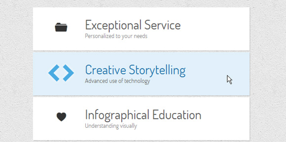
Example 1
In this example, we will look at the vertical menu in which we will change the sizes of the elements and the background color of each item.
Let's define the style of the list item:
.ca-menu li{
 width: 500px;
 height: 100px;
 overflow: hidden;
 display: block;
 background: #fff;
 box-shadow: 1px 1px 2px rgba(0,0,0,0.2);
 margin-bottom: 4px;
 border-left: 10px solid #000;
 transition: all 300ms ease-in-out;
}
.ca-menu li:last-child{
 margin-bottom: 0px;
}
The transition will be for all properties, since we want to change the border color and background color.
The item link will have the following style:
.ca-menu li a{
 text-align: left;
 display: block;
 width: 100%;
 height: 100%;
 color: #333;
 position:relative;
}
Let's define a style for individual elements. Span icons will have the following style:
.ca-icon{
 font-family: 'WebSymbolsRegular', cursive;
 font-size: 20px;
 text-shadow: 0px 0px 1px #333;
 line-height: 90px;
 position: absolute;
 width: 90px;
 left: 20px;
 text-align: center;
 transition: all 300ms linear;
}
As you can see, we will use web symbols as a font family. Each letter will be an icon.
The wrapper for content items will have the following style:
.ca-content{
 position: absolute;
 left: 120px;
 width: 370px;
 height: 60px;
 top: 20px;
}
The content of the elements will vary depending on their font size and will have a linear transition:
.ca-main{
 font-size: 30px;
 transition: all 300ms linear;
}
.ca-sub{
 font-size: 14px;
 color: #666;
 transition: all 300ms linear;
}
And now the most interesting part. When hovering over a list item, we will change the font size and color:
.ca-menu li:hover{
 border-color: #fff004;
 background: #000;
}
.ca-menu li:hover .ca-icon{
 color: #fff004;
 text-shadow: 0px 0px 1px #fff004;
 font-size: 50px;
}
.ca-menu li:hover .ca-main{
 color: #fff004;
 font-size: 14px;
}
.ca-menu li:hover .ca-sub{
 color: #fff;
 font-size: 30px;
}
Since we defined a transition for each of these elements, the changes will be “animated”.
Example 2
In the second example, we will add some animation for the content elements. The idea is to revive them above and below:
.ca-menu li:hover{
 background: #e1f0fa;
}
.ca-menu li:hover .ca-icon{
 font-size: 40px;
 color: #259add;
 opacity: 0.8;
 text-shadow: 0px 0px 13px #fff;
}
.ca-menu li:hover .ca-main{
 opacity: 1;
 color:#2676ac;
 animation: moveFromTop 300ms ease-in-out;
}
.ca-menu li:hover .ca-sub{
 opacity: 1;
 animation: moveFromBottom 300ms ease-in-out;
}
Let's define two animations. The first will start by inserting the corresponding element 200% down along the Y axis, which means that it will be shifted down. In addition, it will have a transparency of 0. Then it will be animated by changing translateY to 0%:
@keyframes moveFromBottom {
 from {
 opacity: 0;
 transform: translateY(200%);
 }
 to {
 opacity: 1;
 transform: translateY(0%);
 }
}
The second animation will move the element on top according to the same principles:
@keyframes moveFromTop {
 from {
 opacity: 0;
 transform: translateY(-200%);
 }
 to {
 opacity: 1;
 transform: translateY(0%);
 }
}
Example 3
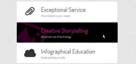
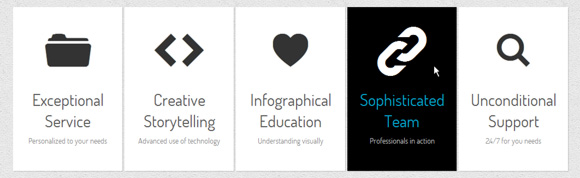
In this example, we want to change the background and color of the text on hover. We will also rotate and enlarge the icon. We can do this with transition and by increasing the font size of the icon:
.ca-menu li:hover{
 background-color: #000;
}
.ca-menu li:hover .ca-icon{
 color: #f900b0;
 font-size: 120px;
 opacity: 0.2;
 left: -20px;
 transform: rotate(20deg);
}
.ca-menu li:hover .ca-main{
 color: #f900b0;
 opacity: 0.8;
}
.ca-menu li:hover .ca-sub{
 color: #fff;
 opacity: 0.8;
}
Example 4
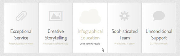
Examples 4 through 8 will use a different menu layout. Elements will be located next to each other:
.ca-menu li{
 width: 200px;
 height: 300px;
 overflow: hidden;
 position: relative;
 float: left;
 border: 5px solid #fff;
 background: #e2f0ff;
 box-shadow: 1px 1px 2px rgba(0,0,0,0.2);
 margin-right: 4px;
 transition: all 300ms linear;
}
.ca-menu li:last-child{
 margin-right: 0px;
}
The icon will be placed on the top, in the center of the item:
.ca-icon{
 font-family: 'WebSymbolsRegular', cursive;
 color: #c5e4f4;
 font-size: 90px;
 text-shadow: 1px 0px 1px rgba(255,255,255,0.7);
 line-height: 150px;
 position: absolute;
 width: 100%;
 height: 50%;
 left: 0px;
 top: 0px;
 text-align: center;
 transition: all 200ms linear;
}
The content wrapper will be placed on the bottom of the element:
.ca-content{
 position: absolute;
 left: 0px;
 width: 100%;
 height: 50%;
 top: 50%;
}
The primary and secondary headers will have the following style:
.ca-main{
 font-size: 30px;
 color: #005382;
 opacity: 0.8;
 text-align: center;
 transition: all 200ms linear;
}
.ca-sub{
 text-align:center;
 font-size: 14px;
 color: #666;
 line-height: 40px;
 opacity: 0.8;
 transition: all 200ms linear;
}
When you hover, we will blur the icon, change the background color and move the content elements above and below:
.ca-menu li:hover{
 background-color: #fff;
}
.ca-menu li:hover .ca-icon{
 text-shadow: 0px 0px 20px #c5e4f4;
 color: transparent;
 animation: moveFromTop 400ms ease;
}
.ca-menu li:hover .ca-main{
 color: #000;
 animation: moveFromTop 300ms ease;
}
.ca-menu li:hover .ca-sub{
 color: #000;
 animation: moveFromBottom 500ms ease;
}
Blurring an icon occurs when we set its color as transparent and create a shadow for it with a lot of blur.
The animation will be the same as the one we used in one of the previous examples, except for translating the values for the moveFromTop animation. Here we set translateY to -300%.
Example 5
In the fifth example, we put forward the icon on the left, the name on the right and the secondary name below:
.ca-menu li:hover{
 background:#fff;
}
.ca-menu li:hover .ca-icon{
 color: #afa379;
 font-size: 90px;
 opacity: 0.1;
 animation: moveFromLeft 400ms ease;
}
.ca-menu li:hover .ca-main{
 color: #afa379;
 animation: moveFromRight 300ms ease;
}
.ca-menu li:hover .ca-sub{
 color: #000;
 animation: moveFromBottom 500ms ease;
}
We already know the animation moveFromBottom, let's take a look at moveFromLeft, which moves the corresponding element to the left, setting translateX to -100%, and then moving it back to its original position:
@keyframes moveFromLeft{
 from {
 transform: translateX(-100%);
 }
 to {
 transform: translateX(0%);
 }
}
In the moveFromRight animation, we will set translateX (100%) initially.
Example 6
In this example, we want the name to slide on the left and also rotate at the same time:
.ca-menu li:hover{
 background-color: #000;
}
.ca-menu li:hover .ca-icon{
 color: #fff;
 font-size: 90px;
}
.ca-menu li:hover .ca-main{
 color: #00ccff;
 animation: moveFromLeftRotate 300ms ease;
}
.ca-menu li:hover .ca-sub{
 color: #fff;
 animation: moveFromBottom 500ms ease;
}
The moveFromLeftRotate animation will move the item and rotate it:
@keyframes moveFromLeftRotate{
 from {
 transform: translateX(-100%) rotate(-90deg);
 }
 to {
 transform: translateX(0%) rotate(0deg);
 }
}
Example 7
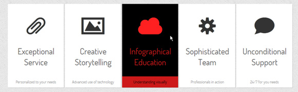
In this example, we will set the background name to the bottom of the element:
.ca-sub{
 text-align:center;
 font-size: 14px;
 color: #666;
 line-height: 40px;
 opacity: 0.8;
 position: absolute;
 bottom: 0;
 width: 100%;
 transition: all 200ms linear;
}
We want the name to slide below and also change the background color. The icon will move out from below, while the main name will increase:
.ca-menu li:hover{
 background-color: #000;
}
.ca-menu li:hover .ca-icon{
 color: #ff2020;
 animation: moveFromBottom 300ms ease;
}
.ca-menu li:hover .ca-main{
 color: #ff2020;
 animation: smallToBig 300ms ease;
}
.ca-menu li:hover .ca-sub{
 color: #000;
 background-color: #ff2020;
 animation: moveFromBottom 500ms ease;
}
The smallToBig animation is an example of how to use transformation:
@keyframes smallToBig{
 from {
 transform: scale(0.1);
 }
 to {
 transform: scale(1);
 }
}
Example 8

In this example, we want to enlarge the entire list item on hover. We will do this by scaling it to 1.1.
We also have a special span with the ID #heart icon. This span will be red and on hover we will use smallToBig animation in a special way: we will endlessly alternate the animation, creating the effect of a beating heart.
.ca-menu li:hover{
 background-color: #000;
 z-index:999;
 transform: scale(1.1);
}
.ca-menu li:hover .ca-icon{
 color: #ccff00;
 font-size: 90px;
 opacity:0.3;
}
.ca-menu li:hover .ca-icon#heart{
 animation: smallToBig 900ms alternate infinite ease;
}
.ca-menu li:hover .ca-main{
 color: #ccff00;
 animation: smallToBig 300ms ease;
}
.ca-menu li:hover .ca-sub{
 color: #ccff00;
 animation: moveFromBottom 500ms ease;
}
Example 9
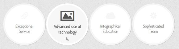
The last two examples will be in circles, so we will change the style for the list items:
.ca-menu li{
 width: 230px;
 height: 230px;
 border: 10px solid #f6f6f6;
 overflow: hidden;
 position: relative;
 float:left;
 background: #fff;
 margin-right: 4px;
 box-shadow: 1px 1px 2px rgba(0,0,0,0.2);
 border-radius: 125px;
 transition: all 400ms linear;
}
In order to create a circle, we need to set border-radius to half the outer width / height of the element.
We will do the following when hovering:
.ca-menu li:hover{
 background: #f7f7f7;
 border-color: #fff;
 transform: rotate(360deg);
}
.ca-menu li:hover .ca-icon{
 color: #555;
 font-size: 60px;
}
.ca-menu li:hover .ca-main{
 display: none;
}
.ca-menu li:hover .ca-sub{
 opacity: 0.8;
}
The item will rotate 360 degrees and the main name will disappear, allowing the secondary name to appear (its transparency was initially set to 0).
Example 10

In the last example, the list items will have a left margin of -48px. This will allow overlapping. Then, on hover, we will scale them and increase the z-index, so that the active item will be on top:
.ca-menu li:hover{
 border-color: #333;
 z-index: 999;
 transform: scale(1.1);
}
.ca-menu li:hover .ca-icon{
 color: #000;
 font-size: 60px;
 text-shadow: 0px 0px 1px #000;
 animation: moveFromBottom 300ms ease;
}
.ca-menu li:hover .ca-main{
 color: #000;
 animation: moveFromBottom 500ms ease;
}
And that’s it! I hope you enjoyed these little experiments and find them useful!
Please note that this animation and transitions will only work in the latest versions of truly modern web browsers such as Google Chrome, Apple Safari, Opera and Mozilla Firefox.
Download files with examples.