Psychology of color perception or "Pink glasses from Auto.ru"
What is your impression of the highlighted pink-red ad?
Would you like to see him?
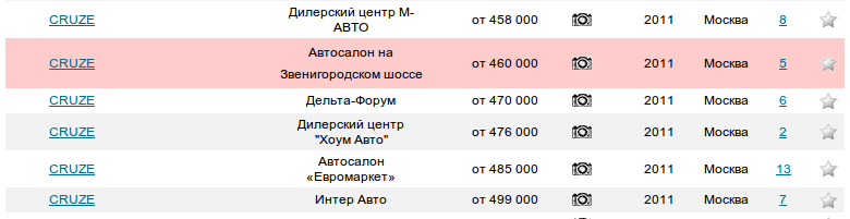
Subjective sensation - something is wrong with this car .
Maybe the seller was fined with something, or users complained about this ad.
This is due to the fact that most of the time we think in a stereotyped way and this allows us not to waste time and mental efforts in everyday life and solve problems quickly, intuitively, without thinking.
Suspicious hawkers guessed that with this announcement everything was in order and even more so, its owner paid extra money to be “highlighted”.
1. Both desktop and web applications have taught users that this kind of highlighting is a mistake (incomplete or incorrect data)!
2. Quote from the portal "An ad highlighted in color on the list attracts a greater number of buyers." Attracting certainly attracts, but what will it give?
A crocodile in the middle of the sidewalk also attracts attention, but does this mean that all passers-by will want to stroke it?
3. I can’t say with 100% certainty, but on those cars that were interesting to me,highlighted ads had less (sometimes significantly less, all other things being equal) views than their "pale-faced" counterparts. It turns out that users spend money to their own detriment.
4. Highlighting the ads in color, the portal did not bother about what would happen if they were followed several times in a row
5. The subjective side of perception is clear - a certain part of users who have patterns of thinking similar to mine will avoid such ads. And if they will rationalize: the seller spent extra money on advertising compared to other players, "at whose expense the banquet"?
Advice to developers - read smart books on the psychology of perceiving interfaces, test your decisions, collect feedback from the user.
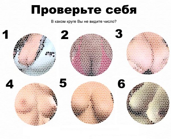
Finally, a small test for color blindness :)
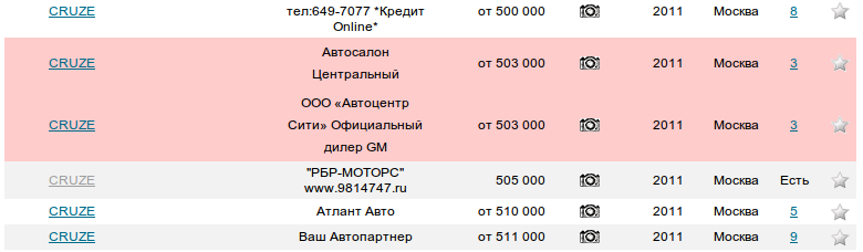
Would you like to see him?
Subjective sensation - something is wrong with this car .
Maybe the seller was fined with something, or users complained about this ad.
This is due to the fact that most of the time we think in a stereotyped way and this allows us not to waste time and mental efforts in everyday life and solve problems quickly, intuitively, without thinking.
Suspicious hawkers guessed that with this announcement everything was in order and even more so, its owner paid extra money to be “highlighted”.
1. Both desktop and web applications have taught users that this kind of highlighting is a mistake (incomplete or incorrect data)!
2. Quote from the portal "An ad highlighted in color on the list attracts a greater number of buyers." Attracting certainly attracts, but what will it give?
A crocodile in the middle of the sidewalk also attracts attention, but does this mean that all passers-by will want to stroke it?
3. I can’t say with 100% certainty, but on those cars that were interesting to me,highlighted ads had less (sometimes significantly less, all other things being equal) views than their "pale-faced" counterparts. It turns out that users spend money to their own detriment.
4. Highlighting the ads in color, the portal did not bother about what would happen if they were followed several times in a row
5. The subjective side of perception is clear - a certain part of users who have patterns of thinking similar to mine will avoid such ads. And if they will rationalize: the seller spent extra money on advertising compared to other players, "at whose expense the banquet"?
Advice to developers - read smart books on the psychology of perceiving interfaces, test your decisions, collect feedback from the user.
Finally, a small test for color blindness :)