 September 11, 2011 at 19:52
Outside Tabs
- Transfer
Rounded corners are now done trivially with border-radius. Thanks to border-radius, we can “crop” blocks according to need, but what if we need to round the “outer” corner? The problem is easier to explain graphically:

making the upper corners is not a problem, but the lower ones are more complicated. Under the cat we explain how.
In website layouts, you can stumble upon almost any visual effects. In the worst case, you have to use images to achieve them. Our task in this case, as always, is not to use them (since it is quickly loaded, affordable, easy to update). Here is our markup:
The class name “active” indicates the active tab.
The reason why this is difficult is because we need to get a form that goes beyond the initial block. To achieve this without additional markup, we use pseudo-elements. If you need to refresh your memory about what these elements are, you can do this by reading this and this article. Directly through css, we can add additional stylized elements to the page. Each element can generate two additional ones using pseudo-selectors: before and: after. For each tab, we will use four. This is possible due to the fact that each tab consists of two elements: a list item and an anchor.
Let's visualize the process step by step without reviewing the code for now.
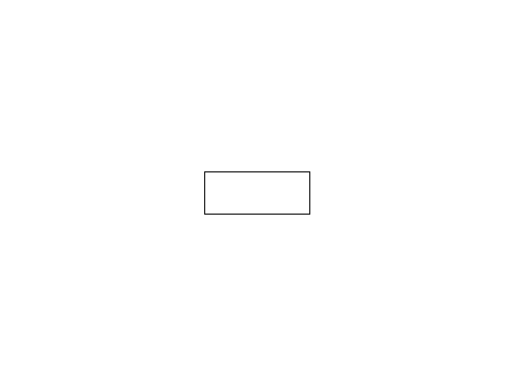
 List items are typically a block item and the anchor is a lowercase item. So we get such a bark.
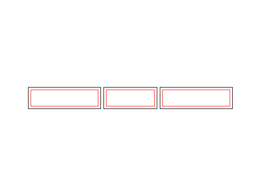 Assigning float: left to the list elements, we line them up in a row and shorten the anchors inside. In fact - to the width of the content.
 By themselves, list items do not have indentation or margins (margin or padding), so list items and anchors nested within them have the same size.
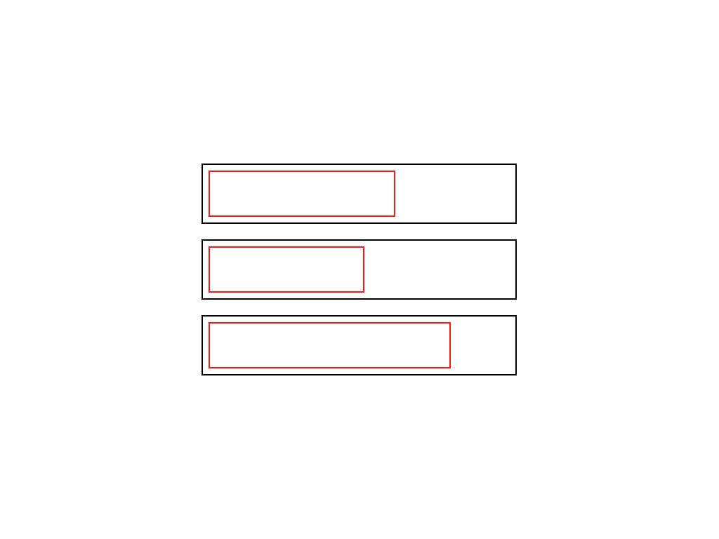
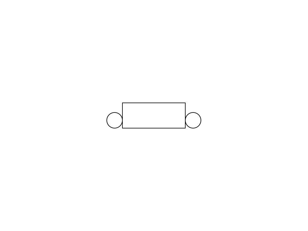
 Let's take a close look at one tab
 We use two of the four pseudo-elements to position the circles on the left and right at the bottom edge of the tab.
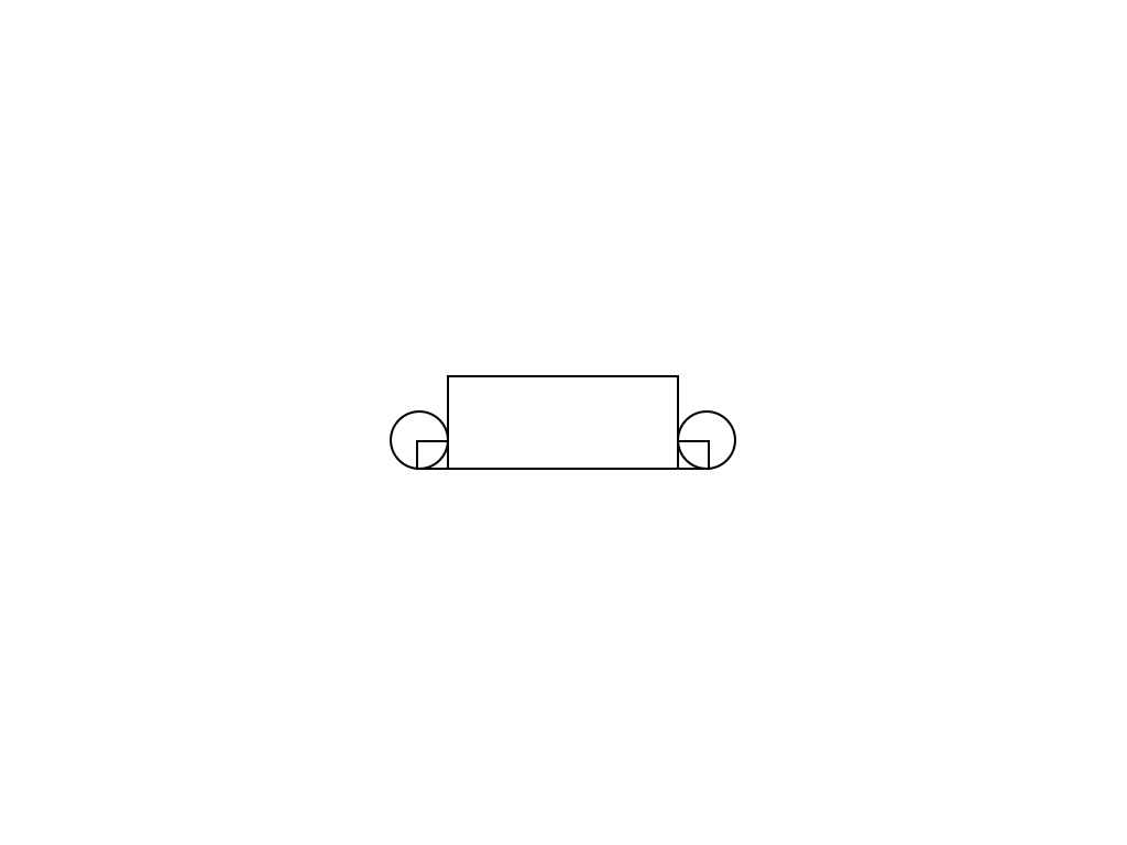 Using the remaining two pseudo-elements, we will create smaller rectangles.
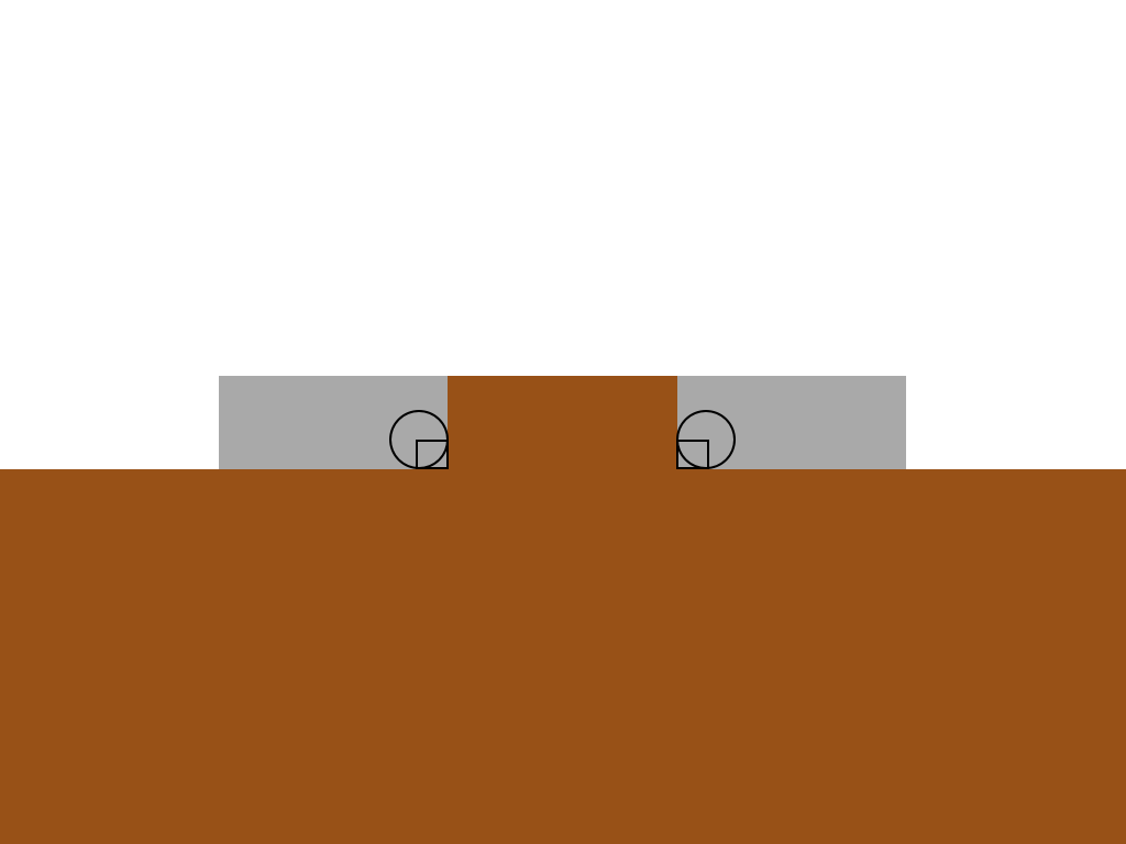 The active tab and content have a common background color.
 Rectangles correspond to the color of the active tab, circles correspond to the background color behind them.
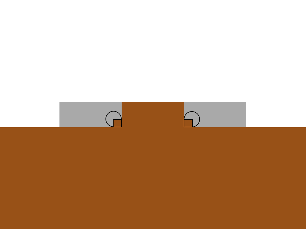
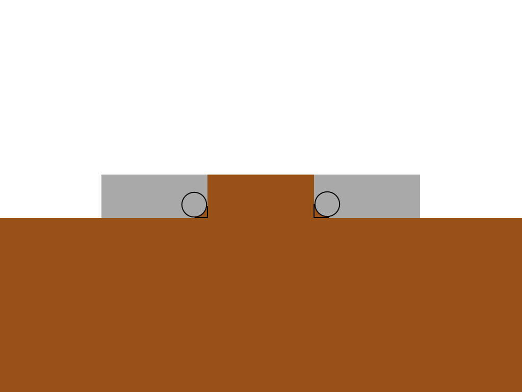 Using z-index, we provide overlapping rectangles with circles.
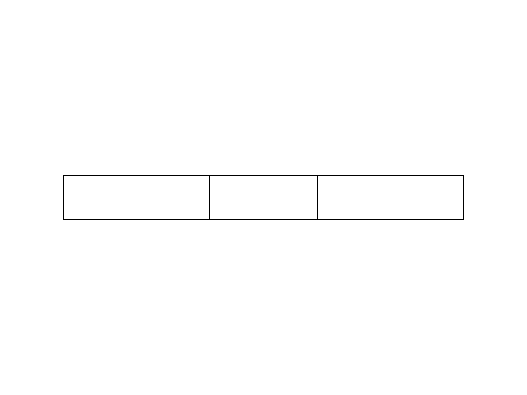
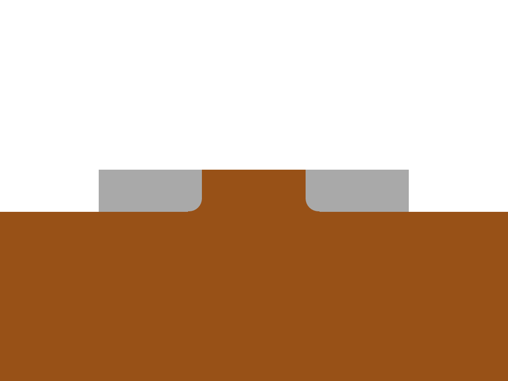 The frame was just in the illustration, in fact it will look somewhere like this.
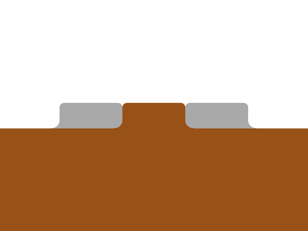 We apply the same principle to the outer tabs and round the top corners using border-radius. Done.
And this is a huge CSS block, but I commented on it in detail to make it understandable.
That's all!
It will work in all modern browsers including IE9 and higher. In older browsers it degrades (there will be no rounded corners).
This chapter was written by a translator for those unfortunate people who could not explain to the client that the absence of rounded corners in IE is not a personal insult on the part of the layout designer. Let's improve mild degradation as much as possible.
Extra CSS:
For ie8, I had to put CSS in a separate block highlighted by conditional comments, since I could not find a hack that worked for ie8 and did not work for ie9. If someone knows this, please share.
I did not see the need to go into details, but if there is a need, I will be happy to explain any point that may raise questions.
I hope the addition will be useful.
making the upper corners is not a problem, but the lower ones are more complicated. Under the cat we explain how.
Pure html
In website layouts, you can stumble upon almost any visual effects. In the worst case, you have to use images to achieve them. Our task in this case, as always, is not to use them (since it is quickly loaded, affordable, easy to update). Here is our markup:
The class name “active” indicates the active tab.
How it works
The reason why this is difficult is because we need to get a form that goes beyond the initial block. To achieve this without additional markup, we use pseudo-elements. If you need to refresh your memory about what these elements are, you can do this by reading this and this article. Directly through css, we can add additional stylized elements to the page. Each element can generate two additional ones using pseudo-selectors: before and: after. For each tab, we will use four. This is possible due to the fact that each tab consists of two elements: a list item and an anchor.
Let's visualize the process step by step without reviewing the code for now.
1) Initial state
List items are typically a block item and the anchor is a lowercase item. So we get such a bark.2) We build in one row
Assigning float: left to the list elements, we line them up in a row and shorten the anchors inside. In fact - to the width of the content.3) We bring to the same size
By themselves, list items do not have indentation or margins (margin or padding), so list items and anchors nested within them have the same size.4) Consider one tab
Let's take a close look at one tab5) Circles
We use two of the four pseudo-elements to position the circles on the left and right at the bottom edge of the tab.6) Rectangles
Using the remaining two pseudo-elements, we will create smaller rectangles.7) Colorize the tab and contents
The active tab and content have a common background color.8) Color the pseudo-elements
Rectangles correspond to the color of the active tab, circles correspond to the background color behind them.9) Overlapping elements
Using z-index, we provide overlapping rectangles with circles.10) No frame
The frame was just in the illustration, in fact it will look somewhere like this.11) Finish
We apply the same principle to the outer tabs and round the top corners using border-radius. Done.CSS
And this is a huge CSS block, but I commented on it in detail to make it understandable.
.tabs li {
  /* Выстраиваем табы в полоску */
  float: left;
  /* Что бы псевдоэлементы можно было абсолютно позиционировать в табах */
  position: relative;
}
.tabs a {
  /* Делаем якорь блочным элементом и укорачиваем до размера контента*/
  float: left;
  padding: 10px 40px;
  text-decoration: none;
  /* Цвета по умолчанию */
  color: black;
  background: #ddc385;
  /* Скругляем верхние уголки */
  -webkit-border-top-left-radius: 15px;
  -webkit-border-top-right-radius: 15px;
  -moz-border-radius-topleft: 15px;
  -moz-border-radius-topright: 15px;
  border-top-left-radius: 15px;
  border-top-right-radius: 15px;
}
.tabs .active {
  /* Активную вкладку помещаем поверх остальных */
  z-index: 3;
}
.tabs .active a {
  /* Цвета активной вкладке */
  background: white;
  color: black;
}
.tabs li:before, .tabs li:after,
.tabs li a:before, .tabs li a:after {
  /* Все псевдоэлементы абсолютно позиционированы относительно нижней грани*/
  position: absolute;
  bottom: 0;
}
/* Только первая, последная и активная вкладка создают псевдоэлементы, остальным они не нужны*/
.tabs li:last-child:after,   .tabs li:last-child a:after,
.tabs li:first-child:before, .tabs li:first-child a:before,
.tabs .active:after,   .tabs .active:before,
.tabs .active a:after, .tabs .active a:before {
  content: "";
}
.tabs .active:before, .tabs .active:after {
  background: white;
  /* Прямоугольники под окружностями */
  z-index: 1;
}
/* Прямоугольники */
.tabs li:before, .tabs li:after {
  background: #ddc385;
  width: 10px;
  height: 10px;
}
.tabs li:before {
  left: -10px;
}
.tabs li:after {
  right: -10px;
}
/* Окружности */
.tabs li a:after, .tabs li a:before {
  width: 20px;
  height: 20px;
  /* Окружности … э … крууугггглыыыыыеееее */
  -webkit-border-radius: 10px;
  -moz-border-radius:    10px;
  border-radius:         10px;
  background: #222;
  /* Окружности над прямоугольниками */
  z-index: 2;
}
.tabs .active a:after, .tabs .active a:before {
  background: #ddc385;
}
/* Первая и последняя вкладки обладают разными фоновыми цветами у внешних элементов*/
.tabs li:first-child.active a:before,
.tabs li:last-child.active a:after {
  background: #222;
}
.tabs li a:before {
  left: -20px;
}
.tabs li a:after {
  right: -20px;
}
That's all!
It will work in all modern browsers including IE9 and higher. In older browsers it degrades (there will be no rounded corners).
Improving mild degradation
This chapter was written by a translator for those unfortunate people who could not explain to the client that the absence of rounded corners in IE is not a personal insult on the part of the layout designer. Let's improve mild degradation as much as possible.
Extra CSS:
For ie8, I had to put CSS in a separate block highlighted by conditional comments, since I could not find a hack that worked for ie8 and did not work for ie9. If someone knows this, please share.
I did not see the need to go into details, but if there is a need, I will be happy to explain any point that may raise questions.
I hope the addition will be useful.