Dark or light UI? Tips for choosing a color scheme for your interface
- Transfer
Our daily life is an endless stream of decisions. In personal and professional life, we must take into account numerous opposing points of view and conditions, and it is better when decisions are based not only on assumptions, but also on facts, experience and knowledge. Today we will discuss one of the frequent tasks for UI-designers who should do the project after the project - which scheme is better for the interface, light or dark?

Be sure there is not a single specific solution that works for all tasks. The decision is largely dependent on a variety of factors, covering not only the view from the user, but also the business objectives, market conditions and current trends in interface design. Let's look at the significant factors that need to be considered.
These terms are directly related to the perception of the content represented by the text. Readability determines how easily people can read words, phrases, and blocks of text. Legibility affects how quickly and naturally users can distinguish between letters in a particular font.
These characteristics should be carefully considered, especially for interfaces filled with a large amount of text. Among many other factors, the color scheme chosen for the interface plays a crucial role in the process of effective text perception. For example, as with physical objects perceived on different backgrounds, a black copy, shown on a white or light background, appears larger than a white copy on a dark background. Weak readability leads to poor user experience: users are not able to quickly perceive the data, moreover - even if the data is relevant, but not readable, users feel an inexplicable tension associated with the text, or may even miss critical information.
Does this mean that interfaces with a light background are more readable? Not always. One of the famous gurus of user experience design, Jacob Nielsen, said: “Use colors with high contrast between text and background. For optimal clarity, black text on a white background (so-called positive text) is required. White text on a black background (negative text) is almost as good. Although the contrast ratio is the same as for positive text, the inverted color scheme “cools” people a little and slows down their reading. Most of the legibility suffers in color schemes that make the text lighter than pure black, especially if the background is darker than pure white. ”
Thus, any color scheme can be quite readable if the designer studies the peculiarities of text perception on different backgrounds and carefully approaches the choice of font.

However, some scientific studies dating back to the 1980s show that for large volumes of text, a light background seems to be a more effective choice for most users. Studying the work of advertising media, D. Bauer and K. R. Kavoniy shared their research in the article “Improving the readability of visual display by changing contrast” (1980). In particular, they found that participants were 26% more accurate when reading text, when dark letters appeared on a light background.
Why is this so? Jason Harrison of Sensor Perception and Interaction Research Group (University of British Columbia) explains this phenomenon as follows. People with astigmatism (of which, according to various statistics, about 50% of the population) feel that it is more difficult to perceive white text on black than black text on white. This is partly due to the level of illumination. With a bright display (on a white background), the diaphragm closes a bit more, reducing the effect of a “deformed” lens. With a dark display (black background), the iris opens to receive more light, and the deformation of the lens creates a much more fuzzy focus for the eye. So, based on this study, if the interface represents a lot of text and requires a long reading, then the light background is more user friendly.

Accessibility is mainly defined as the ability of the web or mobile interface to reach as many people as possible and ensure its functionality without discriminating anyone. Thus, the “use or not use” decision should be primarily based on the needs and preferences of users, and not on their physical abilities. The color scheme is mentioned among the main factors affecting this aspect. When choosing a palette and color combinations, the designer should take into account users of different ages, special needs or restrictions, who can also determine the choice of colors for the background and the location of elements. User research in this business is a great help, they provide UX-designers with data that helps to get closer to the target audience.
Clarity is determined by the ability to see and distinguish all the necessary data on the screen or page. First of all, it concerns the simplicity and intuitive navigation - the ability to understand the layout, search for information zones and interaction elements, when users do not need to make a lot of effort to get what they need. If this aspect is not worked out properly, then this can lead to a weak visual hierarchy and turn the screen into complete chaos. Contrast plays a big role here, and the color scheme becomes the basis for it. To check whether the interface is clear enough and whether the contrast is sufficient, do not forget about the good old trick of the “blur effect” when you look at the screen or page in a blurred mode and check whether everything you need is easily noticeable and accessible.

Responsiveness of the interface means that users can use it and work with it no matter what device they use it on. What looks stylish and attractive on a high resolution professional monitor in Sketch can turn into a dirty spot on a small screen with a low resolution. Therefore, some color schemes that look beautiful at the design stage can lose their beauty in the very different conditions in which they are applied. Since the color scheme directly affects the perception of color, shape and content, it must be tested on different devices before the final decision is made.
Web and mobile interfaces are used in environments that can be, with careful study of the target audience, predetermined. For example, if you assume that your application will be used in natural light, a dark background can create a reflection effect, especially on glossy screens typical of tablets and smartphones. Conversely, in a poorly lit environment, a dark background can divert light from the screen and this will have a good effect on navigation and readability. That is why the problem of color combinations, contrasts and shades is given so much attention here.
If we consider all the above factors, we can offer a short checklist for choosing the color scheme of the mobile interface.

Not wanting to adhere to strict color schemes, user interface designers sometimes find compromise solutions, for example, such.
As we already mentioned in the trend overview of UX design , this trend is especially popular for interfaces with a dark background. It implements an approach to better readability, which is often a matter of discussion — by creating windows or spaces with a light background for the main data blocks, designers solve the problem by adding elegant contrast to the screen or page. One of the cases when such a solution was applied effectively was the Watering Tracker application , developed by the Tubik team.

Another approach is to give users a choice of colors. This is what we did for Upper , a to-do list application that offers the user a choice of color scheme. On the one hand, it makes the product very user-friendly, the choice is more personalized and relevant not only to ease of use, but also to aesthetic preferences. On the other hand, designers and developers need additional working time to work through all the schemes.

Factors affecting the choice of color scheme
Be sure there is not a single specific solution that works for all tasks. The decision is largely dependent on a variety of factors, covering not only the view from the user, but also the business objectives, market conditions and current trends in interface design. Let's look at the significant factors that need to be considered.
Readability and legibility
These terms are directly related to the perception of the content represented by the text. Readability determines how easily people can read words, phrases, and blocks of text. Legibility affects how quickly and naturally users can distinguish between letters in a particular font.
These characteristics should be carefully considered, especially for interfaces filled with a large amount of text. Among many other factors, the color scheme chosen for the interface plays a crucial role in the process of effective text perception. For example, as with physical objects perceived on different backgrounds, a black copy, shown on a white or light background, appears larger than a white copy on a dark background. Weak readability leads to poor user experience: users are not able to quickly perceive the data, moreover - even if the data is relevant, but not readable, users feel an inexplicable tension associated with the text, or may even miss critical information.
Does this mean that interfaces with a light background are more readable? Not always. One of the famous gurus of user experience design, Jacob Nielsen, said: “Use colors with high contrast between text and background. For optimal clarity, black text on a white background (so-called positive text) is required. White text on a black background (negative text) is almost as good. Although the contrast ratio is the same as for positive text, the inverted color scheme “cools” people a little and slows down their reading. Most of the legibility suffers in color schemes that make the text lighter than pure black, especially if the background is darker than pure white. ”
Thus, any color scheme can be quite readable if the designer studies the peculiarities of text perception on different backgrounds and carefully approaches the choice of font.
However, some scientific studies dating back to the 1980s show that for large volumes of text, a light background seems to be a more effective choice for most users. Studying the work of advertising media, D. Bauer and K. R. Kavoniy shared their research in the article “Improving the readability of visual display by changing contrast” (1980). In particular, they found that participants were 26% more accurate when reading text, when dark letters appeared on a light background.
Why is this so? Jason Harrison of Sensor Perception and Interaction Research Group (University of British Columbia) explains this phenomenon as follows. People with astigmatism (of which, according to various statistics, about 50% of the population) feel that it is more difficult to perceive white text on black than black text on white. This is partly due to the level of illumination. With a bright display (on a white background), the diaphragm closes a bit more, reducing the effect of a “deformed” lens. With a dark display (black background), the iris opens to receive more light, and the deformation of the lens creates a much more fuzzy focus for the eye. So, based on this study, if the interface represents a lot of text and requires a long reading, then the light background is more user friendly.
Availability
Accessibility is mainly defined as the ability of the web or mobile interface to reach as many people as possible and ensure its functionality without discriminating anyone. Thus, the “use or not use” decision should be primarily based on the needs and preferences of users, and not on their physical abilities. The color scheme is mentioned among the main factors affecting this aspect. When choosing a palette and color combinations, the designer should take into account users of different ages, special needs or restrictions, who can also determine the choice of colors for the background and the location of elements. User research in this business is a great help, they provide UX-designers with data that helps to get closer to the target audience.
Clarity
Clarity is determined by the ability to see and distinguish all the necessary data on the screen or page. First of all, it concerns the simplicity and intuitive navigation - the ability to understand the layout, search for information zones and interaction elements, when users do not need to make a lot of effort to get what they need. If this aspect is not worked out properly, then this can lead to a weak visual hierarchy and turn the screen into complete chaos. Contrast plays a big role here, and the color scheme becomes the basis for it. To check whether the interface is clear enough and whether the contrast is sufficient, do not forget about the good old trick of the “blur effect” when you look at the screen or page in a blurred mode and check whether everything you need is easily noticeable and accessible.
Responsiveness
Responsiveness of the interface means that users can use it and work with it no matter what device they use it on. What looks stylish and attractive on a high resolution professional monitor in Sketch can turn into a dirty spot on a small screen with a low resolution. Therefore, some color schemes that look beautiful at the design stage can lose their beauty in the very different conditions in which they are applied. Since the color scheme directly affects the perception of color, shape and content, it must be tested on different devices before the final decision is made.
Environment
Web and mobile interfaces are used in environments that can be, with careful study of the target audience, predetermined. For example, if you assume that your application will be used in natural light, a dark background can create a reflection effect, especially on glossy screens typical of tablets and smartphones. Conversely, in a poorly lit environment, a dark background can divert light from the screen and this will have a good effect on navigation and readability. That is why the problem of color combinations, contrasts and shades is given so much attention here.
Checklist for choosing a color scheme
If we consider all the above factors, we can offer a short checklist for choosing the color scheme of the mobile interface.
- Determine the purpose of the interface . Defining the main points of using the interface and the ability to solve user problems, you will make the choice of color scheme more reasonable. If the user interface is textual (blog, news platform, e-reader, etc.), a light background will be a more efficient choice. The light makes the screen spacious and it becomes easier to focus solely on the content. On the other hand, if the interface rotates around images rather than text, then a color scheme with a dark or bright background can be a good solution, since the colors of the images will be felt deeper.
- Analyze your target audience. Identifying and analyzing the target audience is the main thing that a designer must do. Understanding who your potential user is and what he wants from a website or application is a solid foundation for a convenient, useful and attractive interface. Middle-aged people and older people prefer interfaces with a light color scheme, as they find it more intuitive and manageable. Young people often find interfaces with a dark background more original and stylish, which can be a way to attract target users. Teens and children prefer interfaces that use bright backgrounds and fun details. The choice of color, obviously, depends on the nature of the functioning of the interface and content. But the preferences of the target audience are always a good key to user-oriented solutions.
- Examine the competition . Another aspect to keep in mind is that your product does not float in the “blue ocean”. On the contrary, it will compete for the user's attention in a strong and dynamically changing competition. Choosing a color scheme becomes a way to make an application or website different and lead to such a precious first user interaction. Time spent exploring existing products in the segment will save you time and effort that you would otherwise spend on redesigning inefficient solutions.
- Test, test, test . The points described above convince one key thing: since color refers to factors that directly affect the usability and attractiveness of the interface, each design decision should be checked accordingly - in different resolutions, on different screens and in different conditions. Testing will reveal the strengths and weaknesses of the color scheme before the product enters the market, gets attention and loses the chance to make a first impression.
Compromise solutions
Not wanting to adhere to strict color schemes, user interface designers sometimes find compromise solutions, for example, such.
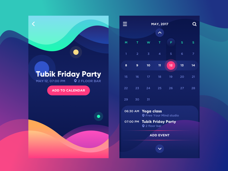
Dark interface, white tabs for content
As we already mentioned in the trend overview of UX design , this trend is especially popular for interfaces with a dark background. It implements an approach to better readability, which is often a matter of discussion — by creating windows or spaces with a light background for the main data blocks, designers solve the problem by adding elegant contrast to the screen or page. One of the cases when such a solution was applied effectively was the Watering Tracker application , developed by the Tubik team.
Providing the user with a choice of color scheme
Another approach is to give users a choice of colors. This is what we did for Upper , a to-do list application that offers the user a choice of color scheme. On the one hand, it makes the product very user-friendly, the choice is more personalized and relevant not only to ease of use, but also to aesthetic preferences. On the other hand, designers and developers need additional working time to work through all the schemes.
Useful reading:
- The Dark Side of UI: The Benefits of the Dark Background
- Effect of page background on readability, returns, perception, and behavior
- Visual Perception: Introduction
- Art and visual perception: the psychology of the creative view
- Choosing colors for a webpage: contrast versus readability
- What not to do in a dark web design
- Why light text on a dark background is a bad idea.
- When to use light text on a dark background.
Only registered users can participate in the survey. Sign in , please.