 July 10, 2014 at 12:36
About screen, pixel and element size

Hi, username. I want to devote my first post to an urgent problem related to the emergence of a large number of new display formats and the ongoing race for pixel density. In the light of the emergence of devices such as augmented reality glasses, smart watches, 4K monitors and an even wider range of tablets and laptops, the question arises: what size of the graphic element / text should be considered optimal and how to measure it. Android developers will undoubtedly exclaim immediately: “Yes, of course, in dp!”. But practice shows that things are a little more complicated.
Problem
One of the key tasks of the interface designer is to create an optimal balance of elements that allows you to realize the business goals of the product comfortably for the user. There are not so many methods of differentiating elements besides position:
- The size
- Color and tone
- Borders (a special method associated with the property of the visual center to draw out individual objects by touching the black and white plane and background)
- Textured and graphic saturation
Obviously, when developing a single interface for different devices, the designer assumes not only a similar ratio of the details of this interface, but also the greatest readability of the text and graphic elements. At the same time, David Ogilvy notes that an advertising poster cannot be readable at any distance, but must be such (and have an appropriate balance of elements) at a distance of the most likely viewing scenario. In the case of interfaces of interactive devices, viewing scenarios are very different, but functional scenarios are usually saved. For a person familiar with layout on different platforms, the problem clearly arises: how to designate the size of the elements so that they occupy the necessary place in the angular space visible to the eye, regardless of the scenario?
Synopsis
A similarity to the ppi standard (pixels per inch) appeared in the mid-1980s when Apple launched its first Macintosh series computers. These computers had a 9-inch diagonal screen with 72 pixels per square inch. Even then, Apple took the position of creating its own ecosystem, therefore, in the range of technological capabilities of that time, ppi was chosen exactly half the dpi (dots per inch) of the Apple ImageWriter, which ensured that the size of the elements on the screen would exactly match the size on paper. However, this only applied to Apple computers, as other manufacturers used a variety of ppi, following their capabilities and market laws. This rudiment of seeing the computer as a set-top box for the printer led to the appearance of the Resample Image checkbox in Photoshop.
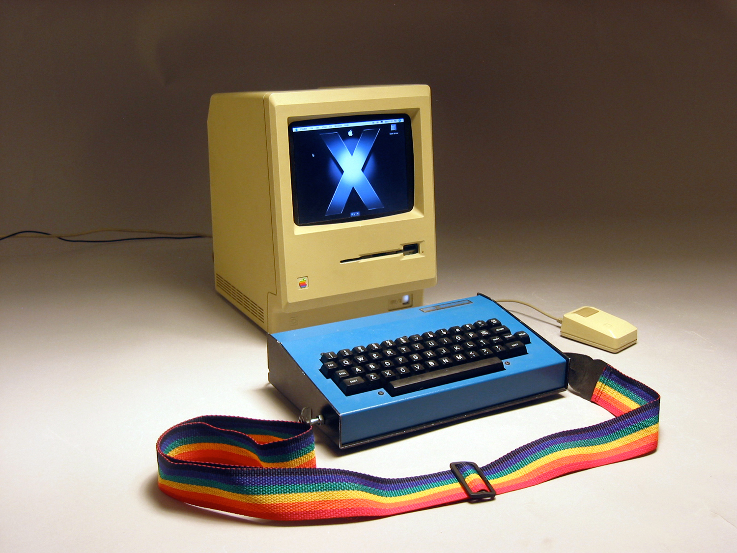
Meanwhile, the resolution and diagonal of monitors began to grow by leaps and bounds. If the Mac 128k had a resolution of 512x342 pixels, then by 1996 the same company released the Apple Multiple Scan 15 Display with a diagonal of 13.3 inches and an amazing resolution of 1024x768px for those times. This value, regardless of the diagonal, remained the most popular screen resolution for another 12 years.
Despite attempts to develop some kind of standard, by the mid-2000s, there were several hundred variations in resolution and diagonal of screens in the consumer sector. As for the professional market, where, it would seem, some standardization should have been respected, the situation there was even worse. Manufacturers created monitors of very exotic parameters for specialists, which were like a steam locomotive and tended to become obsolete for a year.
In 2008, I bought a Lenovo Y710-200 laptop, which had a diagonal of 17 inches and a resolution of 1920x1200px. Unfortunately, at that moment neither I nor, apparently, Lenovo had an idea of what a strong advantage this was for a laptop: 132ppi! Even professional monitors had lower ppi, and higher could already be observed in a very specific technique, such as medical monitors or space device monitors, although this year Kopin Corporation introduced the product of the peak of technological research - a device with 2272ppi. For me personally, the thing ended up being that I learned to watch only HD quality video (1920x1080), because on this screen the 720p or 480p video was very small. The same situation prompted me, as a novice designer, to self-realization of the independence of the size of the element from the device. By the way
In 2010, Steve Jobs introduced the high-definition display, called Retina (“retina”). At the same time, in his presentation, he stated that the ppi of the retina exceeds that of the human eye and, therefore, is considered ideal.
As an experienced presenter, Jobs made an impression on the public, but according to experts cultofmac.com disguised about 2-3 times, as some researchers believe that the resolution of good vision is slightly higher.

This picture(open on the device with Retina) will allow you to understand how Jobs statement is true. A person with normal vision can easily find in this image both white and black stripes one pixel wide and a cycle (black and white stripes nearby) 2 pixels wide in the center.
It should also be understood that, due to the limited angular resolution of the eye, ppi for screens of different sizes and at different distances from the user will be different. For example, for iPhone this value should be around 952ppi, and for iPad - 769ppi.
Situation
To date, we have a number of problems related to the history of the pixel. It is quite obvious that the sizes specified in pixels have lost all meaning - only on Wikipedia the number of different ppi values for monitors exceeds two hundred, which means that the size of the element will always be different. Google describes in its development center several units of measurement, which in theory should be a solution:
- px - Pixels (pixels) corresponding to the actual physical pixels of the screen
- in and mm - Inches and millimiters (inches and millimeters), physical units
- pt - Points, 1/72 physical inch of screen
- dp - Density-independent Pixels (density independent pixels), an abstract unit based on the density of physical pixels and corresponding to a 160 dpi screen (on which 1dp is approximately 1px)
- sp - Scale-independent Pixels (scale-independent pixels), analogue of em in web-layout
By the way, Microsoft by default considers dp = 1/96 of a logical inch, the dpi of which can be configured in the control panel. I would like to note that, using physical values, it would be best practice to use millimeters as a derivative of the basic SI unit.
The closest to the title “universal” would be the sp / em unit, if we somehow knew the basic optimal size value of the size. Actually intuitive idea of the designer about the optimum gave rise to the following hack in the web layout:
- The html tag is assigned font-size: Nxx, N = value, and xx = pixels / millimeters / inches (for tablets, I usually use 3mm).
- In all further element sizes, the so-called rem (root em) is used, always equal to the value specified in the font-size of the html tag (but not its children).
- The body tag specifies the font-size of the text itself.
html {
    font-size: 22px;
}
body {
    font-size: 14px;
    line-height: 1rem;
}
This elegant solution allows you to automatically build elements on a modular grid with a cell size obviously equal to the value of rem. Nevertheless, in spite of the advantages for layout, it has all the same limitations: it is not clear how to set the element to an absolute size relative to visual perception.
In order to understand this problem, we will have to go a little deeper into physiology.
Bionics
The visual apparatus appeared as a result of the evolution of the simplest photoreceptors excited by bright light. At the same time, nature created as many as four options: the eyes of mollusks, forming from the epithelium, having the ability to see a wide range of light waves, the eyes of mammals, forming from the nervous tissue and originally intended to find the shapes and movement of objects, the chamber eyes of cube jellyfish and the facet eyes of insects. As a sign, vision has proved to be a very useful tool for survival, and therefore its evolution in humans (together with the person himself) lasted only about half a million years.
Without going into details, we can say that the eye is a biological lens, the bottom of which is lined with a layer of receptor matrix of rods and cones - special cells that respond to light and create nerve impulses that go further into the brain. However, it should be remembered that, for example, in the retina there is a layer of amacrine cells that are directly involved in the primary processing of information, responsible for lateral inhibition: a decrease in the number of pulses in places of bright diffuse lighting and an increase in places of a sharp difference in illumination. The system, therefore, serves to highlight the edges of the shadow falling on the retina or moving along it - that is why black text on a white background is better read. This is one of the reasons,
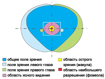
On average, the vertical field of view of a person is about 135 degrees, and horizontally - 155. At the same time, the binocular and chromatic capabilities of the eye are heterogeneous in its area.

A source
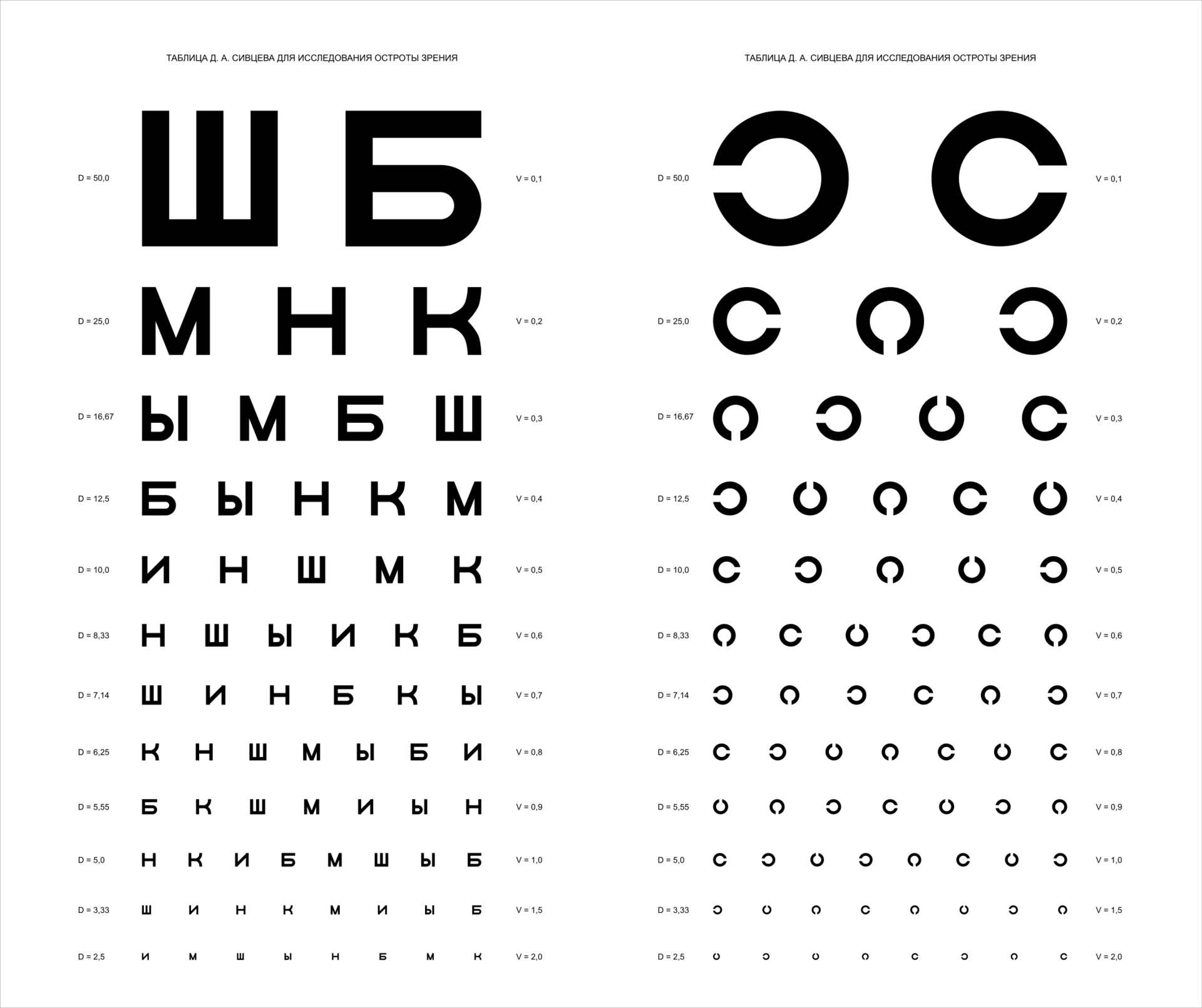
In order to determine visual acuity (an analog of camera resolution), Snellen tables are used - rows of letters of different sizes, where the size and width of the sign are selected so as to tighten the angle of 1 minute of the arc at a certain distance. In this case, vision is considered the norm in which a person distinguishes the letters in the sixth line from a distance of 6 meters, which equals 5 minutes of the arc. In scientific research, it is customary to use Landolt rings, since this allows you to more objectively evaluate data, without error on the recognition of typographic signs and type. In Russia, Landolt’s rings were adapted by S. Golovin, and Snellen’s table was made by Golovin’s student D. Sivtsev.
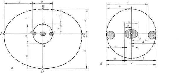
Psychooptic Harold Blackwell expressed the concept of resolution of the eye as an angular parameter of the function of luminosity and contrast. His researchshowed that this angle is approximately 0.7 minutes of the arc for determining the spot of a non-point object (to say that the spot is not a point, the observer needs at least 2 pixels), which results in a minimum resolution of 0.35 minutes of the arc.
Modern studies of visual clarity use the term cycle per degree (a cycle means a black and white pair of lines) and offer a value of 77 cycles per degree, which is approximately 78 cycles per degree of arc. Again, due to the minimum loop width of 2 pixels, we see similar 0.39 minutes of arc.
Given the angular space of the eye, by simple calculation
100 * 100 * 60 * 60 / (0.3 * 0.3) = 400 мегапикселейwe get a value very close to the total number of photoreceptors in the retina.It should be understood that while the region of clear vision gives a fairly clear idea of the minimum acceptable size of objects and their resolution, the mechanics of perception in the peripheral region are somewhat different, since it is more responsible for unconscious scanning and prioritization. The feature of the human eye to have maximum resolution and cognitive focus in the fovea region (the so-called yellow spot), for example, allows services such as Spritz to increase the speed of text perception (in addition to reducing the “lag” due to the lack of eye movements), placing the word in the area of clear vision.
In addition, the above diagram gives us a clear idea of the recommended sizes of the elements. It is clear that for a comfortable orientation on the interface, the interactive element on which attention is focused in the current scenario should not exceed the macula area (7 ° x5.5 °), and the block / group / list in which it is located should be the area of clear vision ( 16-20 ° x12-15 °). It is this fact that indirectly supports the hypothesis proposed by Google that a small screen does not mean less information, since the field of cognitive analysis is, in principle, quite small.
A more detailed view of the field of clear vision. It was shown that the ratio between zones of different receptor activity actually corresponds to the golden ratio.
Optimum
Further studies revealed the most objective recommendations:
- Key elements should take at least 20 minutes of arc
- Recommended size 20-22 minutes of arc
- Character elements smaller than 16 minutes of arc should be avoided,
- Resolution of good human vision = 0.4 minutes of arc
- Average resolution (including all ages) = ~ 1 minute of arc
The formula for calculating the size of an element depending on the distance:
h = 2 *d * Tan(x/2)
where
h = element height sought
d = distance in millimeters
x = element size expressed in radians ( arc minutes in radians )
Examples of rounded calculations of the recommended font size (21 minutes of arc) in millimeters
| Distance | Size |
| 400 | 2.4 |
| 500 | 3.1 |
| 600 | 3.7 |
| 700 | 4.3 |
conclusions
Based on the above reasoning, we can come to the following conclusions regarding the solution of the layout problem on different devices:
- Monitor manufacturers should always inform the OS of their physical size through the drivers to approximately determine the distance from the screen.
- The OS should not only scale the elements in percent, but also be able to calculate the size dp based on data from the monitor, so that the elements occupy the required space in the angular space visible to the eye
- For additional calibration, you can use the data from the camera to estimate the average distance from the eyes to the monitor.
- Obviously, am - arc minutes (degrees of the arc) themselves would be the most universal unit. In addition, 1am describes well the thickness of the optimal line for the eye in the corresponding classic 1px line on an average monitor.
At the moment, the only way to solve this problem with existing methods is to find out the device parameters through the user-agent and adjust the rem variable of the modular grid for it. However, this solution is probably only suitable for large companies that can afford to analyze and test typesetting on dozens of types of devices.
PS In some paragraphs describing the exact data, the sources were translated unchanged.