 August 8, 2011 at 12:19
What web designers can learn from video games
- Transfer
Games are becoming more like web pages, and web pages are more and more like games. Look at Habr: the people write topics for which karma and a rating are charged. It works according to the psychology of success and game mechanics, thus encouraging interaction. This begs the question: what can a web designer learn from games, or rather video games?
A good game interface should be user-friendly and intuitive, able to perform many repetitive actions with as few clicks as possible. It should be attractive and catchy. It should be a pleasant sight. A good interface increases the enjoyment of the game: people need to get content in a way that does not destroy the game of the imagination. Any dissonance with the interface can cause the failure of the game, which in all other respects is beautiful.
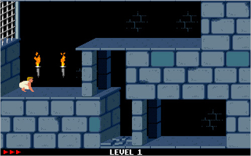
Even in older games, such as Prince of Persia, a limited system of capabilities forced designers to come up with creative and innovative design patterns. Opportunities have now increased, and we can find more advanced design techniques in modern video games.
Similarly, site users want content to be presented in a simple, intuitive way, engaging and not requiring a lot of mouse movements. Web designers can learn a lot from video game interfaces. Sites that use the usual means of game interfaces can speed up the user’s work and at the same time add personality. This can lead to more traffic and more repeat visits, and therefore sales.
Therefore, it is not surprising that we see an influx of carousels, lightboxes, drop-down menus and increasingly sophisticated navigation models, because CSS and JavaScript libraries allow browsers to use such tools. For better or worse, the topic is for a separate article, while this article will focus on various techniques.
Things a web designer can learn from video games are not limited to the user interface. Thus, when we look at some basic ideas and models of the interface, other top-level concepts can also be useful and worth exploring.
When considering game interfaces, a web designer must be acutely aware of the context of their project and the goals of the client. It goes without saying that the goals of the site are often, although not always, very different from the goals of the game. On many sites, priority is given to efficiency rather than the entertainment side. A cool fisheye-style interface is not the most practical idea for a site that provides quick tax information, or for an e-commerce site. However, an interactive media channel can only benefit from using a leaderboard or some achievement system. Choose the components of your interface so that they fit the project.
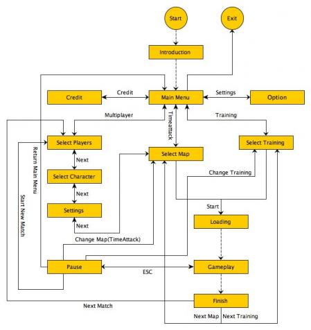
Looking at the big picture, consider the structure and method, not just the interface components. For example, take a look at the menu structure and think about why such a choice was made. Many games use the “hub and spoke” architecture, with different sets of tools in different menus. If you select "Weapons", on the next screen you will see all the options for weapons. To select "Maps", you need to return to the first screen. This structure simplifies a set of options that might otherwise become too confusing as it focuses on one choice at a time.
You see how this type of architecture can help a site offering visitors a wealth of information? By letting the visitor focus on one part of a large online task, you potentially increase the conversion rate for the client. The example below shows the structure of a simple game menu, which can be easily applied to the information architecture of the site.
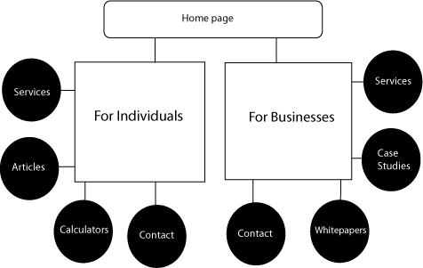
If you are creating a website for a certified audit firm, you may need to segment the information in the menu according to the type of visitor. A high-ranking person needs completely different things than a small business, but both of them may be interested in hiring one company. You could start from the top level, with two entry points: one point is for individuals, the second is for organizations.
Also notice the places where video games are shown instead of telling, and try to understand the reason for this. Successful games are especially adept at showing during training. The hero must pass through the simplest rooms or levels, where he is taught to perform basic tasks in a fascinating and appropriate plot form. The adventurer learns to take the sword and wave it, then kills the rat, and then learns how to collect treasures. The player will learn how to use the interface through training with the effect of presence.

In The Elder Scrolls IV: Oblivion, you start the game in prison and must escape to the underground cave, fighting rats and rare goblins along the way to learn the basic principles of control in the game.
Why is it important? You may not have to compile a complete interactive tutorial for complex interfaces, but it may happen that your client’s content will be easier to understand with the help of graphs and tables. You can take large concepts and break them into smaller ones. You can search for potential causes of difficulties and clarify them with tips and examples (but not long explanations). By understanding how games show instead of explanations, you can make a breakthrough in the difficult problem of presentation.
Game design wizard Jesse Schell says: “Games offer an opportunity of success, a chance to satisfy your curiosity; this is an opportunity to try to solve problems and make a choice. ” Even the most mundane sites can be made much more fun by asking the question: “What elements of the games do people find the most enjoyable?”
Games provide feedback, often at the time a player enters their choice. These elements can be included in interfaces, and not only through carousels or drop-down menus. By asking something like “Want to know more about this?” Before confirming the submission of the document, you can greatly improve the user’s interaction with the site.
Some web designers are already using some of these interface components at a simple level. Of course, drop-down menus and tips are not new. Their use in games may suggest a more interesting and creative application in the interface.
Let's take a look at some user interface elements that can liven up your next project. We will look at examples, and then at some resources, where you can learn more about this.
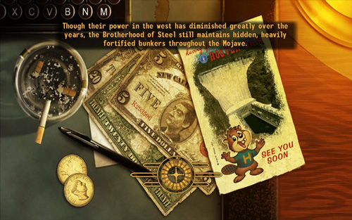

These download screens from the game Fallout: New Vegas (above) and Fallout 3 (below) provide useful information and tips, and in the background there is a background image that matches the theme of the game. Instead of an image of a moving download, the user sees a roulette wheel or a green target that turns boring waiting into part of the gameplay.
What can a web designer get from here:
Create your own graphics. Use it to drag the player into the "world" that you create on the screen. Even if you are working on a corporate website, you can add tips and useful information. Do you make a website for selling sports equipment? It might be worth using a rotating basketball as a loading picture in a slide show. Not sure where to start?Check out this tutorial on how to preload images.
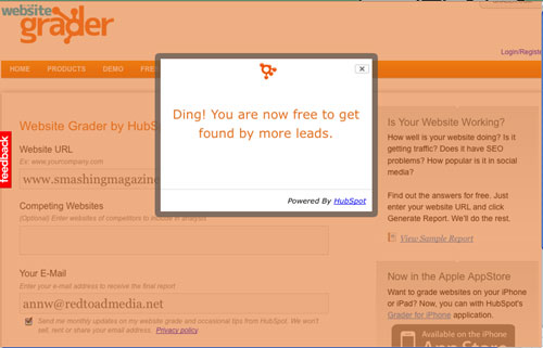
A full-page background image might be too heavy and slow for the boot screen, but you can fill the background with color in the div of the boot panel and then use JavaScript plugins to load random tips and information to fill the space. For best results, the size of the boot files should not be more than 30 KB: the smaller the better. A simple AJAX request can change tips once in a certain number of seconds, or just put one tip on each download. The choice depends on how much content you need to download and how much time you have at your disposal. Examples of such downloads are on Website Grader. Look at the download that appears while you wait for the result.
In Fable 3, a player’s selected spot is marked with a magnifying glass icon that acts as a custom cursor.

In The Elder Scrolls IV: Oblivion, a simple hand-shaped cursor indicates that the player can pick up this object. A red cursor indicates that the item can only be stolen, and that soldiers can begin the pursuit.
What can a web designer get from here:
Perhaps the most recognizable cursor is the “grabbing hand” on Google Maps. But user cursors are not new and common in web applications. The ability to use them is built into most browsers.
It is important to use these cursors wisely: to offer help, to indicate content that you can click on, to highlight important information. You see how this can be used to attract attention and highlight important points. Imagine what a well-made JavaScript wand can do on a kids site! It is obvious, however, that such a solution is not suitable for a corporate site.
The only significant difference between video games and sites is that the icons in the game menus are much more complex. Usually the user spends more time in the game than on the website. But icons are used on sites more and more often, so the line between sites and web applications is erased.
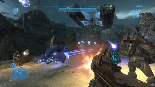
So, how can icons be used effectively in game navigation? They should be readable and contextual. For example, in the Halo Reach game, a player relies on icons when navigating and choosing weapons, but the menu resembles line-of-sight indicators (in the real world, these can be seen in vehicles). Icons for websites should also be easy to understand. For optimal usability, add text labels.
If the icons are selected carefully and consistently, they can greatly speed up navigation using complex menus. Use clear colors, vivid contrasts and simple, easy-to-see outlines.
Games move from small, highly detailed images to more intricate shapes, such as those seen in Halo Reach and the Call of Duty series, and to large detailed pictures with crisp shapes, such as below. Even if you do not notice the details, you will recognize the outline of the hand, circle, and face. The use of one color makes them less complex visually and easier to distinguish. The more icons used, the easier and clearer they should be.
You can also use icons to focus on key topics. Use header images instead of buttons as quick tips in content boxes and repeating sections. Make complex images bigger and be consistent. Icons can add interest to lists, as well as divide content into more digestible parts. With their help, you can draw attention to important sections of the text, as Treemo skillfully does.
Consider using the appropriate icons to navigate and group by topic. You can use the same forms as headings or frames in the text to indicate the relationship of different parts of the content with each other. Icons make it easy to browse through content, noting interesting places, which makes it easier for users to find the information they need.
Icons should not be static illustrations. Screenshots on Pattern Tap serve as traditional thumbnails of images, but their special shape also functions as an icon, increasing interest and strengthening the brand’s position:
But what if we use client products as icons? The smart DonQ submenu shown below uses products as icons, quickly and easily directing you to an object of interest. Even smarter it seems that when a submenu appears, the rest of the content dims, thus highlighting the options you need.
Bookmarked screens that slowly disappear, like this one from Dragon Age, Origins, have been used for a long time:
In the Carnage Report ”(Halo Reach) this idea has reached a new level. Screens scroll horizontally, and each page has several tabs. Gamers are accustomed to this interface, but apply it on the site and people will be surprised.
Jax Vineyards uses a similar type of layout, without tabs:
Add tabs to each carousel screen and your site will take it to the next level.
Magento offers a different look at this idea:

Right now we are seeing this type of interface on mobiles and tablets, with lots of background pictures. They are also used in games of all kinds. It's more than tabbed tabs or simple horizontal scrolling: imagine an iPad with multiple monitors. Think for a Living offers a map (very much like a game) in the upper right corner to help users navigate this unusual carousel.
What can a web designer get from here:
If you have a lot of content, such a bold decision may appeal to the user, which will increase site traffic. Your screens slide and are easily controlled with a touch screen - the importance of this factor will only grow.
Due to the different screen sizes, this type of layout needs to be carefully planned and may require CSS3 media queries to be sure to load content onto different screen sizes. You will need to make your layout responsive to interaction. You can embed a full-screen carousel with a full-size div and overflow with a value of hidden, placing frames in an unordered list with a fixed length.
Users are increasingly getting used to this type of interface with the proliferation of tablets. Using even more simplified horizontal scrolling can help your client stand out from the crowd.
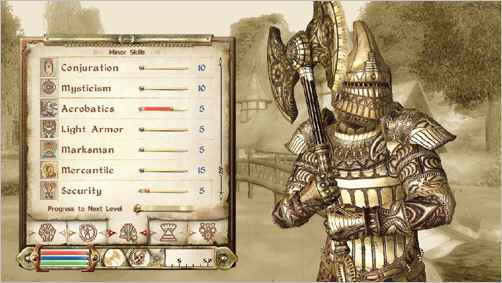
The menu system of the recently released Fable 3 game is completely different from the one used in Fable 2 (in the picture above). But Fable 2 has such a nice sliding menu that I was required to include it in the list.
Scrolling the slider gives access to the buttons, and the content is shown on the right side of the screen. Buttons also have drop-down menus; inactive content fades. The picture above shows the category “Clothing”. Then from the content you can select “Jackets”, from there - to the specific details of the clothes. Does this remind you of e-commerce sites?
What can a web designer get from here:
Have you ever been to a site with huge fly-out menus across the page? Which expand to submenus, sometimes four-level, while you explore the list of contents? Such sophisticated menus look somewhat menacing and can cause the visitor to leave. A good way to avoid bloated menus and disgruntled users is to create small menus.
There are several “sliding” scripts that offer special scroll panels for each div container. Why not put buttons there too? Due to its scalability, this type of menu looks more suitable for some cases (for example, for entertainment or fashion sites) than the usual drop-down menu. Add the AJAX loader that appears on click, and it will become easier for users to understand the interface. Here our task is to keep the user on one screen and keep the menu scalable. You can add virtually any number of items in each menu, and they will not become bulky.
I must admit, the first time I saw pivot screens in Halo Reach, my heart sank. When you go to the main menu, the text is beveled. Halo Reach uses perspective throughout the game to point to the right edge of the menu. This is a visual cue. What happens when you move the controller to the right? The screen scrolls horizontally, becomes cloudy, and the next frame appears, where perspective is also used, this time pushing text and pictures to the left edge. Under the tab you can see your hero, almost not moving and terribly similar to a living person. Bravo. I sat and played with pivot screens for a long time. Of course, my first reaction was: I want to do this!
What can a web designer get from here:
You can simulate this menu with a little help from Photoshop. Using a large panoramic background image with a width of two screens with beveled typographic markup of the text in CSS3, as well as fast horizontal scrolling in JavaScript, you can get something similar to the menu tilt in this game. Apply this to the smaller panel and use on the banner or button and you will be amazed (like your client). I don’t know anyone who would use this method on sites, but I created a small demo so that you have a starting point in case you want to put this into practice.
Pay attention to how Halo Reach integrates regular menu screens into the game world with a skillful illusion of landscape in the background. It is really beautiful; it gives a feeling of depth and proximity, as if you were looking at the ground from an airplane before landing. It excites and seduces you to move on, act and be part of the plot. This type of integration is not suitable for all websites, but if it is appropriate, then this is a very worthwhile solution. Never underestimate the power of admiration!
The context menu in a video game is a “distant relative” of a submenu on a website. Context menus such as those at the top of the Assassin's Creed: Brotherhood game give the user certain options, depending on their location in the game and their choice of actions. If you choose to cast a spell, the submenu offers you a choice of fireball or lightning bolt. If you choose movement, you can run, climb or hide - that is what is in the radial menu. Radial menus with icons are very popular, but context menus may well be just short vertical lists of words.
What can a web designer get from here:
When you invite a user to take an action, the context menu may be convenient. Instead of a list of links, you can offer an interesting list of special actions. This is used in web applications and small widgets for social networks.
When creating a context menu, you should at least think about making it radial. Radial menus should give users three to eight options, and the interface should make them visually interesting. Leave the menus as simple and clear as possible. They should offer the user the appropriate choice at the time of decision and increase the level of conversion. In addition, they should be easy to press and visually light.
As a good example of a radial context menu, take a look at TuneGlue's musicmap:
Since the map was made in Flash, you can build a simple radial menu using JavaScript. Or you can complicate the task with nested radial menus, something like this:

Radial menus are not limited to context menus only. Drop-down panel menus at the time of action can be just as effective, and their development may require less time and testing.

Many other examples of great interfaces can be gleaned from video games. Games serve as design inspiration and can make your interface more intuitive and fun.
Are you creating a website for a nonprofit organization planning a fundraising campaign? Consider using a blackboard to keep track of donations. You can also use them to know the top 10 of your readers, thus giving them an incentive to comment.
Learn to work with icons and think about ways to use them, making the site more enjoyable and easy to use. Make interesting hints and consider adding downloadable content as a reward or incentive. By observing and applying the above, you will make your sites more exciting and easy to use. And let's not forget that research is fun!
A good game interface should be user-friendly and intuitive, able to perform many repetitive actions with as few clicks as possible. It should be attractive and catchy. It should be a pleasant sight. A good interface increases the enjoyment of the game: people need to get content in a way that does not destroy the game of the imagination. Any dissonance with the interface can cause the failure of the game, which in all other respects is beautiful.
Even in older games, such as Prince of Persia, a limited system of capabilities forced designers to come up with creative and innovative design patterns. Opportunities have now increased, and we can find more advanced design techniques in modern video games.
Similarly, site users want content to be presented in a simple, intuitive way, engaging and not requiring a lot of mouse movements. Web designers can learn a lot from video game interfaces. Sites that use the usual means of game interfaces can speed up the user’s work and at the same time add personality. This can lead to more traffic and more repeat visits, and therefore sales.
Therefore, it is not surprising that we see an influx of carousels, lightboxes, drop-down menus and increasingly sophisticated navigation models, because CSS and JavaScript libraries allow browsers to use such tools. For better or worse, the topic is for a separate article, while this article will focus on various techniques.
Things a web designer can learn from video games are not limited to the user interface. Thus, when we look at some basic ideas and models of the interface, other top-level concepts can also be useful and worth exploring.
Remember the big picture
When considering game interfaces, a web designer must be acutely aware of the context of their project and the goals of the client. It goes without saying that the goals of the site are often, although not always, very different from the goals of the game. On many sites, priority is given to efficiency rather than the entertainment side. A cool fisheye-style interface is not the most practical idea for a site that provides quick tax information, or for an e-commerce site. However, an interactive media channel can only benefit from using a leaderboard or some achievement system. Choose the components of your interface so that they fit the project.
Looking at the big picture, consider the structure and method, not just the interface components. For example, take a look at the menu structure and think about why such a choice was made. Many games use the “hub and spoke” architecture, with different sets of tools in different menus. If you select "Weapons", on the next screen you will see all the options for weapons. To select "Maps", you need to return to the first screen. This structure simplifies a set of options that might otherwise become too confusing as it focuses on one choice at a time.
You see how this type of architecture can help a site offering visitors a wealth of information? By letting the visitor focus on one part of a large online task, you potentially increase the conversion rate for the client. The example below shows the structure of a simple game menu, which can be easily applied to the information architecture of the site.
If you are creating a website for a certified audit firm, you may need to segment the information in the menu according to the type of visitor. A high-ranking person needs completely different things than a small business, but both of them may be interested in hiring one company. You could start from the top level, with two entry points: one point is for individuals, the second is for organizations.
Also notice the places where video games are shown instead of telling, and try to understand the reason for this. Successful games are especially adept at showing during training. The hero must pass through the simplest rooms or levels, where he is taught to perform basic tasks in a fascinating and appropriate plot form. The adventurer learns to take the sword and wave it, then kills the rat, and then learns how to collect treasures. The player will learn how to use the interface through training with the effect of presence.
In The Elder Scrolls IV: Oblivion, you start the game in prison and must escape to the underground cave, fighting rats and rare goblins along the way to learn the basic principles of control in the game.
Why is it important? You may not have to compile a complete interactive tutorial for complex interfaces, but it may happen that your client’s content will be easier to understand with the help of graphs and tables. You can take large concepts and break them into smaller ones. You can search for potential causes of difficulties and clarify them with tips and examples (but not long explanations). By understanding how games show instead of explanations, you can make a breakthrough in the difficult problem of presentation.
Involvement should not be intrusive
Game design wizard Jesse Schell says: “Games offer an opportunity of success, a chance to satisfy your curiosity; this is an opportunity to try to solve problems and make a choice. ” Even the most mundane sites can be made much more fun by asking the question: “What elements of the games do people find the most enjoyable?”
Games provide feedback, often at the time a player enters their choice. These elements can be included in interfaces, and not only through carousels or drop-down menus. By asking something like “Want to know more about this?” Before confirming the submission of the document, you can greatly improve the user’s interaction with the site.
Some web designers are already using some of these interface components at a simple level. Of course, drop-down menus and tips are not new. Their use in games may suggest a more interesting and creative application in the interface.
Let's take a look at some user interface elements that can liven up your next project. We will look at examples, and then at some resources, where you can learn more about this.
AJAX messages with download image
These download screens from the game Fallout: New Vegas (above) and Fallout 3 (below) provide useful information and tips, and in the background there is a background image that matches the theme of the game. Instead of an image of a moving download, the user sees a roulette wheel or a green target that turns boring waiting into part of the gameplay.
What can a web designer get from here:
Create your own graphics. Use it to drag the player into the "world" that you create on the screen. Even if you are working on a corporate website, you can add tips and useful information. Do you make a website for selling sports equipment? It might be worth using a rotating basketball as a loading picture in a slide show. Not sure where to start?Check out this tutorial on how to preload images.
A full-page background image might be too heavy and slow for the boot screen, but you can fill the background with color in the div of the boot panel and then use JavaScript plugins to load random tips and information to fill the space. For best results, the size of the boot files should not be more than 30 KB: the smaller the better. A simple AJAX request can change tips once in a certain number of seconds, or just put one tip on each download. The choice depends on how much content you need to download and how much time you have at your disposal. Examples of such downloads are on Website Grader. Look at the download that appears while you wait for the result.
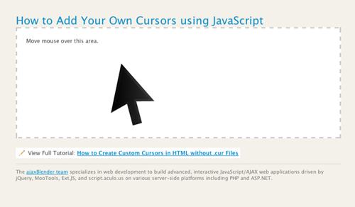
Custom cursors
In Fable 3, a player’s selected spot is marked with a magnifying glass icon that acts as a custom cursor.
In The Elder Scrolls IV: Oblivion, a simple hand-shaped cursor indicates that the player can pick up this object. A red cursor indicates that the item can only be stolen, and that soldiers can begin the pursuit.
What can a web designer get from here:
Perhaps the most recognizable cursor is the “grabbing hand” on Google Maps. But user cursors are not new and common in web applications. The ability to use them is built into most browsers.
It is important to use these cursors wisely: to offer help, to indicate content that you can click on, to highlight important information. You see how this can be used to attract attention and highlight important points. Imagine what a well-made JavaScript wand can do on a kids site! It is obvious, however, that such a solution is not suitable for a corporate site.
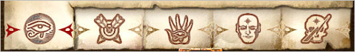
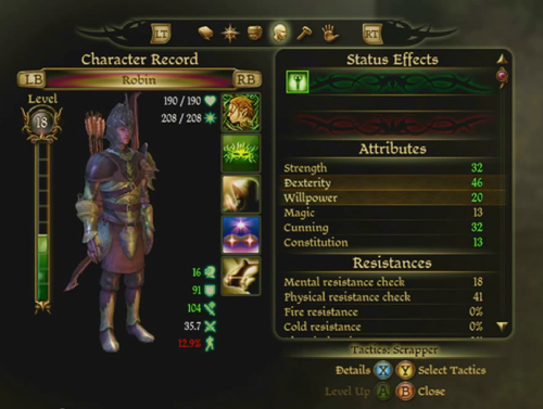
Icons, icons, icons
The only significant difference between video games and sites is that the icons in the game menus are much more complex. Usually the user spends more time in the game than on the website. But icons are used on sites more and more often, so the line between sites and web applications is erased.
So, how can icons be used effectively in game navigation? They should be readable and contextual. For example, in the Halo Reach game, a player relies on icons when navigating and choosing weapons, but the menu resembles line-of-sight indicators (in the real world, these can be seen in vehicles). Icons for websites should also be easy to understand. For optimal usability, add text labels.
If the icons are selected carefully and consistently, they can greatly speed up navigation using complex menus. Use clear colors, vivid contrasts and simple, easy-to-see outlines.
Games move from small, highly detailed images to more intricate shapes, such as those seen in Halo Reach and the Call of Duty series, and to large detailed pictures with crisp shapes, such as below. Even if you do not notice the details, you will recognize the outline of the hand, circle, and face. The use of one color makes them less complex visually and easier to distinguish. The more icons used, the easier and clearer they should be.
You can also use icons to focus on key topics. Use header images instead of buttons as quick tips in content boxes and repeating sections. Make complex images bigger and be consistent. Icons can add interest to lists, as well as divide content into more digestible parts. With their help, you can draw attention to important sections of the text, as Treemo skillfully does.
Consider using the appropriate icons to navigate and group by topic. You can use the same forms as headings or frames in the text to indicate the relationship of different parts of the content with each other. Icons make it easy to browse through content, noting interesting places, which makes it easier for users to find the information they need.
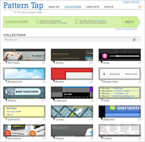
Icons should not be static illustrations. Screenshots on Pattern Tap serve as traditional thumbnails of images, but their special shape also functions as an icon, increasing interest and strengthening the brand’s position:
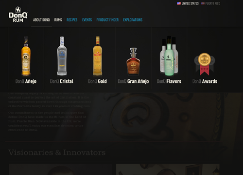
But what if we use client products as icons? The smart DonQ submenu shown below uses products as icons, quickly and easily directing you to an object of interest. Even smarter it seems that when a submenu appears, the rest of the content dims, thus highlighting the options you need.
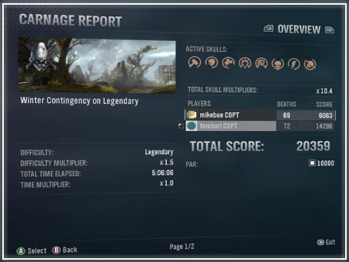
Full Page Carousel Menus
Bookmarked screens that slowly disappear, like this one from Dragon Age, Origins, have been used for a long time:
In the Carnage Report ”(Halo Reach) this idea has reached a new level. Screens scroll horizontally, and each page has several tabs. Gamers are accustomed to this interface, but apply it on the site and people will be surprised.
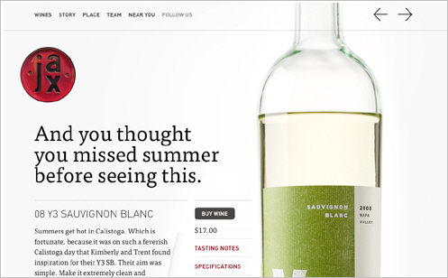
Jax Vineyards uses a similar type of layout, without tabs:
Add tabs to each carousel screen and your site will take it to the next level.
Magento offers a different look at this idea:
Right now we are seeing this type of interface on mobiles and tablets, with lots of background pictures. They are also used in games of all kinds. It's more than tabbed tabs or simple horizontal scrolling: imagine an iPad with multiple monitors. Think for a Living offers a map (very much like a game) in the upper right corner to help users navigate this unusual carousel.
What can a web designer get from here:
If you have a lot of content, such a bold decision may appeal to the user, which will increase site traffic. Your screens slide and are easily controlled with a touch screen - the importance of this factor will only grow.
Due to the different screen sizes, this type of layout needs to be carefully planned and may require CSS3 media queries to be sure to load content onto different screen sizes. You will need to make your layout responsive to interaction. You can embed a full-screen carousel with a full-size div and overflow with a value of hidden, placing frames in an unordered list with a fixed length.
Users are increasingly getting used to this type of interface with the proliferation of tablets. Using even more simplified horizontal scrolling can help your client stand out from the crowd.
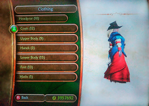
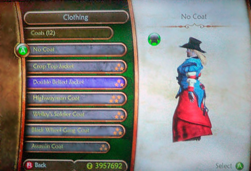
Sliding menus
The menu system of the recently released Fable 3 game is completely different from the one used in Fable 2 (in the picture above). But Fable 2 has such a nice sliding menu that I was required to include it in the list.
Scrolling the slider gives access to the buttons, and the content is shown on the right side of the screen. Buttons also have drop-down menus; inactive content fades. The picture above shows the category “Clothing”. Then from the content you can select “Jackets”, from there - to the specific details of the clothes. Does this remind you of e-commerce sites?
What can a web designer get from here:
Have you ever been to a site with huge fly-out menus across the page? Which expand to submenus, sometimes four-level, while you explore the list of contents? Such sophisticated menus look somewhat menacing and can cause the visitor to leave. A good way to avoid bloated menus and disgruntled users is to create small menus.
There are several “sliding” scripts that offer special scroll panels for each div container. Why not put buttons there too? Due to its scalability, this type of menu looks more suitable for some cases (for example, for entertainment or fashion sites) than the usual drop-down menu. Add the AJAX loader that appears on click, and it will become easier for users to understand the interface. Here our task is to keep the user on one screen and keep the menu scalable. You can add virtually any number of items in each menu, and they will not become bulky.
Pivot screens
I must admit, the first time I saw pivot screens in Halo Reach, my heart sank. When you go to the main menu, the text is beveled. Halo Reach uses perspective throughout the game to point to the right edge of the menu. This is a visual cue. What happens when you move the controller to the right? The screen scrolls horizontally, becomes cloudy, and the next frame appears, where perspective is also used, this time pushing text and pictures to the left edge. Under the tab you can see your hero, almost not moving and terribly similar to a living person. Bravo. I sat and played with pivot screens for a long time. Of course, my first reaction was: I want to do this!
What can a web designer get from here:
You can simulate this menu with a little help from Photoshop. Using a large panoramic background image with a width of two screens with beveled typographic markup of the text in CSS3, as well as fast horizontal scrolling in JavaScript, you can get something similar to the menu tilt in this game. Apply this to the smaller panel and use on the banner or button and you will be amazed (like your client). I don’t know anyone who would use this method on sites, but I created a small demo so that you have a starting point in case you want to put this into practice.
Pay attention to how Halo Reach integrates regular menu screens into the game world with a skillful illusion of landscape in the background. It is really beautiful; it gives a feeling of depth and proximity, as if you were looking at the ground from an airplane before landing. It excites and seduces you to move on, act and be part of the plot. This type of integration is not suitable for all websites, but if it is appropriate, then this is a very worthwhile solution. Never underestimate the power of admiration!
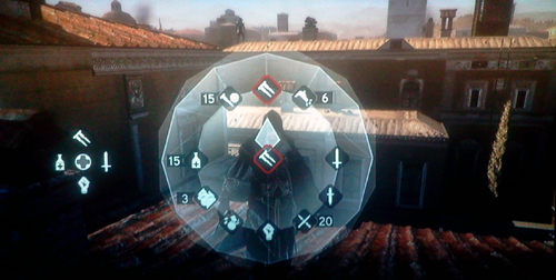
Context menus
The context menu in a video game is a “distant relative” of a submenu on a website. Context menus such as those at the top of the Assassin's Creed: Brotherhood game give the user certain options, depending on their location in the game and their choice of actions. If you choose to cast a spell, the submenu offers you a choice of fireball or lightning bolt. If you choose movement, you can run, climb or hide - that is what is in the radial menu. Radial menus with icons are very popular, but context menus may well be just short vertical lists of words.
What can a web designer get from here:
When you invite a user to take an action, the context menu may be convenient. Instead of a list of links, you can offer an interesting list of special actions. This is used in web applications and small widgets for social networks.
When creating a context menu, you should at least think about making it radial. Radial menus should give users three to eight options, and the interface should make them visually interesting. Leave the menus as simple and clear as possible. They should offer the user the appropriate choice at the time of decision and increase the level of conversion. In addition, they should be easy to press and visually light.
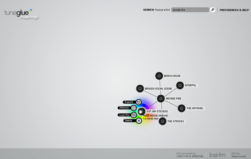
As a good example of a radial context menu, take a look at TuneGlue's musicmap:
Since the map was made in Flash, you can build a simple radial menu using JavaScript. Or you can complicate the task with nested radial menus, something like this:
Radial menus are not limited to context menus only. Drop-down panel menus at the time of action can be just as effective, and their development may require less time and testing.
Your turn
Many other examples of great interfaces can be gleaned from video games. Games serve as design inspiration and can make your interface more intuitive and fun.
Are you creating a website for a nonprofit organization planning a fundraising campaign? Consider using a blackboard to keep track of donations. You can also use them to know the top 10 of your readers, thus giving them an incentive to comment.
Learn to work with icons and think about ways to use them, making the site more enjoyable and easy to use. Make interesting hints and consider adding downloadable content as a reward or incentive. By observing and applying the above, you will make your sites more exciting and easy to use. And let's not forget that research is fun!