 September 1, 2010 at 16:34
Prototyping in Expression Blend + SketchFlow. Part 2. Basics
We continue, or rather, begin to deal with prototyping in SketchFlow. The last time we looked at the evolution of SketchFlow itself - from early prototypes to the final product , and today we will begin to sort through its capabilities.
It all starts with the creation of a new project. At this point you can choose what type of SketchFlow application you want to create. You have two options: Silverlight and a WPF application. It might seem that SketchFlow allows you to develop only prototypes of Silverlight or WPF-applications, but this is not so, nor is it true that only prototypes of “paper” applications can be made on paper. In fact, you choose a container or, if you want, a delivery method
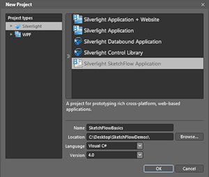
your prototype. Silverlight-container works in the browser and can be posted on the site. The WPF container is a standalone Windows application. This is the main difference, however, do not forget that by its own functionality Silverlight! = WPF, that is, there may still be some nuances, especially if you go beyond the basic ideas of SketchFlow and begin to actively use the capabilities of a particular platform . (See also Project Types in Expression Blend + SketchFlow )
 vs.
vs.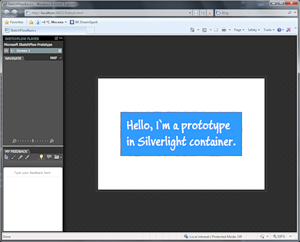
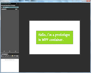
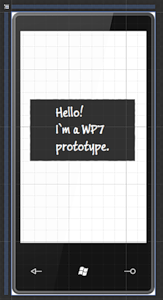
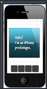
Otherwise, it all depends on your imagination and your tasks. With SketchFlow, you get a container - an interactive prototype player. In this sense, nothing prevents the development of prototypes of conventional applications, sites or mobile applications for any platform. Essentially, to add context, it’s enough to add a suitable background and, if necessary, appropriate control styles (Expression Blend can import psd files). That is, the answer to the question “can I use this thing to make a prototype iPhone application?” positive. Although, it is better, of course, if you make an application for Windows Phone 7 ;) I will stick to the Silverlight container path. Let's look at the Expression Blend interface for a SketchFlow project:
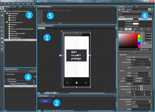
In addition to the menu and toolbar, there are 6 main blocks in the interface:
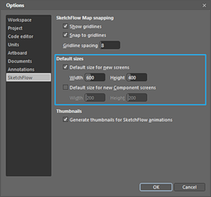
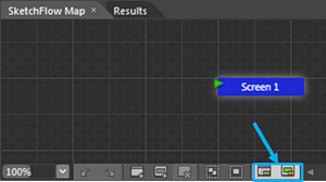
Before moving on, you need to make one important setting, which will make life much easier: through the Tools⇒Options⇒SketchFlow menu, you need to set the default size for new screens and components. For example, if you use the background of your phone or browser, then it is reasonable to set the default size for the screens to the size of the background. We move on: the main concepts are ahead: the map, screens, components, communications, and in the end we will talk a little about import.
SketchFlow Map is a map of your screens and components, showing how they are related. (Mathematically, this is a directed graph, and somewhere in the project’s service files you can even find its description in xml format.)
What screens can the user get from the current one? What transitions are available to him? What should he do to get to the right screen? How do different components fit into each other and into different screens? Together, this forms the flow of your application, that is, illustrates the possible ways for the user to work with your application.
Perhaps you can even say that SketchFlow Map allows you to see the whole picture, what is called a big picture . The card allows you to concentrate not on the details of the screens, but on the connections between them.
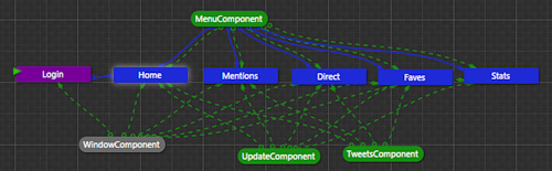
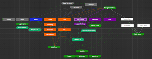
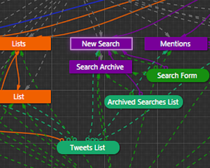
For example, in the picture above you can see that there is a Login start screen , and there are several main screens, each of which contains a menu in the form of a MenuComponent component , through which you can access any of the screens. A WindowComponent underlay has been inserted into all screens, a TweersComponent tweet feed and a panel for updating UpdateComponent status have been inserted into the main screens .
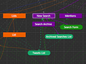
The circuit may be more complicated: or more simple: .
Ultimately, it all depends on the complexity of the prototype and the level at which you do screen splitting, because part of the transitions between different states can be “wired” inside the screen in the form of selected states (States), transitions between which can be set, for example, using behaviors (Behaviours).
Another interesting point: from the point of view of prototyping as a tool for thinking and analysis, the SketchFlow Map itself is a tool for designing the "flow" of the application and exploring possible options, somewhat reminiscent of MindMap.
A few simple SketchFlow Map rules:
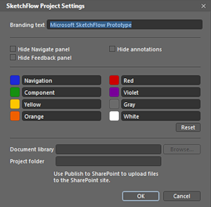
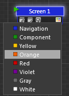
By the way, you can set your colors to all elements of the map (screens, components, links) - you have a pool of eight colors (color tags) that you can define through the Project⇒SketchFlow Project Settings menu ... Then you can assign a color through the drop-down or context menu: For convenience, you can enable snapping to the grid through the map context menu. Also, in the case of a large overgrown scheme with a bunch of links, these two buttons can be useful, highlighting the links for the selected components or screens and extinguishing the rest: Compare: and . Moving on: screens and components.
Screens are the key states of your application, you can establish connections (transitions) between them. Components are parts of an application that can be inserted into other components or screens, i.e. this is the usual composition. The same component can be inserted into multiple screens.
Technically, both are regular UserControls.
Using components allows, for example, moving navigation (application or site menu) into a separate block that concentrates all the necessary functionality (transitions, navigation), and which will subsequently be inserted into all the necessary screens. That is, from the scheme

you can go to the scheme
 .
.
However, this must be done depending on the stage of development of the prototype and the problem being solved. In the first case, you concentrate on the main screens, and in the second, you already highlight the components of the UI.
You can create new screens and components in various ways:
For each new screen or component on the map, a window opens in which you can edit the content. Do not forget to set the sizes of screens and components by default (see the beginning).
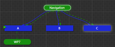
Communications is a very important element: not only do they, in fact, connect different screens to each other, they also allow you to conveniently play your prototype using the player. Each screen (or components inserted into it) has outgoing connections that show where you can go from this screen: In this case, from screen C you can directly go to screen X and, through the inserted Navigation component, to screens A, B, C (yes , formally it turns out that you can also switch to yourself). In the prototype player (compilation and launch - F5), this set of links directly maps to the available navigation options (transitions):
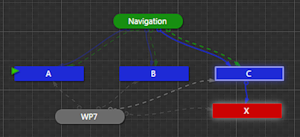
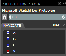
Please note that for monitors, the colors match the colors on the card. In this case, of course, in the player you can simply open the card and directly go to any screen or component of interest.
New connections on the map can appear in several ways:
This is about manually creating links. There is another option for the semi-automatic appearance of relationships on the map: Behaviors can be hung onto individual elements (inside screens or components) through which you can launch many interesting actions and, in particular, transitions.
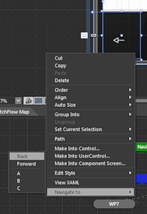
For transitions, a special item in the context menu is even added - NavigateTo, through which you can hang up a click on any of the available screens or forward / backward in the user's history of movement on the screens. If there is no connection between the screens, it will automatically be added to the map. We will consider the behavior separately in one of the following articles.
To conclude this article, I want to outline another interesting topic, an introduction to the next part. Note that all of the above is, in fact, a conversation about the form, and not about the content, that is, about the application flow, and not the details of the UI.
In this context, it becomes interesting to quickly identify what will be on each of the screens. This problem can be solved in various ways: from the simplest in the form of a text explanation “there will be a list of contacts” to the import of ready-made sketches.
In the case of import, Expression Blend + SketchFlow provides you with several interesting features, each of which has its pros and cons
For an example, see the video on creating a prototype interactive banner .
Getting started and interface
It all starts with the creation of a new project. At this point you can choose what type of SketchFlow application you want to create. You have two options: Silverlight and a WPF application. It might seem that SketchFlow allows you to develop only prototypes of Silverlight or WPF-applications, but this is not so, nor is it true that only prototypes of “paper” applications can be made on paper. In fact, you choose a container or, if you want, a delivery method
your prototype. Silverlight-container works in the browser and can be posted on the site. The WPF container is a standalone Windows application. This is the main difference, however, do not forget that by its own functionality Silverlight! = WPF, that is, there may still be some nuances, especially if you go beyond the basic ideas of SketchFlow and begin to actively use the capabilities of a particular platform . (See also Project Types in Expression Blend + SketchFlow )
vs.Otherwise, it all depends on your imagination and your tasks. With SketchFlow, you get a container - an interactive prototype player. In this sense, nothing prevents the development of prototypes of conventional applications, sites or mobile applications for any platform. Essentially, to add context, it’s enough to add a suitable background and, if necessary, appropriate control styles (Expression Blend can import psd files). That is, the answer to the question “can I use this thing to make a prototype iPhone application?” positive. Although, it is better, of course, if you make an application for Windows Phone 7 ;) I will stick to the Silverlight container path. Let's look at the Expression Blend interface for a SketchFlow project:
In addition to the menu and toolbar, there are 6 main blocks in the interface:
- The work area where the main action takes place,
- SketchFlow Map is a map of your application showing what screens and components are and how they are connected.
- Projects - the tree of your project, Assets - blanks, controls, etc. that can be used in the prototype.
- The tree of elements of the current screen, component or control + panel for recording animations.
- SketchFlow Animations is a special panel for simplified recording of animations for prototypes.
- Properties of selected elements - color, position, fonts, etc.
Before moving on, you need to make one important setting, which will make life much easier: through the Tools⇒Options⇒SketchFlow menu, you need to set the default size for new screens and components. For example, if you use the background of your phone or browser, then it is reasonable to set the default size for the screens to the size of the background. We move on: the main concepts are ahead: the map, screens, components, communications, and in the end we will talk a little about import.
Sketchflow map
SketchFlow Map is a map of your screens and components, showing how they are related. (Mathematically, this is a directed graph, and somewhere in the project’s service files you can even find its description in xml format.)
What screens can the user get from the current one? What transitions are available to him? What should he do to get to the right screen? How do different components fit into each other and into different screens? Together, this forms the flow of your application, that is, illustrates the possible ways for the user to work with your application.
Perhaps you can even say that SketchFlow Map allows you to see the whole picture, what is called a big picture . The card allows you to concentrate not on the details of the screens, but on the connections between them.
For example, in the picture above you can see that there is a Login start screen , and there are several main screens, each of which contains a menu in the form of a MenuComponent component , through which you can access any of the screens. A WindowComponent underlay has been inserted into all screens, a TweersComponent tweet feed and a panel for updating UpdateComponent status have been inserted into the main screens .
The circuit may be more complicated: or more simple: .
Ultimately, it all depends on the complexity of the prototype and the level at which you do screen splitting, because part of the transitions between different states can be “wired” inside the screen in the form of selected states (States), transitions between which can be set, for example, using behaviors (Behaviours).
Another interesting point: from the point of view of prototyping as a tool for thinking and analysis, the SketchFlow Map itself is a tool for designing the "flow" of the application and exploring possible options, somewhat reminiscent of MindMap.
A few simple SketchFlow Map rules:
- The prototype always has a start screen, which is indicated by a green triangle (see in the pictures above). Through the context menu, you can make any screen start.
- Screens are indicated by rectangles; by default they are blue (Navigation).
- Components are indicated by rounded rectangles; by default they are green (Component).
- Transitions are indicated by solid lines. The composition is indicated by dashed lines.
By the way, you can set your colors to all elements of the map (screens, components, links) - you have a pool of eight colors (color tags) that you can define through the Project⇒SketchFlow Project Settings menu ... Then you can assign a color through the drop-down or context menu: For convenience, you can enable snapping to the grid through the map context menu. Also, in the case of a large overgrown scheme with a bunch of links, these two buttons can be useful, highlighting the links for the selected components or screens and extinguishing the rest: Compare: and . Moving on: screens and components.
Screens and components
Screens are the key states of your application, you can establish connections (transitions) between them. Components are parts of an application that can be inserted into other components or screens, i.e. this is the usual composition. The same component can be inserted into multiple screens.
Technically, both are regular UserControls.
Using components allows, for example, moving navigation (application or site menu) into a separate block that concentrates all the necessary functionality (transitions, navigation), and which will subsequently be inserted into all the necessary screens. That is, from the scheme
you can go to the scheme
.However, this must be done depending on the stage of development of the prototype and the problem being solved. In the first case, you concentrate on the main screens, and in the second, you already highlight the components of the UI.
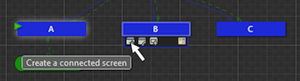
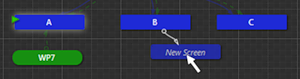
You can create new screens and components in various ways:
- The SketchFlow Map control panel has the necessary buttons:
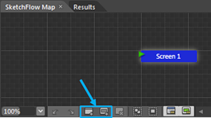
- The same options are available from the map context menu.
- The screens and components on the map have a drop-down menu from which you can pull out a new connected screen or component:
- If you select one or more elements in the workspace or the tree of objects, then from the context menu they can be turned into new components (Make into Component Screen ...).
For each new screen or component on the map, a window opens in which you can edit the content. Do not forget to set the sizes of screens and components by default (see the beginning).
Links and transitions
Communications is a very important element: not only do they, in fact, connect different screens to each other, they also allow you to conveniently play your prototype using the player. Each screen (or components inserted into it) has outgoing connections that show where you can go from this screen: In this case, from screen C you can directly go to screen X and, through the inserted Navigation component, to screens A, B, C (yes , formally it turns out that you can also switch to yourself). In the prototype player (compilation and launch - F5), this set of links directly maps to the available navigation options (transitions):
Please note that for monitors, the colors match the colors on the card. In this case, of course, in the player you can simply open the card and directly go to any screen or component of interest.
New connections on the map can appear in several ways:
- When you pull a new screen or component from an existing one, a link automatically appears (see above).
- From the drop-down menu of a component or screen, you can select the option Connect an Existing Screen or Insert Component Screen and drag the link to the desired object.
- You can simply select an object with the mouse and drag it onto another - a link (navigation or composition) will be automatically created between them.
This is about manually creating links. There is another option for the semi-automatic appearance of relationships on the map: Behaviors can be hung onto individual elements (inside screens or components) through which you can launch many interesting actions and, in particular, transitions.
For transitions, a special item in the context menu is even added - NavigateTo, through which you can hang up a click on any of the available screens or forward / backward in the user's history of movement on the screens. If there is no connection between the screens, it will automatically be added to the map. We will consider the behavior separately in one of the following articles.
Import
To conclude this article, I want to outline another interesting topic, an introduction to the next part. Note that all of the above is, in fact, a conversation about the form, and not about the content, that is, about the application flow, and not the details of the UI.
In this context, it becomes interesting to quickly identify what will be on each of the screens. This problem can be solved in various ways: from the simplest in the form of a text explanation “there will be a list of contacts” to the import of ready-made sketches.
In the case of import, Expression Blend + SketchFlow provides you with several interesting features, each of which has its pros and cons
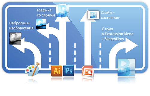
- Graphic sketches. Thinking through the sketches, you immediately highlight the key states (screens) and prepare sketches for each of them. State = sketch . Next, each under a sketch, create a separate screen and transfer the image there. Then you connect the screens together and get the primary version of the prototype. It can also be convenient if you start with paper prototypes or sketching an interface on paper.
- Graphic editor. You can open Adobe Illustrator or Photoshop and draw the entire sketch in a single file (or several files), spreading different components and states into layers. State = set of layers. Then you can import this file into Expression Blend along with the layers.
- Microsoft PowerPoint If you are making a prototype in PowerPoint as slide sequences, then you can import the presentation into Expression Blend. For each slide, SketchFlow will create a separate screen and establish links between them. State = slide.
- Expression Blend. And finally, you can create everything at once in Expression Blend + SketchFlow. We will consider this option in the next article.
For an example, see the video on creating a prototype interactive banner .