A Brief History of Computer Iconography
- Transfer
Since the seventies of the last century, the most common computer icons have come a long and thorny path. This article is an attempt to put together a collection of icons illustrating the development of computer iconography. And although from 1981 to 2010 there were many different operating systems with a graphical interface, only the most significant were selected, which had the greatest impact on the modern icon design.
Year 1981. Xerox 8010 Star - the first computer for ordinary customers with a graphical user interface
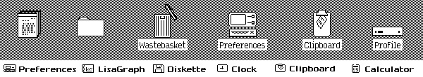
In 1973, Xerox Alto became the first computer in the world with a graphical user interface (GUI). The metaphor of the “office” was used in the design of the icons, by the way, also for the first time in the world. Alto was created for scientific development and therefore did not hit the wide market. In total, about two thousand such machines were produced and, later, the success of Xerox Alto prompted and inspired Apple to create a Lisa computer (in 1983). In 1981, Xerox Star was released, developing Alto's ideas and incorporating all the innovations and finds of his ancestor. Xerox icons demonstrate the principle of human interaction with the computer interface through familiar things. Take a look, the icons of the calculator, documents, folders and trash have not changed at all over the past thirty years.
1981 - Xerox 8010 Star
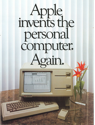
Year 1983. Apple Lisa - Popularization of the GUI
Apple began developing the Lisa computer back in 1978, under the strong influence of Xerox's early computers. Hoping to occupy a niche in the personal computer market, Apple adopted the metaphor of the “office” to make the communication of beginners with a computer as easy as possible. For that time, Lisa had an extremely advanced graphical interface: it had “Desktop Accessories” (and, in fact, widgets), drop-down menus and directories in the form of folders. As you can see, Lisa icons do not differ much from Xerox computer icons, except for the size and single-pixel stroke, as well as using the computer icon for the settings panel (it’s customary to use a gear for these purposes).
1983 - Lisa Office System 1
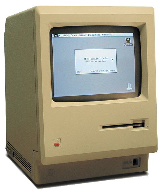
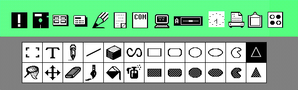
Year 1984. Apple Macintosh 1.0 - icons created by the artist
A year after the release of Lisa, Apple Macintosh 1.0 was born . From now on, you can copy files using the drag'n'drop method, move windows, in addition, new amazing icons have appeared. This time creating icons in charge of the now legendary Susan Kare (Susan Kare). Susan created many icons for Apple, including icons for the MacPaint interface (Figure 2). Ker’s philosophy is simple - “I believe that good icons are much closer to road signs than ordinary drawings, and, ideally, should be as simple, concise and memorable as possible. I’m trying to make the icons as clear and simple as possible, despite the fact that much more graphic features have appeared in today's computers. ” This philosophy served as the basis for Apple's commercial success in those years.
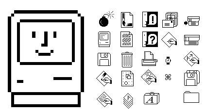
1984 - Macintosh System 1.0 (Figure 1)
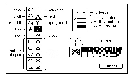
1984 - Macintosh System 1.0 (Figure 2)
Year 1985. Atari TOS - isometric icons
It is important to note that in those years, not only Apple computers had a graphical interface. At Atari ST has its own operating system the TOS, which had a minimalistic interface that uses the same metaphor of the desktop, which has become by the time the computer standard. By the way, some of the TOS icons were drawn isometric.

1985 - Atari TOS Version 1.0
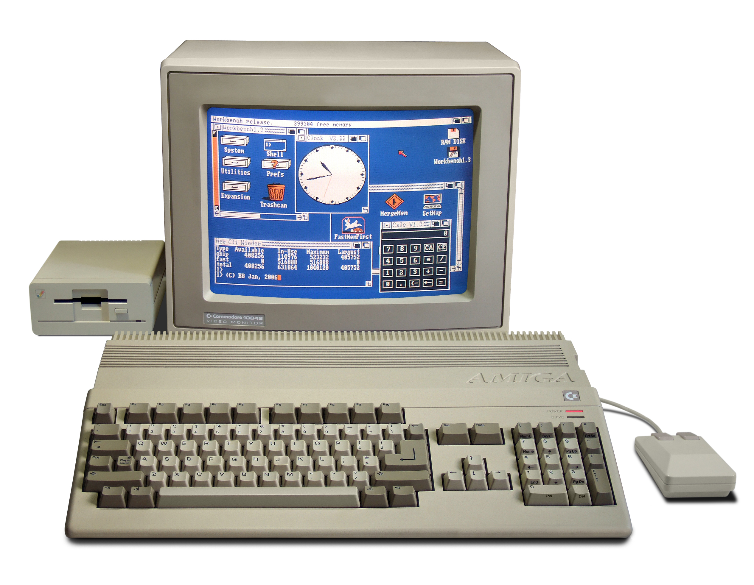
Year 1985. Amiga Workbench - four-color icons
The Amiga Workbench was created for the Amiga 500 PC . And, despite the crudely drawn icons, it was extremely progressive for that time. It was possible to change the appearance of the cursor in it, the icons were four-color, and also had the ability to visually change the state. Amiga changed the desktop philosophy and used a workplace with drawers instead of folder icons in their environment.
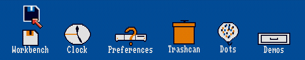
1985 - Amiga Workbench 1.0
Year 1985. Windows 1.0x - Microsoft's first GUI OS
In 1985, Microsoft finally managed to release its first graphical user interface . The icons looked as crude as those of Amiga, and they were also black and white. Interestingly, the first Windows Painter icons directly borrow some of the characters from MacPaint, in particular the Spray Painter icon is striking.
1985 - Windows 1.0x
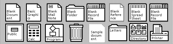
Year 1986. GEOS for Commodore 64 - alternative OS
It’s worth adding GEOS for Commodore 64 to the list, since at that time this graphical interface was the second most popular after Macintosh 1.0 (by the number of units sold). Icons were much more expressive than those of Microsoft, but professed the Macintosh philosophy - a philosophy of simple metaphors.
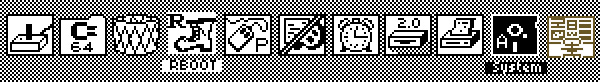
1986 - Commodore C64 GEOS
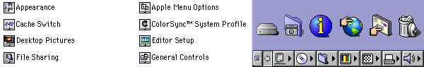
Year 1991. Macintosh System 7 - first color Mac OS
In System 7, icons made friends with color. In addition, they have grown slightly for greater “clickability”.
1991 - Macintosh System 7
Year 1992. Windows 3.1 - new design icons!
In Windows 3.0 (1990), Microsoft used the icons already familiar to us Susan Care (previously created icons for Macintosh 1.0). For Windows 3.1, Susan further enhanced the colors and look of the icons. In addition, Windows 3.1 was the first Microsoft platform with predefined True Type fonts.
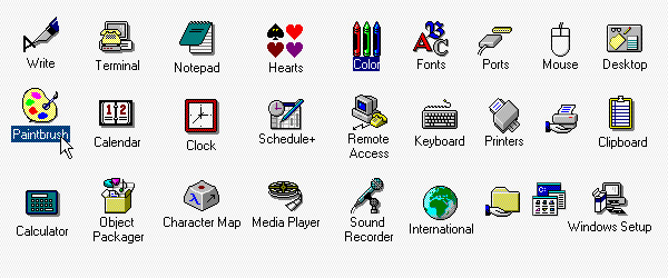
1990 - Windows 3
Year 1995. Windows 95 - Start Button
Windows 95 allowed to make icons more colorful. In addition, a few more isometric objects appeared. The design of the Windows 95 interface has been radically redesigned, it included some of the elements that live in Windows to this day. This is the taskbar, the menu and the “Start” button that has become the talk of the town.
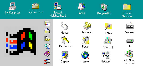
1995 - Windows 95
Year 1997. Macintosh OS 8 - Bright Icons
On Mac OS 8, the icons look much brighter, with a clearly visible light source direction. Macintosh has begun introducing an isometric style with a shadow effect.
1997 - Macintosh OS 8
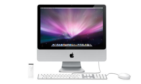
2001 Mac OS X v10.0 - Mac Style
The release of Mac OS X was marked by the appearance of shiny, plastic-jelly icons that looked just perfect. OS X icons have been a huge leap forward compared to OS 9 icons released two years earlier (its icons looked almost the same as OS 8 icons). Probably, due to the appearance of the dock, all the icons were drawn as if the light source was either directly in front of them, or slightly above them. Created as an integral part of the new Aqua graphic theme, the icons had complex reflections, highlights and textures. I am sure that it was Aqua who set the tone thanks to which the current computer iconography is so diverse and interesting.
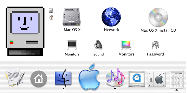
2001 - Mac OS X v10.0
Year 2001. Windows XP - bright calm icons
In 2001, Microsoft introduced the public to a new operating system. Using a rich color palette, the icons, however, look calm. There is one light source, as well as translucent falling shadows. The style continues to use isometry.
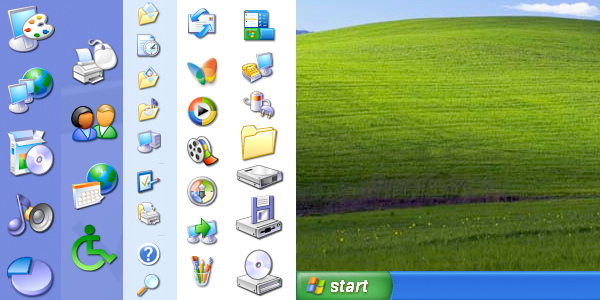
2001 - Windows XP
Year 2007. Mac OS X Leopard - Reflection Dock
Mac threw the stripes and gave birth to a 3D-style dock, reflecting the icons located on it. Use in the design of chrome, glass and reflections is more popular than ever. The icons themselves have not changed much since OS X.
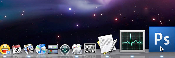
2007 - Mac OS X Leopard
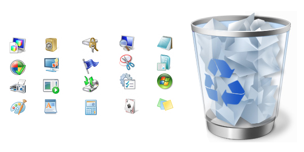
Year 2009. Windows 7 — Calm with Reflections
Icons of Windows 7 are fundamentally different from Windows XP icons and Vista icons inherit. The main difference is that the Windows 7 and Vista icons look to the left, and not the right, like the Windows XP icons. In the seven icons are even calmer, softer, although with a clear presence of the reflection effect.