Interface Building: Pattern Description Alternative Views
- Transfer

This is one of a series of articles about using patterns.
Have you ever been in this situation: the customer, in pursuit of a beautiful design, gives tasks that are competing, and sometimes mutually exclusive?
We offer to see how leading developers have solved this problem and introduce the following term: View mode.
This solution will allow you to combine the seemingly incompatible, while maintaining the integrity and convenience of the interface.
With examples of various Viewing Modes, each PC user encounters each time he opens the next window or document, they have become a familiar tool for us. In the article we’ll try to figure out when it makes sense to use several modes, how to organize them, and how to make them accessible and convenient tool for users.
Disposition:
You have competing or sometimes even mutually exclusive design tasks for the same interface.
What can be done?
Create multiple Alternative Views in the same interface that can solve various competing design challenges.
When to use?
- You cannot fully satisfy the needs of the interface using the same design.
- The need for alternative designs for the appearance is quite justified: as a rule, in addition to stylistic ones, the interface also requires structural differences.
- You can divide competing tasks into target groups that will be understandable to users.
- You have the time and opportunity to create a variety of external types of documents for the same interface.
Why so?
When your design tasks begin to diverge so much that trying to combine them all makes the screen technically unsuitable for use, you should start using Alternative Views. Probably the most common example of this technique is printing, especially on the Internet, where the use of browser printing features ends in low readability due to navigation and auxiliary visual elements that are not directly related to the available content.
Similarly, you may need to provide looks for completely different form factors, such as telephones or other portable devices, or you may need to provide a portable format such as PDF so that you can use offline information in readable form.
More advanced applications of this pattern will be provided with different appearances for the same data, such as different visualizations and / or viewing mechanisms to help users analyze and find the information they need. You can go further by creating a changing / adaptable look and feel that optimizes the interface for users who may be hindered by elements specially designed to help novices or casual users, or you may need to display additional information or functionality that most people don’t normally need. users. Whatever the details, if you find yourself in a situation where the interface becomes cumbersome or simply does not meet the needs of the user, alternative types of documents are the best solution.
How to do this?
The use of diverse appearances will vary with the changing needs of different interfaces. The key point is to determine that you are facing competing usage needs that cannot be met properly in one interface, in order to isolate them in one or more viewing modes.
Often there is only one incompatible need (such as printing, transfer, execution, formation), so an alternative structure is clearly necessary. However, sometimes the need for an alternative structure is not obvious until you add something to your standard settings, and then you are faced with excessive cumbersomeness, in which case you need to try to rationalize the structure of the windows.
There is a temptation to make a structure based on the opposition “beginners - advanced users”, but such a separation is not always useful. A more useful tool for debugging the external structure of windows can be the use of so-called “images” or “roles” (see the example with Adobe Flash) to determine what a particular type of user will need. For example, you can enter the role of a reviewer-publisher who needs a separate structure — with more or more functionality, which differs from the author’s role you choose by default. Terminological definitions of user types (role-based and personal) can help establish what kind of appearance of windows you need to focus on the goals and objectives facing them.
If there is no reason not to do this, for example, for security reasons, you should ensure easy switching between different appearances. If the appearance of the screen contains signs of the user's state (for example, he is working in some form or document), you should make sure that this state is saved / transferred from one variety to another.
Some presentation-level technologies, such as HTML, Windows Presentation Foundation, and Silverlight, have technical support for creating a variety of looks with styles that can change independently of the application code. In HTML, you can use CSS, and in Windows Presentation Foundation and Silverlight, style, design, and templates.
Examples of
MS Windows. Explorer
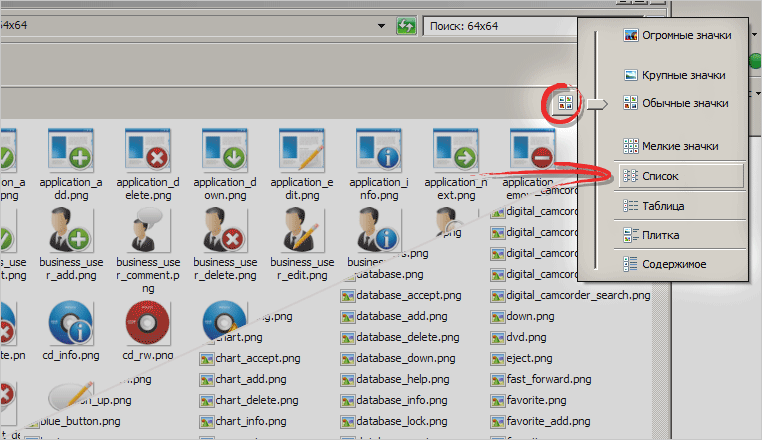
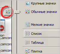
The simplest and most popular example. Any user can customize the display of files based on convenience and needs.
Adobe Flash Professional

Adobe Flash Professional uses several modes based on the "roles" of its users. Separate sets of panels for developers, designers, animators ...
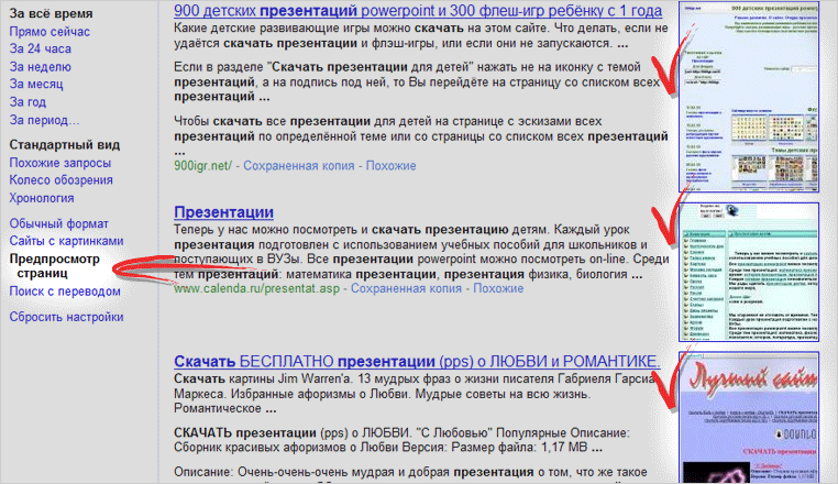
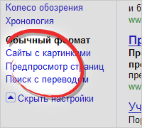
Google uses alternative viewing modes when displaying search results.
Link to an online example: Google Options are available via the Show Settings link.
Quince
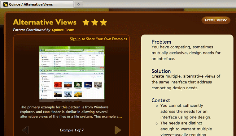
Quince uses two viewing modes: one using Silverlight technology, the second in HTML.
Link to an online example: Quince
Gismeteo
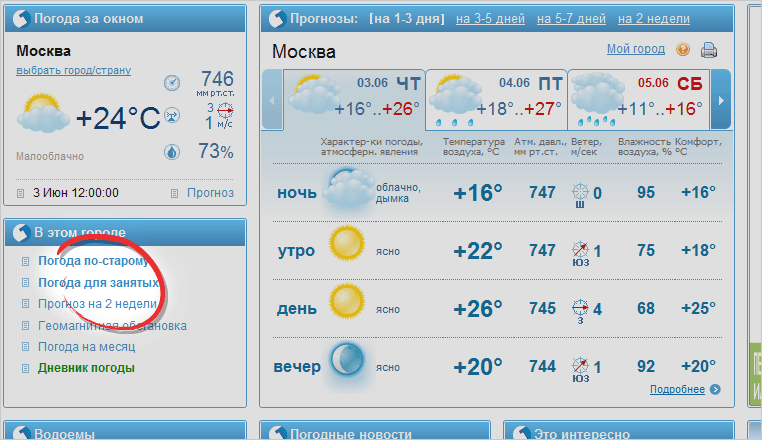
With all the visual similarities to the implementation of this pattern, in our opinion it is not its correct use, since after switching to another viewing mode, the selection menu disappears - the constant presence of which is the rule.
Link to an online example: Gismeteo
