About colors and inputs
Introduction
Hello, Habr!
This is my first habratopik. I hope at least one and a half coders will read it. If after that at least one site gets better, I will be very happy.
Nothing portended trouble
Like any slightly red-eyed Linux user, I like to experiment. Things didn’t come to the assembly of release candidates for the kernel and picking in exotic window managers, but in search of adventure I still moved to the test branch of my distribution, which led to the move to the fourth version of KDE.
A few months before the move, I looked at the new sneakers in a virtual machine, played with plasma and a new design. One fine day, I decided to try the dark color scheme “Wonton Soup”, but I stayed on it, although I used light schemes all my life.
Harsh reality
Everything was wonderful, smooth gradients were pleasing to the eye, small roughnesses were destroyed by experienced hands and a file. But there remains one global problem that all users of dark color schemes face: designers and layout designers do not think at all that someone can use non-standard themes. Pages decorated in light colors are not scary in themselves, if you do not constantly switch from dark pages to light ones.
Troubles appear when two factors are combined:
- The browser uses system styles and colors for inputs on pages. The vast majority of modern browsers do just that for better integration into the environment.
- the typesetter prescribes in CSS its text color for input fields, buttons, or lists, but leaves the default background. Or vice versa, it changes only the background color
But in dark schemes, embarrassment can happen, and we will see a dark gray text on a dark background. That is, we will not see anything.
Board of shame
I will give screenshots from some popular sites, a visit to which makes me want to send a ray of hatred to the layout designers.
| Here so model input fields on Habr look , the text is well read. |  |
| And here is the search box on livejournal.com . The text almost merged with the background. | 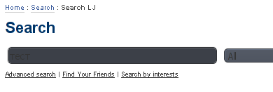 |
| The same disgrace on gametech.ru | 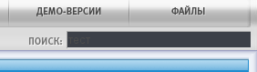 |
| adobe.com Developer Creative Suite 4 Web Standard |  |
| Intel official site |  |
| microsoft.com |  |
| Unfortunately, and Habr is not without sin |   |
Conclusion
Comrades layout designers! Do not rely on system colors and styles in the browser. Use a simple rule: change the text color only with the background color. This will not solve environmental problems and will not feed children in Africa, but will help to preserve the eyesight and nerves of some of your visitors.